The Tyranny of the Churn Equation
Yesterday I spent the day building and analyzing the way subscription applications tend to grow and settle over time. I built a tool to estimate these values and wrote about it here.
Ruthlessly Limiting Scope
I’m reaching a point in the development of this Pedometer++ update where I need to starting drawing lines in the sand about what features are going to make it into v5.0 and which will have to wait.
I talked about this a bit on the last Under the Radar.
This means that I have to start being ruthless about scope. If I’m not, I know for sure that I will never get this out the door. I have a list of ideas and possibilities a mile long and if I’m not careful, I’ll look up and it will be June and I’ll still be working.
So after much consideration here is my list of features that are getting bumped to a future release.
Delayed for Now:
- The Trends tab showing your step statistics over time
- Any workout mode other than walking/hiking. No running, cycling or display of other workout types.
- Rebuilding the Settings Tab in SwiftUI. I had hoped to get all the UIs into SwiftUI, but the Settings tab will have to wait. I’ll restyle it a bit to be in line with the new designs but under the hood it will remain UIKit for now.
This change also makes the marketing for this update more straightforward. The “story” for version five is now:
- Support for iPhone based walk/hike tracking
- Including support for the Dynamic Island and Live Activities
- Support for Map based navigation during workouts
- Improved Apple Watch workout tracking including support for the Action Button and Apple Watch Ultra
- Visual redesign with robust support for Dynamic Type and VoiceOver
This is likely a much simpler story to tell and thus easier to market against. The update is about workouts and additional visual and accessibility improvements.
I feel pretty good about this todo list and where it leaves me for the next month or so. With this in mind my goal endpoint now is to reach a feature complete, “No More New Features” point by February 3rd. That’s three weeks from now and that feels manageable. I’d then spend most of February on polish, beta testing and marketing prep.
This kind of forward planning is helpful to me not because it has any relation to reality. I’ve been a software engineer long enough to know that you can’t reliably estimate how long things will take to build. Instead, I find that it is more a hedge against Parkinson’s Law (work expands to fill the time allocated). Especially since I’m self employed, If I don’t set deadlines for myself I will forever allow my work to expand until I never actually ship anything. Or as the axiom goes “Plans are worthless, but planning is everything”.
Brief excursion into using a custom Accessibility Font
I came across this post by Hilda Bastian regarding the Atkinson Hyperlegible font. This is a font designed for increased legibility, especially for low vision readers.
I had the thought to swap to it within Pedometer++ whenever the Accessibility Dynamic Type sizes are enabled to further increase the readability of the UI.
I did a bit of experimentation with it to see how big of an impact it would make. Again using my SwiftUI blur trick to get a sense of how the font performs in lower vision scenarios.
Here is my tab control in Atkinson:

Here it is in San Francisco Rounded:
To my eye, there was actually not a lot of a difference between the two in terms of readability. I tried it in a number of other UI locations and came to the same conclusion.
My initial analysis is that San Francisco is actually a super legible font already and so the marginal gain of this move would actually pretty small. This is not at all surprising as I know Apple has put a ton of effort into the legibility of San Francisco, but good to confirm empirically.
I realize not everyone’s eyes are the same as mine, and there might be a particular group where this would be a win, but to the best of my ability to determine San Francisco seems great.
I’m glad I check this out, but for now I’ll stick with San Francisco.
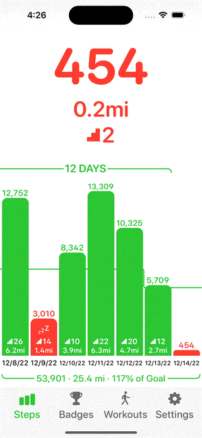
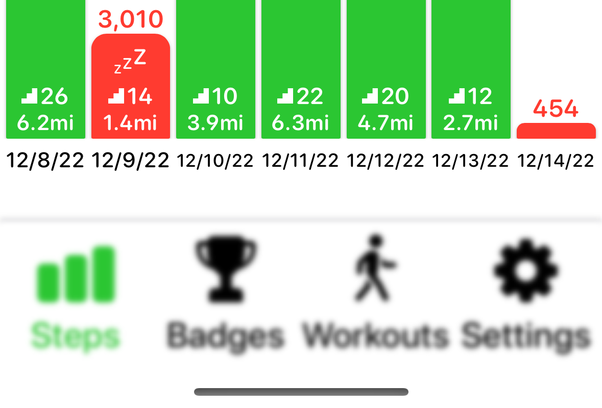
Better Week Summary View
One of the little design details that was annoying me about the layout of the main step graph view is that there was some dead space along the bottom of the graph when you scroll into the past. This was because at the bottom of the graph I show a little summary of your current week’s stats.
Given that I now dynamically scale the graph height as you scroll, I realized that I could now instead move the graph bar down when you scroll over to eliminate this issue. Here is the result:

Amusingly, while making this change, I had an issue where one of my spring animations was getting out of control and the the result was this kinda hilarious UI glitch: