watchOS 10 Redux
The funny thing about working on my Liquid Glass redesign for the Pedometer++ watchOS app is how very little needs to actually be done. A couple of years ago with watchOS 10 Apple introduced a very similar design language, with edge-to-edge backgrounds and frosted overlays. This redesign also carried with it the underlying nudge to move away from any form of custom navigation and instead rely on system provided mechanisms.
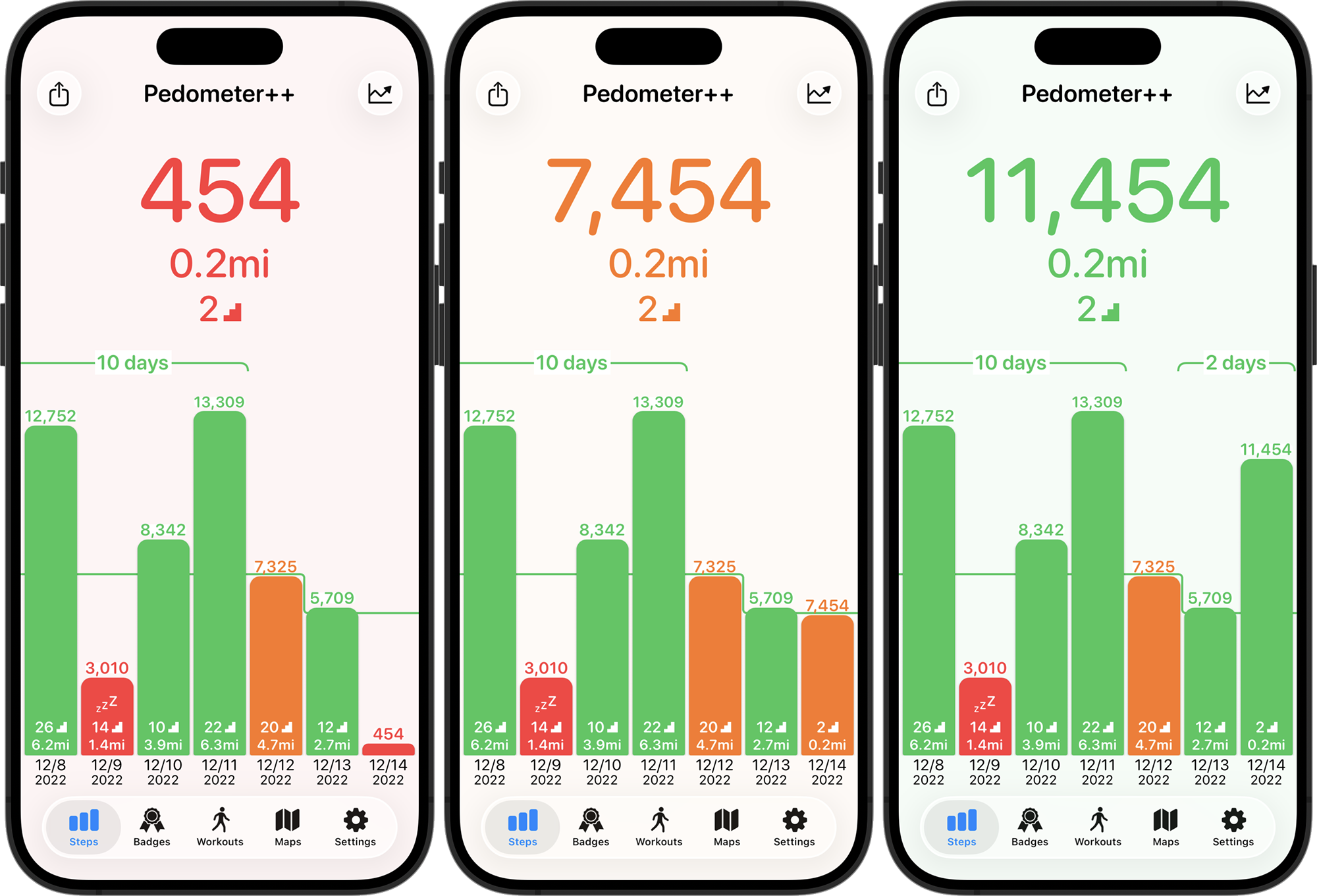
So when I did a simple rebuild of the project with Xcode 26 the result for many of my screens was already pretty close. Here’s the main current steps screen.
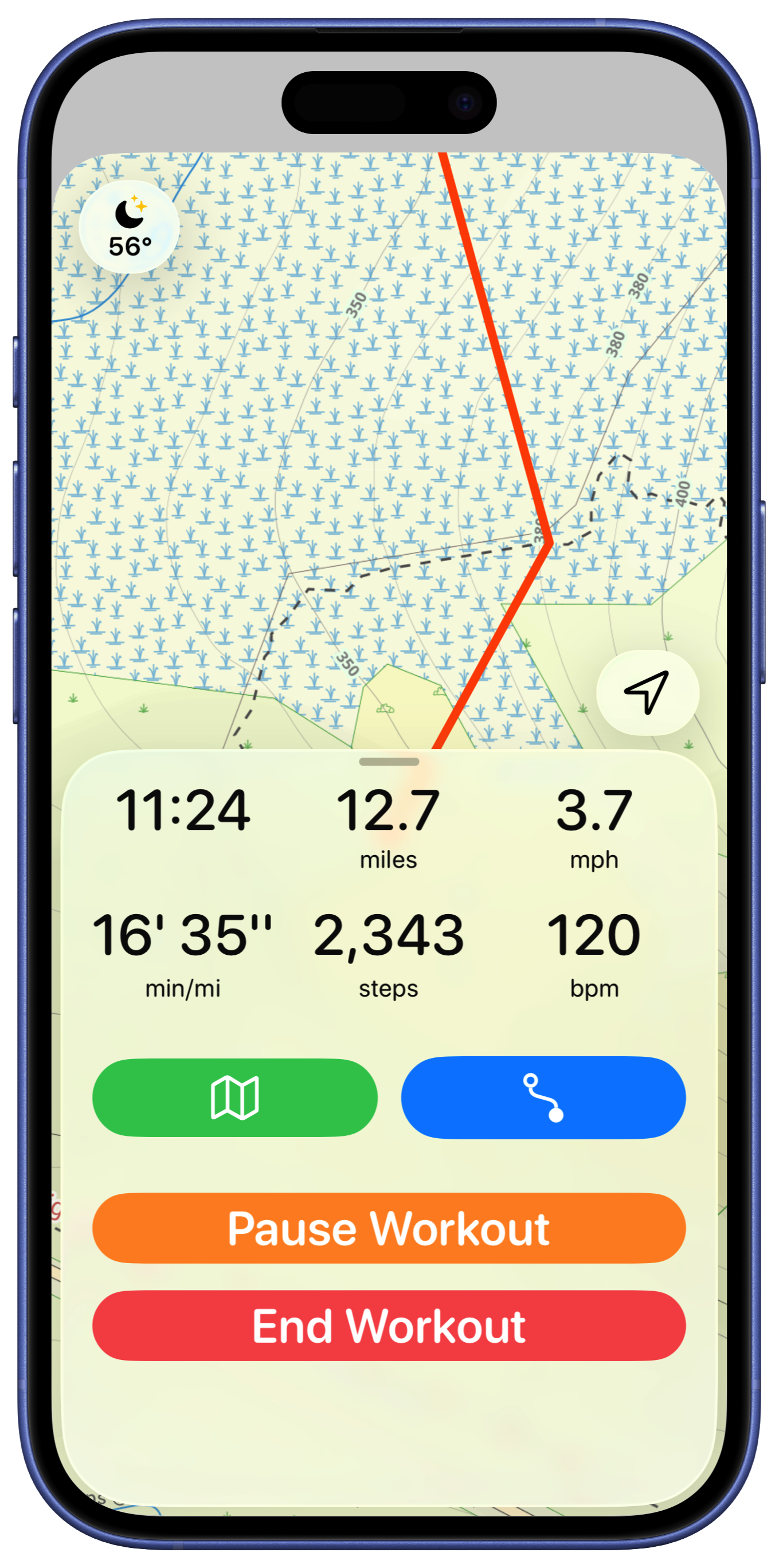
Other than the buttons going from the flat frosted material to the glassy sheen there is very little which initially needs to be done here. Similarly, the basic workout screen has a similar result.
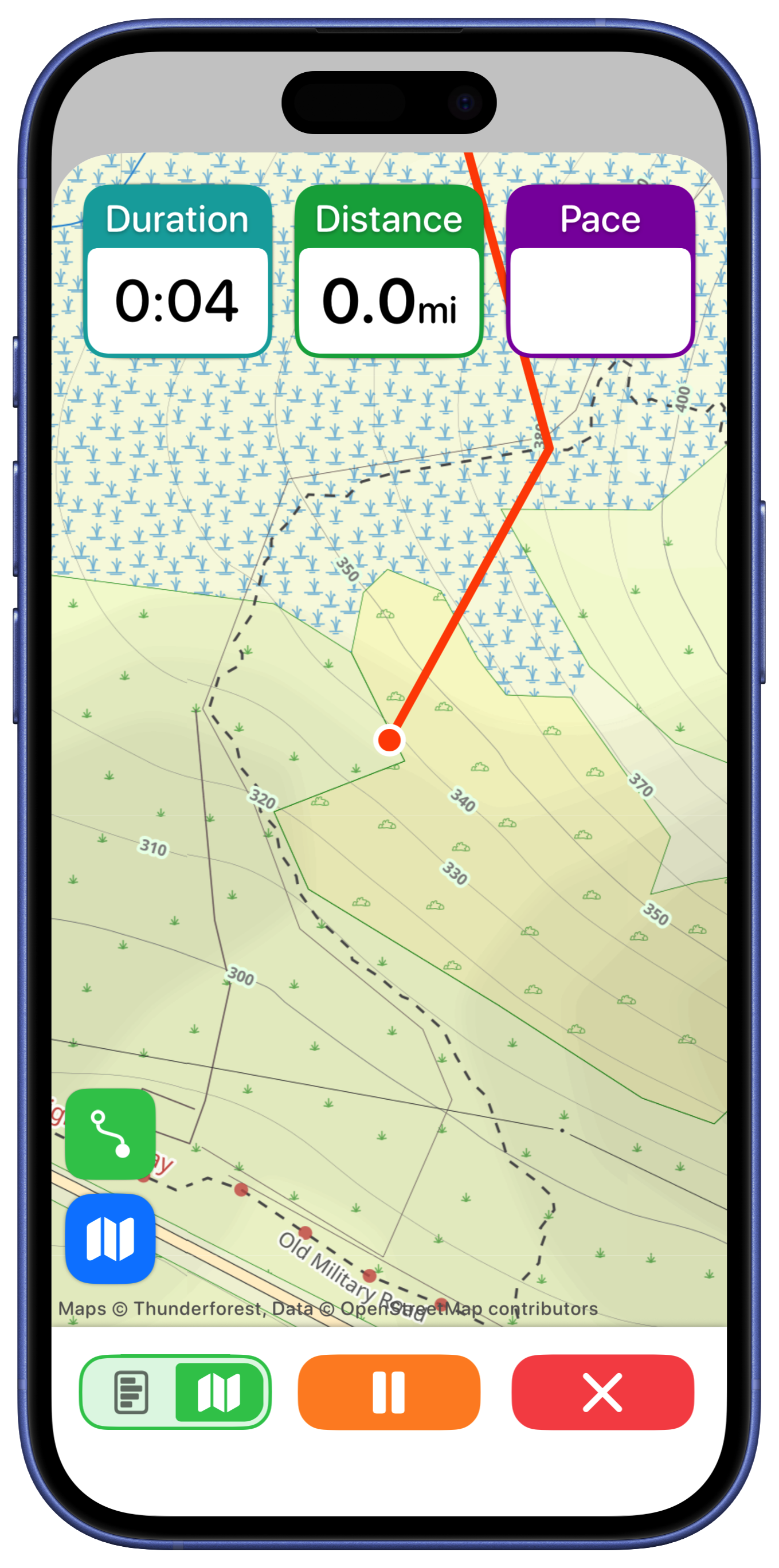
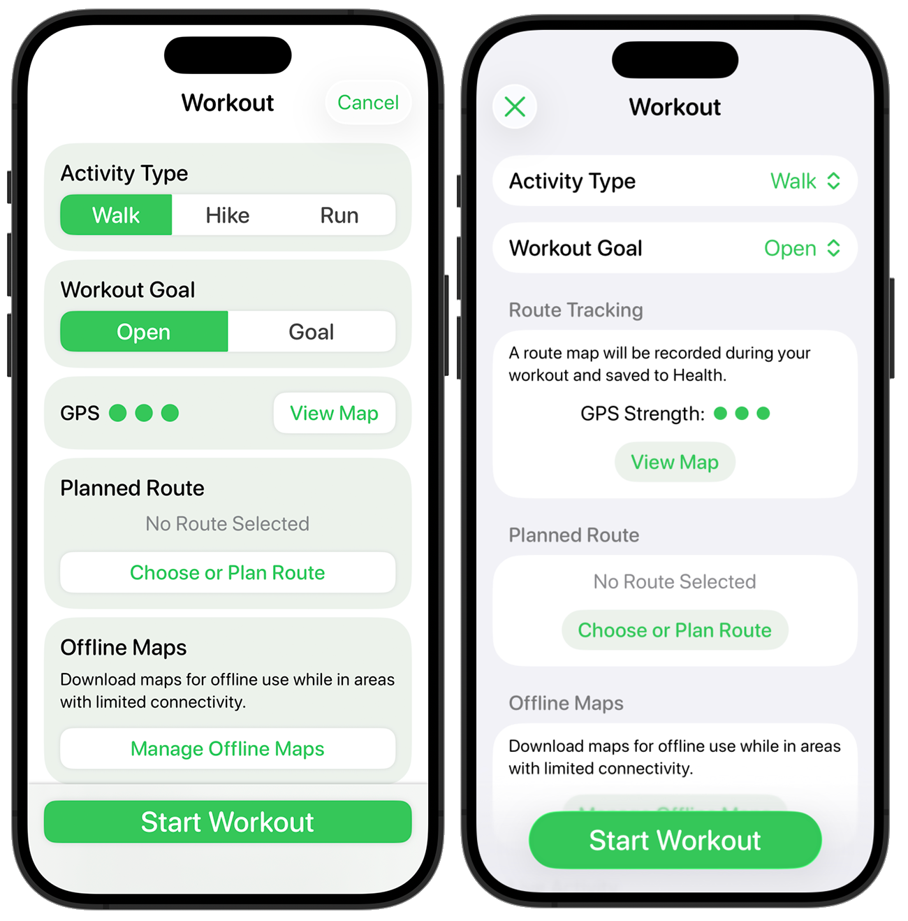
Route Planner
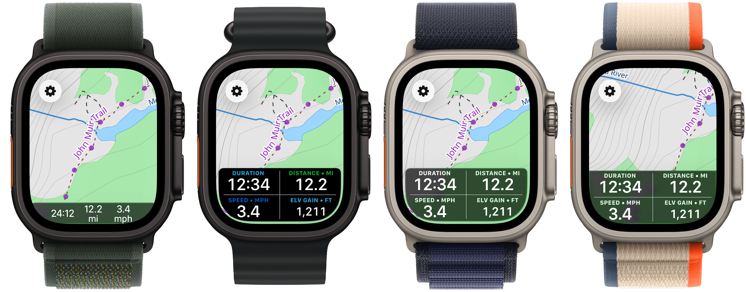
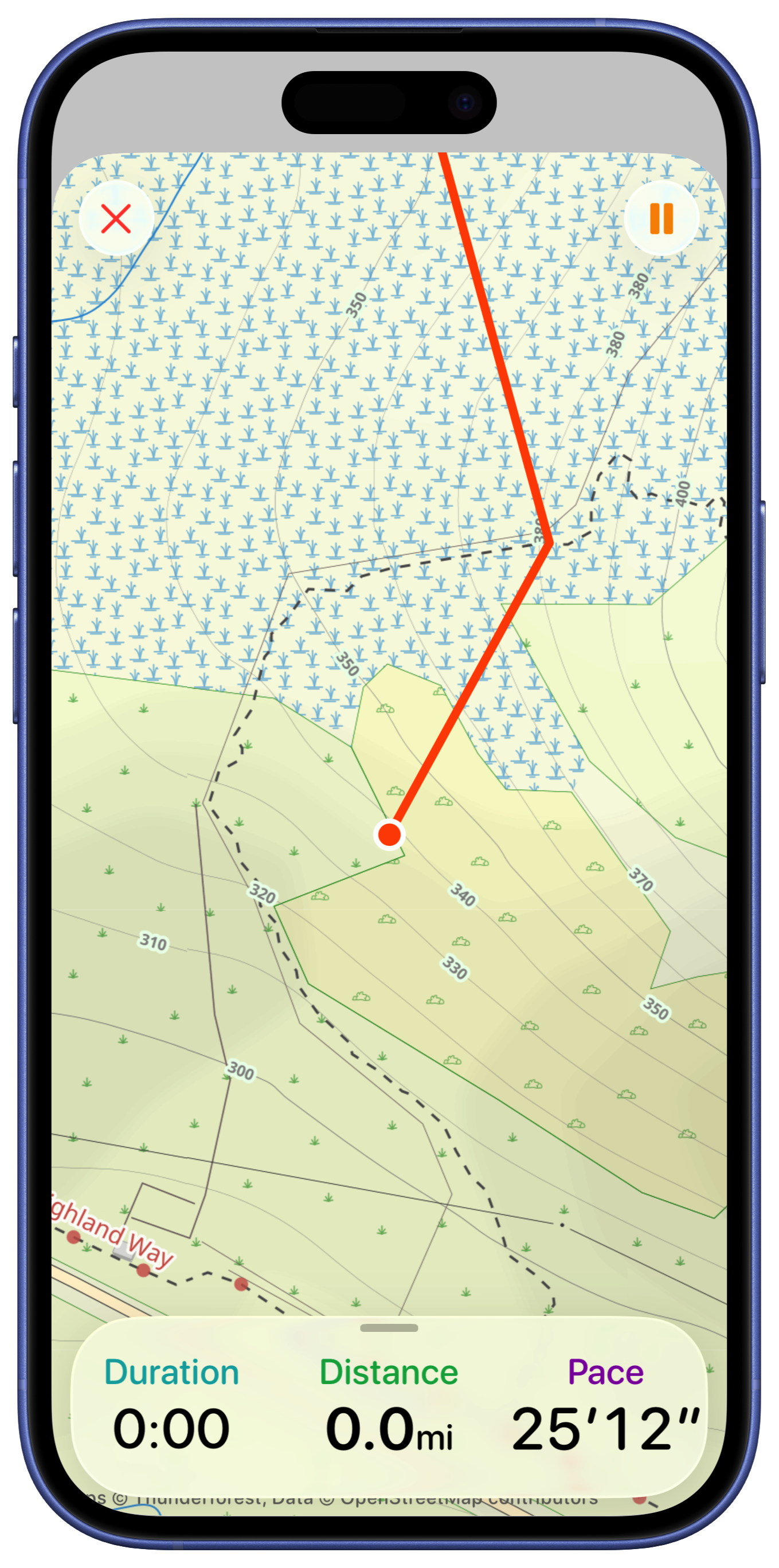
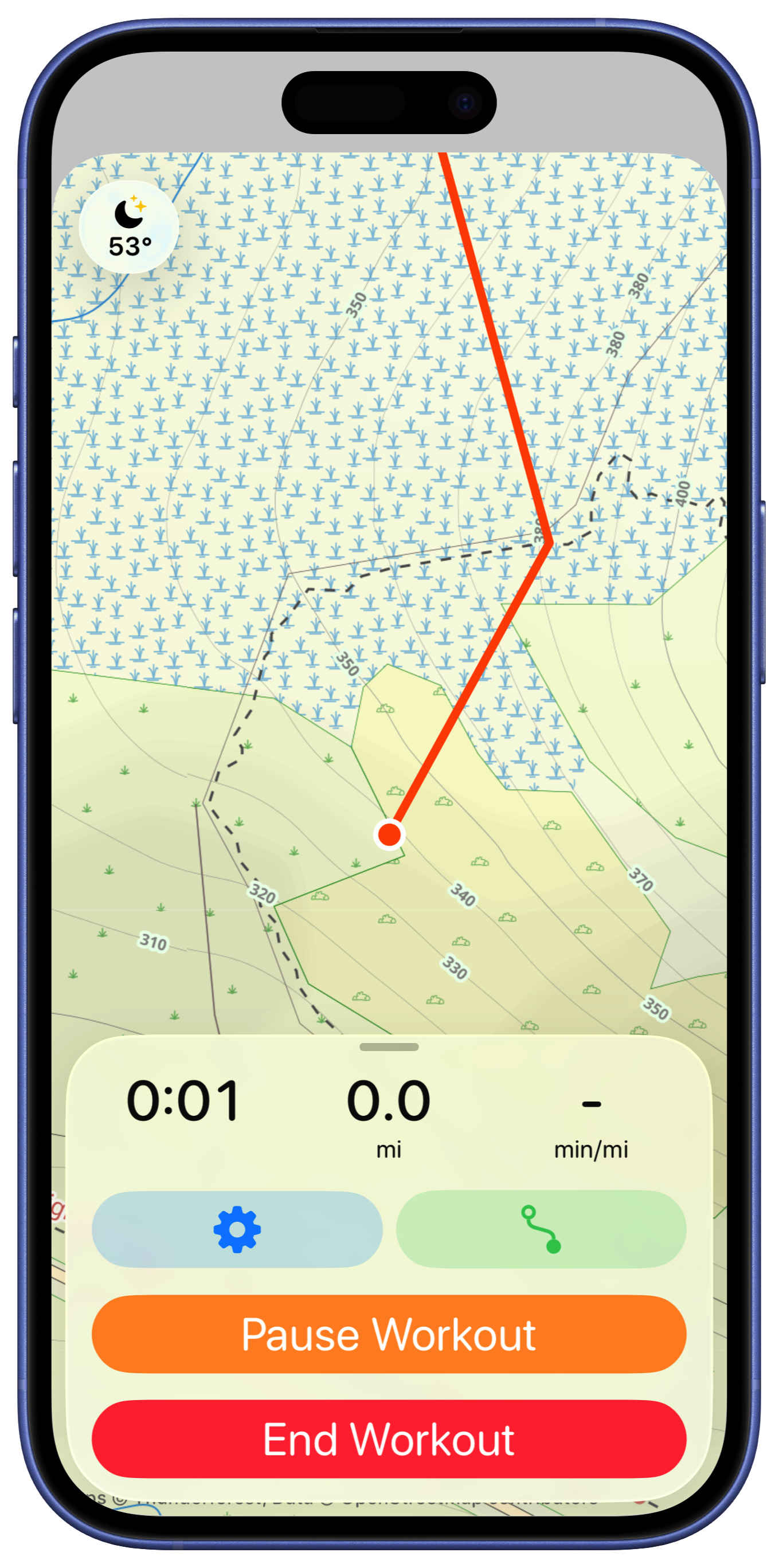
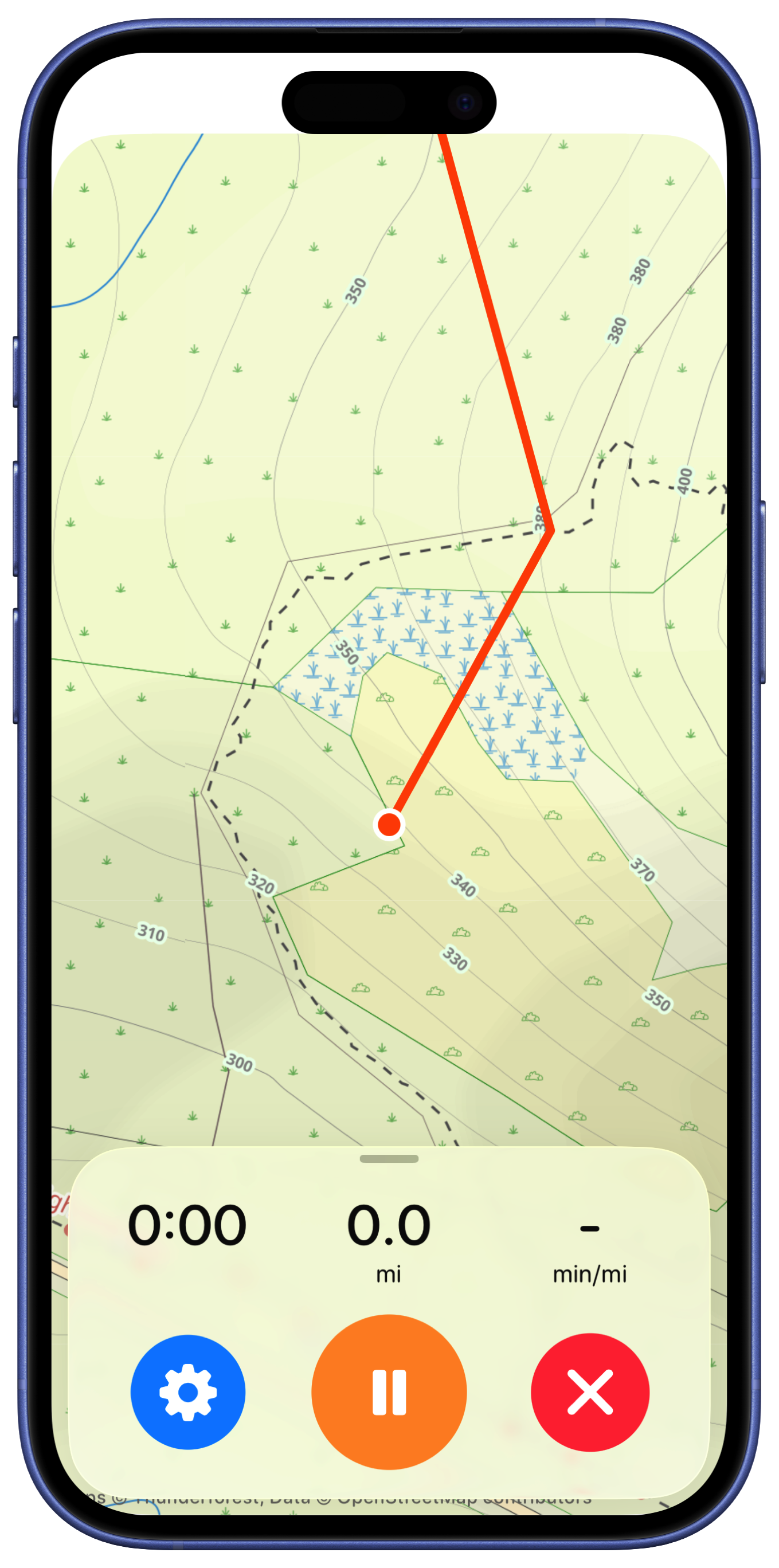
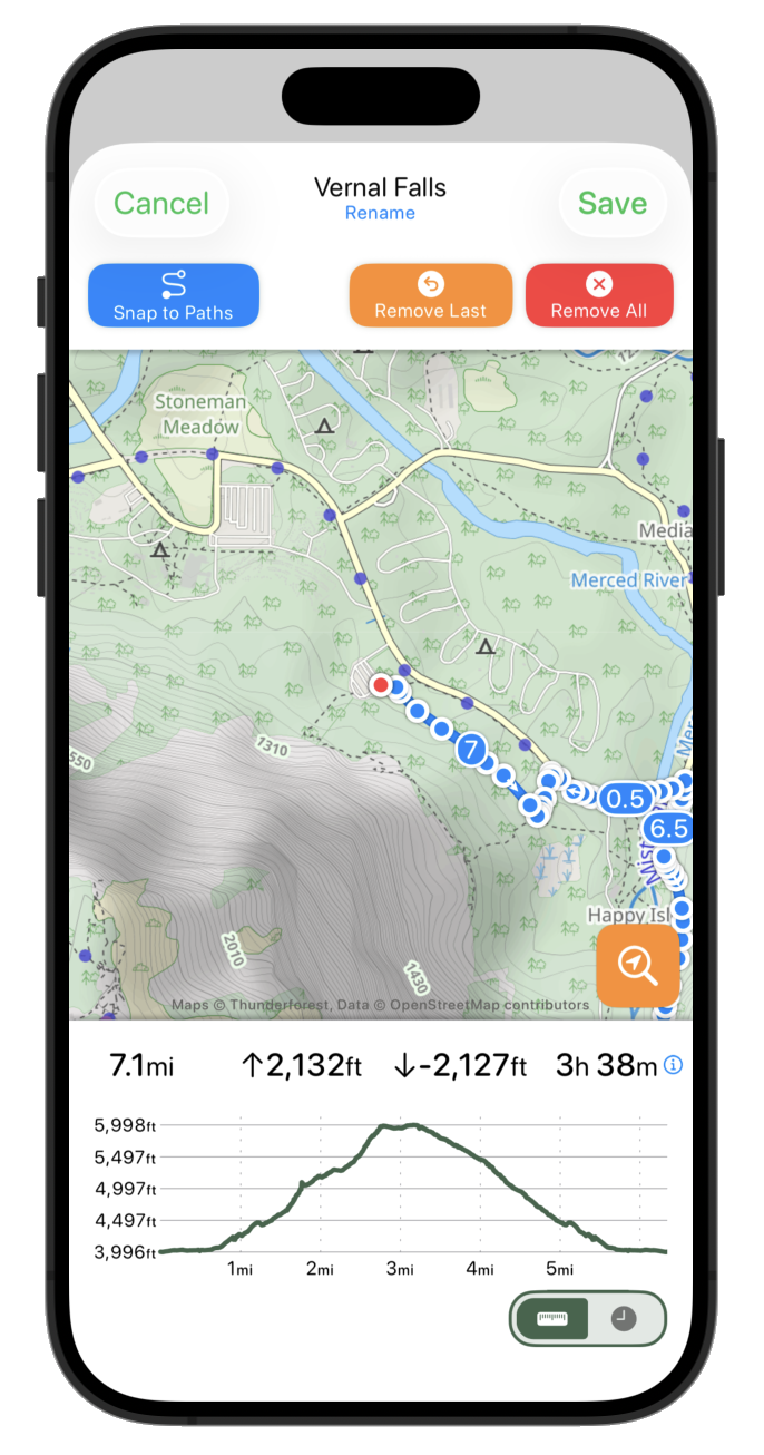
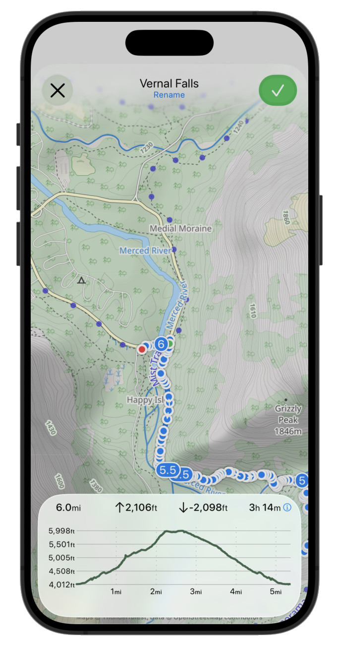
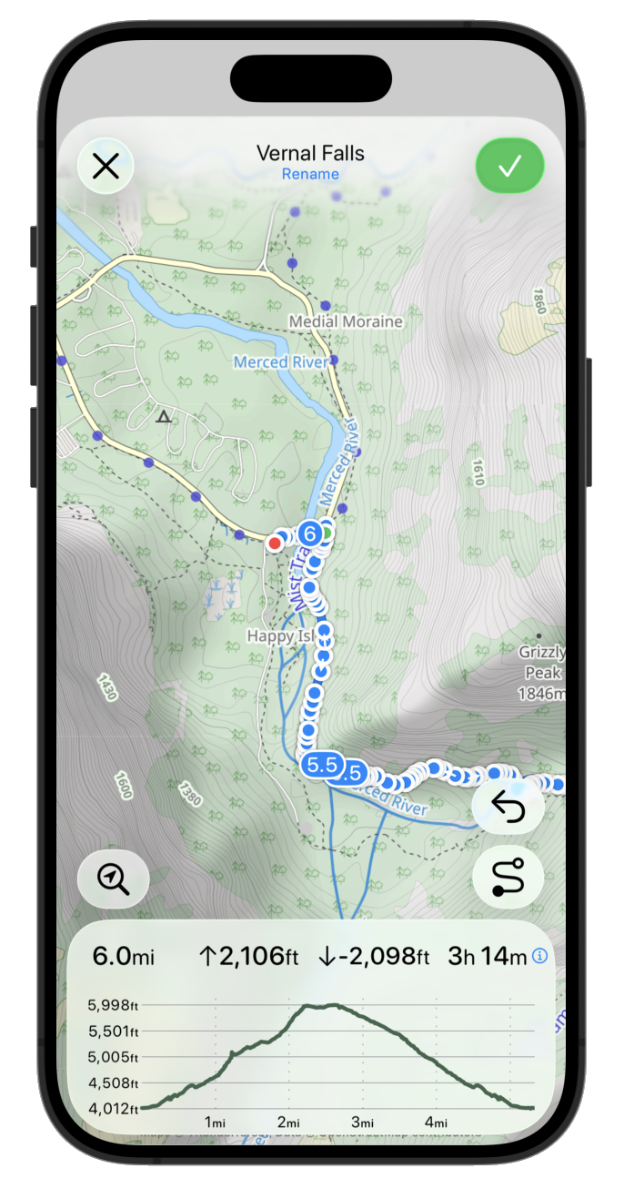
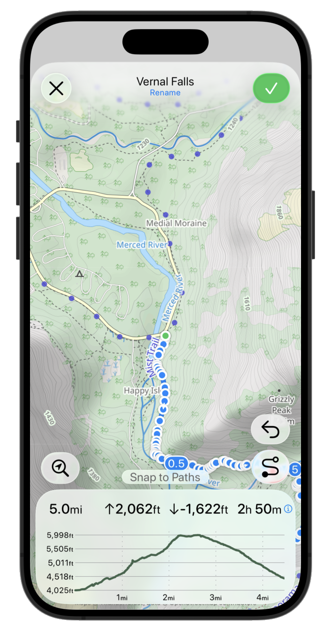
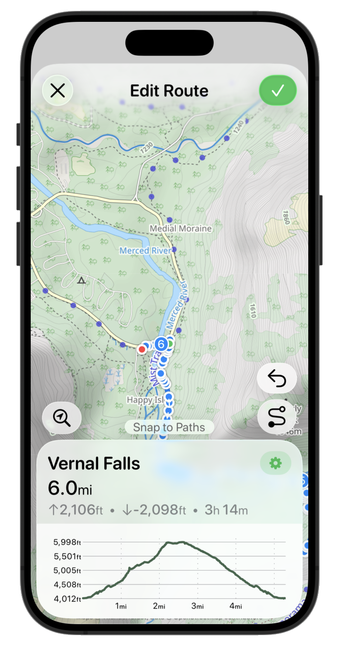
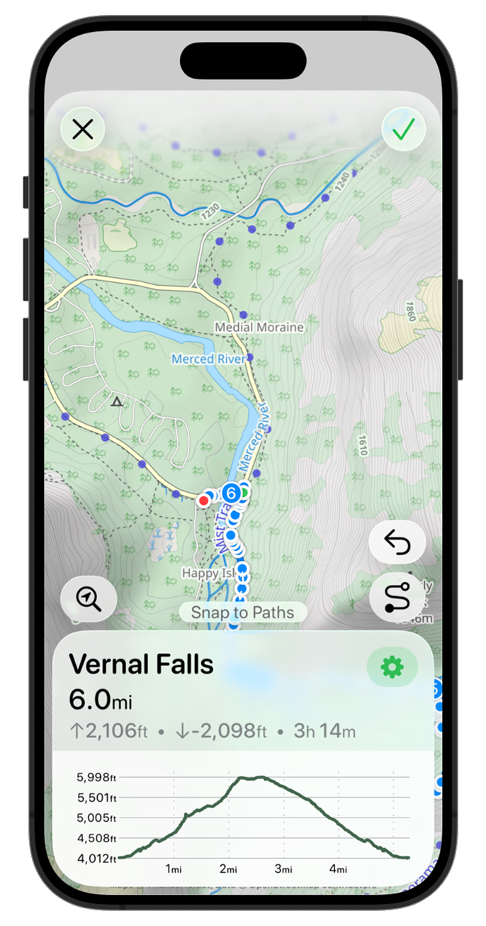
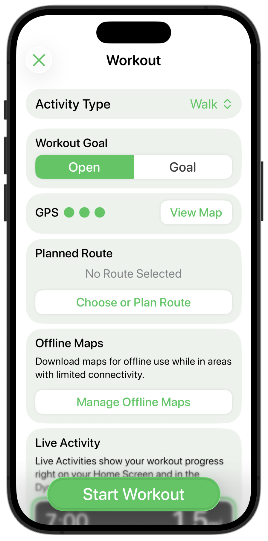
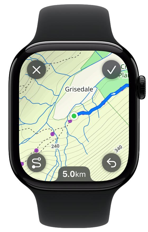
Where things start to get slightly more interesting is when I look at some of the more sophisticated screens in the app. For example the route planner screen.
Here the initial step is the same to switch the corner buttons to glass.
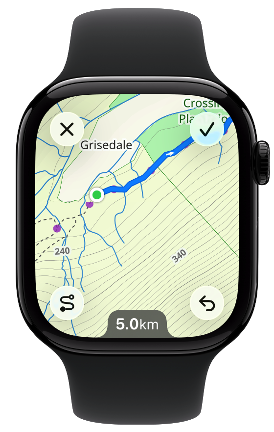
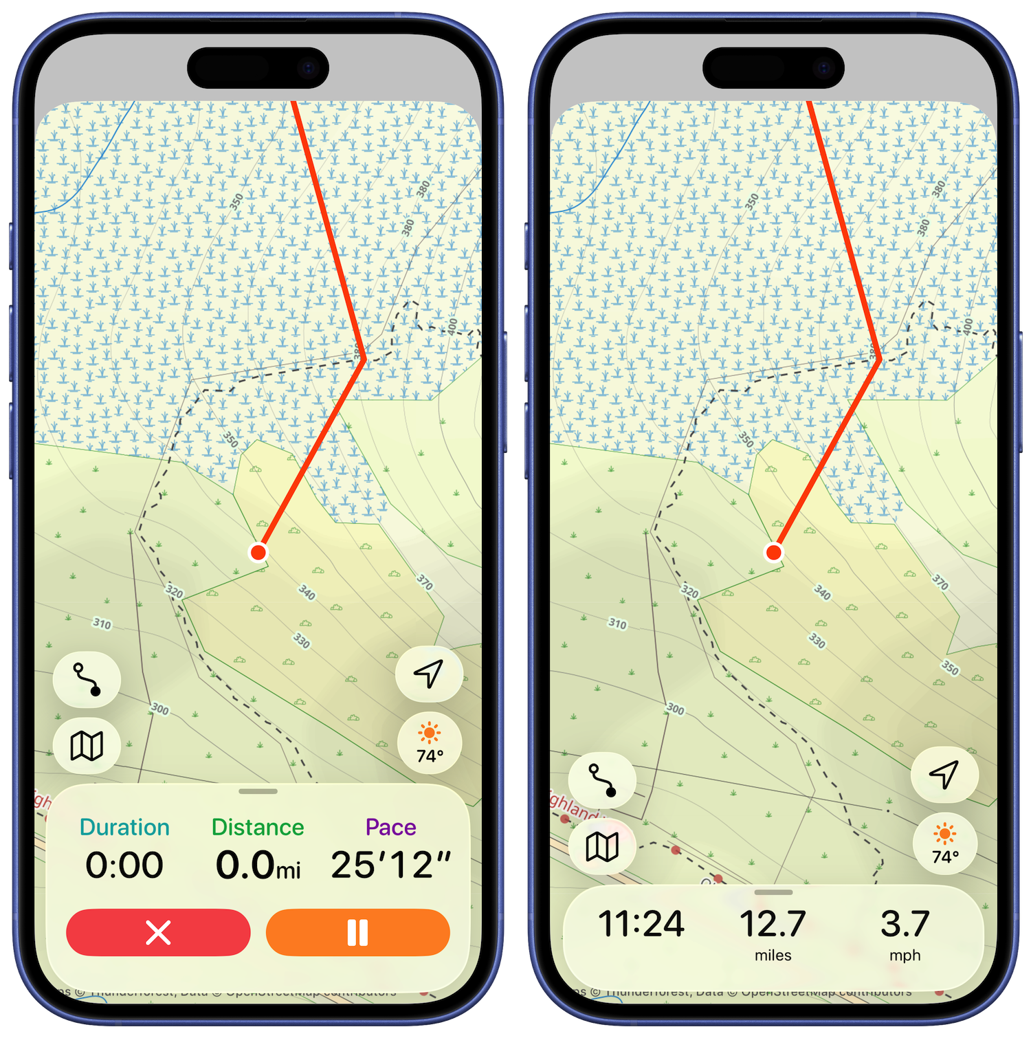
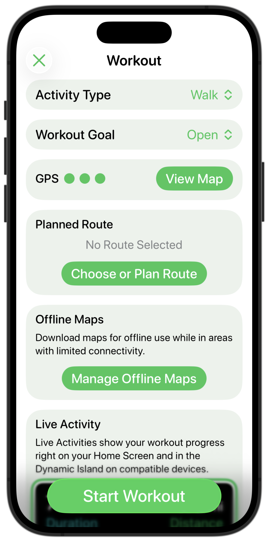
But what to do with that distance indicator at the bottom? My instincts here is that there are really two ways to approach an element like this: blend it into the device frame or harmonize it with the glassy buttons.
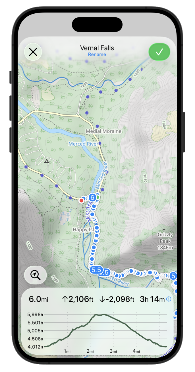
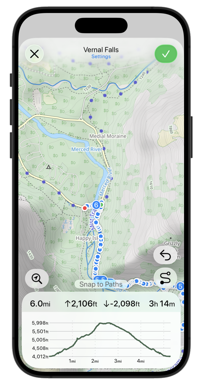
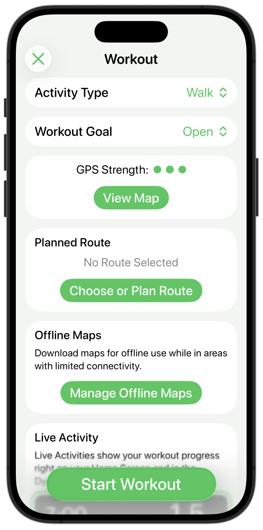
Blending it into the device frame would look like this:
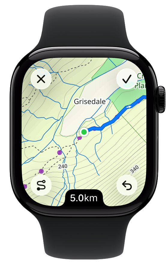
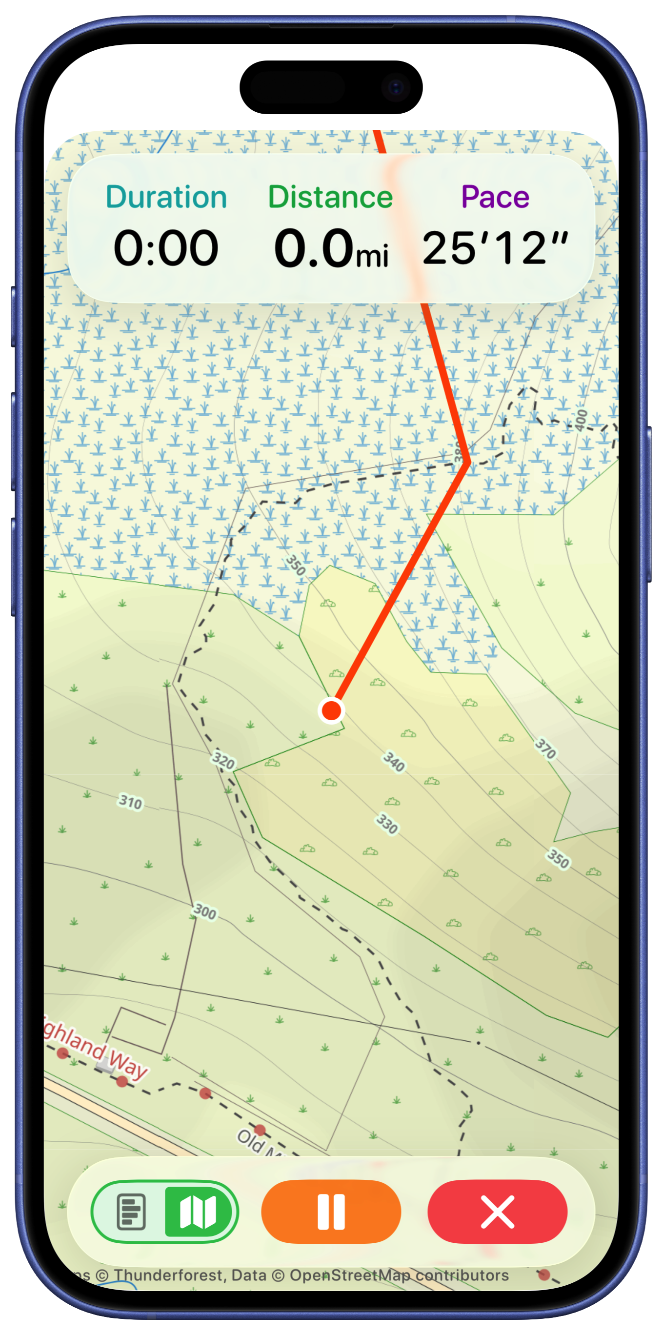
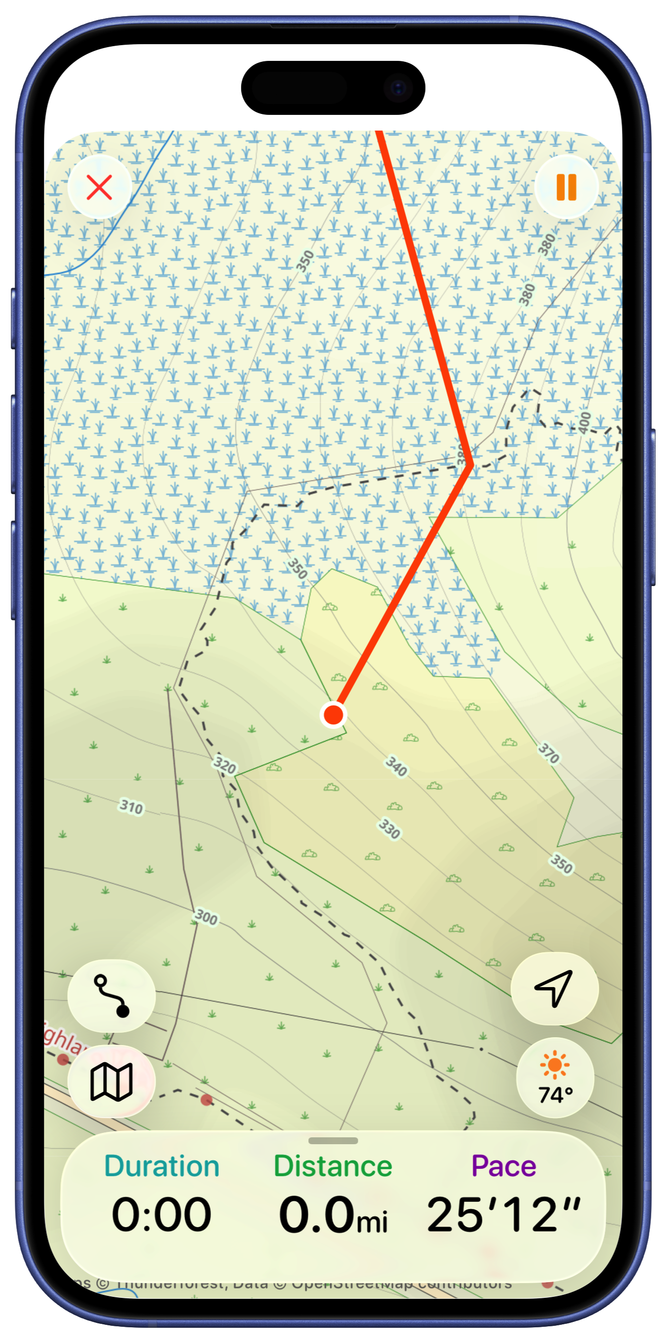
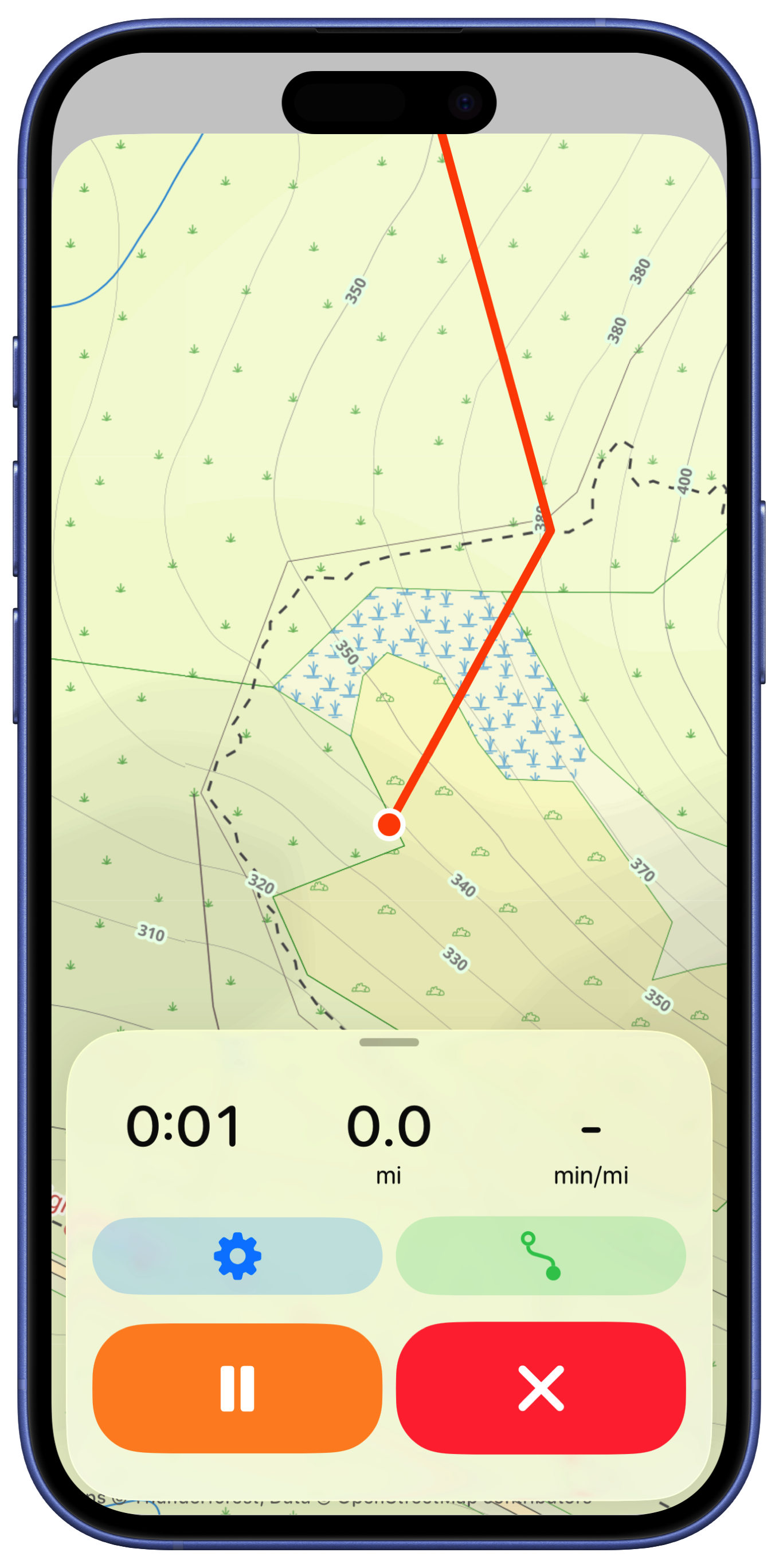
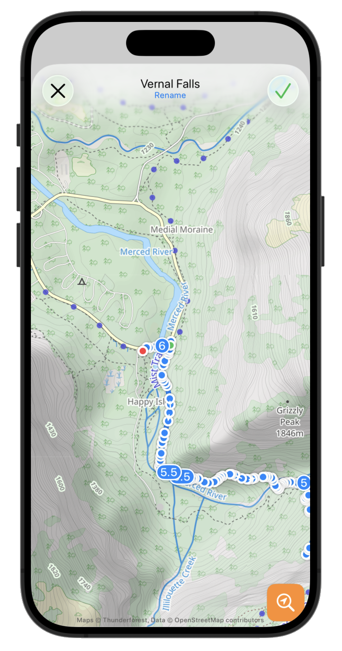
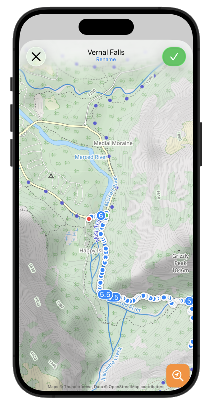
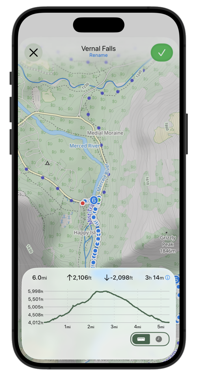
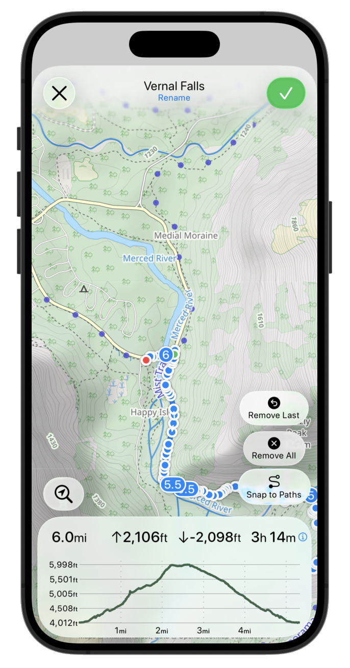
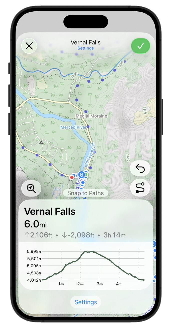
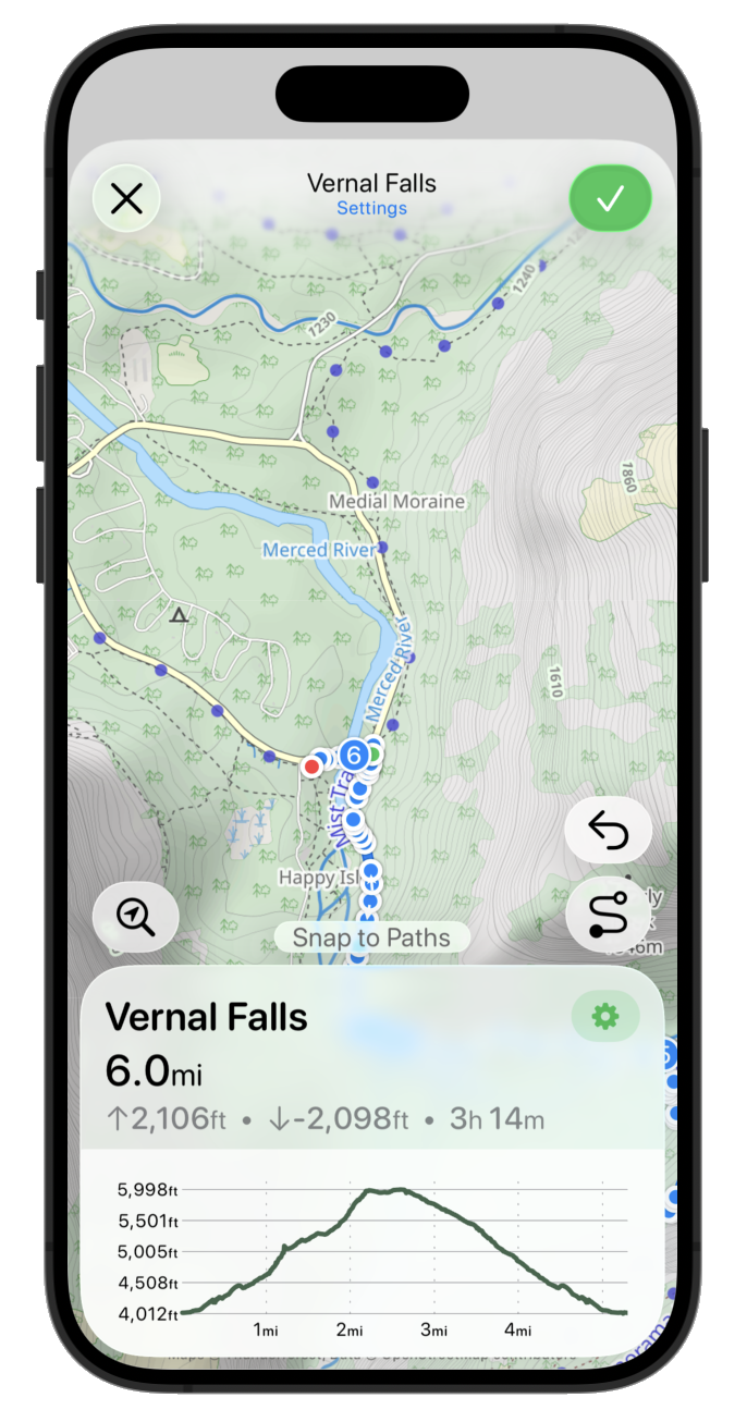
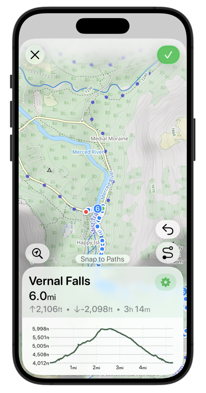
Which works visually but also feels like it might be contrary to the general watchOS design language where we aren’t supposed to be emphasizing black edges of the device. So let’s try glass instead:
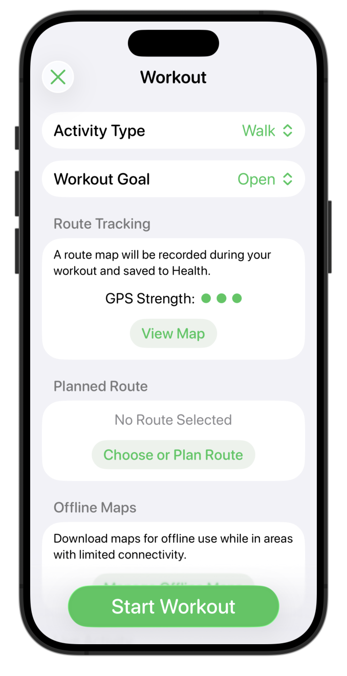
That feels very harmonious. I’m not 100% convinced though as it does feel slightly odd. The glass texture and effect is continuing to be changed and developed with each successive beta, so I don’t want to make any decisions based on its current look. Instead, what I’m thinking I’ll do is leave it there for now and see what it is like in a few betas time.
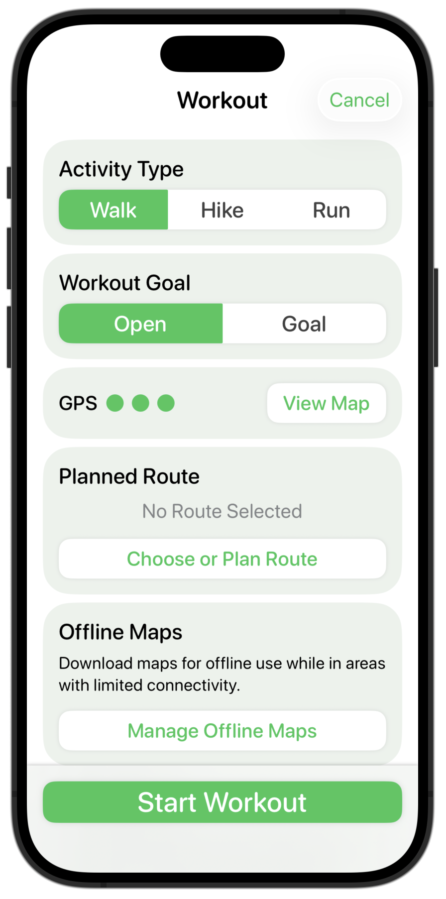
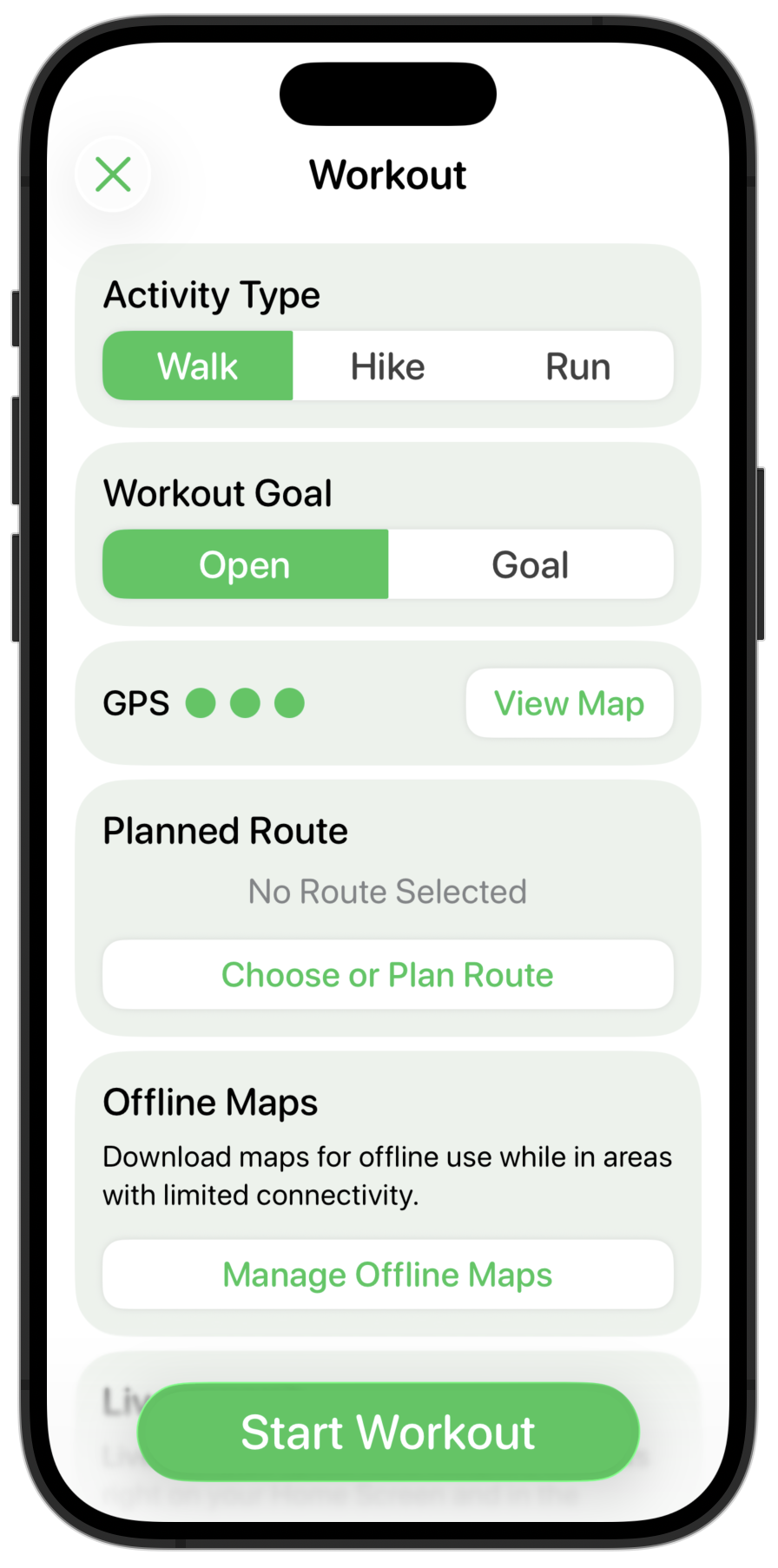
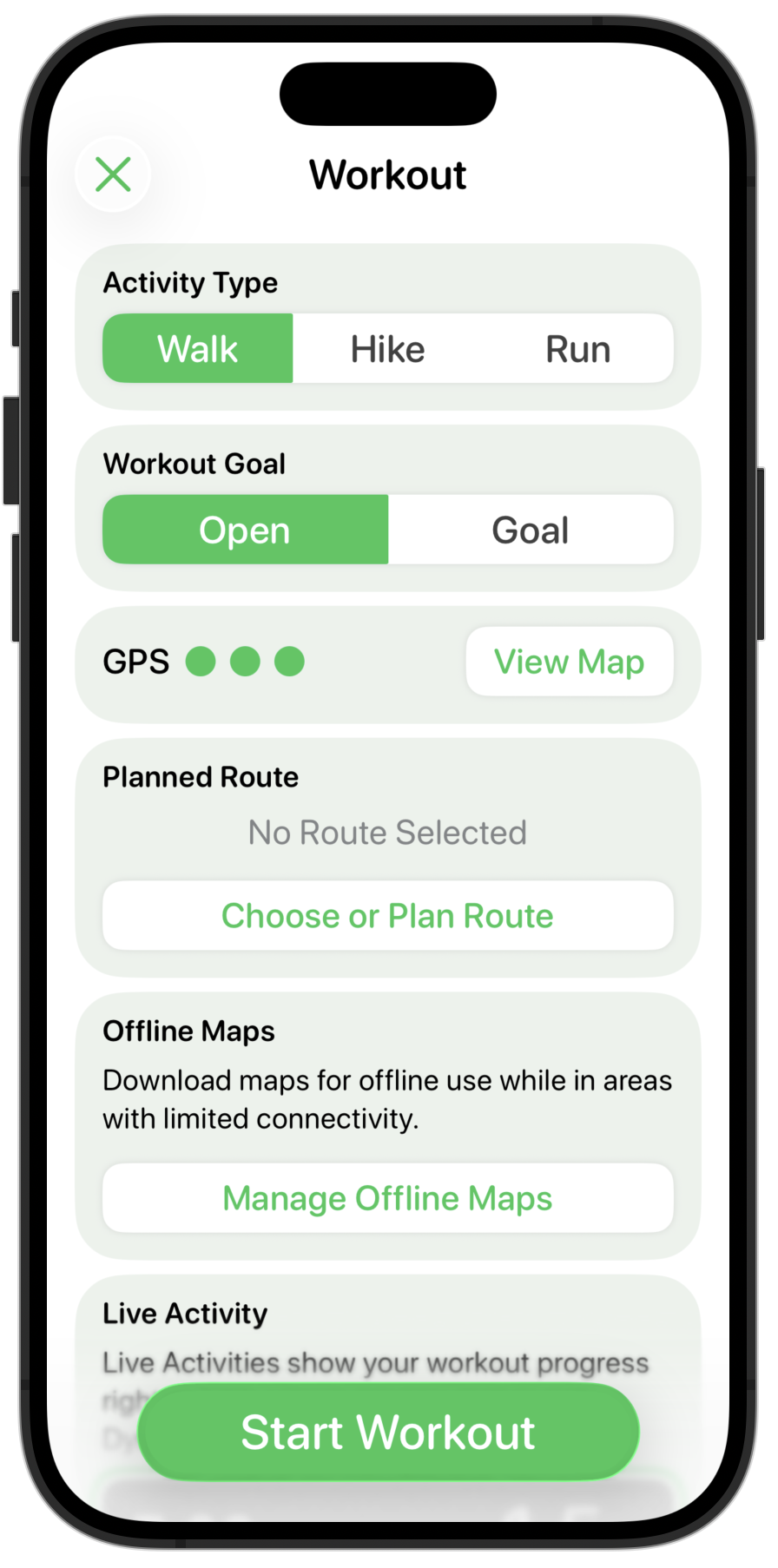
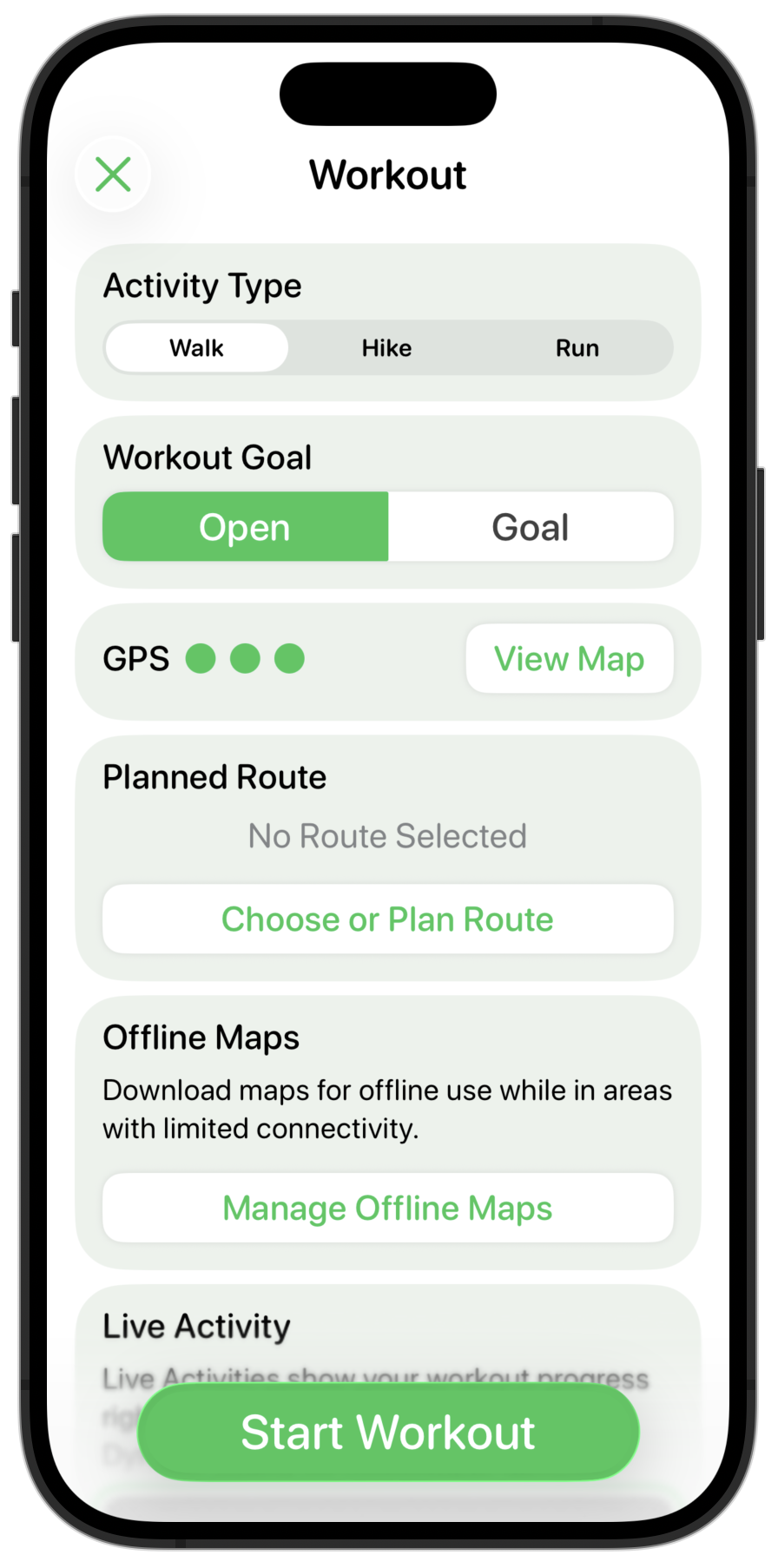
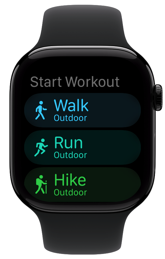
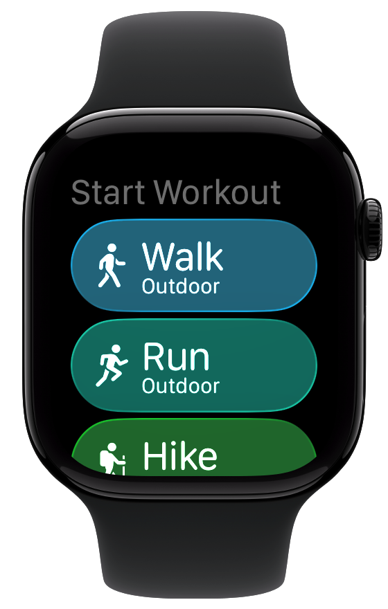
Workout Chooser
Another place where there are subtle changes which need to be made is in the start workout chooser. Again the starting version has the watchOS 10 frosted material look.
One area I’m still struggling a bit with in Liquid Glass is exactly when to use which variant of the glassy texture. This feels like a place where some glass is in order.
I start with the prominent glass variant.
But that feels too heavy and a visually distracting. So maybe a lightly tinted variant of the regular glassy style.
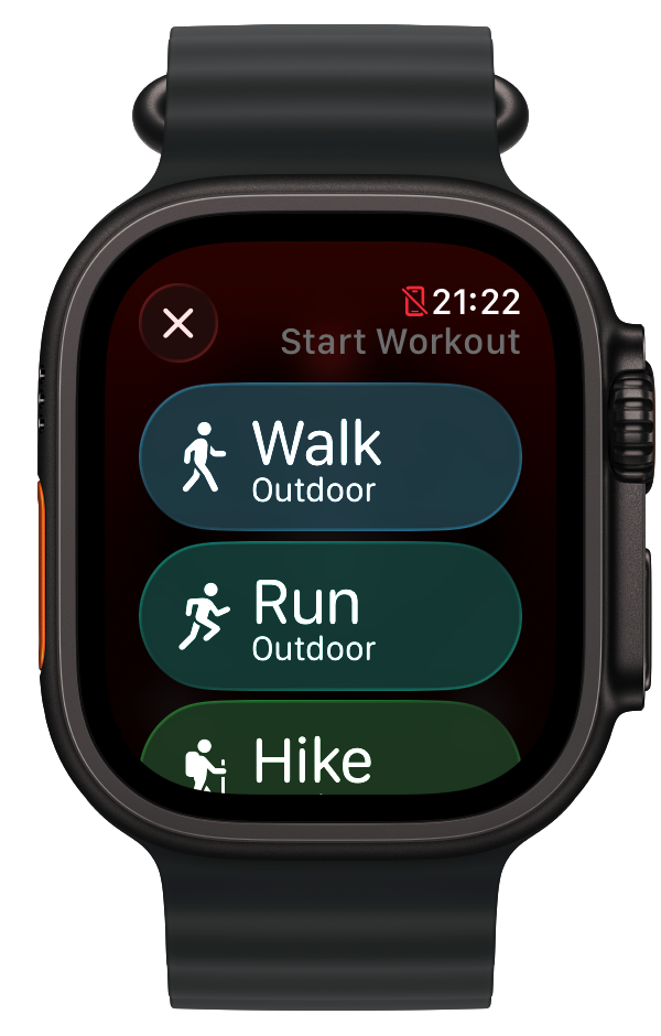
I like that. It draws colors from the background but still gives each workout type a distinct flavor.
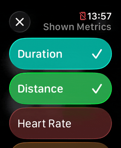
Metric Chooser
I have found that the contrast between the prominent and muted variants of glass really work well for indicating state changes. In the metric chooser there is a list of entries which you can choose between for display, with each either enabled or disabled.
I found that using a prominent style for selected and a muted for unselected visually is really clear.
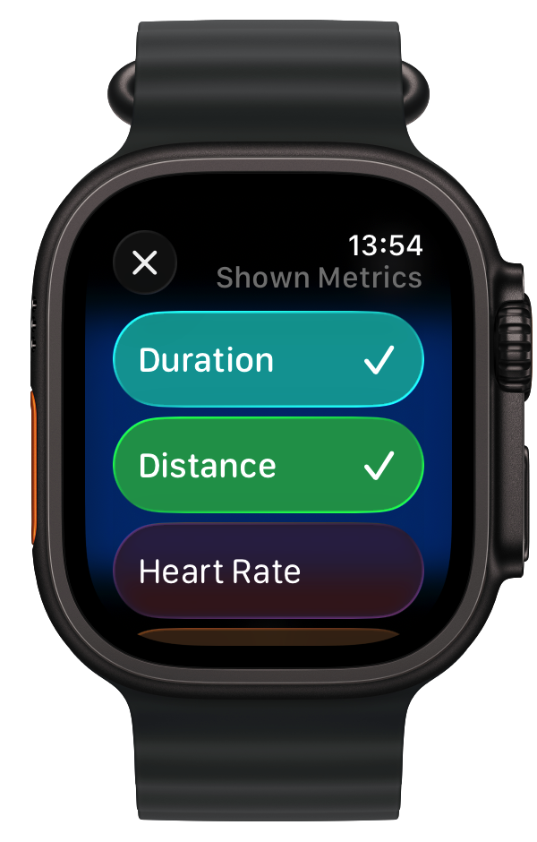
Additionally, the transition between the two states is visually gorgeous.
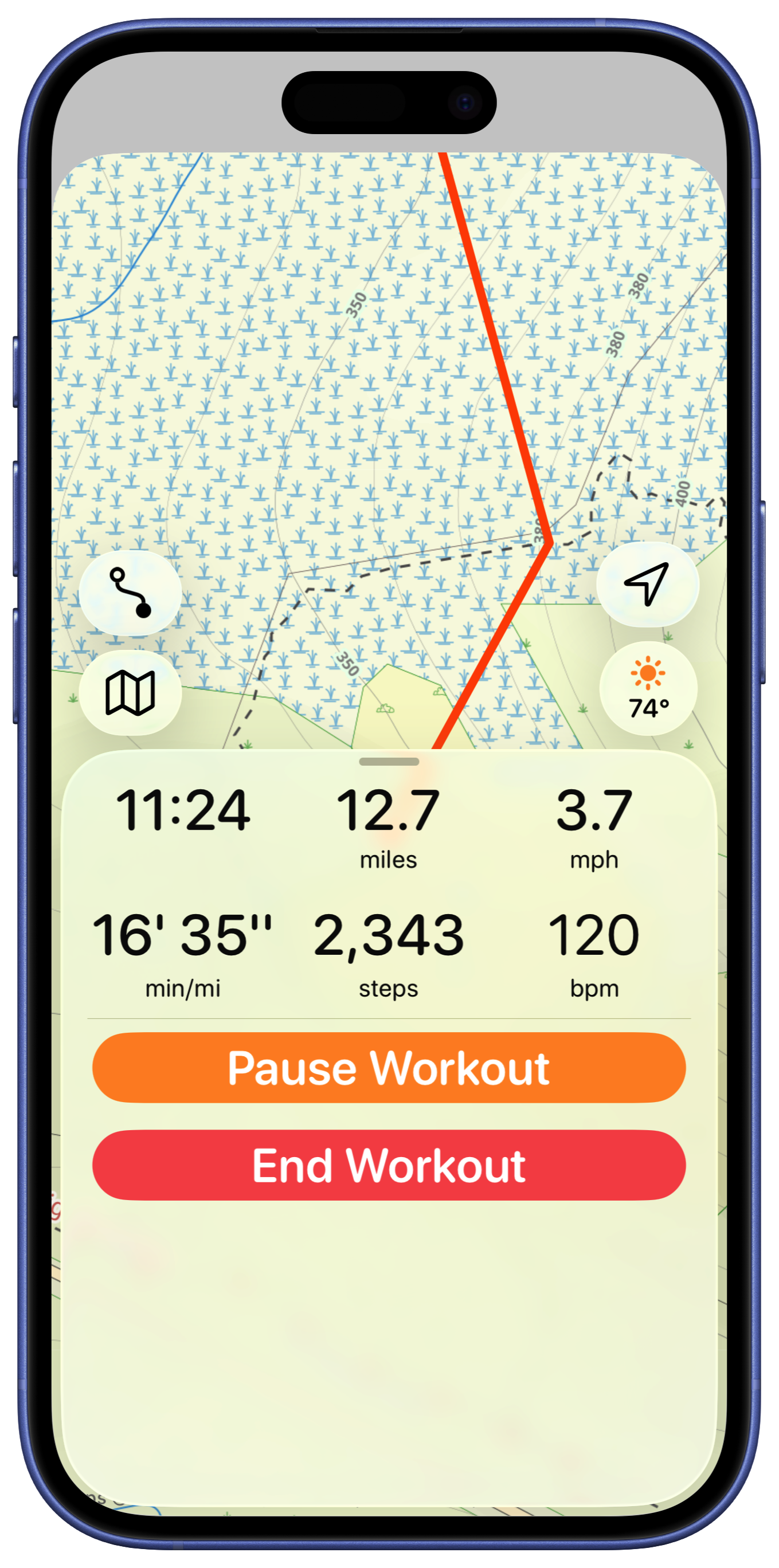
Workout Controls
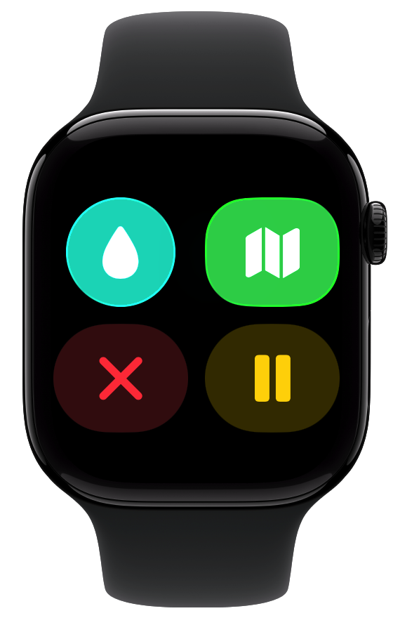
The workout control screen is another place where I found myself wrestling between different button styles and prominences. Here is the starting point:
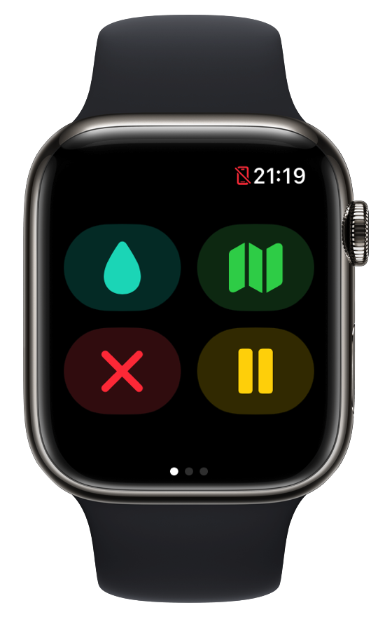
A straight forward conversion to Liquid Glass buttons would look like this:
Which is pretty solid. The next thing I explored was to have the button icons all the same color.
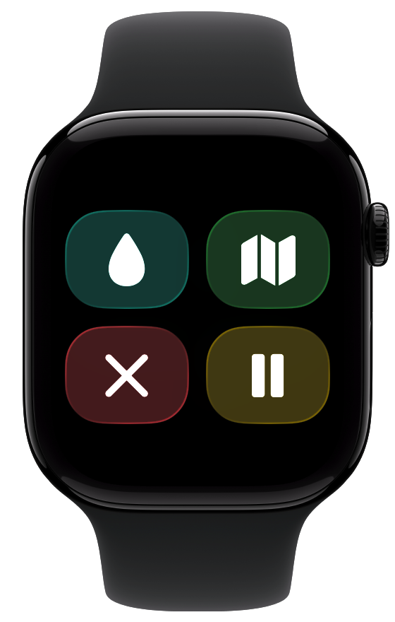
Nope, don’t like that. Maybe in a brighter button mode?
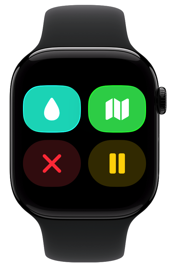
That actually works pretty well. But maybe they should be circles?
No, I think that makes them visually too small. These buttons are used in a dynamic physical context during workouts, so larger touch targets are almost certainly better.
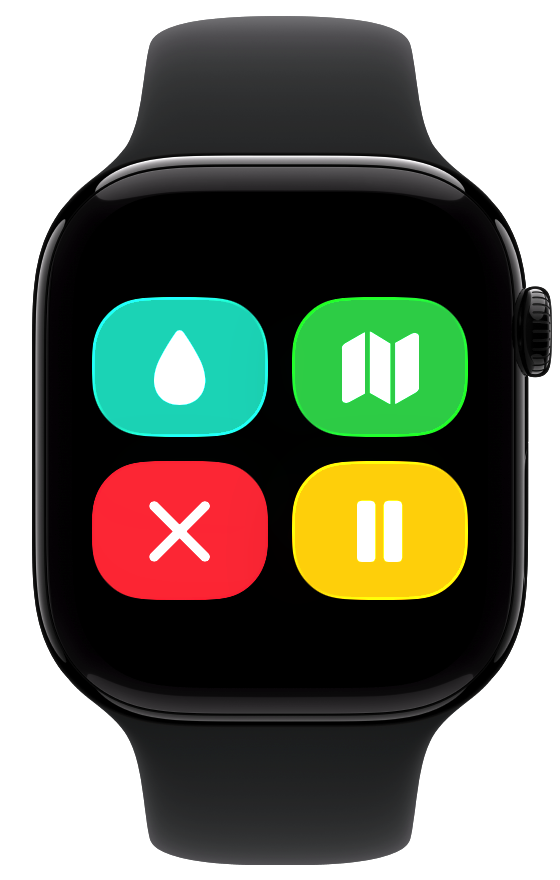
So here they are all in the bright mode. That works alright, but I think is just too bright and bold. So I think I’ll go back to the initial conversion for now.
Future ideas…
That is it for where I’ll leave the core parts of the app for now. This transition from a watchOS 10 design to watchOS 26 has been relatively straightforward.
Where things start to get interesting is with the longer term ideas I have for the app. These likely won’t ship with the September updates, where I’m expecting to mostly ship an updated variant of the current app. Nevertheless I’m starting to think about them, here’s a little preview of some of the ideas I’m playing with: