Five years ago, a TikTok video changed my life.
And I can say that without any hyperbole.
The run up
In April of 2020, while the world was struggling through the early stages of the COVID pandemic, I launched an app for creating highly customizable complications for the Apple Watch. Watchsmith was my attempt at filling the void left by the lack of 3rd-party watch faces on watchOS.
It let you chose from loads of different colors, fonts and display types to make your watch face your own.
The app did alright commercially at launch—it was a niche app for a niche purpose. Much like many of my other apps at the time, I was building things which I wanted to exist and hoping that they’d find some audience with folks who had similar needs and desires.
Then that June at WWDC Apple announced iOS 14 and with it the introduction of a new widgets system for iOS. For the very first time iPhone users had the ability to personalize the look of their home screens (beyond their choice in wallpaper).
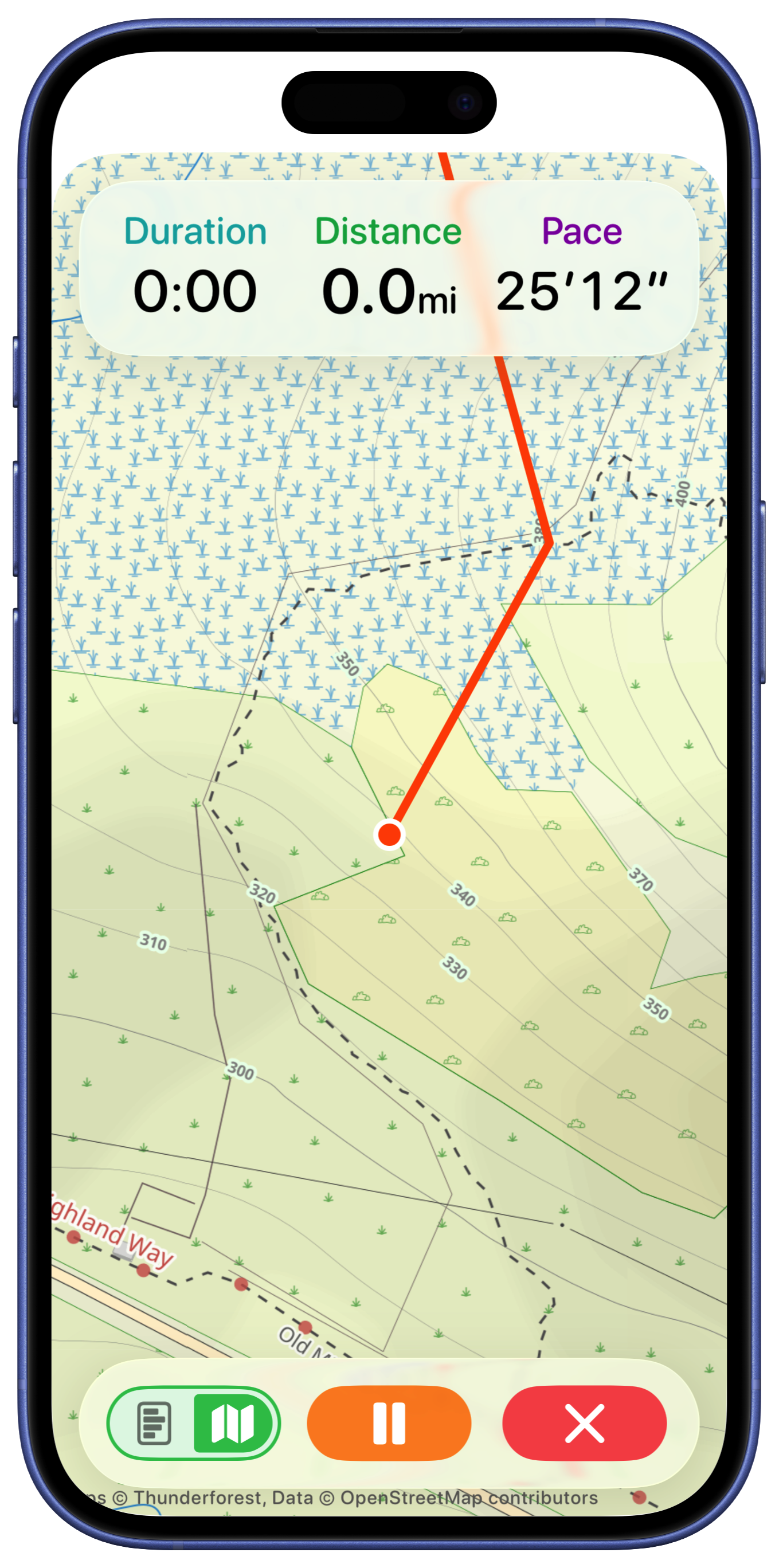
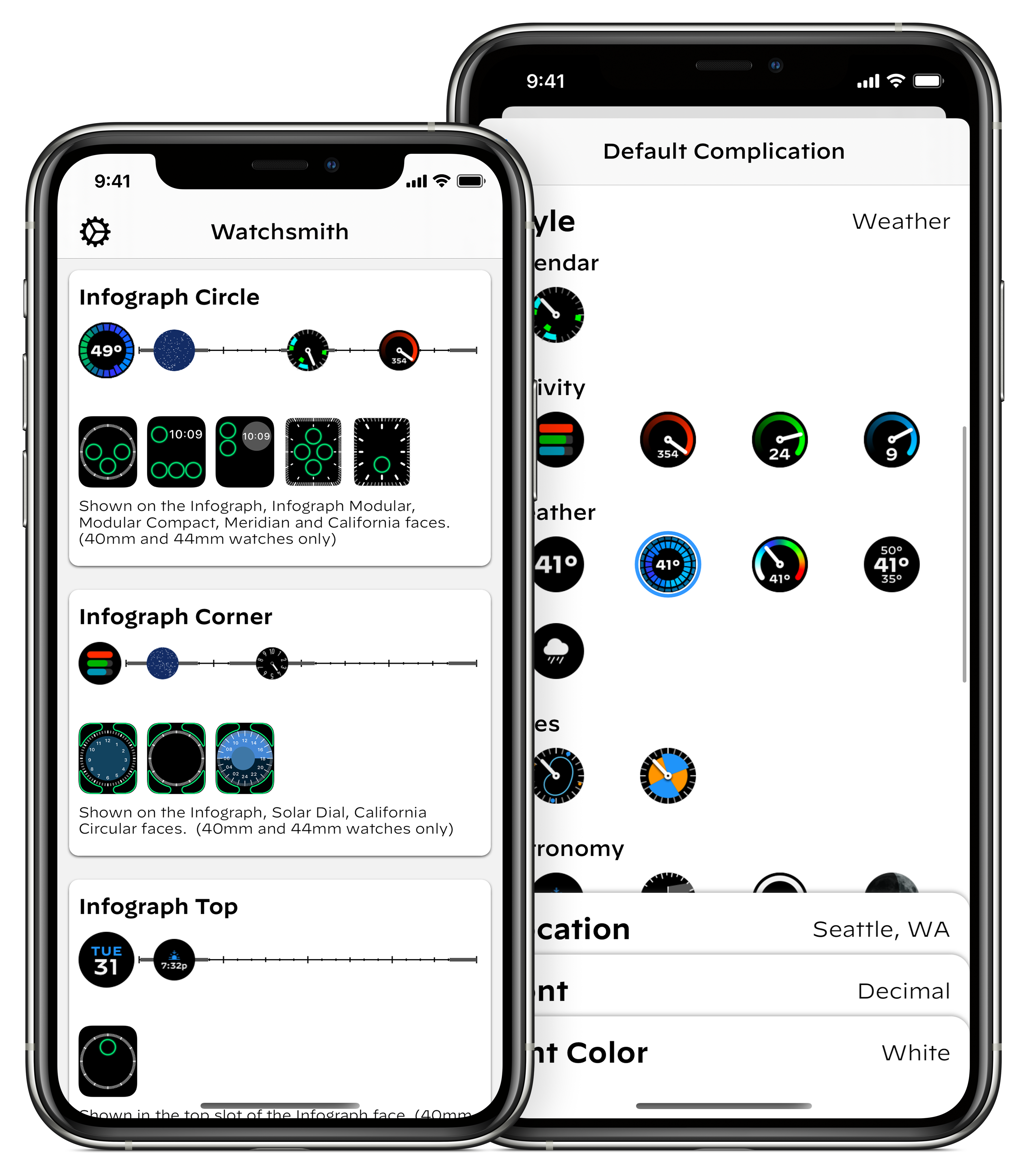
This then kicked off a busy summer for me adapting the work I’d done for Watchsmith to iOS. Because Watchsmith was my first top to bottom SwiftUI app I could actually re-use a lot of the code between the two and so by mid-July I had the early prototypes of this ready:
I was very much viewing this as a project which would have a similar lifespan as Watchsmith. I was building a niche tool for niche users. I thought it was a good idea, and one I’d enjoy using myself, but at this point my expectations for it were still very managed.
When Apple announced that their September event would be on September 15, I thought I was mostly ready. I had a good basic version of the app with most of the feature-set copied over from Watchsmith.
I remember watching the video keynote, enjoying it as it went right up until this moment when Tim said:
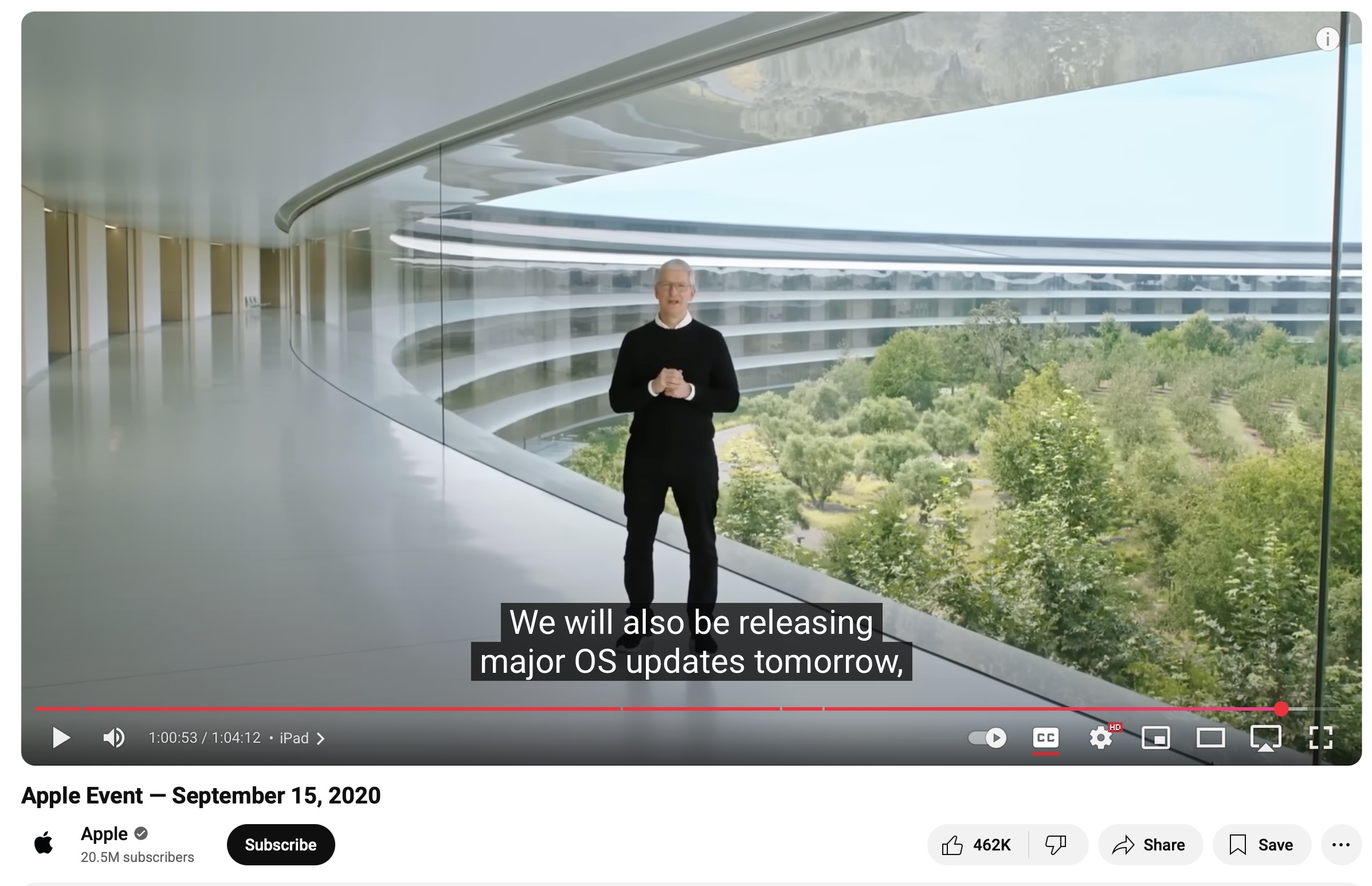
…tomorrow! Usually we get a few days between when Apple releases their final “Gold Master” versions of an iOS version and when it will come out to the public. But in this case we had less than 24 hours to get our apps submitted, approved and ready for the world.
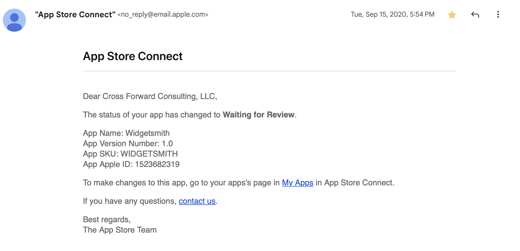
So I frantically got to work on final touches and build and at 5:54pm, I got it submitted.
Phew.
Then 6 hours later (at 11:30pm) Widgetsmith was approved by Apple, ready for when iOS 14 would be released the next day.
The Initial Response
So at 4:21PM on Wednesday, September 16, I hit release for Widgetsmith v1.0. The app launched as part of a much wider release schedule I was mananging at the time with updates for Pedometer++, Sleep++ and Watchsmith all going out that same day.
The initial response to the app was warm but nothing out of the ordinary. Widgetsmith was the 59th app I had launched so I’d been through this process a lot over the preceding twelve years of indie app development. Typically you see a little swell of interest in the first few days. Then things settle down into a stable level and you move onto the maintenance and gradual improvement of the app.
This was what I thought would happen with Widgetsmith and the indications for the first few days were that this was exactly what would happen.
So the next day I left home with my family for our first proper holiday since the start of the pandemic, heading down to the beach.
The Turn
That Friday (September 18) I awoke and went about my morning like normal. Checking in on things a bit here and there but mostly enjoying some welcome down-time with my family. We went for a walk in a local nature preserve and generally had a nice quiet day.
It wasn’t until we got back from our walk that I had my first indication that something was up. Someone reached out to me on Twitter saying they’d seen Widgetsmith getting mentioned on TikTok. I click through to the video they linked to and discovered that there was a walkthrough video by Katarina Mogus which was going viral at the moment. Her video showed how to use Widgetsmith to make your home screen look Aesthetic AF.
I then opened my helpdesk page and I was shocked by what I saw. There were new emails coming in at a rate of several per second. A literal waterfall of customer outreach. I couldn’t even tap on things because the rate was too high. I was rather bamboozled at to what exactly is happening but at this point I realized something was different.
Widgetsmith had taken off in a way I could never have had the imagination to hope for. It was everywhere. It was being mentioned in the news, I even recall it getting a shout out in Vogue. Complete madness.
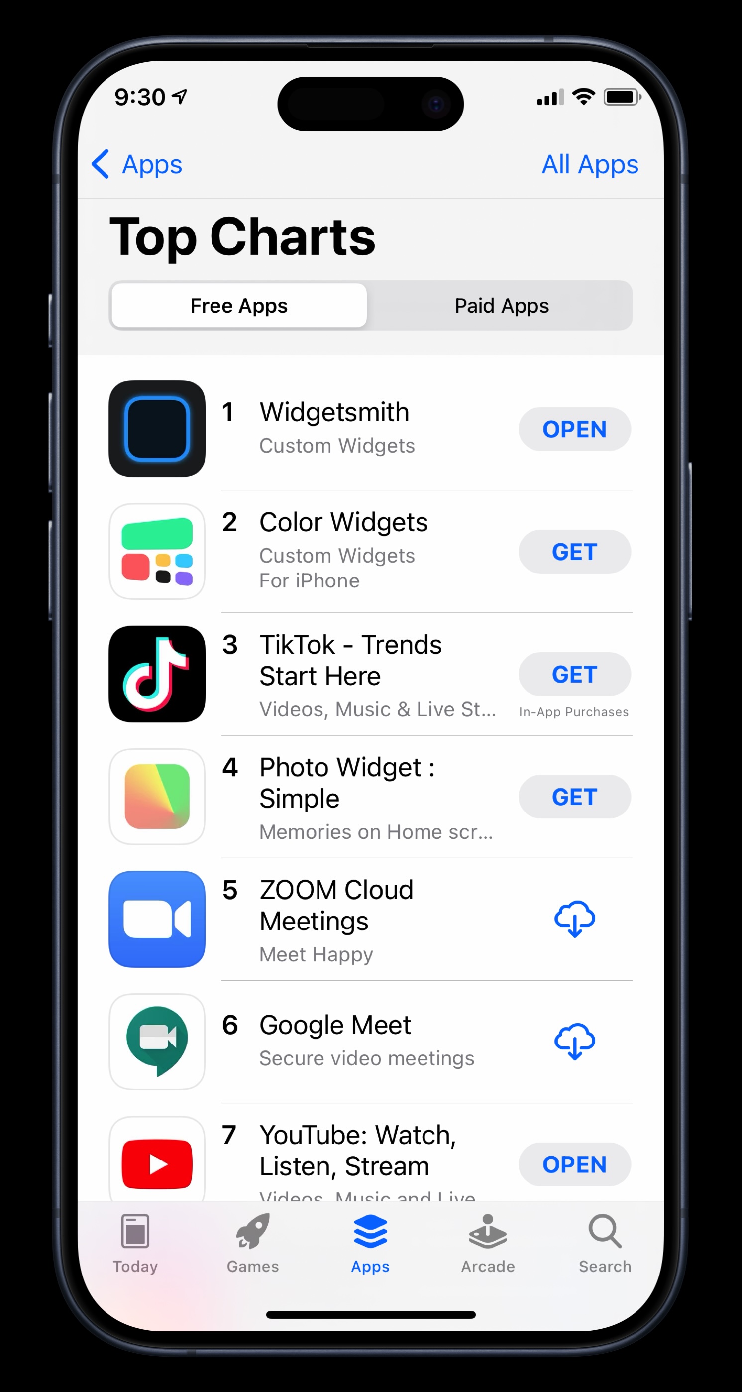
Widgetsmith quickly became the #1 App in the App Store, and remarkably stayed there for a couple of weeks.
I will be forever grateful for the App Store for the opportunity it allowed me. It still, to this day, doesn’t seem like it should be possible for a solo, indie developer to build something on their laptop. Hit submit, and then have it end up on over a hundred million people’s phones.
Five Years Since
The initial few weeks after Widgetsmith’s launch are a bit of a blur to me now. I remember frantically coding up requested features, trying to keep up with the outreach, and generally trying to keep holding everything together.
Eventually things settled down out of the frantic stage and into a new only-slightly-frantic stage. The app matured and developed and I was able to craft and adjust it towards the features its newly found audience wanted. What I had built as a niche tool for niche users had become a mainstream tool for mainstream users.
I wasn’t ever really sure if it would be a flash in the pan — a meteoric rise followed by a meteoric crash. Happily, five years on I can report that it was not a flash in the pan. Widgetsmith’s usage and userbase continue to grow. As of my writing this the app has received around 131 million downloads.
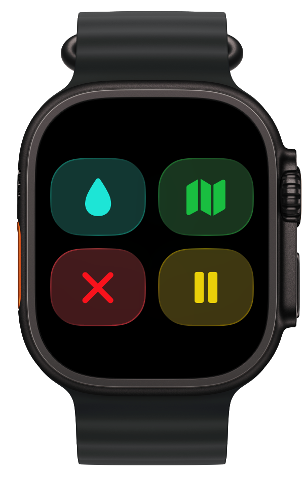
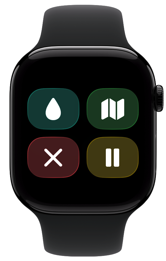
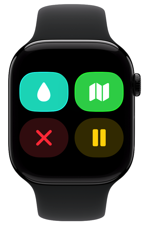
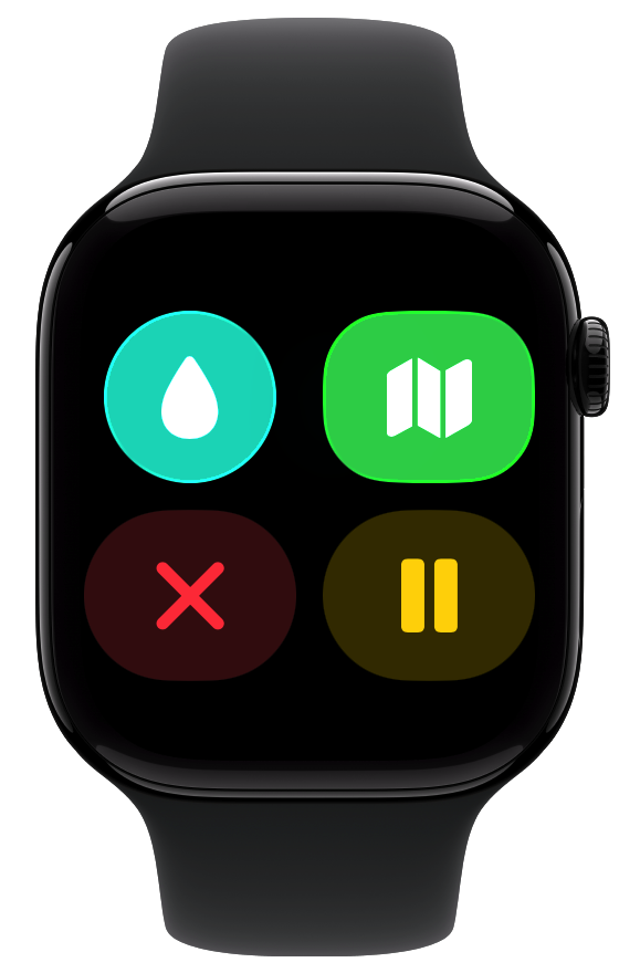
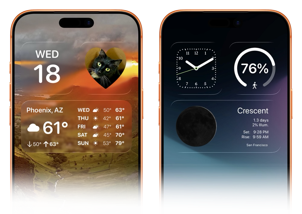
I continue to find enjoyment from coming up with ways to enhance and improve the app. Most recently with a fresh new re-design for iOS 26 and support for the new Liquid Glass widget styles.
I have no idea how long Widgetsmith will continue to be relevant, but I do know for sure that I am incredibly grateful for the opportunities and experience it has provided me.