I am a very avid hiker. I am never more at peace than I am on the top of the mountain. The wilderness is my happy place and whenever I leave it, I always long to return. In the visionOS Photos app there is the ability to wrap your panoramic photos around you in a way which gives you a strong sense of being back in the spot the photo was taken.
I love this. For years I’ve been capturing panoramic photos from my favorite scenic overlooks, but the experience of viewing them was always a bit underwhelming. If you look at them on your iPhone/iPad they are nice but completely lack any sense of scale or wonder. The best approach I’ve found so far is to have them printed large scale and then mounted on the wall. My walls are littered with these prints and I’m very fond of walking up to them and standing a few feet away to “take in the view”.
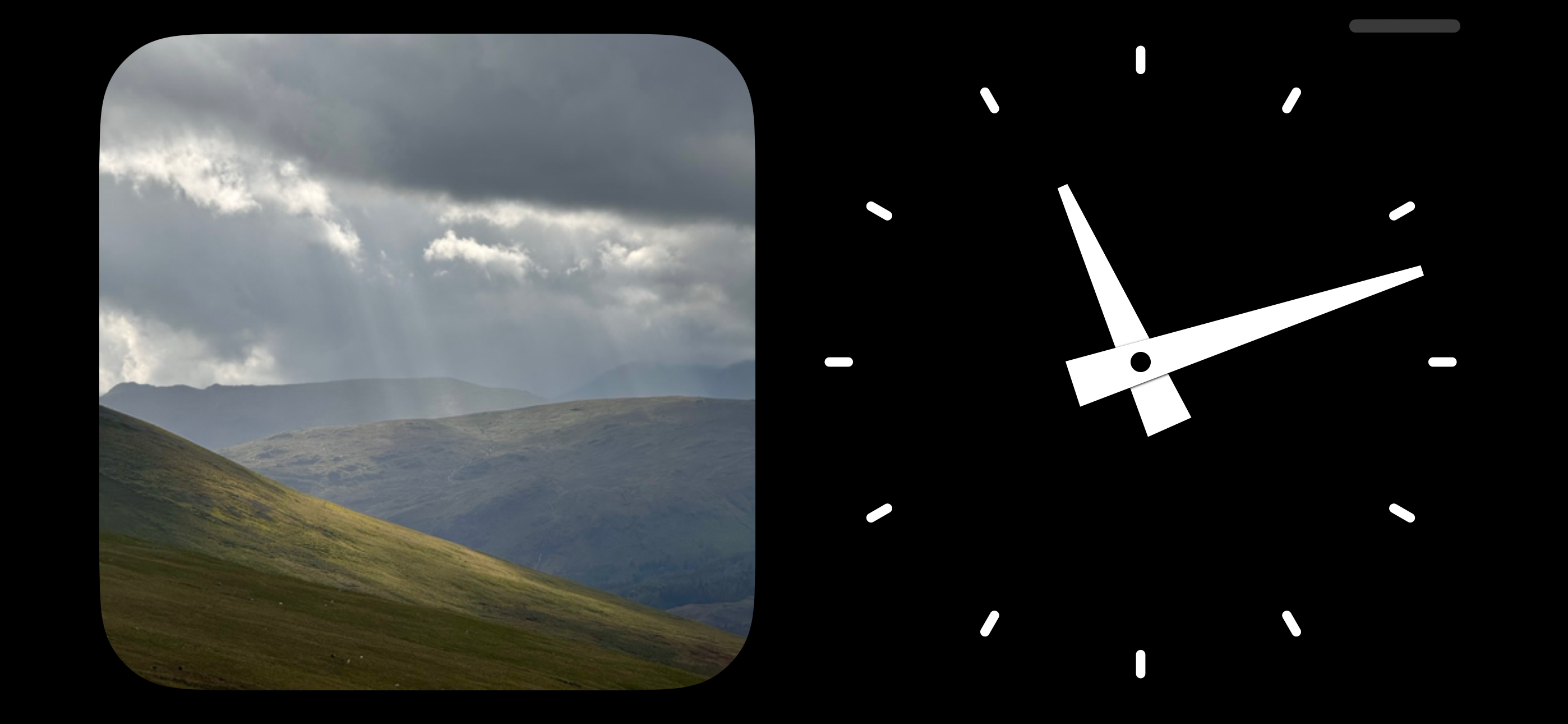
For example this print of Ben Nevis is currently on the back wall of my office.
I capture all of these panoramas on my iPhone (the above image was captured with an iPhone 14 Pro and is printed five feet wide). What became clear very quickly after starting to make large prints of iPhone photos is that resolution is king. The iPhone camera is amazing for its convenience but up until recently the limit of 12MP captures made making compelling large format prints really difficult. But starting with the iPhone 14 Pro we can now capture images up to 48MP, so now we have 4X the pixels to play with.
The iOS Camera app has a default mode for recording panoramas. This is a very clever bit of UI which guides you to sweep your camera across a landscape in a level fashion. The result of this is very good for a quick capture, but unfortunately right now these panoramas are limited to roughly the width of a standard 12MP capture (you shoot panoramas vertically so sensor width becomes the height of the panorama).
Looking at these iPhone panoramas on a Vision Pro is lovely, they have barely enough resolution to give a good sense of being back at the place where the image was captured. However, after the initial WOW! factor has worn off I started to really notice the fuzziness of the presentation. Presenting an image which is around 3900px tall at a conceptual height of about six feet tall just isn’t enough resolution to really feel immersive.
Thankfully because of my aforementioned photo printing experience in addition to having countless standard iOS panoramas, I also have countless super-resolution iPhone panoramas too.
I continue to capture these in the iOS Camera app but instead of using their panorama mode, I just use the regular old camera mode to record a sweep of several individual 48MP photos which I then later stitch together. The results are amazing. That Scotland photo above ended up at 25,326px × 6,609px, or 167 Megapixels. When viewed on a Vision Pro the effect transitions from good to “woah, I’m back in Scotland”.
Last summer I went hiking to the top of Helvellyn in the English Lake District. While I was up there I took two panoramas (well actually I took dozens 🤫, but I’ll show two here). The first was recorded using the standard panorama mode on the iPhone. It ended up being 13,986px × 3,788px (53MP).
I then also recorded the scene as 20 full resolution 48MP photographs. Holding up my phone in vertical mode and slowly turning around, making sure that each photograph slightly overlapped the previous.
I then merged them together in Photoshop using their “Photomerge” feature (though there are countless tools which can do the merging).
The result is an image which is 41,062px × 7,395px (304MP!).
You won’t be able to see the difference in this article view, but if you click through on each of those images you can view them at full resolution and the difference is, quite literally, massive. (If you have a Vision Pro, I’d really recommend tapping through and then saving them to your library and trying it yourself, the difference is really difficult to appreciate until you are in the actual immersion)
This approach was made all the easier in iOS 17 with the addition of the ability to capture photos in the “HEIF Max” format which avoids the added complexity of handling RAW photos. I’m sure that the truly ‘best’ version of this would be to use “ProRAW Max” images, but so far I’ve found my inability to expertly process those to mean the ultimate difference in quality is fairly minimal compared to the default Camera app image processing magic.
Loading up this new super-resolution panorama on my Vision Pro and then swiping between the two (you can swipe phots in the visionOS Photos app by pinching your fingers and flicking them), the difference is meaningful. With this much resolution the panorama feels more like an “Environment” than a photograph. The rocks look sharp and the horizon clear. It really feels like I’m back on this windswept mountain peak.
Here’s a 100% crop comparison of a tiny section in each image. On the left is the super-resolution, on the right the regular iPhone panorama. As you’d expect there is essentially twice the information. In many respects this is the “Retina” screen equivalent.
There are two other great benefits of this approach:
There are also two big drawbacks:
A little pro tip I have for anyone who is interested in trying out this approach is to record a ‘marker frame’ before and/or after the section of panorama frames. Otherwise, what will happen is that you’ll end up looking back through your library at a bunch of very similar photos taken from the top of a mountain and struggle to know which images need to be stitched. My approach to this is to take a photograph of my fist right before and after the series. This is logistically very easy to do and then when I’m reviewing my photographs these ugly markers will always jump out to me help me find the frames I’m looking for.
And hey, if you start to pursue this on your next wilderness trips you’ll also end up with photographs you can print in large format and put up on your walls. While I love the immersive feeling of looking at these photographs in visionOS, there is nothing to beat beauty of classic, analog art on your walls.
I would be delighted (and not at all surprised) if this kind of capture came in iOS 18 or the iPhone 16 Pro. It seems highly likely that Apple will do whatever they can to ensure that the panoramas they are collecting will look as awesome as possible in visionOS.
Here are a few other full-resolution images if you’d like to try ‘em out:
From Stybarrow Dodd
Ullswater
Ben Nevis
Blackwater Reservoir
Or if you’re wondering how this technique would apply to a 12MP capture series (where I just took regular old photos). Here is one from the top of Loughrigg, where I forgot to turn on the 48MP mode. It is still, I think, better than what a Camera.app pano would look like but doesn’t quite have the sharpness.
Something that’s been rattling around my mind recently is the phrase “Independent as in Freedom, not Independent as in Alone”. For so long I think I have been conflating those two ideas in my head. Which has not been serving me well.
I am extraordinarily proud of being an “indie”, it is a meaningful part of my professional identity. As such I held on too long to a sense of needing to do it all myself. But I’ve grown in this regard and I am extremely excited about what Stephen and I will be able to accomplish together.
My personal definition of being an “indie” has grown and been improved upon. It isn’t about being alone, it’s about the freedom to choose your own path and then walk it in the manner aligned to your own values. That part of the indie life I don’t expect to ever give up, but I can walk that path with others and expect the journey to be all the richer as a result.
Today I’m releasing version 5.3 which completes this movement by rounding out some of the missing features from the v5 update. Specifically this update adds Route Planning and Offline Map Management.
I am a very avid hiker. It is my favorite activity and simply put it is my happy place. Because I’ve spent so many hours hiking I’ve developed a number of very strong opinions about what features are important for hiking and how best to build them. These features are built from the perspective of how I plan and track my hikes, developed with the benefit of countless adventures.
While you can continue to import GPX files from external sources into Pedometer++, I wanted to also create a method for planning the routes directly in Pedometer++.
I tend to use GPX files when I am new to an area and want to benefit from other people’s experience. There are numerous hiking trail resources online which publish the best routes in an area and are a valuable way to get familiar with a location.
After walking in an area for a while, however, I find that I typically want to start striking out on my own routes and find new places and hidden gems. There are a number of ways to build a route planner but my favorite method is to boil down a hike into a few key waypoints/viewpoints and then backwards plan a route between them. This is exactly how I’ve built the route planner for Pedometer++.
You simply tap on the locations you want to visit and it will use the Mapbox Directions API to find the shortest route between them. This typically serves as a great starting point for a route. While not necessarily the ‘best’ route, these automatic routes can make it super quick to plan a hike. I’ll often then tweak the automatic route to my tastes based on terrain, access or trail popularity.
Because this planning system is so straightforward and automated it was even possible to add it into the Apple Watch app as well.
I’ve found this super helpful for when I’m actually out on a hike and want to quickly consider an alternative path. Rather than pulling out my iPhone and looking there, I can just tap “Plan a Route” on my wrist, tap a couple of waypoints and very quickly get a distance/route estimate for the possible detour. Then if I like the option I can simply save the new route and use it for the rest of hike, or until the detour is complete.
Another important feature being added in this update is the ability to more widely download maps for offline use. Rather than just being able to download the map tiles for a particular route you can now download maps for a wide area before you head off on a hike.
This works great for situations where you may be entering an area with limited connectivity. The maps on your iPhone are automatically available on your Apple Watch (as long as your iPhone is within range of your watch).
In the United Kingdom Ordnance Survey maps are the gold standard for outdoor navigation. They provide rich detail for walking routes and rights-of-way. Thankfully they are offered as an API which other apps can make use of and so I’ve been able to include them in this update.
This is also available on your wrist during workouts on your Apple Watch.
Lastly I’ve also done a lot of work to improve the visual design of both the iPhone and Apple Watch apps. The old design was feeling a bit “heavy” and cumbersome. I wanted to bring forward a design which felt more modern, clean and intuitive.
On the Apple Watch side of things I had done a partial update this September to bring the app more in line with the watchOS 10 design language. This update completes that work and fully embraces the new layering and visual aesthetic of watchOS.
I hope you enjoy this update, which is available on the App Store now.
I had the idea for a semi-minimalist layout showing the five things I’m most regularly wanting to see on the face:
I could then put these into the four corners of the watch face and end up with a nice clean look. Here was the initial result:
Not too bad but the font shown in the complications (using Watchsmith), just didn’t fit at all with the new Ultra face showing the time.
I’ve heard that this new font used on the Modular Ultra is referred to as Zenith within Apple so I’ll use that name in this article for clarity. I have no idea if that is actually true but calling it the “New time font used in the Modular Ultra face” would be rather cumbersome, so Zenith will do…both for clarity, and also because that is just a super awesome name.
Zenith has a number of font attributes very similar to San Francisco, but looking at the font it also has a number of tweaks and adjustments which make it not match well when shown on the same watch face. I kinda wish that watchOS would have automatically rendered complications in a matching font (like they do on the other Ultra face, Wayfinder), but they don’t as far as I can tell.
So I set out to see if I could adjust regular San Francisco to match Zenith better. The first step was to create a little test app to be able to quickly compare the font rendering options.
The most obvious problem is that the numerals “6” and “9” have curly tails in regular San Francisco, rather than the straightened ones in Zenith. This I can fix by adjusting one of the optional features in San Francisco. Specifically the rather awkwardly named kStylisticAltOneOnSelector
.
This leads to this rendering for the “6” and “9”.
Great, but now let’s look at the “4” numeral. Which is closed on San Francisco, but the top of the “4” in Zenith is open. This can be adjusted by kStylisticAltTwoOnSelector
.
So now we have a numeral which look s like this:
Getting close but the width and weight of the font aren’t right. But thankfully variable width rendering was recently added to San Francisco so we can now adjust that too.
Leading to a look which is like this:
To my eye that is very, very close. I’m sure there are more typographically adept folks who could tweak or adjust things to make it even more of a match, but this is good enough for my ability.
The last step was in doing a full numeral test to make sure I wasn’t missing something in one of the other numerals.
That looks great to me. So I then took the font I’ve now made and loaded it up into a private build of Watchsmith, and boom…this is the result:
I love the way this face looks. It feels modern but in a way which is harmonious and friendly to me. And the best part, as opposed to some of my previous explorations into building custom watch faces, this is 100% built using the standard components so runs on my wrist without any workarounds or hacks. Delightful.
How would you calculate the rotation angle for the minute and hour hand of a clock?
Specifically this came to mind for me because of a feature in Widgetsmith where you can specify an analog clock as one of your widgets which looks like this.
I’d encourage you to pause for a moment and actually think how you’d approach this because the result I ended up with was way more complex than I would have initially guessed and it was a good learning exercise to reason through.
The version of this feature which shipped with iOS 17 used the rotation angle calculation I had used since Widgetsmith was first created which is based on a simple method dividing a full rotation of the clock hands by the current hour/minute.
This worked fine in the old version of WidgetKit which only showed one widget at a time, but starting in iOS 17 each progressive widget refresh is now animated between the previous and next value. So now at the end of every hour you get this:
Not great, because I’m only calculating each rotation based on a single rotation around the clock face it jumps from 360° back to 0°.
OK I thought let’s adjust the minute so that it takes into account the hour of the day as well and successfully add in an additional 360° rotation at the start of each hour.
That solves the minute hand jumping around during the day, but now at midnight we have this:
Now at midnight we get a massive backwards rotation because we are again reverting to 0° at the start of each day.
So my next thought is that we need to instead try and make the rotation increase continuously (monotonically for the mathematically inclined). That way the rotation will just keep rolling around and around over time.
This was my first attempt at this type of approach where I pick an arbitrary anchor date and then calculate the number of seconds since that date and then just keep rotating based on the number of hours/minutes it has been since then.
This gets around the midnight reset problem. Though it does mean that I am now providing rotations way outside of the typical 360° range so I wanted to then check if this would eventually overflow and cause issues with the renderer. But trying it with a date far into the future seems to work just fine.
But now the next problem I face is a bit more subtle and relates to the spectre which haunts all programming work which relates to time, daylight savings. Because this approach starts its rotation at midnight on New Year’s Day and then increases linearly from there it will fall apart when the clocks change.
I’m not accounting for the fact that there can be instances where the rotation angle isn’t actually evenly increasing between each date. It needs to either jump forward or backwards when the daylight savings points are met.
My first thought for how to solve this problem would be to determine the starting angle of each day and then use that as the reference point to adjust then based on the previous hour/minute method. This way I’m determining the daily rotation based on the actual hour/minute value (2pm, 4:12am, …) and not just the time since the reference.
This approach however includes a subtle bug. Can you spot it? The issue comes from the fact that the start of each day isn’t actually a multiple of 24 hours from the start of the year…because in March when the clocks change we have a non 24 hour day. 🤦🏻♂️
So taking this approach I would get funny rendering bugs after March.
But I think I was on the right path by referencing the start of each day as my baseline for then adjusting a daily rotation. But instead of basing it on the number of seconds from the start of the year I need to instead determine the number of whole days and then multiply that out to get how many full daily rotations have occurred.
This is what I ended up with (code here):
Here I use the number of full rotations of each of the hands per day as the basis for my calculations (2 for the hour hand and 24 for the minute hand).
Then determine the number of whole days have past since my anchor date, and multiply this by the revolutions per day.
Now I have the correct starting point from which I can then determine how far to rotate based on the nominal hour and minute values in the current timezone. Then I’m adding these two values together to get the final rotation.
As far as I can tell this works perfectly. I’m still doing a bit more testing to be sure but here is for example what it does at the two daylight savings points:
The animation actually now involves the correct adjustment being made (either jumping forward or falling behind).
Code like this is always an interesting challenge to get right. Personally I find it very difficult to think through all the possibilities and ensure that I’m accounting for all the correct factors.
I hope this approach is right (if you see a bug in my logic please do let me know!), but either way I’ve learned a bunch for the process of thinking it through which was a great way to start out my week.
Also, if I’m being completely honest I really don’t know if I’m doing things the right way so by sharing my learnings (no matter how small), if I’m on a bad path someone else could correct me and we can all learn as a result.
To that end today I’m going to walk through my experience trying to tint a “glassy” component. A relatively small design component but nevertheless useful for understanding the visionOS rendering system better.
The visionOS design language is full of instances where we UI elements are given a frosted glass look, typically with a corresponding specular highlight. These are added to views using the .glassBackgroundEffect()
modifier.
This generally looks great as-in, but I ran into something where I wanted to slightly extend the default appearance. My design includes a top ornament on all my widget views which is used to toggle between the expanded and compact views of the widget. It looks like this:
As you can see the topmost ornament does pick up a bit of the color from the underlying view, but the top of it is the standard system flat grey color. I don’t really like the way that looks, it isn’t harmonious with the rest of the view. So I want to add a little bit of tint to the ornament, while still retaining the frosted, semi-transparent look.
UPDATE: Since posting this it was suggested to me that I should instead try using the .tint(color)
modifier on the button itself. This works a treat and is probably the better way to go. So use that…though I would still suggest reading through the process I used to find my not quite as good solution. At times like this it is often the journey which is more helpful than the final conclusion. I learned a ton about how visionOS handles layer rendering through this experimentation.
The first step was to create a little isolated test view to work on.
My first thought was to add the tint color as the background of the button.
That retains the specular highlights around the view but looses the frosted glass look. So next let’s try putting the colored view all the way behind the .glassBackgroundEffect
too.
That is getting somewhere, now have a blue tint but retain the frosted look. I can tweak the opacity of the background color to make this effect more or less dramatic:
However, this was where I learned an important lesson when working on visionOS rather than iOS. DEPTH MATTERS! By putting this background behind the glassy effect this now has all kinds of knock on effects as you move your head around.
You can see this more clearly if I remove the color from the content view.
There is now a ghostly tinted shadow which will emanate from the button. That is definitely not what I want, but I must confess I was a bit surprised to see this. I have to think carefully about Z-Hierarchy now.
So now my next idea is to instead of putting the color behind the contents, let’s try overlaying a semi-transparent color on top.
This is actually looking pretty nice. One advantage of the overlay approach is that the color is evenly tinting the entire view and so it feels more “part” of the button itself.
The only issue now is that the button symbol is now also being tinted. So I need to now overlay the symbol on top to make it actually white again.
The code to accomplish this looks like this:
And here is what it looks like in a variety of colors (to make sure it wasn’t a color dependent solution).
Alright, the visual appearance of this is looking good, but then I ran into another issue. When you go to “hover” over the button the highlight effect is incredibly weak.
This turned out to be because my call to .hoverEffect()
was up towards the top of the view tree with the Button itself, it turns out that .hoverEffect
really needs to be put on the top most element you want to gain the effect. So in this case I move it to the last overlaid view.
Much better, now the button correctly responds to the user looking at it.
Here is that first button I referenced at the beginning of the article compared to its appearance with the tint applied.
It is subtle, but I really like the difference. The new button now has a look which is visually harmonious with the content and feels more connected to it.
It relates to the graphs shown at the bottom of my route planner. As you adding waypoints to your planned route it will update to show you the metrics of your trip and a graph indicating the elevation profile of your route.
It is super helpful when planning a hike to know the general terrain you are facing. The elevation heavily dictates the difficulty of a route and thus it is important to know what you are getting into.
In this case I want to show this elevation plot in one of two ways: either as a graph of elevation versus time, or as elevation versus distance. The time value shown here is based on Naismith’s rule which is a good rule of thumb for roughly estimating how long a given route will take taking into account elevation changes. The rule is “Allow one hour for every 5 km, plus an additional hour for every 600 m of ascent”. While the actual hiking time will vary based on fitness, weather, and breaks, I’ve found this to be still useful to get a sense of the ‘best case’ time.
Here is a comparison of the two views on a hike which hopefully gives a sense of the utility of this. If you look at it from a distance perspective it looks like the peak is half way through the hike…which it is in terms of miles. But if you then look by time you’ll see that you should expect to reach the top until nearly 3/5ths of the way through.
The first thing I need to do is extract the current graph into its own SwiftUI view and then I can start working on the switchable graph.
This graph is made up of lots of individual line segments. Let me color them individually to help to see this.
Now let’s compare the elevation plot against Time/Distance.
As you can see the general shape is essentially unchanged (hence my comments about this whole project being a bit silly), but if you look closely the xAxis is shifted between the two plots. This is because the steeper the terrain the slower you’ll move so that the time plot will lag behind the distance plot.
If I switch naively between the two plots you’d get this:
That isn’t awful, but I really don’t like the abrupt jump between rendering modes. A general rule I try to abide by in my design work is that: If the same element exists in two view states, then the transition between those two states must animate the element’s movement.
This approach is generally very helpful in making it clearer what is happening to the user, in addition to just being more visually pleasing.
So I then set out to update my graph renderer to support SwiftUI animation between the two graphs. I won’t go deeply into the technical parts of this here, but I found this blog post by Eric Callanan super helpful in how best to approach this. Here is the result:
Isn’t that nice. Not some massive, jarring animation but just a little nice touch which gives the interface a much more polished feel.
Next I need to make it show that the graph has axis labels. The most basic way to do this would be to just split the x-axis into 10 segments and then change the value for each marker based how that would correspond to the current x-axis metric.
This is approach, however, violates the animation rule I stated above because it treats the two axis scales as identical. I need to show some movement in the axis between graphs to help indicate to the user that they aren’t the same.
So let’s instead make the tick marks on the axis dynamic. To start with I’ll make them at whole number increments in either miles or hours.
No you can clearly see that the two graphs are different and have a sense of the movement between them.
For this example dataset whole miles makes sense but it is short enough that whole hours looks funny. So let’s switch that to half hour increments.
That’s better and a more consistent transition between the two. But now if you look closely you’ll notice a weird issue I’ve seen a few times with SwiftUI where you can’t easily animate a Text label between two values. So instead here the numerals just jump from one location to another. I remembered that I had solved this problem at some point in the past but couldn’t recall how…which led to a rather amusing search query:
As a brief aside, this is partly why I find it so helpful to write these kinds of articles or post technical solutions on Mastodon. So often my future self benefits from my own words.
Anyway, so I found the relevant post about how to fix this and was then able to make a label which will shift between it’s two locations smoothly.
Now let’s update the axis label’s to be nicely formatted.
I had a brief notion to try and indicate the gradient of each line segment along the rendered line:
But after a bit of playing around with it I ultimately didn’t like how disjointed that made the graph’s appearance.
So I settled on this color scheme instead.
Next I wanted to add the segmented control to switch between the two render modes.
At this point I was pretty happy with the appearance of the graph and so I went to integrate it into the actual app itself.
That’s looking pretty nice, but as I explored it with more and more routes I found that I had neglected to dynamically adjust my x-axis scale to accommodate very long routes.
So I needed to add a dynamic scaling option here so that it will progressively increase each axis tick mark’s separation so that they never overlap each other.
Much better. I then even tested it on a massive testing route and the logic was sound.
Here’s the final result. I’m pretty happy with how this turned out.
However, exactly how to do that is not necessarily straightforward. I could just continue to work heavily on visionOS. But realistically I also need to continue making forward progress on my main apps that are shipping right now. Especially because the timing of the visionOS release is so ambiguous. It’s awkward to be working towards something that you don’t have a definite date for. Apple keeps saying that it’ll release in “Early 2024”, but that could mean January or that could mean May, and depending on which one of those things it is but you have a pretty dramatic impact on the amount of work I’m able to do on other projects between now and then.
So the compromise idea that I’ve come up with is to start regularly working on visionOS, but in a limited window each week. Specifically I’m going to start working on visionOS every Friday with something I’m gonna call “VisionOS Fridays”, or for the Spanish speaking, alliteration liking folks “VisionOS Viernes”.
That way I can continue to make meaningful progress, but shouldn’t allow it to impact or impinge on my ability to ship good regular updates to the apps that are out in the store right now. Hopefully this will put me in good shape for when visionOS does actually launch. Hopefully Apple will give us a bit more of a specific date sometime early next year at which point I can easily switch to giving it my full attention to get it finished.
While I’ve done it a lot of work on visionOS so far since it was announced to WWDC, including going to one of the in-person Labs and experimenting with my ideas. I’ve also discovered that because I was built my first version of the app using the earliest form of the Xcode tools there were a lot of issues when I went to try and upload my binary to App Store Connect. I think something went funny when I added the visionOS target to the project and so now when I try to upload the app with visionOS support App Store Connect gets very grumpy.
So it seemed like a good idea to throw away that branch where I’ve been working and instead add support for visionOS in a clean branch (based on the latest version of Widgetsmith) using the latest tools (Xcode 15.1 Beta 2). After a little bit of experimentation it seems like the tooling has improved meaningfully from June and so this will better set me up for success down the road.
I’ll then go back and re-integrate all the code I wrote in the old branch into this newly clean starting point. So I’m not throwing away all the work I did over the summer but instead just moving into a stable environment.
Adding visionOS support to an existing iOS project is as easy as checking a box.
I just start by telling Xcode that I’d like it to target visionOS and then the app will in theory start to run on a Vision Pro.
However, in reality checking that box is just the start of a rather monumental project to make the app compatible with visionOS. There are dozens of frameworks and methods which aren’t available on visionOS coming from iOS, so anytime you currently mention one of these you’ll now get an error.
For an app like Widgetsmith which deeply integrates with WidgetKit this is a bit of a disaster to then disconnect from.
I’ll spare you all the gory details (and instead just show the highlight lessons), but just to get the app to compile again required hundreds of changes to 82 files.
Many of these changes are relatively straightforward. Things like changing any of my references to WidgetKit
to be wrapped in a conditional logic to exclude it from visionOS.
But of course there was a reason I was importing WidgetKit
in the first place, so then I have to go through and workout how I can shim things to get them working again.
Sometimes this takes the form of something like this:
Where I know that a particular view which currently requires WidgetKit
just gets stubbed out and replaced with an empty view. This works reasonably well in cases where whole parts of the app just won’t make sense on visionOS (in this case Home Screen widgets).
In other spots things can get pretty awkward where a particular view will be shared between iOS and visionOS. In these cases I can’t simply exclude it. This is particularly gnarly when it involves using SwiftUI modifiers which are only available on iOS. For example the .widgetURL
method which I use for handling links from widgets.
In cases like this the “easy” approach is to stub over the missing method on the new platform.
Taking this approach means that the widgetURL
method is now available to the compiler when run on visionOS but simply operates as a “no-operation”. This will work and is an approach which I’ve used to great affect on other projects…but I know full well that I’m setting myself up for future pain later on. If Apple does eventually add widgetURL
to visionOS I’ll have a bit of a challenging compatibility problem.
The other approach I can take is to instead hide way this incompatibility inside of a new proxy method.
Using this approach I introduce a new method (here compatibleWidgetURL
), which I use instead of directly using the missing method. This means that if widgetURL
is later added I can much more easily maintain compatibility because I’ll just change this method to switch between them.
This is nearly always the “right” way to handle this kind of system integration work. It is a bit of a pain and makes the code a bit more verbose but ultimately that is way better than coding myself into a corner later.
Another example of handling compatibility between iOS and visionOS is with features which just don’t appear on Vision Pro. For example Haptics aren’t supported for a head mounted device (for good reason!), and so my references to the UIImpactFeedbackGenerator
don’t work on visionOS. Here I take the approach of then extracting this out into a new wrapper class which then can either perform the haptic or not based on the device.
This wrapper will again preserve lots of options for the future should some form of haptic equivalent become available on visionOS. I would then alter this method to provide the new functionality.
This first day of “VisionOS Friday” was a bit underwhelming in terms of flashy features but ultimately it was vital to provide myself with the ability to move forward with the project. Performing a clean integration of my previous work using the latest tools means that I can now move forward with a visionOS compatible project with confidence that when it does come to sharing it with TestFlight or the App Store that I won’t be caught out with weird project compatibility issues.
Next Friday I’ll be diving in properly to adding features to the app again.
This is a design evolution showing my thought process in designing this feature.
I have a strong dislike for the offline maps systems in most other mapping apps. Typically they operate on some variant of establishing a rectangular area you want the downloaded maps to cover and then adding it to a list of offline map sets.
I personally find this to be really inconvenient for a hiking context. I either need to draw a way to big area for the map (which isn’t bandwidth or time efficient) or end up babysitting dozens of smaller submaps. Also it is really challenging to confidently knowing if a particular geographic area is downloaded…which is really the whole point!
I can understand there are a number of benefits to this approach. It is really important when you don’t like an approach to think why the designer to made it chose this path, because they aren’t doing that out of blind foolishness, they had their reasons. For this case here are the top benefits I came up with:
But I knew this wasn’t for me. In a hiking context I find that I prefer something where I am more focused into a particular area where I will be hiking and often find that the process of grabbing the offline map tiles is a good time to enhance my spatial awareness and sense of direction for the trip. It is a good thing to explore where I’m going on the map and become familiar with it before I head out, rather than more blindly grabbing a massive area.
For my maps I’m using an XYZ/Slippy map system. Where the world is subdivided into progressively subdivided tiles. In this system for each increase in zoom resolution you quadruple the tile count at the lower level. This is in incredibly powerful approach to mapping and I’ve found it to be generally very straight forward to work with.
Thinking along those lines my first thought was to add an overlay to a regular map which has buttons for downloading a given map tile (and all its children tiles). The user could get browse around to wherever they want to explore and then cache or uncache whatever segments they chose.
Conceptually this works, but visually it’s a disaster. There is far too much going on and even if I removed the debugging strings it wouldn’t really indicate what the user is doing.
So let’s try to tidy this up by making the download controls something a bit more bounded and clear. In this case by indicating the percent the tiles is complete and then showing a download/delete button.
Logically we are getting somewhere now, but it is still really visually busy. So maybe let’s drop the percentage. I’m not sure if the user really benefits from knowing exactly how partial the download is.
That is much cleaner. I can surface the percentage to the user during the download process where it is actually useful to get a sense of how much more is waiting to complete.
Next I want to clean up these buttons. The white borders are an artifact of the older version which persistently showed the percentage, so I removed those and made the buttons more “button shaped”.
Overall I like this approach but the more I looked at it I started to think that it was just too busy still. I find the screen overwhelming and I’m the one who made it!
So I thought about maybe dropping the ability to clear the already downloaded tiles from this screen. I can have that in a more utility screen in Settings, but in the normal operation of the app the user shouldn’t really need to be removing tile sets. I should optimize for the “let’s hit the trail” case, not the “let’s tidy up our downloads directory” case.
So let’s drop delete button completely for now.
That’s visually much nicer and has the strong benefit of clearly showing what area is “good to go”.
But this approach starts to fall apart when the users then zooms out a bit.
Because I’m basing the download buttons on the underlying map tile sizes these can get very small. Which leads to some really cluttered button arrays. I can sort of work around this by making the buttons smaller, like this.
But it was at this point that I had a bit of a “EUREKA” moment in my design process. I was reminded of this general rule:
It is usually a bad idea for your final design to reflect the underlying implementation details rather than the users’ needs.
I was building a system which logically made sense to how the underlying map tiles were stored but the user shouldn’t be aware of this implementation detail. I was using the map tile as the unit of download because it was straightforward for me to do so at a technical level. Instead I should move away from that and to something more user oriented.
So instead of having a fully zoomable, multi-level download button system. I instead switched to a fixed geographic size block system. Where a particular download button always reflects the same area of the earth.
The first question I had to answer was how large this area should be. I thought a good guide would be large enough to accommodate the Mist Trail in Yosemite. This is an area of around 2,000 acres. Big enough to have a proper explore but not unwieldy so.
I explored and played with this approach a bunch and really liked it. I fixed the zoom level where the user could comfortable see the surrounding area at enough detail to know where they are.
So next I wanted to tidy up the visuals. I felt the button colors were weird and an artifact of a failed, previous design so I switched them over to blue.
That’s much more consistent and nice, but the eagle eyed reader will notice an issue with my initial way of drawing the box boundaries.
The lines don’t blend correctly when a downloaded segment and a non-downloaded part are next to each other.
So I fixed that and moved this into its own part of the app with a bit of help text at the top.
And here is the current (but likely no where near fully final) design.
I still need to live with this for a few weeks, go out on a few hikes with it but so far my initial impressions are pretty positive. I find that is a really intuitive and straightforward way to manage the download segments which gives clear indications at a glance as to what is downloaded and what isn’t.
One of the core aspects of this feature is using the Mapbox Directions API to find a walking path between two points. Using an API like this is incredibly productive as I’m entirely offloading the complexity of analyzing the map data to find the best route to their servers and can just focus on the user experience. But it still carries with it some important implications which I have found are really important to consider up front.
I’m going to pose a little axiom I’ve found true in my experience:
The earlier in the development process you make a decision the more impactful it will be on the final product.
This is an axiom I’ve observed in countless development projects, where an early decision can either come back to haunt you or bless you down the road. The challenge is that at the start of the project you have the least amount of information about the final product so you are in the worst position possible to make good decisions.
This tension doesn’t have a straightforward solution. Instead what I have found to be the most helpful is be keenly aware of it when starting a new feature. The care and consideration early decisions warrant is much, much higher than those which will come towards to the polishing end of a project.
The reason for this uneven weighting is that early decisions form the foundations onto which all the later work will build so if you make a mistake early then you’ll either have to rebuild from the ground up or be patching around the issue forever. Similarly the final performance of the feature is often limited by the assumptions and choices you made at the start.
The feature were I was specifically reminded of this rule was with regards to how fine grain of a route I store within the route planner.
Mapbox’s API has two options for routing: a “full” resolution option and an “simplified” option.
For this discussion I’m going to compare the routes returned for a four mile section of trail just outside Patterdale in the UK Lake District.
Here is type of route returned by the Simplified request:
It looks reasonable when zoomed out, but if you zoom in you can see how it often would stray from the actual path and likely doesn’t provide enough detail to differentiate between diverging paths on the ground.
So then let’s look at the Full request:
This is incredibly detailed, and would provide certainly enough specificity to differentiate paths. So the straightforward answer would have been to use this approach and the move on.
However, if I had I would be setting myself up for lots of challenges down the road. The simplified route involves 18 waypoints…but the full route includes 377! 21 times more coordinates to manage.
While I’m cognizant of the risks premature optimization, my experience has told me that the fewer points I can store the more performant countless later parts of my app will be. No amount of finding rendering improvements can make up for the fact that each time I have to analyze or display the route it will use 20X more resources.
So in this case I wanted to try and find a middle ground. Something were I can store just enough coordinates to ensure the walker isn’t confused or lost but no more, so that ALL the downstream systems I build from here can be as performant as possible.
Thankfully I can throw math at the problem in this case and use the Douglas–Peucker algorithm to simplify the resulting route without a loss in accuracy. This method works by looking for points along a line which fall within a given tolerance from a straight line and then drops these points. Essentially dropping out points which aren’t adding accuracy to the line.
Here is the result of running this at a variety of linear tolerances.
You can see that by increasing the tolerance makes the curve less “accurate” but also dramatically reduces the number of coordinates the route is comprised of.
Getting this tolerance right was the real crux of this decision because I want to save as much space as possible but the utility of this feature as a navigational tool is also paramount. So I can’t simplify the route beyond the point where it would cause confusion in the field.
I experimented with a variety of options here on a variety of trails and found that a tolerance of roughly 5 meters was “good enough” for me. This resulted in a reduction to around a quarter of the original points in general, but without a meaningful reduction in accuracy.
Here is another example of this using a longer 23 mile route I walked a few weeks ago.
The original route I got back from Mapbox included 1,809 waypoints (78 waypoints per mile). My algorithmically reduced version included 494 (21 waypoints per mile). But as you can see even on a very winding section of switch-backed trail the route is pretty much perfectly along the trail.
This particular example is a relatively straightforward instance of applying the rule of overvaluing early decisions but hopefully it serves to illustrate the concept. By paying extra attention early on in this process by reducing the inputs to my route maker as much as possible I’m setting myself up for lots of easier problems later on. When I go to make my map scroll smoothly it will be much easier to optimize with only 27% of the points to render, analyze and consider. Similarly it will free me up to explore some on-device features which might be too slow or impractical if I was using the full resolution routes.
What applying this axiom to your work will vary from case to case but perhaps it could be well summarized by asking yourself the question “How can I make my future self’s job easier by the choices I make today?”. The more you adopt this future looking perspective, especially early on the smoother the later parts of the process tend to go.
This past June while I was sitting at Apple Park listening to the announcements it seemed like every few minutes they announced something to do with widgets. We had clock face widgets on watchOS, desktop widgets on macOS, and Lock Screen widgets on iPadOS. But the real star of the show (for me at least) was the announcement of Interactive Widgets for iOS.
Widgets are at their core about extracting parts of an application and elevating them onto your iPhone’s Home Screen. This can be for utility or aesthetic reasons but in either case it lets you personalize your iPhone in a way which makes it uniquely yours. Up until now, however, these little windows into your app were entirely static. There was no animation, no variety, no anything. They were both technically and practically static snapshots.
Now in iOS 17 instead we can bring life to them and enrich their utility and beauty as a result.
I’ve spent the summer exploring as widely and creatively as I can the implications of allowing widgets to be interacted with. At WWDC Apple’s examples were typically small button pushes and fleeting interactions, but I thought I could do much, much more than that. I have no idea if the directions I’ve come up with are going to be popular, but I hope that at the very least the variety of options I’ve come up with will allow for us to find what is the ultimately successful use case.
Here are the ideas I came up with
By far the most popular widget configured in Widgetsmith is the Single Photo widget. This lets you put a favorite image right on your Home Screen, aligned and filtered exactly how you want it. So the first area I wanted to explore adding interactivity to was Photos. The logical place to start was allowing you to flip between multiple photos in a single widget.
To start with I have three gallery views:
The collections shown in these widgets can be created independently of the Photos app which lets you avoid needing to create an Album in two places.
The next idea I had for photo widgets was to combine them with another widget. This could be another single photograph, but more helpfully you could put one of the more informational style widgets as the alternate widget. For example, you can put your step count or the weather behind the photo.
Tap on the widget to flip between the modes.
Next up was a way to take a special photo and give it a special prominence on your Home Screen. So I came up with the concept of a a photo locket. You can take your photo and choose a frame shape. Tap on it to close the locket, tap again to open.
Moving on from photos I wanted to see what I could do with Music. The most obvious thing here was to provide a way to virtually thumb through your favorite music albums and playlists and then play them right from your Home Screen.
So I created a beautiful flow layout for your album artwork, including an optional mirrored effect. Tap through and when you find the perfect album for the moment, tap on it and it will play without needing to open Widgetsmith.
I also have added the option to play the song using the main Music app rather than within Widgetsmith if that is your preference.
My weather widgets got a massive improvement in their utility with the addition of interactivity. The nature of weather reports is that they have a timeline of data reported, through which you want to browse. So now you can browse through the forecast timeline from within the widget itself.
Additionally, you can toggle between the forecast mode: Current, Hourly, or Daily.
I also went a little overboard with a “Weather Station” widget which essentially brings the entire main weather tool from within Widgetsmith into the widget. You can toggle the graph between temperature, wind, UV Index and cloud cover. All smoothly animated and immediately loading.
Similar to how a weather forecast’s timeline nature lends itself to interactive navigation, similarly I found that bringing interactivity to a calendar widget dramatically increased its utility. Rather than just showing you the events for the coming day, you can browse arbitrarily through the upcoming days and see what events are on each day.
And last but certainly not least I’ve also added a tile game to the options for the Large widget style. This can be paired with another alternate widget which will typically display, but then when you have a moment and want a quick game you tap on it to open the game.
I have a number of other games planned but this seemed a great place to start and see how well they are received. Have fun!
While all the existing widgets look and work well in the new StandBy mode introduced in iOS 17 (which displays a large print widget view while your iPhone is charging in a horizontal dock), I also added a new widget which I’ve found particularly useful for this mode. BIG TIME!
This docked mode is perfect for using your iPhone as a clock, however, the built in options don’t include a digital clock that you can pair with another widget, so I fixed this by adding a digital clock option which is positively massive.
This summer has been a wild ride. These widget represent the ideas which ultimately were good enough to ship. Believe me I tried a lot of whacky ideas along the way…and indeed have many ideas which will be coming out over the next few weeks & months. Interactivity opens a wide range of possibilities and even with this broad a collection of options I feel like I’m still only scratching the surface of what is possible.
Widgetsmith is free on the App Store.
Now that we have transitioned away from the rectangular screen of the original series of Apple Watches, we can fully embrace the edge-to-edge rounded screen of modern displays. This lets apps take full advantage of every millimeter of their small displays.
Today I’m launching an update to Pedometer++ which fully embraces this design. My recent Version 5 major update to Pedometer++ had already started moving in this direction but now that transition is complete.
You’ll first see this new design on the Home Screen of the app, where you are greeted by a rich interface letting you know if you’re on track for the day. The central ring glows as your gain steps and the background completes the look with a subtle corresponding gradient that makes it very clear at a glance how close you are to your goal.
Tapping on the workouts button in the lower right corner will let you start a workout.
Here I have pushed the workout controls into the corners to give maximal visibility to the content. This is particularly helpful on the map screen where you can really use the whole display.
The complications provided by Pedometer++ have also been overhauled to better fit in with the new watchOS 10 system. While all the previously offered widgets are still available within the app, some are now available in the brand new widget drawer which watchOS 10 emphasizes. By swiping up from the bottom (or scrolling the Digital Crown) on any watch face you can now bring up this new customizable widget view.
This gives you quick access to your current step count in a variety of appearance options, even on watch faces which don’t support complications.
While the main focus of the update was watchOS, there are a few little improvements that are arriving alongside iOS 17. Most notably the step counting widgets have been updated to provide a clearer display when in StandBy mode.
When you dock your iPhone in landscape mode you can now choose to display your steps in a large, highly legible display.
I hope you enjoy this update, and look forward to more meaningful improvements coming later this fall.
Pedometer++ is free on the App Store.
I’ve applied to attend one of these and hope to get the chance to work on Widgetsmith there. While I wait to see if I was selected, I figured I’d put together a list of tips for getting the most out of experiences like this. Over my career I’ve been to several similar things and have learned a few things about maximizing your time.
If I’m fortunate enough to get one of the slots for a visionOS lab I’ll update this article if there are any additional tips I learn from it, but I think most of this advice is pretty universal regardless of the specifics.
Your enemy at a lab like this is running out of time. You’ll only have a set period from when the lab begins to when it ends and expect those deadlines to be firmly enforced. So the last thing you need is for your tools to hold you back. Ensure that your computer is completely ready for this experience.
I’d recommend doing as much work as possible in the run up to your lab in the simulator. You can get a long way towards your goal there. Ideally you’ve done all the annoying ground work ahead of time so that when you get your hands on the physical device you are working from a solid foundation. There are certainly going to be things you can’t do without real hardware but ideally you’ve done a lot of foundational work already.
This is also a good way to double check your toolset is ready. Ensure you can build-and-run your project for the simulator on the latest Xcode version ahead of time.
Go into your session with a plan of action. While there is some value in spending a bit of time at the start just exploring the device and familiarizing yourself with it, don’t let your time just slip away by aimlessly poking around. I tend to go into something like this with a list of 3-4 things I want to verify/experience/develop and then work through them in order. This keeps me on track and helps me to be mindful of the short time available.
One of the less than ideal realities of a time limited experience like this is that you will almost certainly finish the experience feeling like you wished it was longer. A day just isn’t all that long to get super stuck in. Also, remember that there will likely be some setup and administration time when you aren’t able to do the work itself, which will eat into your slot.
At a lab experience like this there will likely be several members of staff who are in the room with your for the express purpose of helping you; avail yourself of this help. They are there to help you get the most out of your experience. Don’t feel like you are being annoying or wasting their time. If you have a question, or are hitting an issue which you think they could help with. Ask!
In the course of development it is often possible to run into situations where you are getting stuck on an issue. Maybe an animation just doesn’t fire right, or there is a little glitchy transition between things. Or even something more fundamental like you can’t seem to get a feature to work. Unless that feature is the main purpose of your lab and you are specifically there to solve that problem, consider moving on to the next goal on your list if you get stuck. Otherwise it can be easy to look up several hours later and realize you’ve spent all your time on one issue and the rest of your list will go untouched. You can always come back to a sticky issue at the end of your list if time allows.
This one is a bit awkward, but comes from personal experience. It is possible that you will get into the lab and discover that your idea doesn’t really work well when you see it on device. Some concepts work in the simulator but don’t really translate to the device. In this case the lab is extremely useful in showing you this, but then makes the rest of you time at the lab a bit tricky. Consider having a backup plan of your “next best” idea for the platform in the back of your mind. That way you aren’t just sitting there idling the time away.
Inevitably at an event like this there are going to be a number of very specific rules you are expected to follow. You likely had to agree to a list of contractual requirements when you signed up and then on the day the staff running the event may have additional guidelines for the session. Obey these rules, and don’t put the staff in the awkward position of having to call you on things. If they say no photos, don’t try to take a photo on the sly. If you aren’t to talk about things, don’t talk about things. Part of how events like this are able to happen at all is that they can be conducted within a constrained, trusted environment. Realize that if rule breaking is a common occurrence they likely won’t be able to happen at all, or you won’t be selected for one in the future.
This is a bit more of a logistical tip, but consider staying as close to the venue as possible. Because the events have a firm start and end time if you get stuck in traffic or your train is late, you’ll just be out of luck. My plan (if I get a lab slot) is to stay at a hotel the night before and after as close as I possibly can to the event. The night before so that I can avoid travel delays (ideally it will just be a short walk to the venue). The night after so that I don’t feel rushed afterwards and won’t need to deal with luggage on the day.
On the topic of luggage pay attention to any lists of items which are permitted in the event itself. Expect there to be a security process on the day and realize that as a result somethings might not be allowed to be brought into the venue. Similarly to my approach at WWDC I try to consolidate into the essentials for the day while also being thoughtful of comfort items which might be useful. For example, I ensure I have some headache medicine with me to make sure that an ill timed headache doesn’t derail my day. Also, consider if there are accessory computer items which would make you more efficient (for example, an external mouse or AirPods). Also, double check you have all the chargers you’ll need for the day with plugs correct for the country you’ll be attending in.
It is hard to guess how oversubscribed the labs will be and how difficult it will be to get a slot, but I hope that if you are the kind of developer who has read through a list this long with ideas for how to maximize your time you’ll get one.. Have fun and enjoy the time there. Experiences like this are very special and don’t come around too often.
Today I decided it would be interesting to work through updating the weather app from Widgetsmith for the Vision Pro.
To start with I just took the code unmodified and saw how it would run.
That’s actually better than I would have feared it would be. There is no background and the Button
elements which make up the graph view are weird but overall the structure actually lends itself pretty well here.
So the first thing to do is to give it a glassy background and then move the tab based approach I had before into a lower ornament.
The iOS version didn’t really constrain the width of the display because this isn’t necessary on a smaller screen, but now since the whole world is my canvas I need to let the system know how wide a display is useful.
Next I need to do something about those buttons. Because you can tap on each hour of the day to see a detailed view of what to expect then I have a horizontal array of buttons here. But for visionOS I need to hide them from view, or at least make them less visually loud. I’ll still want to keep the hover/glow effect active but when at rest the view should be simpler.
This now illuminates an issue which I don’t run into on iOS but is a big problem on visionOS. In iOS whenever I want to cut out a hole in a view so that a lower view is masked out I can just fill its background with the background color of the current display mode (white or black). This isn’t actually doing the correct layer masking but since the colors are opaque the result is identical.
On visionOS the background is transparent so this doesn’t work. Instead I need to actually do the correct masking of the view hierarchy. This isn’t too difficult in SwiftUI.
If I use a .blendMode
of .destinationOut
on my backing view then I get the correct transparent cut outs.
Next is a relatively subtle change, but the secondary labels in the iOS version used the system Color.gray
as their tint. This doesn’t look nearly so good on visionOS, so instead I need to swap over to using the Color.secondary
.
This gives them a nice semi-translucent look which picks up on the colors of their surroundings.
Next I need to do something about that bottom picker view. It is currently completely translucent which makes it super hard to read. Let’s fix that by giving it a proper glassy background.
This process is then repeated for the Daily weather view.
The radar map view required a bit more help.
It was created for a rectangular screen so it needs to be masked off at the corners to fit better in this new rounded world.
That clips off the timeline bar, so I need to now inset that from the top of the view.
I find the way the timeline capsules are rendered to be a bit hard to see in the ‘dark’ mode of the vision UI so instead let’s make them more solid and clear what is going on.
Much better.
Now for a finishing touch on the bottom ornament. When I originally added it, I had put it into a .toolbar
to avoid it being semi-translucent, however this introduced an unnecessary border around the picker. I was posting about this on Mastodon and was super helpfully suggested to instead use .glassBackgroundEffect(in: Capsule())
behind the picker and put it back into an .ornament
.
That looks much cleaner.
Overall I’m pretty happy with this UI. It is legible and seems to fit pretty well within the overall visionOS design language.
Marco and I discussed the feeling I now have of being “behind” on last week’s Under the Radar, if you’re interested in more detail on how to navigate this feeling.
Regardless of where I am in relation to what typically happens each year, today is the start of the period when I expect to get back to regular work and hopefully some good productivity.
Like I’ve said before, I often find it tricky to know where to start after a break in work. My mind is spinning from all the possibilities and unfocused from lack of use. As such my typical “trick” to get started again is to pick a small concrete problem to solve and work on that to warm up.
Today I decided a reasonable task for my mental warm up was to see how Widgetsmith might look in visionOS and then choose a screen to update to better fit in there.
First off I created a branch of Widgetsmith and then spent about 30 minutes sorting through compiler errors and generally getting the project to run on visionOS. Mostly this was just cleaning up warnings about unavailable methods or restructuring the Project file to adopt a visionOS target.
After this I then was able to run Widgetsmith for the first time on visionOS (which was quite exciting to see).
It isn’t much to look at, but it is progress. The app runs essentially as an iPad app if I don’t do anything to make it properly adopt visionOS.
Of particular interest for today was the situation when I opened the widget editor.
This screen is a disaster on visionOS. Essentially an iPhone window which uses none of the idioms of visionOS. So updating this screen became my project for the morning to warm up for work again.
The first thing I need to do is to move the editor into a full width view.
visionOS tells any app running in it that it is dark mode, so all my controls appear in the darkened state. This looks good on iOS but on visionOS it is stark and very out of place.
Let’s start off my removing some of the separators and generally flatten down the UI.
Next let’s see what we can do about that horizontal chooser in the middle. My general sense is that adopting the “Glassy” material approach is best on visionOS, so the first thing I tried was to change my horizontal selector to instead now use that.
This looks better but still is a bit weird and lacks a sense of “place” in the UI. Next I try switching this from a custom horizontal picker to using a standard system picker view. This then gains a nice inset shading and rounded appearance.
Much better, but now I’m seeing how the vertical layout is very inefficient. visionOS windows are nearly always in a landscape orientation, with a roughly 4:3 ratio. As such my UI needs to be more thoughtful about how it uses vertical space to avoid the user having to scroll to see content.
From my brief experience with the visionOS hardware at WWDC I’d say that scrolling was the least natural gesture I tried. It requires the largest physical hand movement and as such was more awkward than the gestures which can be done with your hand resting in your lap.
So the next thing I wanted to do was to see how much of the main window content I could remove as possible to maximize the usable space in the window. So I tried moving the picker into an ornament at the bottom of the window.
I like the general feel of this. It operates like a tab bar would but by using a segmented control I feel like can more logically show how each selection is related to the same top widget view (rather than an actual tab view which would imply separate operations in each tab).
Now to remove all the custom row coloring and make the app a bit more ‘native’ in its appearance.
That’s better, but what to do about the section separators? I want there to be a clear, logical separation of the widget categories but don’t want something big and heavy here.
Typically when I face something like this I’d go look at Apple’s own apps or the HIG to get a sense of the best practice. The simulator doesn’t have a full app experience, but all the same I could find an example of a similar UI goal in the Settings app.
The general approach seems to be to put the section headers into the base material, and then distinguish the content with an alternate material inset.
Next I want to tackle the scrolling problem again with the main contents of the view. A single row for each option seems very wasteful with my vertical space. Instead, let’s switch over to a 3-wide grid of elements.
Something I noticed when using the headset at WWDC was how because you navigate by looking at what you want to select (rather than say mousing over to it on a Mac) this kind of UI felt really efficient. I don’t need to ‘steer’ a cursor to what I want to select, I just look at it.
Now I need to do something about the index buttons along the right hand side. These let you easily jump to different categories of widgets. On iOS they fit well next to the main list, but here that feels unnecessarily constraining, and leads to some awkward layout concerns if I want to make them big enough to adopt the tap target goals of the platform.
So again let’s try to solve this by using an ornament.
That’s actually looking pretty reasonable. I’m not totally convinced by the double ornament approach but conceptually I like it.
Next I need to hookup the hover effects on the main selection buttons so that they shimmer when you look at them. This is as easy as adding a .hoverEffect()
to the relevant view and setting its contentShape
.
This is then repeated for the category chooser.
Next I need to do something to make the selected item stand out in the list. For now I’m going to go with a thin border and different material background. I’m not very sure about this one, but for now it works and feels generally “native” for visionOS.
Lastly I need to add a bit of visual separation between the preview at the top and the ‘active’ portion below. They are visually quite similar but logically very different, so I don’t want to create confusion between them.
There we go, not bad for a first attempt.
I don’t really think this is a “good” design yet. It will take a ton of time to with the platform to really have a good sense of that, but it is a solid starting point and having gone through the exercise of creating it I feel much more comfortable on visionOS generally. It will likely take creating dozens of “bad” designs on the platform before I can develop an intuition for what a “good” one is.
Furthermore, it will take months of working on the platform and then (hopefully) using the device in practice to really understand it. However, starting now with the simulator and documentation should hopefully give me a good head start for when those opportunities may come later this year.
I have been a “day one” developer for three of Apple’s platforms: the iPhone, the iPad and the Apple Watch. In each of these cases I saw an opportunity for both personal and business growth and jumped at it. There is something different about starting to work on a platform from its infancy, where things are very uncertain and the future prospects are not clear.
That uncertainty is certainly something which we should be circumspect about. I’ve done this enough times now to be clear-eyed about what is to come. This will be an incredibly difficult process, full of false-starts, dead-ends and unfulfilled expectations. That is just the reality of this type of work. At the start of something completely new it is impossible to expect for things to be worked out to a degree that this wouldn’t be the case.
Nevertheless, I’m going to be a “day one” developer for the Vision Pro. I’m extremely excited to be part of the cadre of folks who look at that uncertainty and see it as an opportunity, and not a drawback. I want to be part of the (potentially messy) process of finding the direction this platform takes.
In addition to it just being super cool to try out the Vision Pro, something I’m incredibly grateful for having that opportunity was to be able to confirm whether the extraordinary promises Apple made about the device in the Keynote were real. I am happy to report that they were. That the level of fidelity, responsiveness and performance promised was actually delivered…which is in itself remarkable.
To aim so high and then deliver on that high level of expectation feels nearly impossible. I went into my demo hoping to be impressed, but instead I left speechlessly amazed. It is clear to me that Apple has set a very high bar for user experience here and then held themselves to it.
For any physical product there is always a tensioned relationship between price and user experience: as you increase the price you can improve the user’s experience, lower the price and the experience will suffer. That is the simple reality of the economics of creation. Ultimately one of these factors must be the predominate driver, you’re either favoring experience or favoring price.
For example, the initial version of the Apple Watch felt like a device where they had a specific price in mind ($349) and then did their best to provide as good of a user experience as possible at that price. That first Apple Watch was slow, had a comparatively poor screen and was limited in a number of ways. Apple was able to provide a compelling enough experience with it to establish it as a solid product, but I’d argue it wasn’t until the Series 3 or 4 where the user experience was finally excellent. I imagine Apple could have launched the Series 3 as the first Apple Watch but it would have required a 3X price. It would have delivered a fantastic user experience but likely wouldn’t have worked in the market. In that case it was the correct move to be price focused.
With Vision Pro the opposite tactic seems to have been taken. Apple has an ambitious view on what the baseline user experience for this device must be and then built a device which is able to meet those expectations. As a result it is more expensive than many folks would like or expect, but that price is justified by the user experience it can deliver. In this case a lesser/cheaper version of this product would likely cross a point where it becomes pointless. If you can’t perfectly recreate reality in minute detail and responsively let the user navigate their new world, the whole product feels meaningless. It has to be this good in order to be useful at all, so the price is high.
For this product, being user experience driven makes sense, they are establishing a completely new concept of computing. If they miss on user experience it simply won’t be established, whatever the price.
I’ve heard a few discussions about how the Vision Pro is too expensive or niche to create a viable software business environment. Whether or not that is true is impossible to know. I do suspect that most of the economic realities of the App Store will carry over to this platform. That there will be a rush towards the bottom in regards to pricing and a general user expectation that software should be free (or nearly free).
I’ve made my peace with this on iOS and so don’t find that to be a barrier for my excitement for getting started developing on this platform. It is up to me as the developer to adapt my business to where my customers are, not to expect my customers to change themselves to suit my business.
I’m going into developing for this platform knowing that economically it might not be (initially) a gold rush. I view it far more as a long-term investment in my future business rather than something which needs to pay off right away.
Throughout my career I’ve often sought to be at the forefront of things, to invest early into new technologies and be one of the few folks out there on the cutting edge. I do this because it helps me to grow and stay engaged in my work.
It is comfortable to just keep doing the old thing, the old way. It is scary and awkward to be working on the new thing in new ways. I don’t negatively judge seeking that comfort and being cautious about adopting new things. I understand the instinct and respect it. But for me, I have found that time and time again the more comfortable I am in my work, the less I enjoy it. I would rather face difficult problems and climb the mountain of solving them, than cruise along on level ground.
This isn’t for everyone (or every situation) but I can definitively say that over my years of taking this strategy that discomfort has been worthwhile.
Another reason I want to develop for visionOS from the start is that it is the only way I know for developing what I’ll call “Platform Intuition”.
This year watchOS 10 introduced a variety of structural and design changes. What was fascinating (and quite satisfying) to see was how many of these changes were things that I was already doing in Pedometer++ (and had discussed their rationale in my Design Diary). This “simultaneous invention” was not really all that surprising, as it is the natural result of my spending years and years becoming intimately familiar with watchOS and thus having an intuition about what would work best for it.
That intuition is developed by following a platform’s development from its early stages. You have to have seen and experienced all the attempts and missteps along the way to know where the next logical step is. Waiting until a platform is mature and then starting to work on it then will let you skip all the messy parts in the middle, but also leave you with only answers to the “what” questions, not so much the “why” questions.
I want that “Platform Intuition” for visionOS and the only way I know how to attain it is to begin my journey with it from the start.
All the points I’ve made above about why I’m getting started on visionOS today would be pointless if ultimately this platform is itself a dead-end, and I’m working on something without a future. Having experienced the product myself I’m increasingly confident that this isn’t a cul-de-sac on the march of computing progress. What Apple did was ambitiously seek to take computing out of a “device oriented” context and push it up into a reality/ambient context. Rather than a computer being something to go to, it is something with you.
That shift is fundamental. The interface for Vision Pro felt like it was reading my thoughts rather than responding to my inputs. Its infinite, pixel perfect canvas also felt inherently different. I wasn’t constrained by my physical setup, instead my setup was whatever I thought would be most productive for me.
I suspect the promise of this fundamentally new platform might not be fully expressed for a number of years as the hardware and software of the platform mature, but having experienced it, I can’t really see a future where this isn’t the way we interact with computers.
In the few short days since trying it out at Apple Park I am regularly finding myself wishing I had one already. When I sat down to write this article I was having trouble context shifting back from WWDC mode and wished that I could have gone up to a virtual cabin in the woods, opened a text editor and written it there. Or similarly while I was watching WWDC session videos in my hotel room on my 14” MacBook Pro I found myself wishing for a larger display where I could have the video, notes, documentation and Xcode open all at once.
In short, my brain has crossed a Rubicon and now feels like experiences constrained to small, rectangular screens are lesser experiences.
I’m slightly glad the Vision Pro won’t come out until early next year, so that I can still spend this summer working on my iOS 17/watchOS 10 updates without being completely distracted by visionOS. I have at least seven months to find time and focus to devote to this new platform without it diminishing my existing endeavors.
I expect the journey between now and whenever it launches to be a rich, fulfilling journey. It will be a complex journey with bumps along the way, but a journey I can be confident will be rewarding as well.
Look for Widgetsmith for visionOS from “day one”.
…Let’s Get Started.
In the initial version of workout tracking I focused on distanced based UI, which fit well with the overall structure of the way workout tracking functions. However, I quickly started to get lots of feedback that users would like to track their steps during their workouts…which makes a ton of sense for a step tracker!
Here is what the distance based workout mode live activity looks like:
The bar underneath shows your progress towards a chosen distance goal with the markings indicating mile/km markers along the way.
I’m very happy with this overall look and design language, so I wanted to adapt it to the context of tracking users goal towards their step goal.
The first thing I tried was thinking through using the same two-tone colored look but using the goal based colors I used throughout the app currently: Red for below 50%, orange 50% - 100%, green above 100% (or the color blind friendly alternative colors).
I tried this out but very quickly discarded this look. It is just weird looking, worth trying but not the winner.
So instead I decided that I’d do something where the color of your current goal status fills the whole goal bar, with the remaining section left gray:
That works really well. I like how it follows the same overall look of the distance workout activity but in a way that cleanly shows your progress towards your step goal.
The question, however, remains of what to do once you reach your goal. In the distance goal case I just cap the graph at 100% and say “GOAL ACHIEVED!”. That didn’t feel like the right path here. You could easily be far exceeding your step goal and so I want to keep the live activity relevant here.
Instead I thought I could borrow the mile markers from the distance graph but here instead have them be multiples of your goal (1x, 2x, 3x, …). With the graph thumb staying pinned to the rightmost edge, but the line rescaling as you go.
I like were this is going. The graph stays relevant as it is surpassed, but it is always clear that you have reached your goal.
Something which didn’t quite feel right was reusing the rectangular markers for the milestones. In the Apple Watch app for Pedometer++ I include this screen:
In this ring display the chevron indicates how many times the user has met their goal (1x = 1 chevron, 2x = 2 chevrons, …). I wanted to mirror this feeling here, so rather than using rectangles I’m instead I tried placing chevrons at each of the milestone points.
Nice! This works really well for what I’m trying to communicate…but I very quickly hit a failure state for it. When I update the renderer to give multiple chevrons based on goal completion things can fall apart very quickly if you dramatically exceed your goal:
So that won’t do. Instead I shifted to swapping out chevrons for the fixed width numerical strings(“5x”, “6x”,…) once you reach a certain number of goal completions. Then switching them all once you get above 8x completions to save even more space.
Generally speaking reaching 10 times your goal would represent an extraordinary physical accomplishment (though of course users can set their goal very low, in which case it is more possible).
I feel pretty good with this setup. It is beautiful and coordinates with the Apple Watch app/complications for the typical goal completions and then has a reasonable fallback.
The next step was to incorporate it into the actual live activity UI.
I think it fits well here and is good enough to start testing with. The funny thing with doing a live activity which is step based is that it is harder to ‘simulate’ the users movement. With GPS based activity it is pretty straightforward to do in the iOS simulator, but for motion based step tracking there is no substitute for physical tracking. So I pulled out my desktop testing rig:
Which is always feels very fancy, if a bit silly.
The last thing I wanted to test out was how this Live Activity looks when the user chooses the “clear”/”frosted” look for their Live Activity. In this case I need to make sure that the graph bar still looks good.
All I needed to do was to switch over to using a .destinationOut
blend mode when drawing the chevrons and outlining the graph thumb.
The result looks pretty good to my eye and overall I think this design works. As with all designs I’ll have to live with it for a week or so to be sure, but it is off to a promising start.
I recently was able to finally track down a bug which has been frustrating me for a long time. Widgetsmith’s interface includes several places where I displays previews of widgets. In these views I could occasionally see dark, ghostly outlines along the edges of the preview. I’ve exaggerated the effect here a bit to make it easier to see:
I tried all manner of things to fix this but was thwarted at finding a lasting solution until last week.
To solve this I created a super simple testing project to see if I could isolate the issue. A simple ZStack with two identical RoundedRectangle
views on top of each other:
This results in the following view:
You can see the edges of the lower black round-rect peeking through the top rounded rectangle. Intuitively this makes absolutely no sense to me. The two shapes should be completely identical so overlaying them should fully occlude the lower shape…but that isn’t what happens.
I posted about this on Mastodon and was very helpfully pointed in the right direction as to the cause. Anti-aliasing.
The shapes aren’t in fact actually solid, instead when they are pixelated their edges will acquire small bits of transparency along an irregular grid to help smooth out their visual appearance. Which is then how the lower view can bleed through into the foreground.
This is more pronounced when using the .continuous
shape style because more of the edge isn’t straight but it will also occur when .circular
styles. In fact, the artifact is incredibly visible if I switch to a stack of Circle
shapes.
The solution to avoiding this will vary based on your app’s needs. I bring this up mostly to illuminate this as a potential design need and something to look out for whenever you are stacking similar shapes. If you see weird ghostly outlines of hidden shapes, now you know why.
For me, the lower shape is actually there to account for situations where the topmost view includes some transparency, so it doesn’t actually need to extend to the edge of the view completely. So I just add a .inset(1)
modifier to the background shape and the problem goes away.
Design is an exercise in constantly balancing tradeoffs between simplicity and complexity. Seeking to find that elusive, but satisfying, point where the two balance each other out and you end up with something that is both beautiful and functional.
I recently ran into this in a very concrete way when I was working with what is perhaps the most common visual element in the modern iOS design language…the rounded corner.
You could easily think that the rounded corner is a pretty straight forward thing. Just take a rectangle and then smooth off its edges, how hard could that be? Well the answer is tremendously hard and has taken me on a bit of a journey both in terms of my own tolerance for settling for “good enough” and exploring some mathematical topics which go well over my head.
This design rabbit hole got started when I was working on an app for displaying your current heart rate as broadcast from your Apple Watch.
The visual design I settled on for this looks like this:
As you can see there are several rounded corners that I have incorporated into this design. If I didn’t I’d have a UI that looks like this:
Which isn’t ‘bad’ but just doesn’t quite fit in with the round all the things aesthetic which is popular on iOS these days (and I’m not a good enough designer to try and start my own new trend).
So I’m left to work out how to round the corners of this large green shape.
When you are just making regular old rounded rectangles this is very straightforward. SwiftUI includes a function for RoundedRectangle(cornerRadius: 16, style:.continuous)
drawing beautifully smooth corners if you use the .continuous
style option.
These continuous style corners are what you want to use if you want to fit in on iOS. They are used all over the place within iOS’ UI and system element, and really are just beautiful.
If you used the .circular
option (in red) you’d end up with a quite serviceable look but one that just isn’t quite “as good”.
The corners have a small discontinuity in them which is super subtle but once you’ve trained your eye to see it you can’t unsee it.
This is all well and good and works fantastically for 90% of your corners needs, but what do you do when you don’t want a rectangle? For example, in my above case I need to have variable corner radii and a shape which grows out of the top of another rectangle with a smoothly curving join.
Or alternatively, what if you just want a rectangle with different corner radii on each corner? For example, in my legibility background I use in Pedometer++’s Live Activity:
Over the years I have accumulated a number of tricks for creating smooth corners, which range from “kinda good enough” to “Chef’s Kiss”.
By far the easiest method I know of to create rounded corners is to use the addQuadCurve
method on Path
which lets you very easily draw a curve between two points.
In this case you draw your rectangle as you would normally but stop one “radius” distance from the corner, then draw a quad curve to a point one “radius” away from the corner along the next edge, using the corner itself as the control point.
This works shockingly well, and is super easy to think about. Minimal math is involved and it can easily be adapted to a variety of corner needs.
But if you look closely it has a discontinuity at the join and won’t match the corners of system . continuous
shapes. The latter problem you can sort of fudge by increasing the “radius” of the corner a bit (around 8% usually does the trick).
As you can see this is super close to the corner of the system control (in black.). This is really quite good, and honestly if you stopped reading here only your most eagle eyed users would ever notice a difference.
But in the darkest watches of the night you’ll awake with the lurking suspicion that you could have done better.
The obvious next place to try is to follow the example of the system controls and draw the corners using a circular approach.
Here we again draw our rectangle as usual but when we get to a corner we stop exactly one radius away from the corner and join the edges with a circle.
This results in a corner which is extremely close to the system shape, without the need to fudge the radius.
But the result actually has an even worse discontinuity from the Quad Curve approach, and personally I find that getting angles involved always leads to complexity and challenge.
Alright, this is part where things get well over my head.
Let me make a little confession, I don’t really understand Bézier curves. I understand the principle of them, but they always feel like this mystical black box where you input magic numbers and output beautiful curves. They are not intuitive at all, and if you get a value even slightly wrong then wild things can happen.
However, sadly if we want our curves to match the system ones then, as far as I know, we have to use them(😱). Which is suitably terrifying and something I avoided for a long time.
The best implementation of smooth corners that I could find was in this React Native project by Everdrone. It involves some serious magic values, and also this fascinating visualization of the curvature of corners based on this analysis.
All very cool, but way over my head. But I understand enough of what is happening here to follow that there are some magic values to determine a handful of Bézier curves which when combined together lead to the smooth, system corner I’m after.
The code is complete gobbledygook…
But the result is virtually identical, and without any discontinuities:
Visualizing the control points doesn’t really help me either:
I can sort of see what is happening, but not really how it is working. Though the reality with a situation like this is I’m not really sure how much that matters. Math is math, and so long as I can safely use the math which is behind this form it seems safe to use.
In my own design work I find myself shifting away from the simple to the ‘correct’ more and more. I’m not really sure if this change has a tangible impact on my users, but I do know that it has a tangible impact on me. I feel better about my work when it is ‘correct’ even if it is a bit slower to create. Though I also know very well that this is a trap into which I am placing my foot. I don’t want to get bogged down chasing perfection, but I also shouldn’t give up too quickly when facing difficult problems. The real skill in design is being able to consistently find that line.
In this case by putting in the effort to perfect my corners, I can now nest the top tabs against system rounded rectangles and the result is a perfect fit.
Heart rate zone tracking was added into the main Workouts app in watchOS 9.
This works great if I’m doing an activity where checking my wrist is straight forward (like running), but I found it really inconvenient to use while doing activities like rowing or air bike where my wrist is constantly moving.
What I wanted was a method to project my current heart rate onto my iPhone which I can then put somewhere in my line of sight. I looked around for an existing app which did this but I couldn’t really find any, so of course, I made one.
This app is ridiculously simple. It is just a display for my current heart rate. I don’t really expect to turn this into a product, it is just something for me to use. I could imagine all manner of additional things I could add to such an app, but for now this is just a remote display for my heart rate.
I wanted to build a design which made visual references to the watchOS heart rate zone stuff (it is just so beautifully designed), but that design doesn’t really scale up well to a full iPhone screen.
My core goal was to make something which is incredibly clear about what zone I am in, even when only quickly glancing at it or seeing it in my peripheral vision.
I recorded my design evolution as one of my “Speedrun Design” videos (speed up 20x):
This is the final result:
The screen is essentially all the color of the current heart rate zone. I found that I can very easily see this green from across the room or out of the corner of my eye. So I can easily know if I’m in the right zone or not.
The design actually works pretty well as an Apple Watch app too:
This little design exercise was a lovely way to start off my week. If you are looking for a little project to get your creativity flowing, I’d recommend giving it a go. Set a timer for 60 minutes and see where your design instincts will lead you.