The introduction of the second generation Apple Watch brought with it the addition of a new watch face called Modular Ultra. I’m always on the look out for a new digital watch face and this one is very nice, and particularly flexible in terms of layout and look. It also includes a delightful new font showing the time with a variety of alternate heights and widths.
I had the idea for a semi-minimalist layout showing the five things I’m most regularly wanting to see on the face:
- Time
- Day
- Date
- Temperature
- Conditions
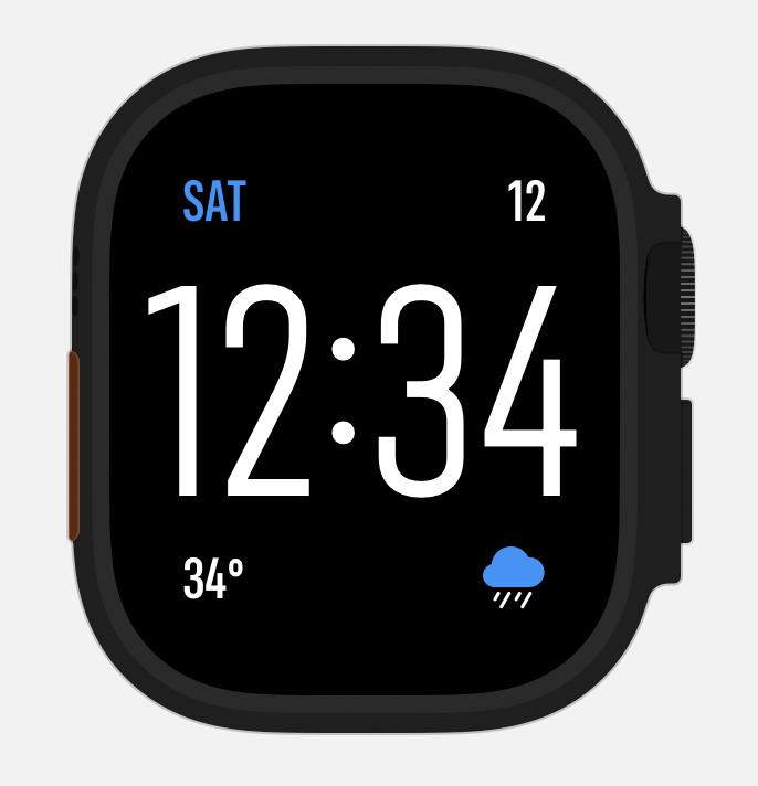
I could then put these into the four corners of the watch face and end up with a nice clean look. Here was the initial result:
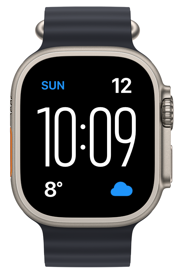
Not too bad but the font shown in the complications (using Watchsmith), just didn’t fit at all with the new Ultra face showing the time.
I’ve heard that this new font used on the Modular Ultra is referred to as Zenith within Apple so I’ll use that name in this article for clarity. I have no idea if that is actually true but calling it the “New time font used in the Modular Ultra face” would be rather cumbersome, so Zenith will do…both for clarity, and also because that is just a super awesome name.
Zenith has a number of font attributes very similar to San Francisco, but looking at the font it also has a number of tweaks and adjustments which make it not match well when shown on the same watch face. I kinda wish that watchOS would have automatically rendered complications in a matching font (like they do on the other Ultra face, Wayfinder), but they don’t as far as I can tell.
So I set out to see if I could adjust regular San Francisco to match Zenith better. The first step was to create a little test app to be able to quickly compare the font rendering options.
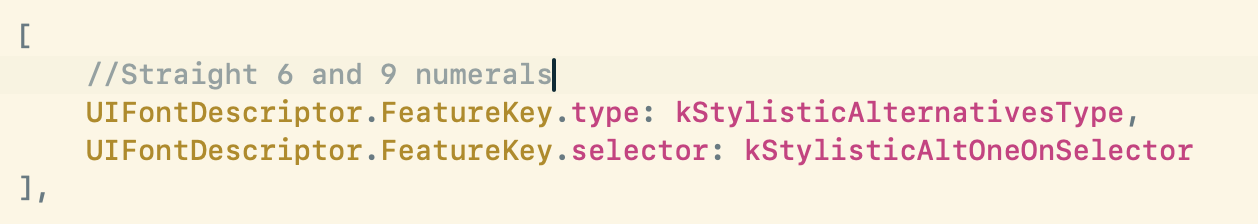
The most obvious problem is that the numerals “6” and “9” have curly tails in regular San Francisco, rather than the straightened ones in Zenith. This I can fix by adjusting one of the optional features in San Francisco. Specifically the rather awkwardly named kStylisticAltOneOnSelector.
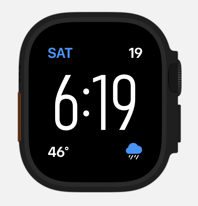
This leads to this rendering for the “6” and “9”.
Great, but now let’s look at the “4” numeral. Which is closed on San Francisco, but the top of the “4” in Zenith is open. This can be adjusted by kStylisticAltTwoOnSelector.
So now we have a numeral which look s like this:

Getting close but the width and weight of the font aren’t right. But thankfully variable width rendering was recently added to San Francisco so we can now adjust that too.

Leading to a look which is like this:
To my eye that is very, very close. I’m sure there are more typographically adept folks who could tweak or adjust things to make it even more of a match, but this is good enough for my ability.
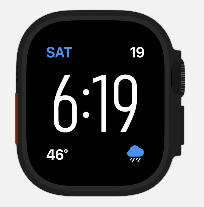
The last step was in doing a full numeral test to make sure I wasn’t missing something in one of the other numerals.
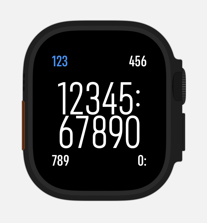
That looks great to me. So I then took the font I’ve now made and loaded it up into a private build of Watchsmith, and boom…this is the result:
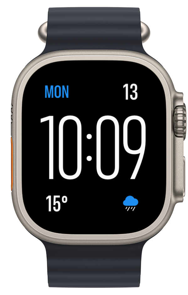
I love the way this face looks. It feels modern but in a way which is harmonious and friendly to me. And the best part, as opposed to some of my previous explorations into building custom watch faces, this is 100% built using the standard components so runs on my wrist without any workarounds or hacks. Delightful.