I played around a bit with the new Kindle Cloud Reader, basically this is a way in which Amazon is skirting the In-App Purchase rules. By creating a fully browser based application that allows for offline reading they are pushing the limits of modern web apps.
They have done an excellent job technically. It is probably the best example I’ve seen so far about just how close you can get to a native look and feel without actually leaving Safari. For that Amazon deserves some credit.
However, for all of their efforts it still doesn’t feel right. The interactions just aren’t fluid. The response time just isn’t right. The app feels like it is living in the Uncanny Valley where it is such a good web app that it feels like it should respond natively, but isn’t able to follow through. Its UI is writing checks its interaction can’t cash.
I wish them the best. I’m a big proponent of native development, but it is encouraging to see how far HTML and CSS have come.
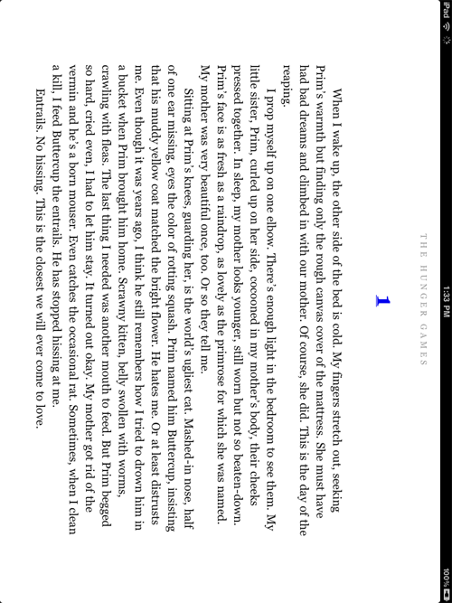
A quick example of where it really falls down is during rotation. There are a host of things that iOS does to make the animation between states fluid and glorious. The actual transition itself is comprised of dozens of tiny animations. In this web app they just can’t keep up. Here is what rotation from landscape to portrait looks like. Notice the strange middle ground that persists for a second or two before the true switch happens.