This Wednesday Apple geeks around the world anxiously await the release of the next generation of iPad. This is widely expected to include a Retina display increasing the resolution of the iPad to a whopping 2048x1536. While I can’t wait to use an iPad with a screen this large, it does present a challenge to developers who want to keep their app bundles below the 20MB limit for 3G download. Here are a few techniques that developers can use to keep their bundles lean.
Remove Unused Code

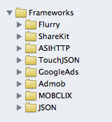
The first candidate for trimming some space is to find any unused code in your project. The most likely candidate for such waste would be any 3rd party libraries that are being included with your project but aren’t actively being used. Furthermore, be sure that you aren’t including the entire contents of a library when you only need a few files.
Remove Unused Resources

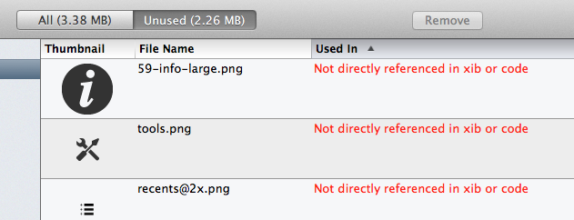
Be sure that you aren’t including any resources that aren’t used in your current project. I often find that my app will include images, icons, or sounds from past versions that are no longer being referenced. Auditing your project for these is often tricky so I can recommend a great tool called Slender that eliminates some of the guess work by analyzing your project for unused files and helping you remove them.
Load Resources On-Demand
If your project includes resources like tutorial videos or graphics that are expected to be rarely needed, consider moving these onto a web-server somewhere and have your application load them on-demand. Amazon’s S3 service or a small VPS on Linode will typically do the trick quite well. Discretion is needed with this technique since you want to avoid frustrating the user with a massive download after installation. Personally I find this helpful for the tutorial videos I include in My Recipe Book, these are only referenced in secondary screens in the app and are not part of the user’s initial experience.
Use Patterned Images

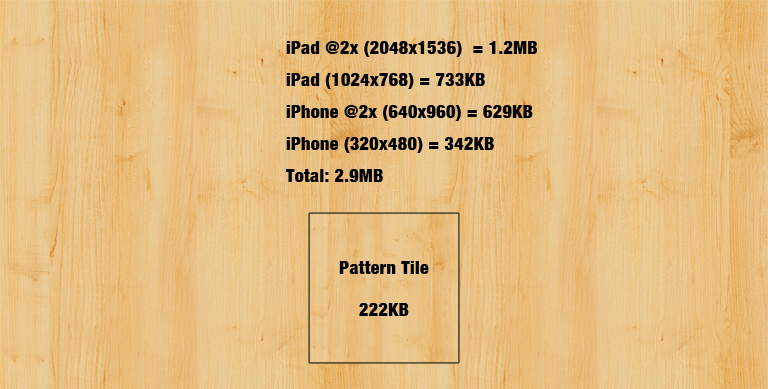
UIColor includes a fantastic feature for reducing the need to include large textured images within your project. An example of this is shown above where you want to give your app a stylized background, though this technique applies equally well to smaller areas where you want to add texture to a UI control. Simply set the background color of the desired view to a patterned color like this:
view.backgroundColor = [UIColor colorWithPatternImage:[UIImage imageNamed:@"pattern.png"]];
The view now will have a textured background that scales and adjusts with the size of the view. A good source for textures that tile well is the Subtle Patterns project.
Use Stretched Images

UIImage includes a performant method of creating images that scale dynamically with size. The image is setup so that the middle section stretches keeping the edges unchanged. This is often used for things like buttons where the corners and sides are styled but the body of the button is plain. I also works well for creating an ‘etched’ effect in table views (like in the App Store example above). Here rather than creating a 320x48 image that represents the cell background you create a tiny 1x3 image with the desired top, body and bottom colors desired. This is then assigned as your backgroundView resulting in the effect shown.
UIImage* template  = [UIImage imageName:@"template.png"];
UIImage* stretched = [template resizableImageWithCapInsets:UIEdgeInsetsMake(1, 0, 1, 0)]
cell.backgroundView = [[UIImageView alloc] initWithImage:stretched];
Draw UI Elements in Quartz
For basic, geometric UI elements you can often avoid using a PNG image for achieving the design goal. Rather than pre-generating the elements in Photoshop and then bundling them with the app, simply render the desired styling at runtime. This can be as simple as creating a square button style:

UIButton* squareButton = [UIButton buttonWithType:UIButtonTypeCustom];
[squareButton.layer setBorderColor: [[UIColor blackColor] CGColor]];
[squareButton.layer setBorderWidth: 1.0];
[squareButton setTitleColor:[UIColor blackColor] forState:UIControlStateNormal];
squareButton.backgroundColor = [UIColor whiteColor];
Or, complicated like the Gradient Buttons project by Jeff LaMarche. The goal here is to render what you need in code, rather than bundling dozens of tiny background views with your app.

Conclusions
Judicious use of these techniques can dramatically reduce the size of your application bundle, helping you squeeze under the download limit. However, be careful in going overboard and trying to squeeze things too much. You should never let your desire you get under the cap mean you abandon good design taste or user experience.
Links (Updated)
- Tony Million did a great follow-up discussing how to reduce the size of image resources by decreasing their bit depth.
If you have any other techniques that you’d like included in this list please let me know on Twitter, I’m @_DavidSmith.