Yesterday I launched an update to Check The Weather to make it feel at home on iOS 7. As I have mentioned before I decided to go iOS 7 only for this update. Having now gotten the update out into the store I’m glad I did. The result, I think, is an app that fits in perfectly on the new OS. Here are a few notes on the decisions that went into the update.
The Icon

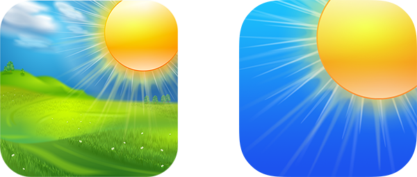
Check the Weather’s icon was made by the fine folks at The Iconfactory. Its initial version was a sun shining down onto a pastoral scene. This overly realistic visual just didn’t feel right on iOS 7. The colors were too diverse and the overall photographic nature felt out of place next to the more streamlined iOS 7 system apps. The challenge then was to take this initial concept and migrate it into something more iOS 7-like while still retaining some brand recognition and visual similarity. The process from there was to strip away as much as I could from the icon leaving only the essential components. This meant dropping the fields, trees, grass and clouds. Then pushing the color of the sky to be even more vibrant. After bumping up the size of the sun a bit the result is something that is visually similar but feels more consistent with the iOS 7 aesthetic.
The UI

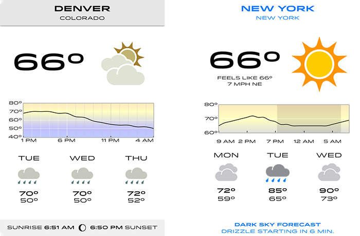
The app itself had a visual appearance not all that out of place on iOS 7. It was visual minimalistic and relied on typographic size and weight to give the content structure. So there wasn’t a lot of work needed to give “deference” to the content. The challenge was in making its color palette more in tune with the vibrant color choices iOS 7 prefers. As a result the colors of all the weather icons were updated from their previously more muted styles to become more bright and lively. An unexpected benefit of this was that I’ve found it greatly improves usability when glancing through a forecast. Before it was easy to confuse rain and cloudy forecasts, but now the pop of the bright blue raindrops clearly draws the eye.
Gestures

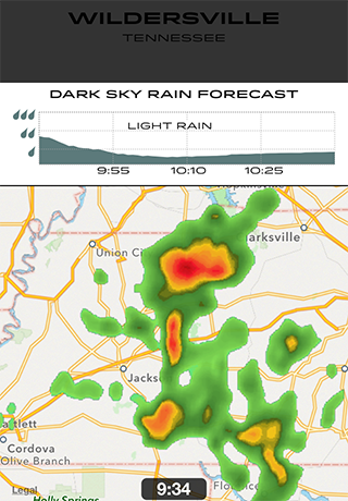
The addition of Control Center to iOS meant that the previously used gesture of swiping vertically to bring up the radar map and detailed Dark Sky data was no longer feasible. I initially tried tweaking some of the gesture parameters to make an accidental trigger less likely but could never get it to a point where I wasn’t accidentally bringing up Control Center at least 20% of the time. So I instead opted to remove the gesture and replace it with a button. This change also motivated the addition of the Dark Sky short-term forecast right on the main dashboard view. Since the button at the bottom is now bringing up the Dark Sky data this seemed appropriate. I’ve found that having the short term precipitation forecast always visible has made the app much more useful when trying to make plans.
Background Fetch
The last major component of the update was integrating with the new Background Fetch Multi-tasking features in iOS 7. These new APIs allow an application to register itself for periodic activations where they can then fetch and update the application’s data. This is perfect for an application like Check the Weather because it allows me to pre-fetch the forecast information for the app so there is no loading time when the customer opens the app. The OS is also supposed to learn the user’s habits and intelligently schedule these updates to be just before they typically open the app. For example, if you typically check the weather just before going to bed each night it should learn your bedtime and update accordingly.
Individually these changes were each relatively small and straightforward to implement but in aggregate they have changed quite substantially the interaction with Check the Weather. It feels faster because of Background Fetch. It is easier to read because of the color changes. It is more straightforward to use without dueling swipe gestures. Overall I’m really happy with how it turned out and am glad iOS 7 motivated me to do it.
Check the Weather is on sale for iOS 7’s launch for just $0.99. If you haven’t already check it out in the App Store.

