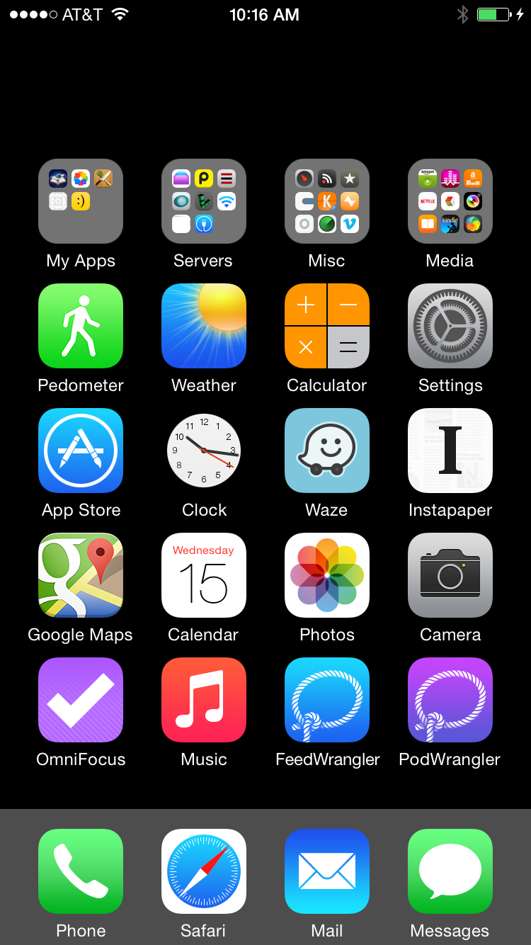
Since getting my iPhone 6 a few weeks ago I’ve been continuously trying to optimize the configuration of my home screen. The larger screen means that I now have an extra row of icons to fit onto the screen, but the physical size of device means that I can’t actually comfortably reach them.
Since you can’t arbitrarily place icons on your home screen this means the situation is actually worse. I now have to fill in the top row of icons with ‘stuff’ just so that I can easily reach my main icons without stretching.
I poked around at finding a better way and this was my solution. No weird hacks or jailbreak required.
Update: Yes, I know all about Reachability—but I don’t want to have to use an accessibility feature each and every time I launch an app on my home screen.

It requires that you use a black wallpaper (which I’ve always done anyway). If you don’t, here are two that I’ve prepared for you. Tap the appropriate size for your device and then long press on the image to Save Image.
The reason it requires that you use a black wallpaper is that iOS doesn’t allow you to have any transparency on home screen icons. Any thing with transparency is simply rendered as black.
You could theoretically create cut-outs of your wallpaper and then match them up perfectly on the grid but in reality this wouldn’t look good since the parallax effect on the screen would skew the alignment every time you moved your iPhone.
Once you’ve set your home screen wallpaper to black simply follow these steps to generate invisible icon blanks.
1) Visit this webpage (http://david-smith.org/blank.html) in Mobile Safari. Nothing super special about that page, it simply has a few header parameters set to specify how we want the icon to be rendered.
2) Tap the Action button on the toolbar.

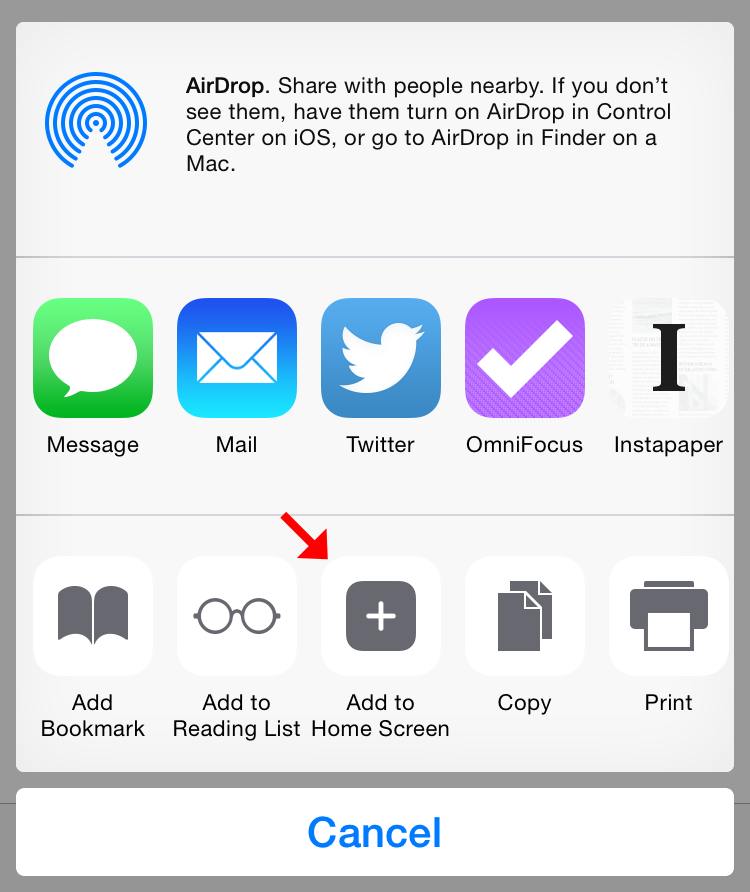
3) Tap the Add to Home Screen button from the Share Sheet.

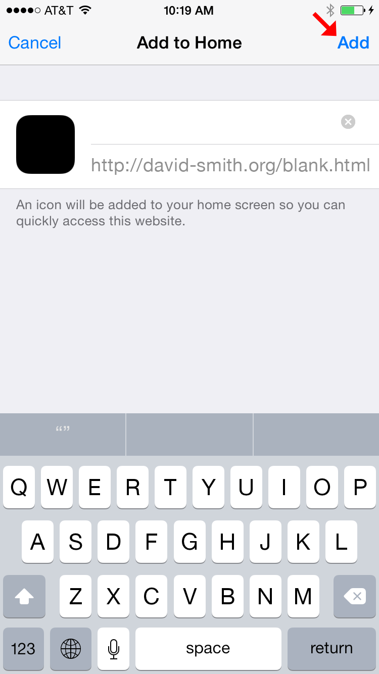
4) Tap the Add button from the Share Sheet. Do not touch the title field, it will be pre-filled with an invisible character so that nothing shows below the icon.

5) Repeat for however many blanks you want.
6) Now whenever you put your icons into Wiggle Mode you’ll be able to positing these invisible blanks wherever you want them. (Shown below against a contrasting background since, well, they are invisible otherwise).

Enjoy.