This is Part One of a new series I’m doing here on my blog called As I Learn WatchKit.
Developing an application for a device that you’ve never seen is a situation ripe with peril, yet that is exactly what we are attempting with WatchKit apps. My only experience with the Apple Watch is what I’ve seen on websites and in Apple Keynotes. Neither of which gives you much context for the actual, in-person physical characteristics of the device.
Back in 2010 with the launch of the iPad I went through a similar process. I had several apps ready for the iPad on Day One having never seen or held an iPad before. With the iPad, however, things were much simpler.
The iPad was in many ways ‘just a big iPod touch’. So many, if not all, of the design and coding paradigms I’d gotten used to on the iPhone carried over. My early apps certainly weren’t anything amazing in terms of pushing the boundaries of the iPad but it was relatively straightforward to get a serviceable interface built up. WatchKit presents a much trickier problem.
The screen on the Apple Watch is tiny. Looking at it on a model’s hands in promotional shots or on Tim’s wrist during a press conference doesn’t do a good job of understanding the scale of the device. I wasn’t able to really wrap my head around just how small it is until I printed out these mockups by Thibaut Sailly.
The 38mm version’s 312x390 screen is especially striking. I quickly realized that I’m going to have to be very, very careful about not making interfaces that are too cluttered. Button hit targets are also going to require extreme care to be actually usable.
My Visualizing Workflow
To that end I’ve come up with a little workflow for my development process that so far has been very helpful in laying out my designs.
While we don’t know for sure the final PPI of the Apple Watch, the current best guess is that it will be around 326PPI. Which is the same density as most iPhones. That means that projecting an Apple Watch screen onto an iPhone screen should give pretty good (if not perfect) simulation of the physical layout in real life.
I started out just sending over Photoshop mockups to my iPhone but this quickly got tiresome. So instead I’ve now moved over to a more elegant and useful workflow using the mirroring capabilities of xScope and xScope Mirror.
These tools are designed to let designers iterate more quickly on their designs by easily streaming them onto a live device. The same can be applied here for the Apple Watch Simulators.
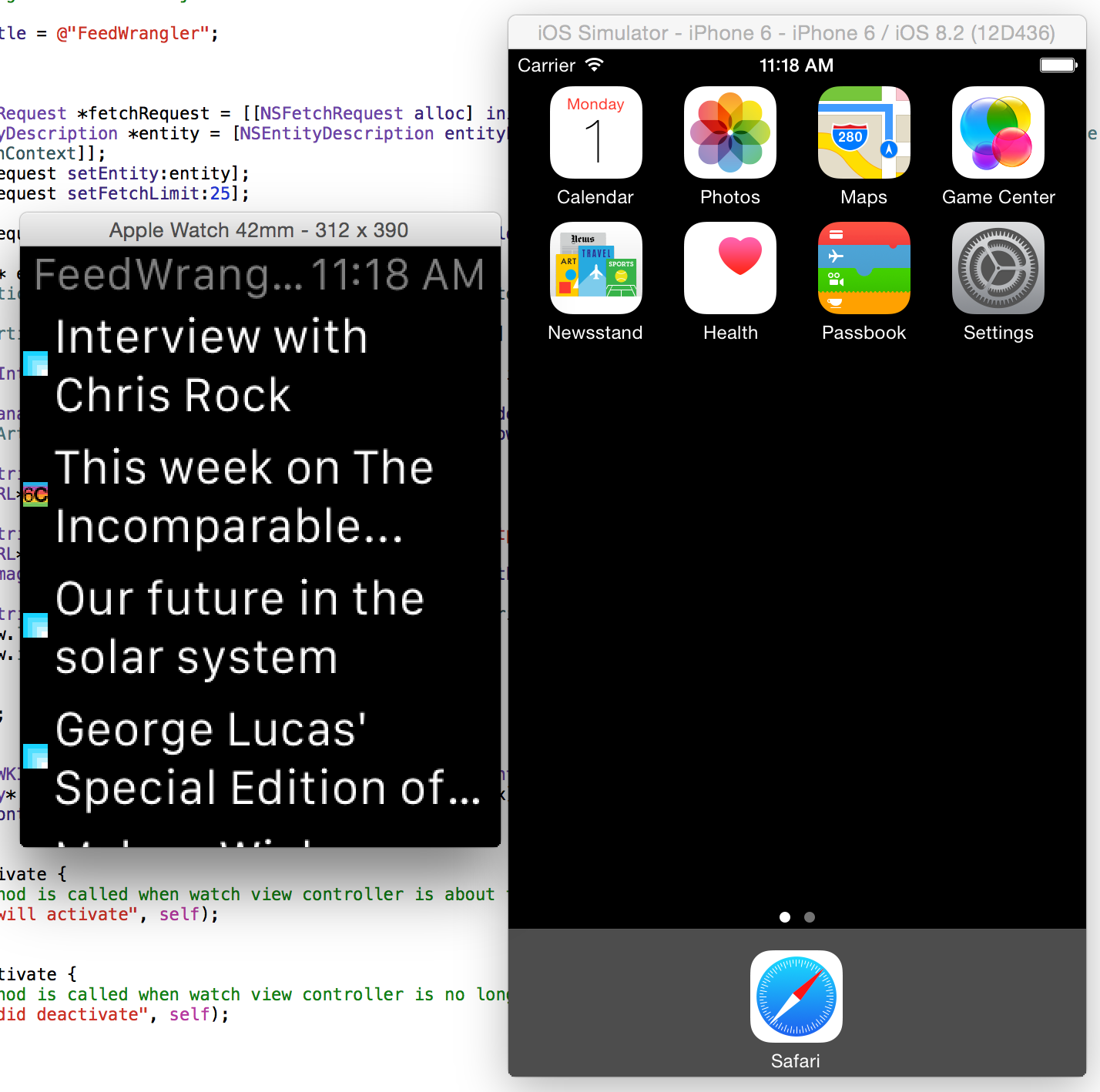
Once I have xScope all setup on my Mac and the xScope Mirror app running on the iPhone I fire up my WatchKit project and hit Run. This gives me a window much like this:

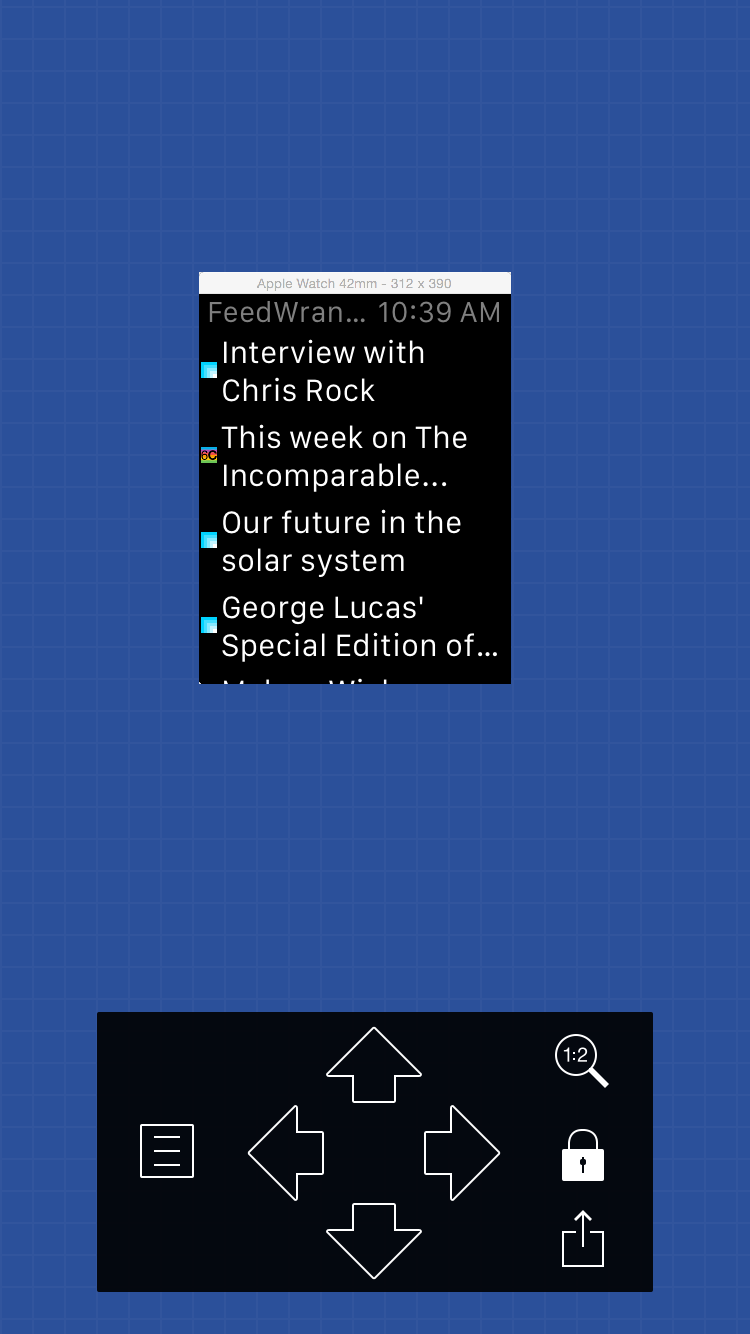
I then set xScope to send over my Watch simulator window. Now on my iPhone I setup xScope Mirror so that it is in:
- 1:2 display mode (so that it is shown at native retina resolution)
- Locked onto the Simulator (tap the lock button)
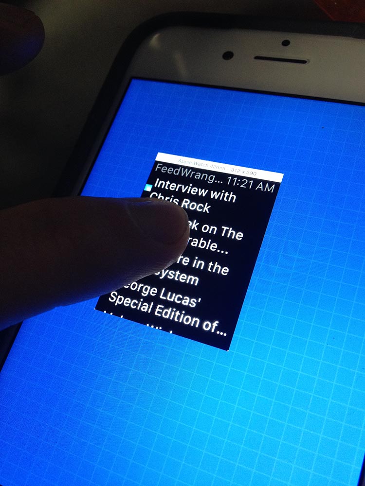
Which results in a live streaming view of my running app at real-life size.

You can then just use the simulator as you would normal to exercise your app all the while seeing the real sized copy running next to you.
Sadly you can’t interact with the simulator via the mirrored copy, it is just a static image. However, even just having the life running app physically in front of me has been extremely helpful as I start to layout screens and try out layouts. I can now physically press my finger on the screen and see how much of the interface it takes up. I’ve already caught a handful of places where my initial design was way too ambitious for what a customer could actually use in practice.

Until you try something like this out for yourself you can’t really appreciate how small the screens on these devices are, but once you get comfortable with the constraints you realize how much you can actually still do with a screen this size.