This is part of my ongoing As I Learn WatchKit (AILW) series.
The need for speed.
As I begin doing the actual work of building out my apps’ WatchKit extensions, a topic that keeps coming to my mind is that of immediacy.
While every application I build always includes a consideration of speed. How fast each view can load, how fast I can render table cells, how quickly I can load and persist data. These considerations are typically rooted in a desire to make the experience of using the application pleasurable. I’m making things fast so that while you use my app it is responsive.
In a WatchKit application all those same considerations apply, but layered on top of them is a further requirement for immediacy.
The nature of interacting with something that is sitting on your wrist is very different than something that lives in your pocket. I don’t typically have momentary interactions with my iPhone. With the exception of reading a notification on my lock screen I can’t think of many interactions I have with my iPhone that take less than 30 seconds.
My suspicion is that Watch Apps will spend much of their lives being used well below that threshold. Raising my wrist to glance at something then immediately putting it down again. These interactions are fleeting and brief.
Apple mentions this concept in their Human Interface Guidelines.
A WatchKit app complements your iOS app; it does not replace it. If you measure interactions with your iOS app in minutes, you can expect interactions with your WatchKit app to be measured in seconds. So interactions need to be brief and interfaces need to be simple.
This means that I need to be extremely careful about how I’m building things so that I can get the user in-and-out of the app as quickly as possible.
Achieving Speed.
This concept is probably best explained via an example.
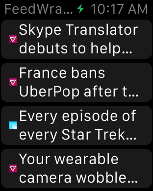
For my Feed Wrangler app extension I’m expecting to present the user with a list of articles from their unread feed. Something that looks vaguely like this mockup.

This will be a scrollable list within the main watch app and likely constructed into a digest format for the app’s Glance view.
There are a couple of different ways that I can structure the data provider for this view.
- The simplest version would be to just make a web-service request asking for the latest articles, parsing the result and updating the table. This guarantees fresh data, is dead simple to implement but comes at a terrible cost. My initial testing could never get this approach to load the data (to say nothing of launching and populating the UI) any faster than a second (typically more like 2-3s). Not awful but certainly not immediate. Anything that involves a network request should likely be completely disregarded.
- Use silent push notifications to keep the app’s internal Core Data stack fresh, then load directly from there on launch. This isn’t too bad. I was able to get this down to something like 0.1 seconds to load the data. This is pretty good to but still not the best we can do.
- Use the same silent push notification setup to get fresh data loaded but add on an additional step at the end of a data import to prime a fast cache for the watch to use. My initial testing for this used a dead simple serialized NSDictionary for the cache. This can get the data load times down to 0.05 seconds.
Without having actual hardware to test, the difference between the later two approaches is difficult to evaluate. I don’t know how important that extra 0.05 seconds will be in actual use. However, my guess is that the difference between good and great watch apps is going to be the sum of a lot of tiny optimizations like that.
Anything that could show the user a progress spinner (however briefly) is a failure on my part.