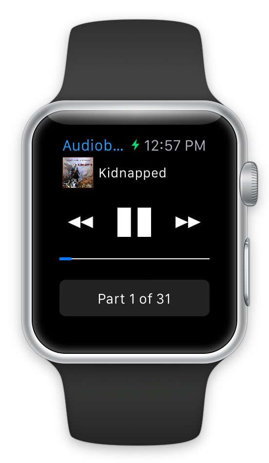
I was doing some work today thinking through the screenshots for my WatchKit Apps1. While tools like Bezel are great for generating lovely looking marketing shots I ran into an issue with the status bar of my apps.
The status bar shown in the Simulator includes the charging indicator (green lightning bolt). I believe the intention of this is to make the Simulator show the shortest possible title space. Which I suppose makes some sense for testing purposes, but can lead to truncated text which is less than ideal for a marketing image.
I started off thinking that I would need to photoshop these out and rebuild the entire status bar, but getting the text size, weight and alignment perfect would have been a bit tedious. I then wondered if I could change the time format to avoid the issue entirely.
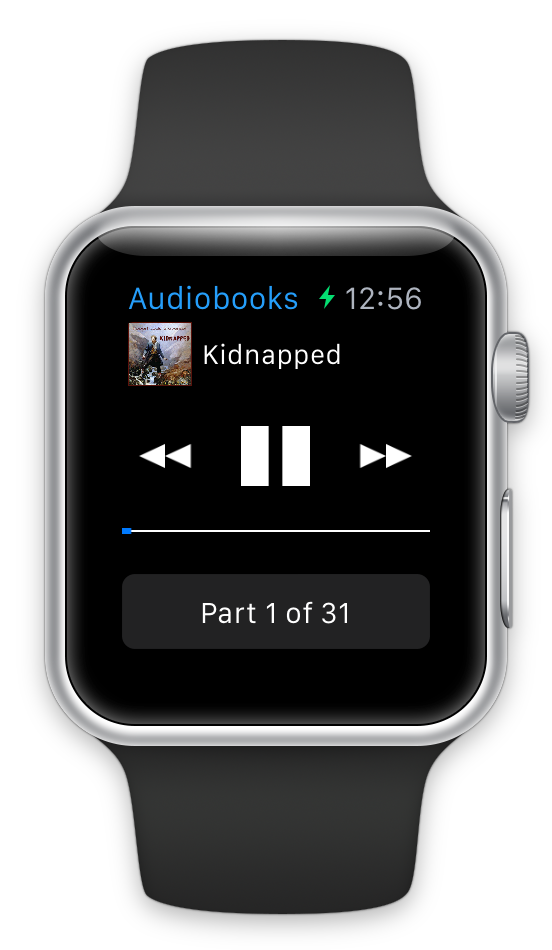
Turns out you can. If you go into the Settings app on the iOS Simulator and change the Region to the United Kingdom you get a better status bar text (i.e. Settings > General > Language & Region > Region > United Kingdom). This will display the time in 24-hour format (without AM/PM).
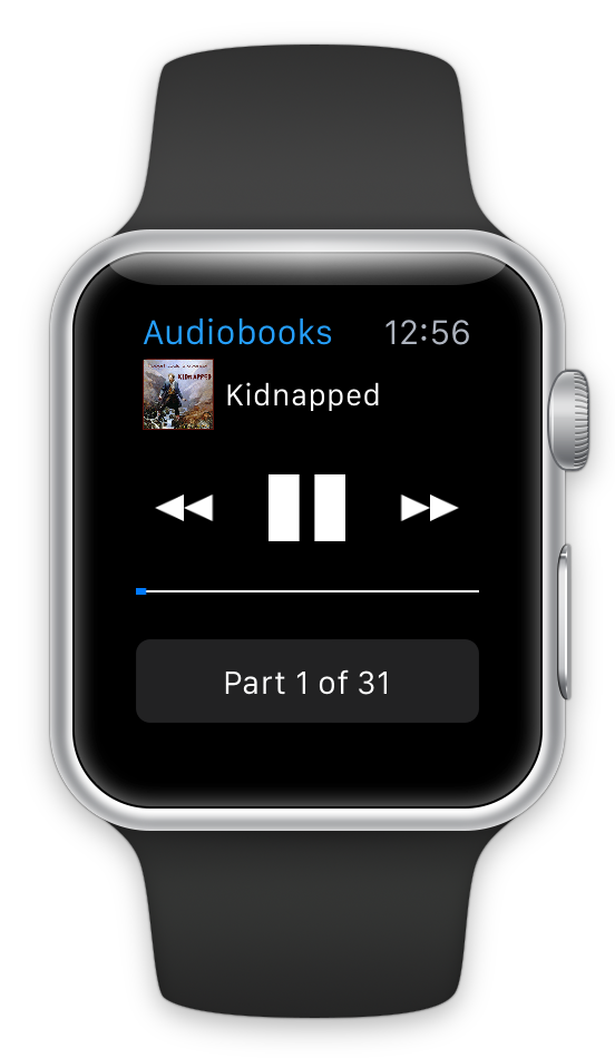
I could either then use this image directly or if I want to remove the lightning bolt in photoshop, now it is just a very simple fill operation:
This method isn’t perfect. I still don’t know if my title will show fully on device if the customer chooses to display times with AM/PM labels. I suspect it will (at least on the 42mm device), but I won’t know for sure until I have actual hardware to try it out on.
It is probably worth noting that all of Apple’s marketing materials show times without AM/PM and show the time as 10:092. Following their lead on this is likely a reasonable plan.