So last week I spent a lot of time working through ideas around making better complications for the Apple Watch Series 4. This showed some progress but is ultimately limited by the constraints imposed by the current watchOS watch face system.
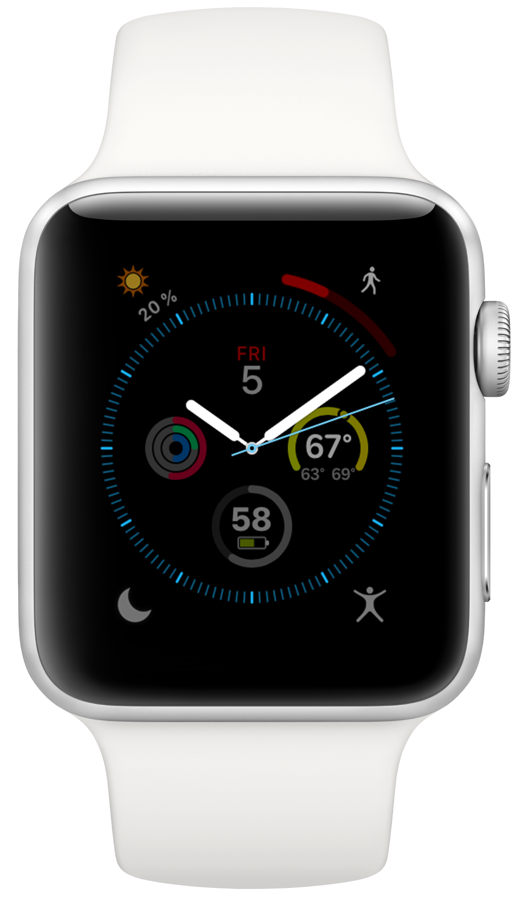
So when the broader discussion got to the point of talking about totally custom watch faces I was very interested. Especially when Steve Troughton-Smith worked out a little hack to hide the time from full screen watchOS apps. Now I was off to the races. We don’t have a means to replace the actual watch faces on our watches but we can make watch apps that look like them and run those on my wrist.
I’ve given a lot of thought to custom watch faces for watchOS over the years but always ultimately just moved on because I believed that Apple will never allow for them. The usual reasons I’ve heard given are:
- Apple likes to control the aesthetics of the device,
- there’d be too much copyright/copycat issues,
- they require too low level connection to the system to be performant,
- and they aren’t necessary.
Whether or not any of these are good, valid, or beneficial reasons honestly doesn’t interest me too much now. Because I spent the better part of this week making my own watch faces, and it was glorious! This is the most fun I’ve had in development in a long time.
There is something delightful about solving a problem that is superficially so simple and constrained. The constraint leads to lots of opportunities for creative thinking. Ultimately you just need to communicate the time but how you do that can take countless different forms. It reminds me of the various ‘UI Playgrounds’ that have existed in app design. For a while it was twitter clients, then podcast players and weather apps.
Here are a few of the designs I’ve come up with this week..
Initial learning through imitation
There are doubtless lots of issues and concerns with allowing developers to create third-party watch faces surrounding copyright, trade dress and copycats. Any App Store for these would likely need to thoughtfully structure itself to handle these.
That said, however, I often find the best place to start when learning to design something is to at first copy from a master and then adapt and grow from there. It is a well trodden technique for learning to paint and I find it works well in digital design too.
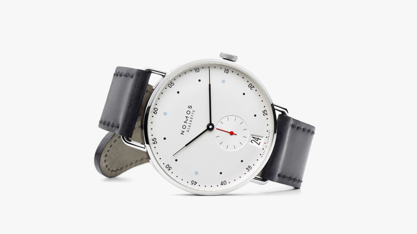
The face that seemed the best place to begin with is the Nomos Metro 38 Date. I have a couple friends who have Nomos watches and when I’ve seen them in person they always strike me as the kind of watch that if I ever wanted to own something fancy I’d gravitate towards. Simple, understated and gorgeous.
I started off making a pretty literal copy of this face but once I got through the actual creation process and put it on my wrist I realized that there are a few details about it that I didn’t like. It is really funny how when you really have to dissect something you can find all the little personal touches or tweaks you’d like. Here is my current draft of the result:
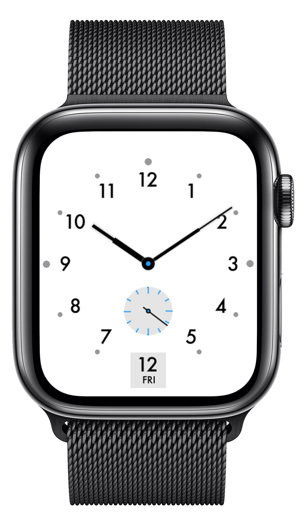
It is by no means finished but building it got me comfortable with the process of making something like this.
Circular Weather
Once I had the general infrastructure in place for making a watch face. My next ideas swirled around alternative ways to display data on the watch face. The obvious place to start is with weather. Having the temperature on my wrist is one of the least expected but most appreciated benefits of wearing an Apple Watch. So I tried out a few ideas around how to more elegantly show the general forecast for the day. This was my result:
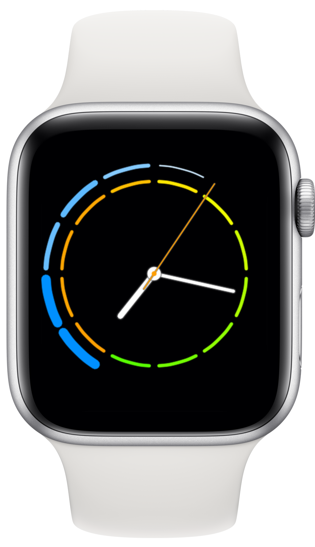
The inner ring shows the temperature for the next 12 hours (warmer colors are hotter, cooler colors are colder), the outer ring shows the likelihood of precipitation. So in this example, rain for the next 2 hours then tapering off until 1AM while the temperature is slowly cooling off. The second hand’s color shifts throughout the day with the current temperature.
By separating the hourly forecast bands I didn’t even need to have indice marks for the hours since those are implied by the blank space. I really like the combination of utility and simplicity it allows.
Other ideas
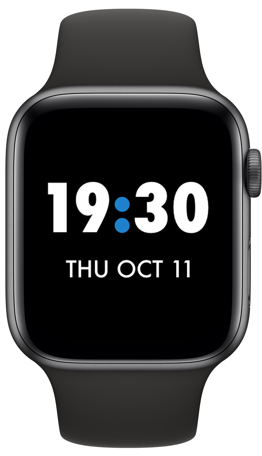
I’ve played with a bunch of other ideas during this little experimental period. Most got thrown out but a few still stick around for me. Like this super simple one that is just a big time and date. It always bugged me that I couldn’t make a face on any of the built-in faces that had a BIG time and then also the date. The closest is the Nike+ digital face but it offends me that I can’t change the top left complication away from a Nike app I never use.
Our Most Personal Device Ever
Something I didn’t really expect about this exercise has been how it has reframed my experience of raising my wrist to see the time.
When Apple first introduced the Apple Watch in 2014 their tag line for the original version was “Apple’s Most Personal Device Ever”. And it’s true, the Apple Watch is profoundly personal, it sits next to your skin all day, literally listening to your heart beating. But it wasn’t until this week of perfecting my own personal watch face that I really felt like the watch on my wrist was truly mine.
There is something sterile and compromising about choosing your watch face out of a fixed set of options. While the watchOS faces provide for a high degree of customization, there is something fundamentally different in being able to customize every single detail of the face. I started with a blank slate and was able to make the face look exactly how I wanted it. When displaying one of my creations it is now truly my most personal device ever.
I have no idea if Apple will or should ever open up 3rd party watch faces for developers. That is a question far beyond my experience and expertise. But I do now know for sure that if they do, it would be a great boon for endearing the platform to its users. Letting them truly personalize their watch to their own tastes and whims.
I hope that day comes, and until then I’ll continue getting better at making these, just in case.