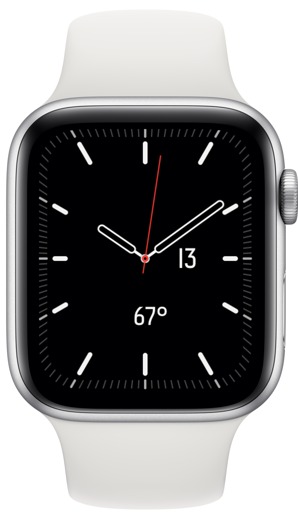
I really like the new Meridian face that arrived in the watchOS 6 GM. It is clean, simple but still provides ample opportunity for customization. Over the summer I’ve been rocking the California face (with Arabic numerals because its default mixed Roman numerals hurt both my head and heart). But the California face only has extensive complication options in the corners which isn’t my preferences. I like the face itself going to the edge of the display, it is one of the things I like most about the Series 4/5 display, that it really fills the face.
There is, however, one thing I’m now really wishing for with the Meridian face…the ability to make seamless complications for its light face options.
For the dark face variants, we already have this. You have white text on a black background that blends seamlessly into the background of the watch.

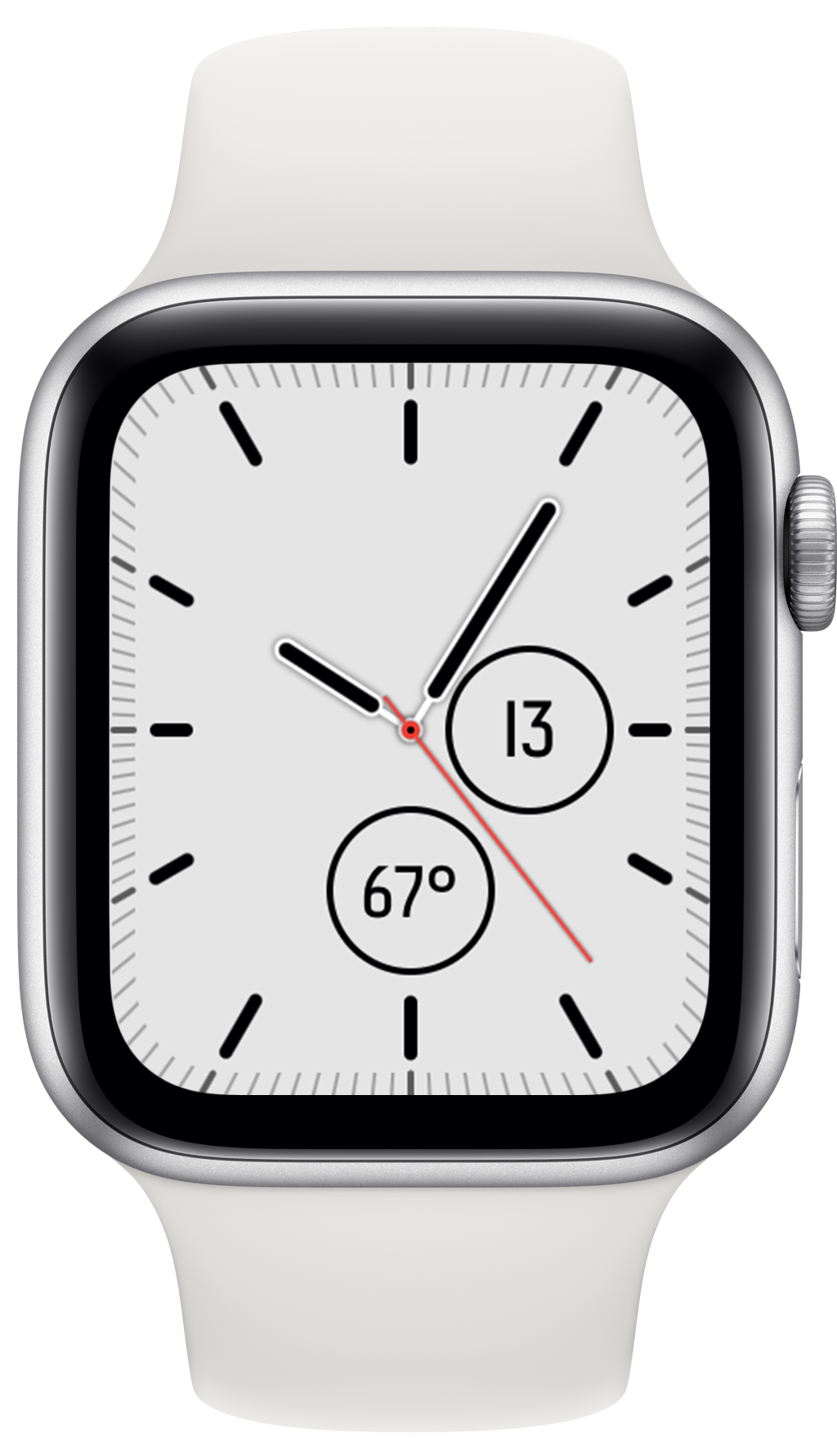
Increasingly Apple is providing options for us to have non-black watch faces, which I think creates a delightful bit of character and delight for the Apple Watch. These started with the Infograph faces and now continue with both California and Meridian. However, sadly we don’t yet have a way to make complications that can blend seamlessly into the these light colored backgrounds. The best I can currently do is something that looks kinda like this:

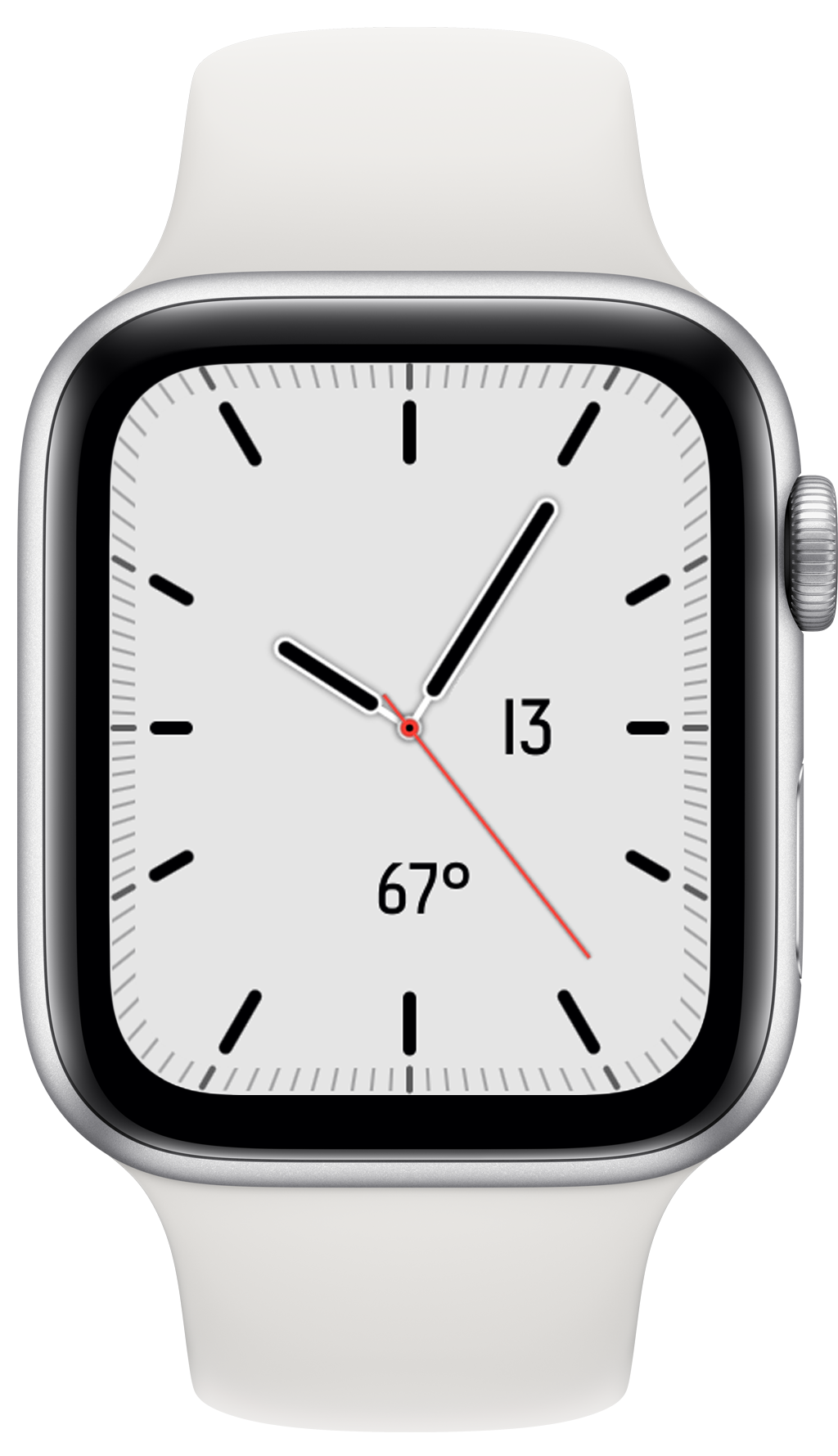
Which isn’t awful, but really interrupts the full effect that would be possible if the complication blended seamlessly into the background. Apple already allows this for the “Digital Time” complication so I know it isn’t completely out of the question. Here is an altered version of the above screenshot removing the ring around my complications.

Doesn’t that look great!
So this is my little feature request for apple (filed as FB7264371), I’d love to see a way to provide seamless complications for these colored backgrounds. Fingers crossed!
Note: The font used in my custom date and weather complications is Redbird, which is my current favorite for display on an Apple Watch face. It just looks at home on this device.