As Watchsmith settles down into its post-launch rhythm I’ve had a chance to catch my breath and look back on its development. Something that jumped out to me was how this app has been able to provide me with an outlet for most of the ideas I’ve had for custom Apple Watch faces.
A couple years ago I spent several weeks designing a series of custom watch faces. This exercise was undertaken with the knowledge that none of these designs would likely ever see the light of day, but once I got started I just kept having idea after idea for cool or interesting concepts to try.
I’m still pretty confident that we won’t get the ability to produce custom watch faces any time soon (but I’d be delighted to be proven wrong). So instead I turned my attention to what I can actually do, which was customizable complications.
I dug through all my old designs for watch faces and was gladdend to see just how many of them were able to be adapted into this alternative path.
Weather & Pixels
![]()
One of my first ideas was an analog watch face that shows the temperature and precipitation forecast around the hours of the clock. This provides a nice visual sense of what the upcoming weather is, without needing to be overly textual and verbose. This has become the Weather style where the next 24 hours of weather is shown around the ring.
Along the same lines I had experimented with bringing the feel of an old-school pixel clock to the Apple Watch. There is a delightful contradiction between the content and the platform. I love the silliness of limiting a high-resolution, OLED display to just a few pixels. This ended up as my Pixel Weather style.
Hand Styles

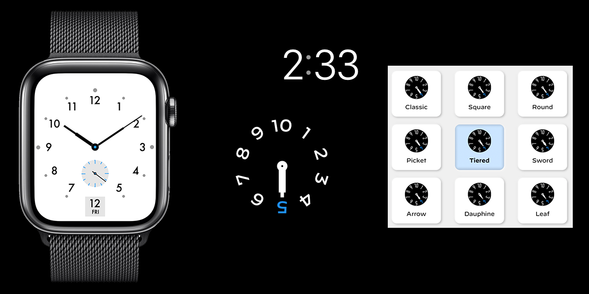
Another aspect to custom watch faces I did a bit of exploration on was hand styles. Second only to color, the shape of the hands on an analog clock define the immediate visual impact of a watch. They can be elegant or utilitarian, simple or flourished, precise or general. Each carrying with it a distinctive feel. For my custom watch face experiments I created an homage to the Nomos Metro watch. I love how precise and elegant its hands are.
For Watchsmith I can’t change the hands that tell you the time on your watch, but instead I can give you choice in the hands you choose for all your sub-dials. This has been a fun way to adjust the character of a watch face, even a digital time one.
Astronomy

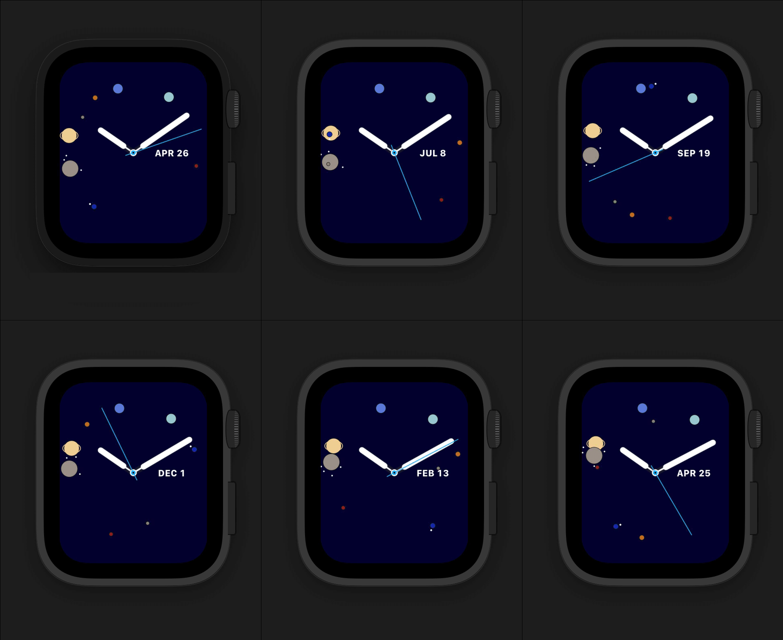
I’ve had all kinds of crazy ideas for astronomy focused faces. Things like this one where the planets are shown in their orbits around the analog time. I just love the history of the interplay of astronomy and time keeping. For example, how astronomical observatories were used to determine the accuracy of a new timepiece. Their connection seems perpetual.

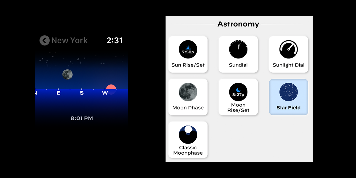
My first practical exploration of this was Geneva Moon which focused entirely on giving accurate renderings of the moon’s appearance in a complication. I’ve then been able to expand this in Watchsmith. Perhaps the most fun I had was in making the Starfield complication which uses the HYG star database and a whole bunch of math to render an astronomically accurate night sky for your location.
Roman Numerals

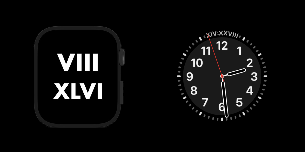
The bestworst idea I had for a custom watch face must have been to show the time in roman numerals. Aside from the unfortunate issue with the top of each hour (zero, turns out it’s a useful idea), it also is completely illegible.
Of course, I had to implement this as a type for Watchsmith. Though I’ll never actually ship it. I mean, I’m not a monster ;)
Conclusions
This experience has served as a great reminder to me of the power and utility of constraints in design. While I couldn’t use my initial designs in their full form on an actual watch, finding ways to adapt them to what I can do has been doubly rewarding.
It is so easy to focus on what I can’t do, the challenge and real growth happens when I instead focus on what I can do.