The announcements of watchOS 7 have generally felt like Christmas Morning to me. As someone who has been working heavily with complications for the last few years, Apple resolved nearly all of my outstanding complaints for the platform. I can now implement nearly all of the ideas I have for watch display and do so in a more power efficient and clean way.
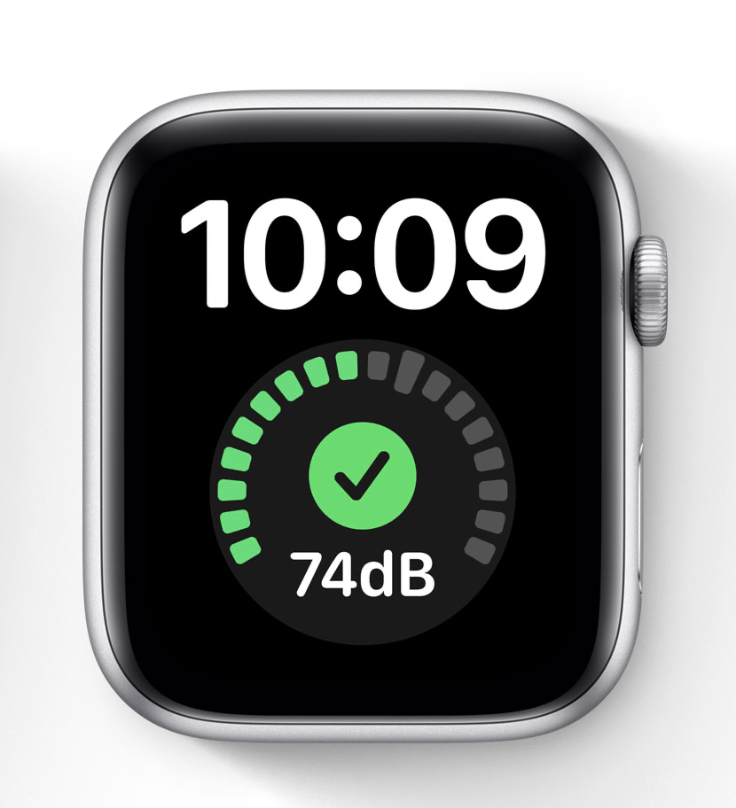
There was, however, one tiny lump of coal in my stocking. One of the many improvements to the complication system was the introduction of a new “Graphic Extra Large” complication. This is a modern update of the classic “X-Large” complication that allows for full color rendering and use of the new SwiftUI complication system.

I really like this watch face as it provides a large clear time and then a substantial canvas for complications…except in their current state in Beta 1 all the complications that are shown here must be masked to a circle. ☹️
This seems like a huge waste of the screen space of this watch face and limits what data types can be effectively displayed here. There are certainly many data that fit well into a circle, for example all the gauge based displays. But many data types just don’t fit well into this constraint.
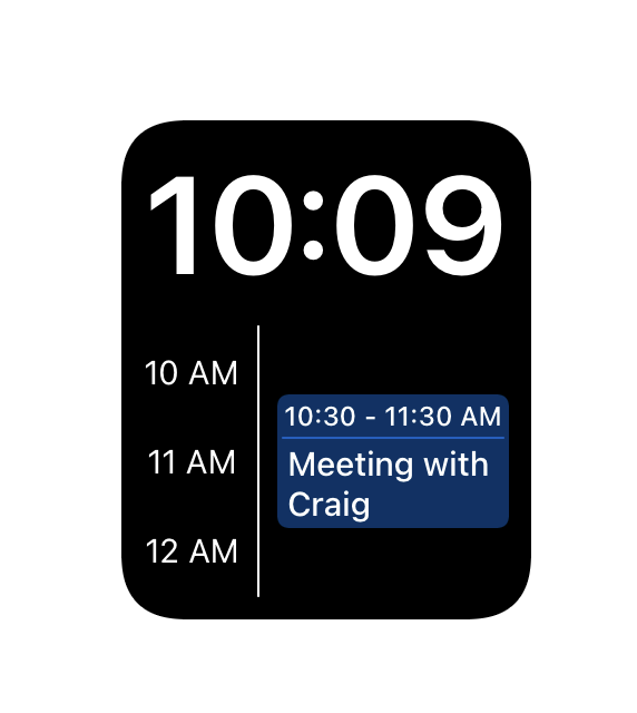
As an example, here is a mock-up of a data type that I think would be wonderful on this face, but currently isn’t possible, Calendar.

There clearly isn’t a total prohibition against rectangular complications as the Modular faces received an ever larger canvas in this update…but it appears that for this face in particular there was a stylistic choice to only permit circular complications.
I have filed this desire as Feedback #FB7798509. Fingers crossed this might change in a later beta of watchOS 7.