I’m delighted to announce the release of Watchsmith 2.0.
Watchsmith to me is a bit of a labor of love project. I doubt Apple Watch apps will ever quite have the reach or audience as iPhone apps, but nevertheless I LOVE working on them. There is something just exciting and challenging to me about working on the wrist that keeps me hooked.
I think the potential of the Apple Watch as an app platform is nowhere near fully explored. Even after seven years there are still huge opportunities for tools and utilities that haven’t been made for the wrist. I suppose I kind of take it on myself to explore as much of this area as possible, and have found Watchsmith as the conduit for that exploration.
This update involved a complete adoption of the new SwiftUI complication and interface systems in both the iPhone and Watch apps. This consolidation has led to a number of dramatic improvements in the performance and capabilities of the app.
New Icon
![]()
I was privileged to work with the legendary designer, Brad Ellis on a new icon for Watchsmith. He was able to capture exactly what I have in the back of my mind while working on Watchsmith. That I’m trying to make a digital watch that pays its respects to the craftsmanship of mechanical watches.
New Complication Styles
 |
 |
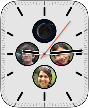 |
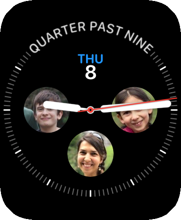
My personal favorite complication style that I was able to add to Watchsmith is the Photo complication. This lets you choose any image from your iPhone and have to always visible on your wrist. I love it. In my daily use my Apple Watch now always shows me my wife and two kids.
The photos are chosen on the iPhone app and then there is an option to automatically have the complication center on the faces in the photograph.
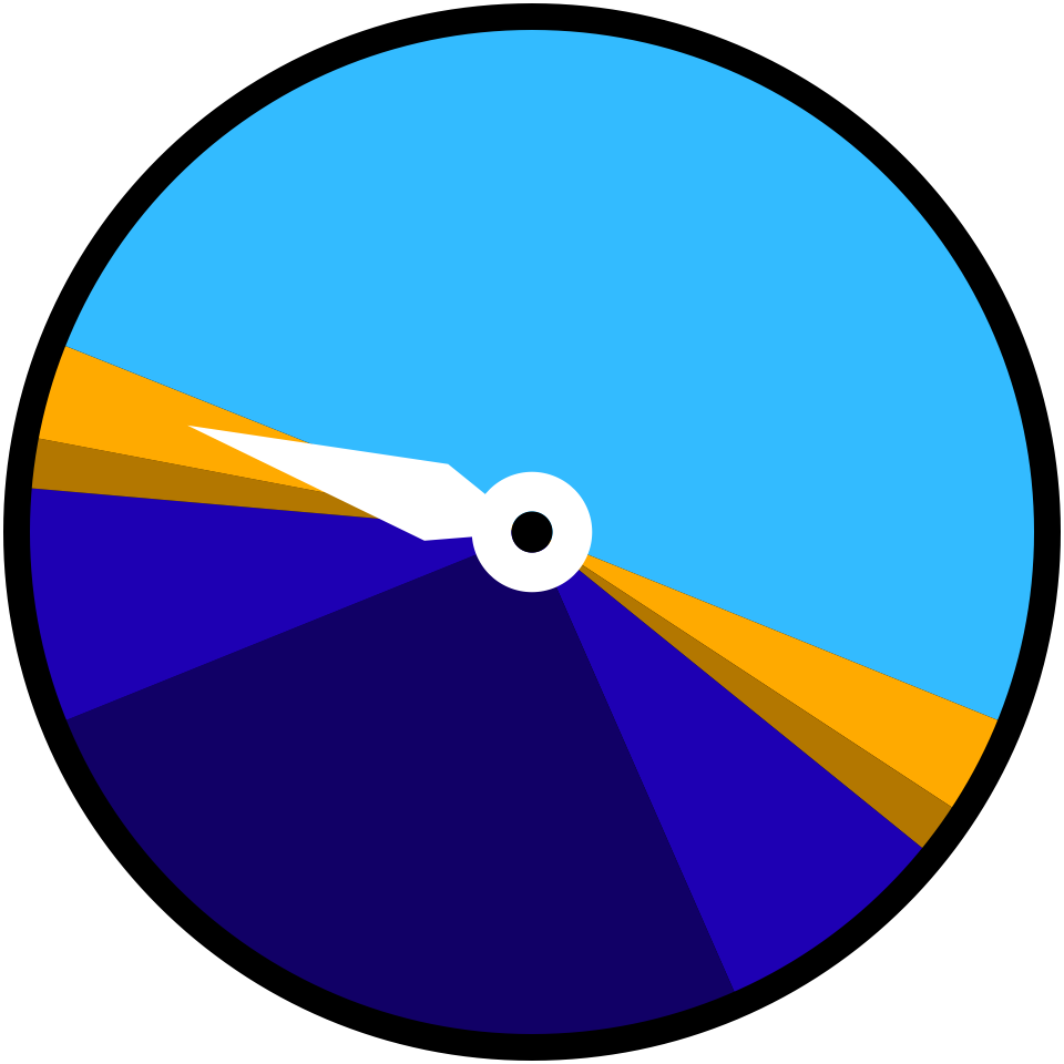 |
Something I often need to be aware of when I’m doing photography is the timing and duration of ‘Golden Hour’ when the sun is close to the horizon and as the result the light is rich and textured. This complication shows the day as a 24 hour disc. On it the Day, Golden Hour, Golden Dusk, Twilight and Night segments are indicated. (There is also a golden hour tool discussed more below)
 |
The had previously existed a moonphase complication that is an homage to the moonphase complications shown on mechanical watches. However, this included the entirely physical constraint of needing to obscure the moon with two semicircles on each side of the horizon line. As this isn’t a mechanical watch I don’t need that constraint so can instead show a full moon, accurately reflecting the current moon phase.
The stars behind the moon show the current stars as visible from the selected location. The area inside the moon is always empty because well…stars are actually always hidden by the moon even if it is a slight crescent.
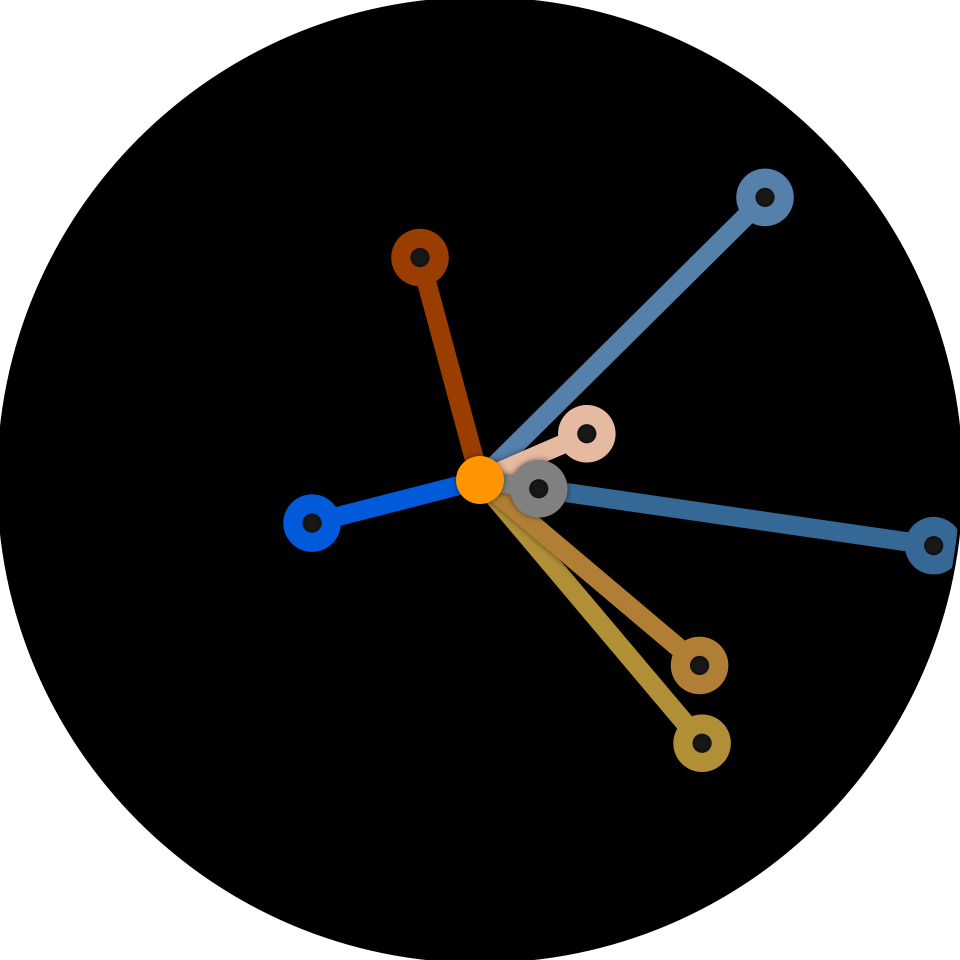 |
I wanted to do a solar system complication, but do it in a more abstract way, so I ultimately came up with this. I like the whimsy of it.
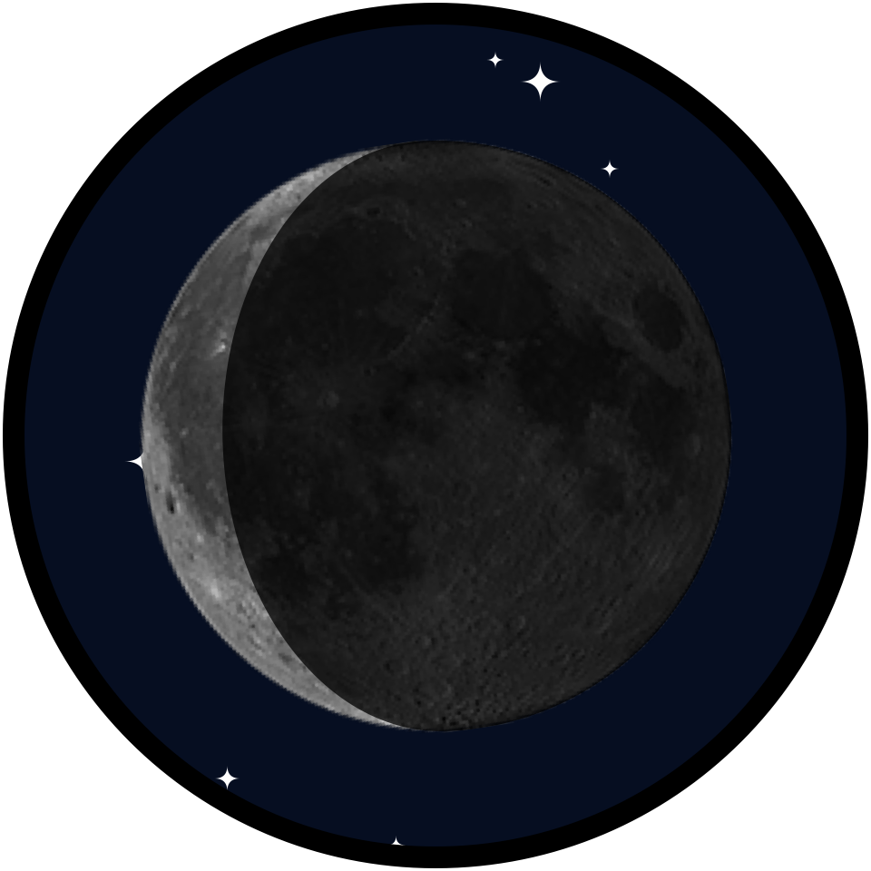 |
I’ve had a moon phase complication for a long time, indeed the origin of Watchsmith was a desire for a better lunar complication. But they all completely filled the complication space. This alternative shows the moon in the context of a few stars, which I think really gives it a classier look.
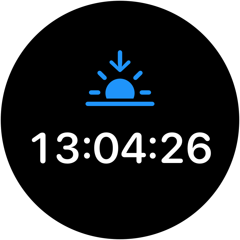 |
Something new in watchOS 7 is an easier way to show dynamically updating complications. So I’ve added a complication that shows the next sun transition (rise or set). It will count down to it in real-time.
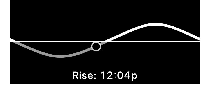 |
This is a homage to the Solar watch face that has shipped on the Apple Watch since the very beginning. I love its elegant display of the sun. I made this complication to let you include this on any of the modular faces so you can have that elegance next to a bit of other data. This can optionally also show the time of the next solar transition.
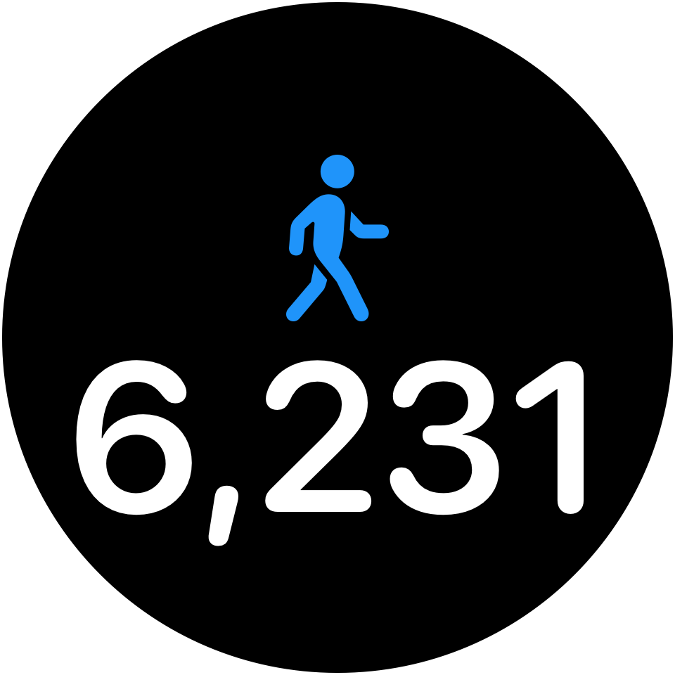 |
Up until recently my most successful app was a step counter called Pedometer++. Step counting is something that I’ve heard time and time again can serve as a powerful motivator for folks getting active. While the Apple Watch is very focused around its Activity Rings I wanted to offer an alternative, step based approach. You can set a step goal in the iPhone app and see your progress towards it, or keep it simply as a daily tally.
Note: The step count shown here is intended to match the count shown in the Activity app, and might differ slightly from Pedometer++’s count. This is because Pedometer++ uses a more sophisticated merging algorithm, but in this context it seemed wiser to match the built-in count. If you want to see Pedometer’s count, you can use its own complication.
Misc Complication Features
- Time Format: You can now choose how you want times displayed within all of Watchsmith’s time complications. This can be 12-hour, 24-hour, condensed or system.
- Config UI: The editor for complications has been overhauled to be much more visually clean and accessible. It now shares a common look to Widgetsmith
New Apple Watch Tools
Workout Metrics
 |
 |
 |
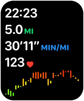 |
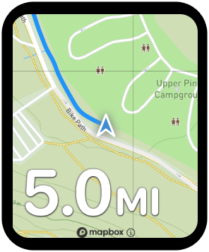
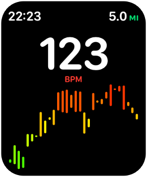
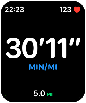
The main workout mode within Watchsmith has been updated to include a wide variety of new metric displays. You can choose exactly what information you are most interested to appear right on your wrist. I find this really helpful for making what I care about easily glanceable. For example, if I’m trying to run at a constant pace I can have my pace shown HUGE on the watch face. Or if I’m hitting a HIIT session I can make my heart rate shown along with a graph of my workout performance so far.
The Map workout display shows your current location and path on a live updating map, that rotates to reflect your current direction. I’ve found this to be really helpful when hiking to get my bearings.
I’ve also updated the existing Heart Rate Zone and Work:Rest Interval workout displays to be more consistent and reliable.
Quick Launch Actions
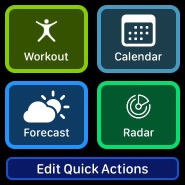
You can now configure the top of the main list screen in the Watch app to show whatever tools are most relevant to you. For me I typically have the Workout, Calendar, Forecast and Radar views. Since any Watchsmith complication will bring you to this screen it makes it super convenient to quickly start a workout, or check if it is about to rain.
Golden Hour Calculator
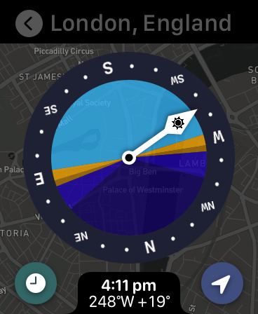
Similar to the Golden Hour complication this new tool shows the various stages of the sun as it moves throughout the sky. However, this gives you much more detail and control over the display. Rotate the digital crown to see the sun’s azimuth and elevation throughout the day. On watches equipped with a compass it will show you exactly where the sun, or will be. Tap the clock icon to see a detailed list view.
Predictive Radar Map
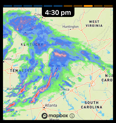
The Radar view within the app now includes ‘future’ tiles, showing the predicted rain path for the next 30 minutes. This gives you a sense not only of where it is raining now, but where it will be soon.
Misc Complication Features
- An Outlook Calendar View
- Elevation graph in workout history
- Blood Oxygen
Misc iPhone tools
- Workout History
- Activity ring progress and Streaks (Similar to MyTrends++)
- Time zone calculator
- Precise Time showing a calibrated highly accurate time display
- Outlook Calendar
