Today I’m announcing the launch of Widgetsmith 3.0. This update is focused around two new themes that I intend to lean into with the coming releases: Seasonal content and Powerful Tools.
Seasonal Content
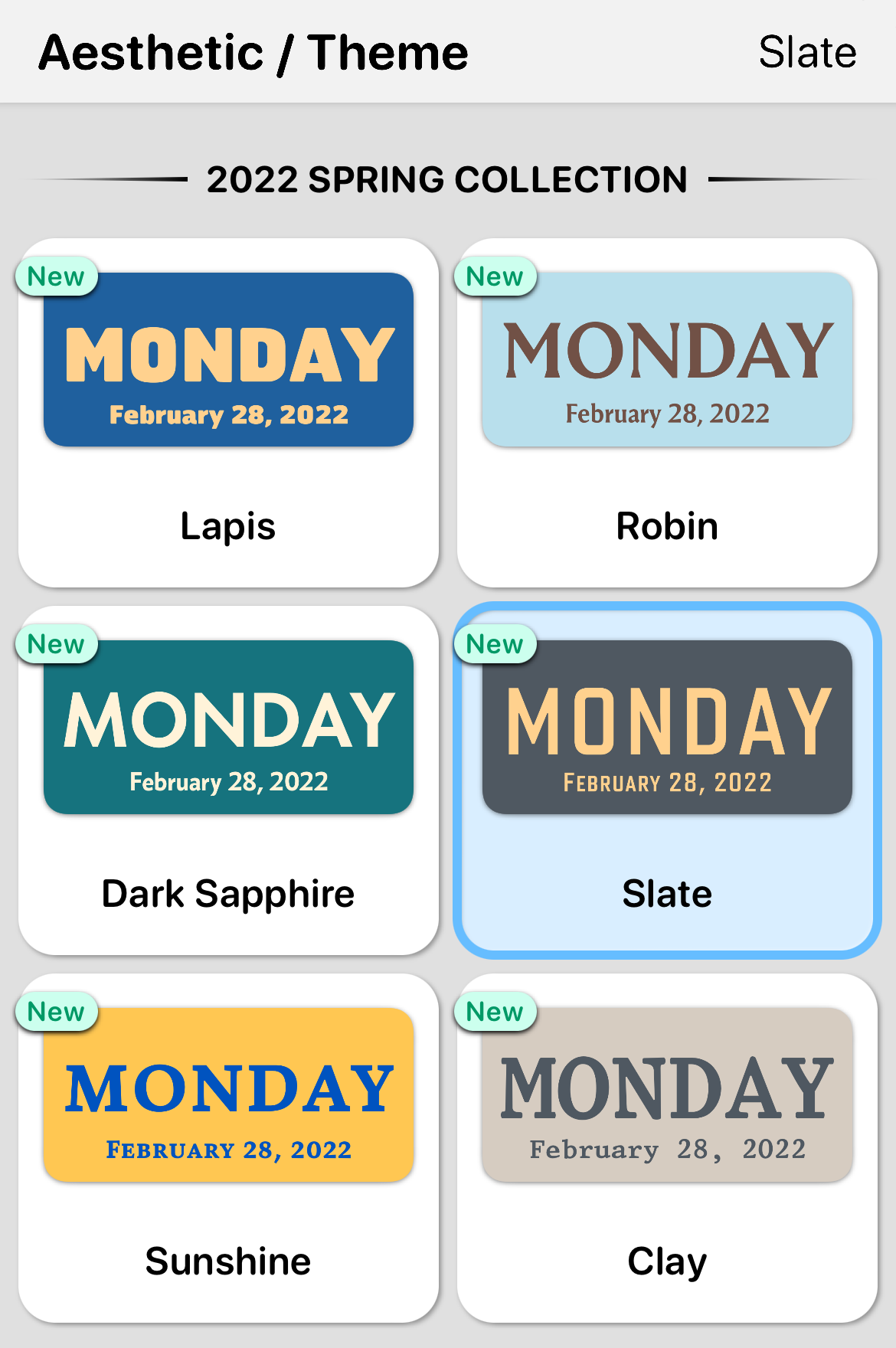
Right from the start of its quite unexpected rise to popularity, Widgetsmith’s core ability has been to allow you to take control over the look and feel of your iPhone’s homescreen. I want to build the tools you need to customize and personalize the look to be exactly what you’d like. To that end I’m going to start rolling out new aesthetic collections at the start of each season. The first being the 2022 Spring Collection:

While I’m no expert at fashion, I have recently tried to become a student of it. Prior to this work it has always felt rather arbitrary that each season fashion designers can declare a new set of colors and looks as “in”. The more I explored this space, however, the more I come to appreciate that while yes the seeds of the choices are largely arbitrary…the goal is not to somehow divine what the trends are going to be. Instead, the goal is to provide a fresh, harmonious starting point from which to reset from.
To that end I’ve put together a collection of new colors and themes for Widgetsmith that I believe work well together and should hopefully provide a fresh starting point from which people can update their iPhone aesthetic. It isn’t so much prescriptive as inspirational in nature.
Additionally, I’m thrilled to announce the addition of a handful of new fonts. When Widgetsmith initially launched it only provided the built-in system font options. Now I’m going to start working with type designers to provide a rich variety of options to make your homescreen really look sharp.
This initial set is by the extraordinary type designer, Matthew Butterick. (My personal favorite is Advocate)
I intend to release a new collection of Themes roughly every three months. Providing a rolling set of inspiration from which you can update your own look.
Powerful Tools
Another new goal that I have for Widgetsmith is to make the experience of tapping on a Widgetsmith widget more useful. Right now, when you tap on a widget you just open the app, but I can do better. This update includes the first two of these new tools, with many more planned in the coming months.
Photo Album Tool
Firstly, I’ve made it so that when you tap on a Photo Album widget you will be shown a browser containing the most recent photos shown in that widget. This screen includes an option to Favorite a photo, or even to create a new single photo widget from it.
Personally, I’ve really enjoy this as a way to explore my older photographs. I have a large album widget set to show All Photos in my photo library. Then whenever I see one I like, I pop it open and mark it as a favorite. This has really helped me to rediscover a number of photographic gems that had been lost to the end of my photo library.
Weather Tool
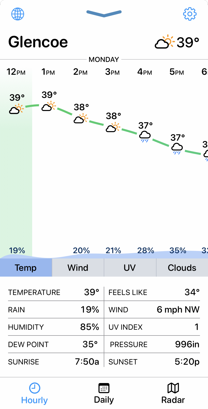
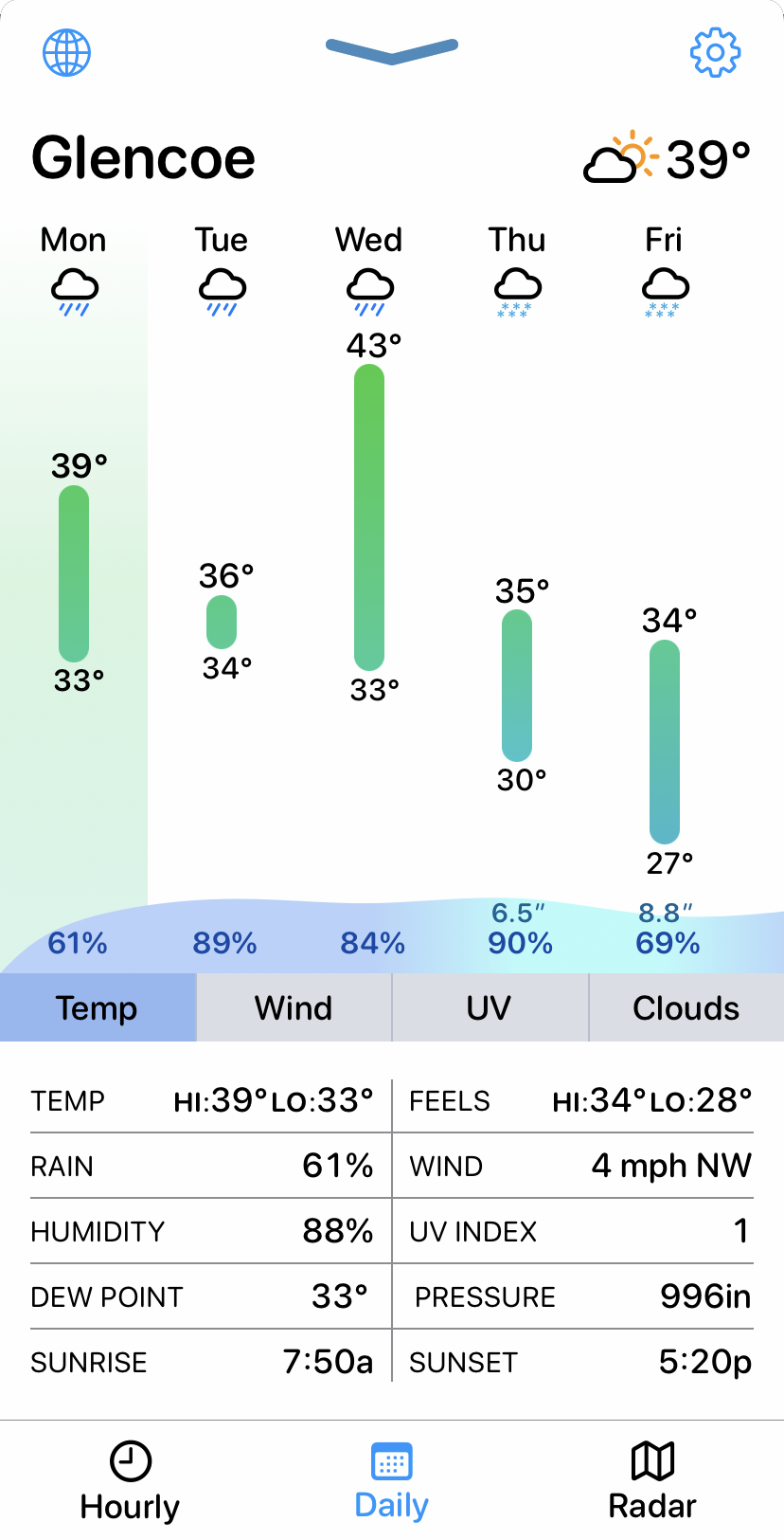
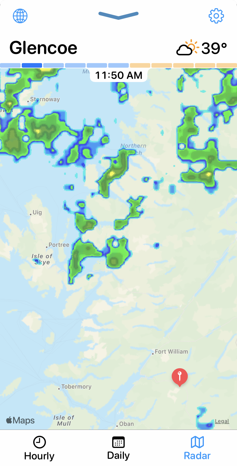
When tapping on a weather widget, I’ve also now made it so that it will launch into a powerful, graphical weather tool. This is customized to match the location you have configured in the widget. This makes checking the weather super convenient.
This weather tool provides an Hourly, Daily and Radar view. Each of the graphical views can be smoothly transitioned between Temperature, Wind, UV and Cloud Cover graphs. My goal is find a good balance between information density and clarity. I want you to be able to see ALL the weather data you want in a single view, but without overwhelming you with data.


This tool is a love letter of sorts to the app, Weather Line, which was acquired a year ago and is set to be shut down this month. While designing my own weather tool I found that kept tending towards features and choices reminiscent of those Weather Line had taken. It was really ground breaking in some of the UI paradigms it created. I’ve taken the concept in my own direction but I’d be remiss if I didn’t mention this influence, and thank Ryan et al. for the work they did here.
