Tuesday, November 29, 2022
8:50a Meta Note on Design Notes
As part of my usual development approach I very often post in-process screenshots and ideas to Twitter. This has provided me with a rich sense of community & feedback. With all the recent drama around Twitter, however, it has gotten me thinking about this part of my work process and whether an alternative would be better, at least for now.
The more I thought about it the more I realized that while posting my work likely had some benefit to others in learning from my process and mistakes, there was a fundamental value to me in the capture rather than the share. In many ways it reminds me of the Field Notes slogan “I’m not writing it down to remember it later, I’m writing it down to remember it now.” Or similarly the concept of rubber duck debugging.
There is a tremendous value in having to condense the vague notion of an idea down into words that clarifies, crystalizes and improves it.
So while the drama and uncertainty of Twitter is likely ongoing for some time I didn’t want to lose this aspect of my work process. So I’ve decided to try something new, a daily Design Notes diary. While I’m working I will keep open a Markdown document and periodically capture what I’m thinking about, working through or evaluating. Then at the end of the day I’ll post these to my blog, with cross post links to twitter and mastodon.
This is very experimental, but times of uncertainty are often useful for experimentation. Expect some typos, half baked ideas and unevenness…but also hopeful useful honesty and a view at what goes into making apps.
And if I’m being completely honest, I hope there is an additional benefit of “being watched” helping me be more productive. I’ve been in a bit of a slump recently, and who knows, maybe this will help. 🤷🏻♂️
8:59a GMT Publish Widgetsmith 4.1.1
I had shipped an update with Widgetsmith last week which had a really awkward mis-render on my new paywalls of all places…thankfully Matthew on twitter let me know so I could get it fixed.
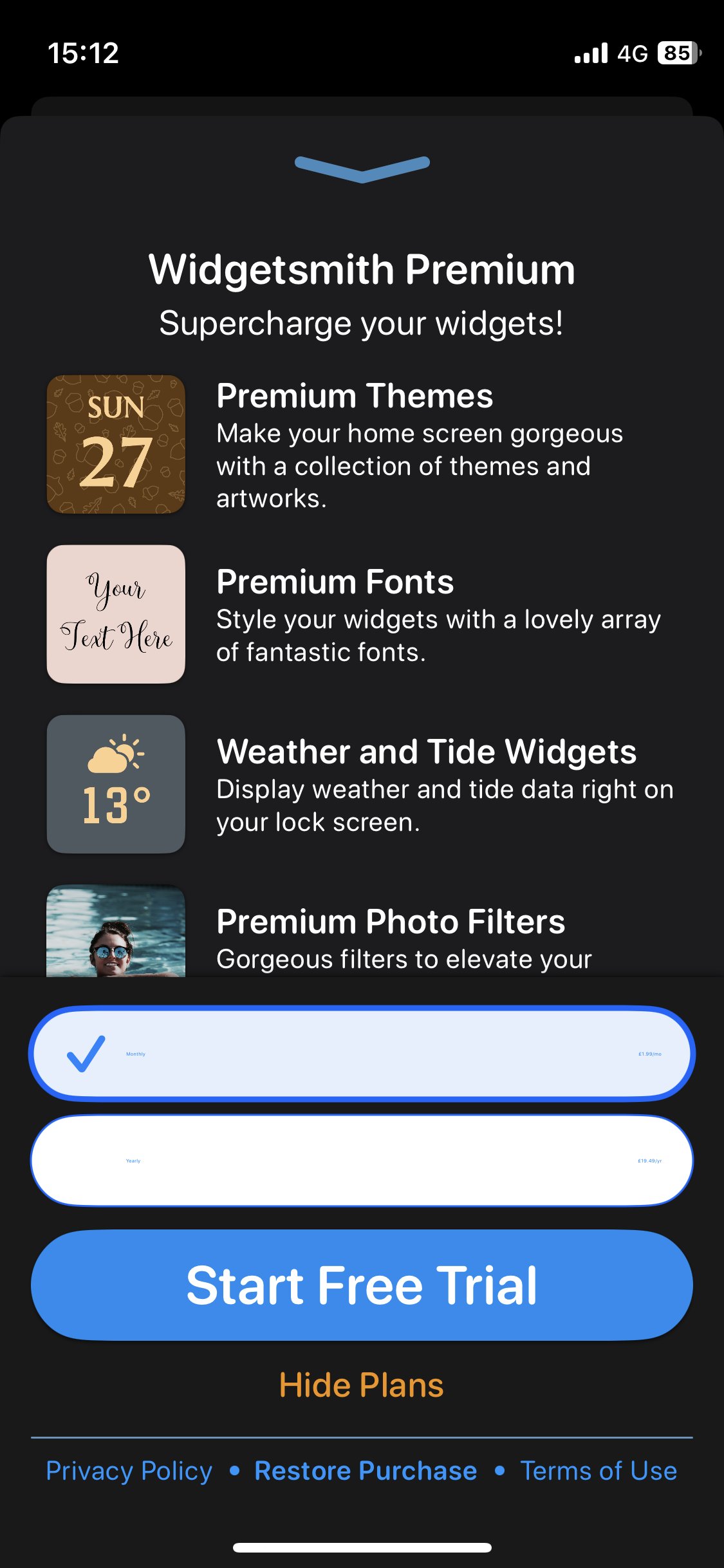
I also added an instrumentation to my privacy oriented analytics system to collect which Dynamic Type sizes are most popular. With the hope of using this to better support it going forward.
9:27a Explore layouts of the Pedometer++ workout screen
I’m working on a new iPhone workout mode for Pedometer++.
This is what I started with:
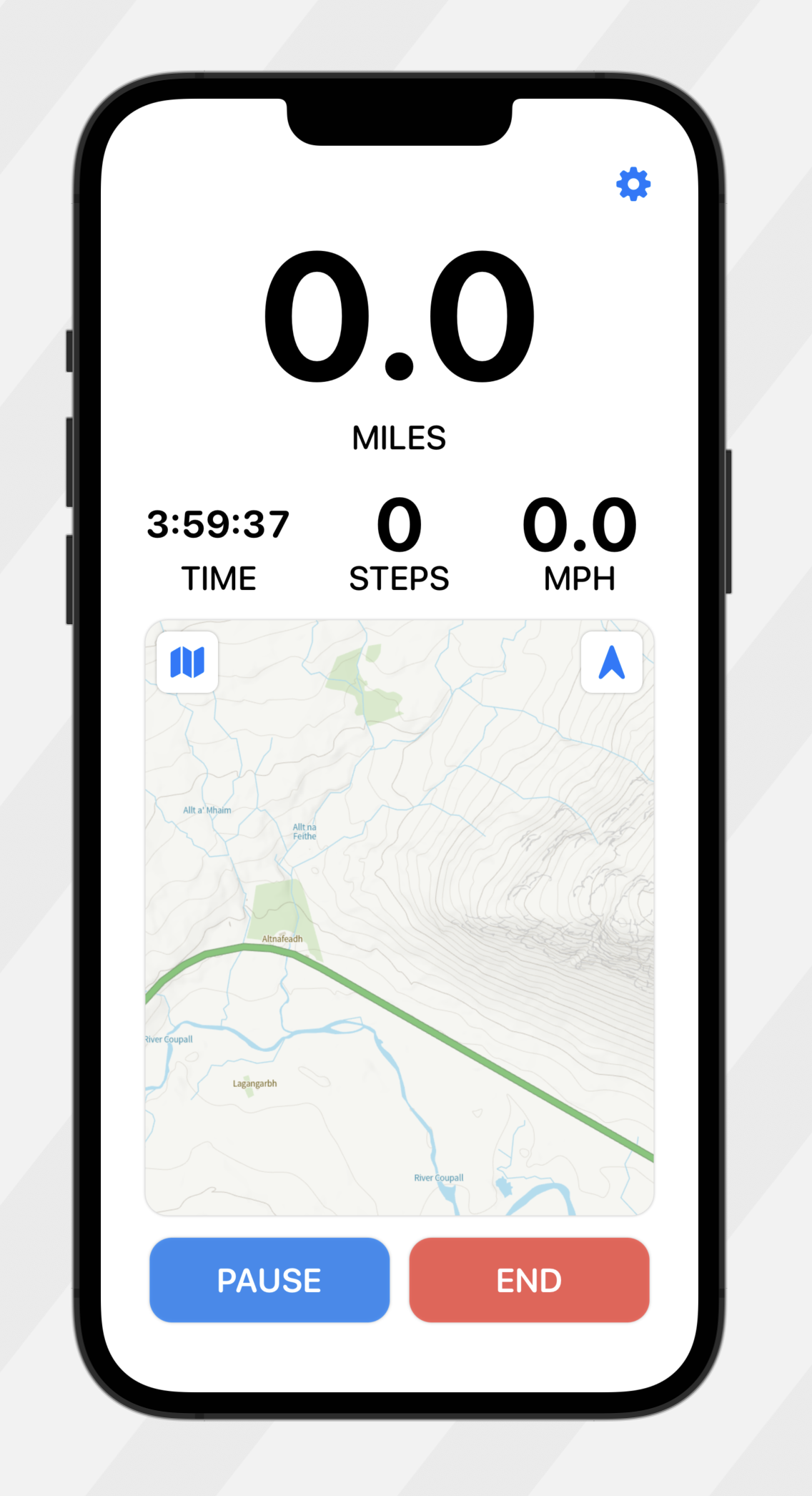
But I think the inset map looks a bit weird. So I tried this:
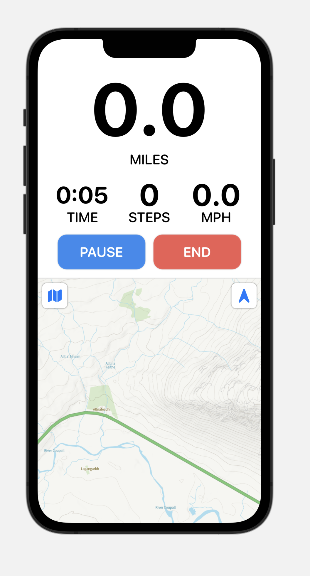
Which I think is much better but I’m not a huge fan of the buttons being next to the map. It looks a bit crowded. Like they need to be free.
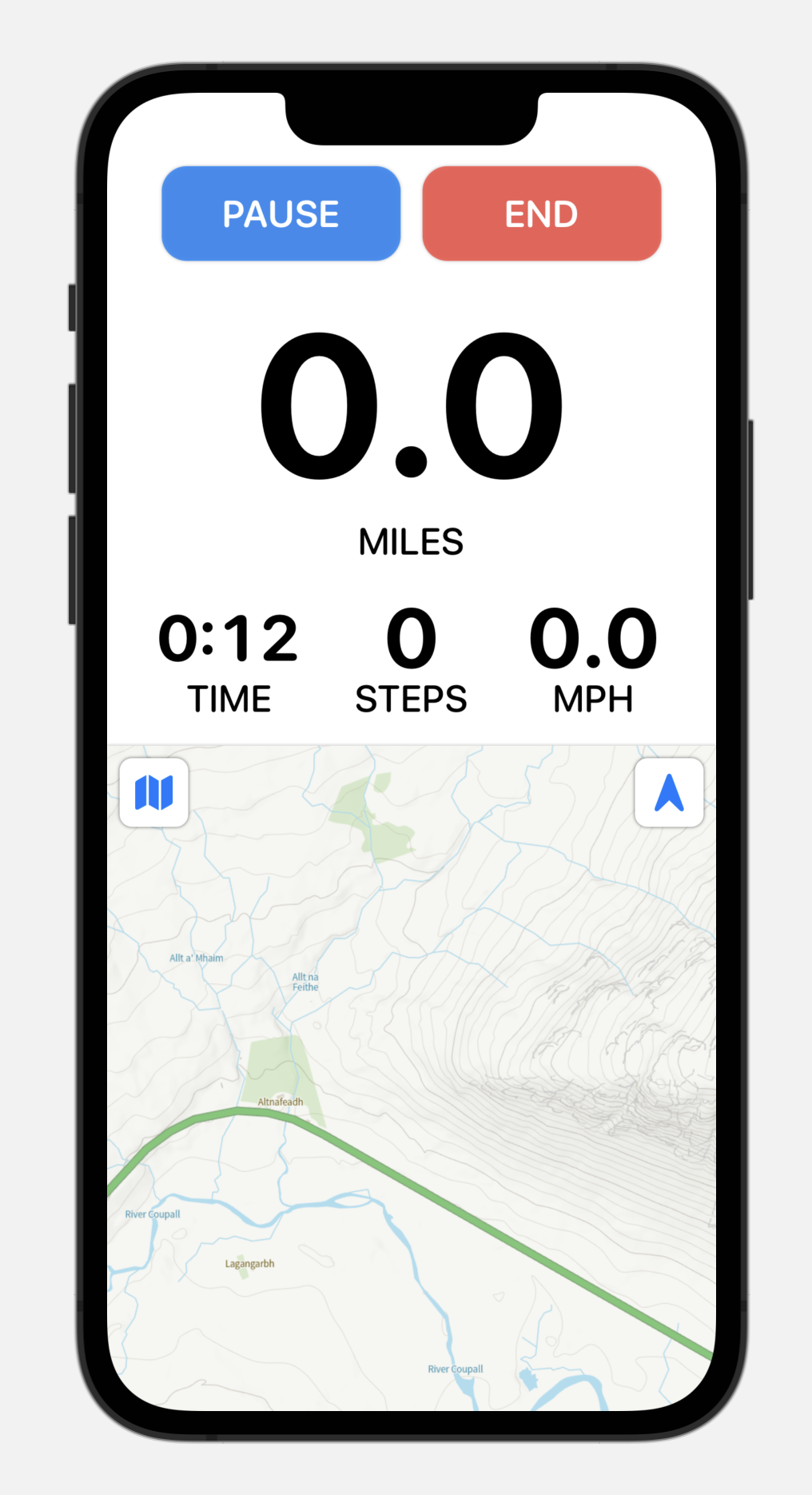
Hmm…I think this is better but it feels a bit unbalanced still. But I’ll run this this for a bit.
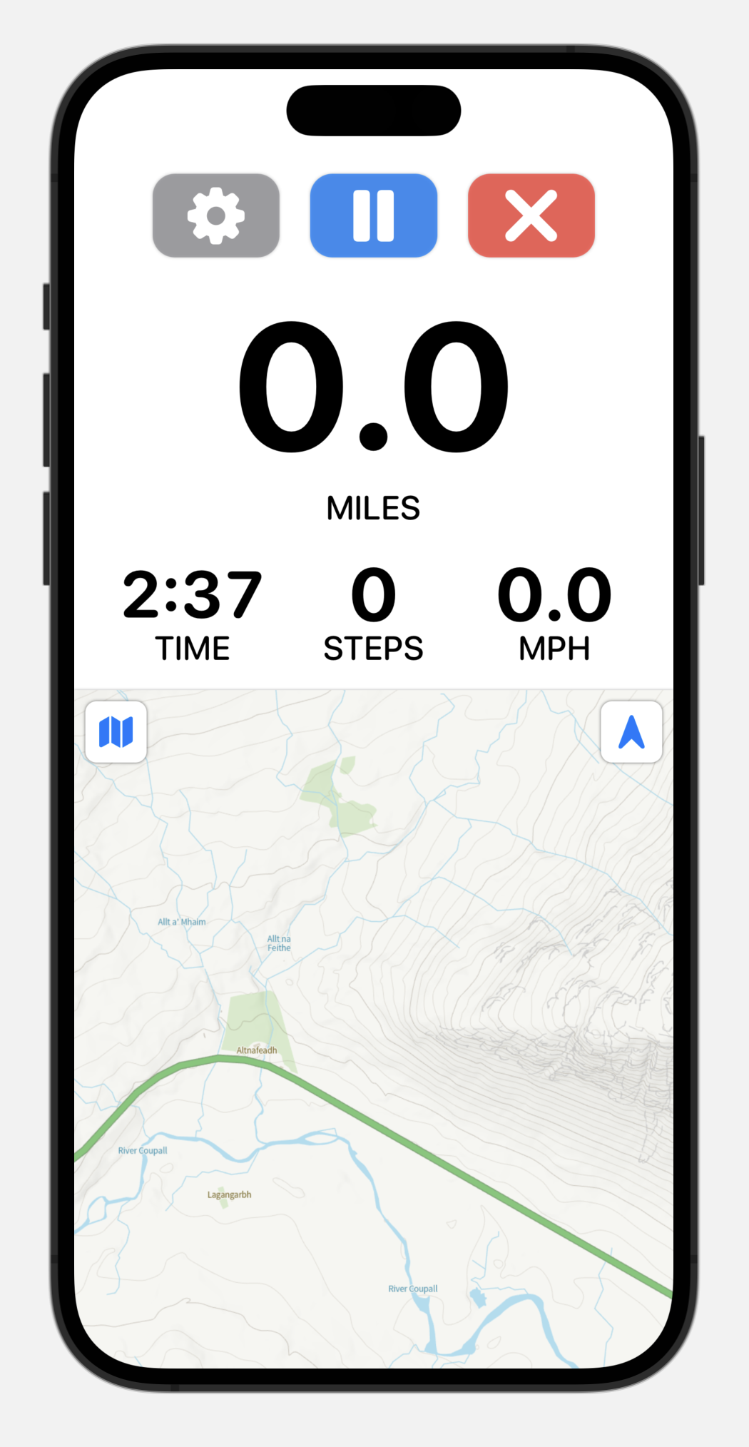
I think it looks more balanced with the buttons as images rather than words. But still not 100% happy with it.
9:46a Get zooming working for my custom map system
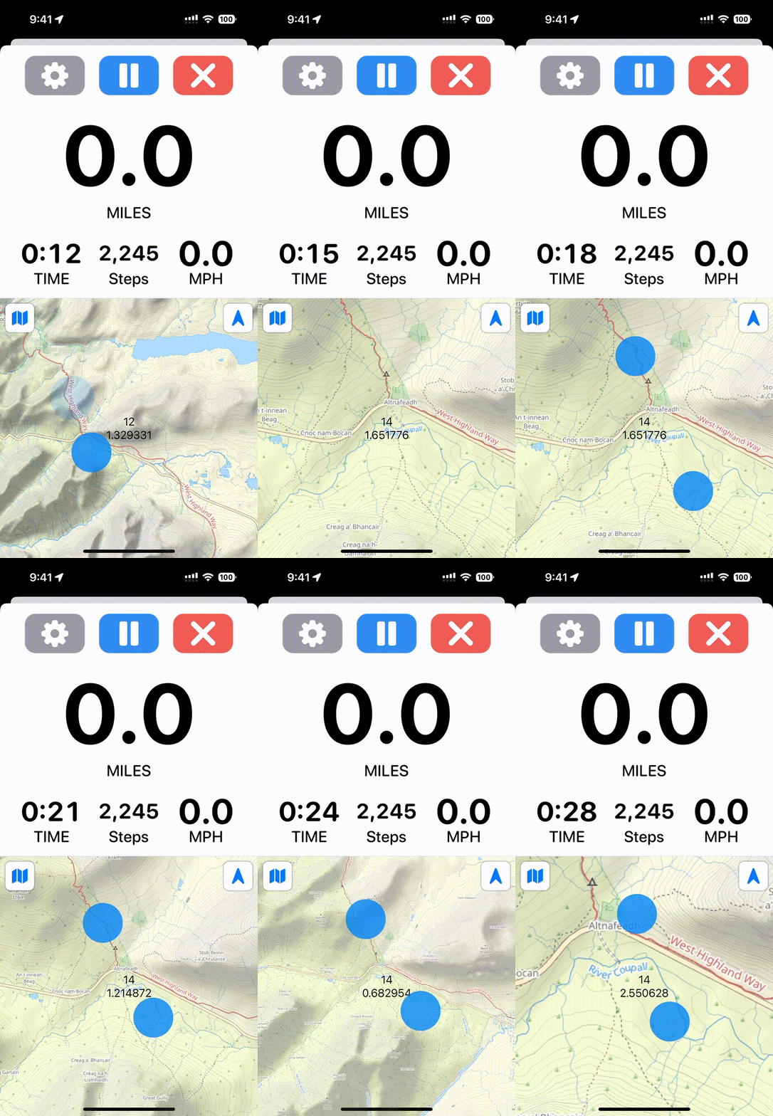
I have built out a completely custom mapping system. Originally this was for the Apple Watch but now it is also for the iPhone. On the watch I could do zooming with the Digital Crown, but now that it is running on an iPhone I also need to get pinch to zoom to work…which is a bit of a pain in SwiftUI.
This work is made much easier with the use of on device SwiftUI previews. Since gestures don’t really work well in the simulator.
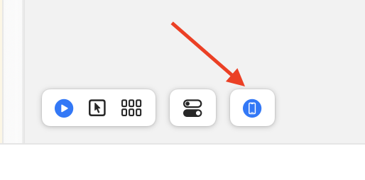
Phew, that was an adventure. You know it is a tricky problem when you end up with a notebook page full of math formulae at the end…but I got there in the end:
12:20p Working on being able to flip between Apple and Custom Maps
When working on GPS features I’m usually having the iOS simulator run in “City Run” mode, which simulates a route around Infinite Loop in Cupertino. Sometimes I wonder, who did this run originally? I believe this has been in the simulator since iPhone OS 2.0, way back in 2008.
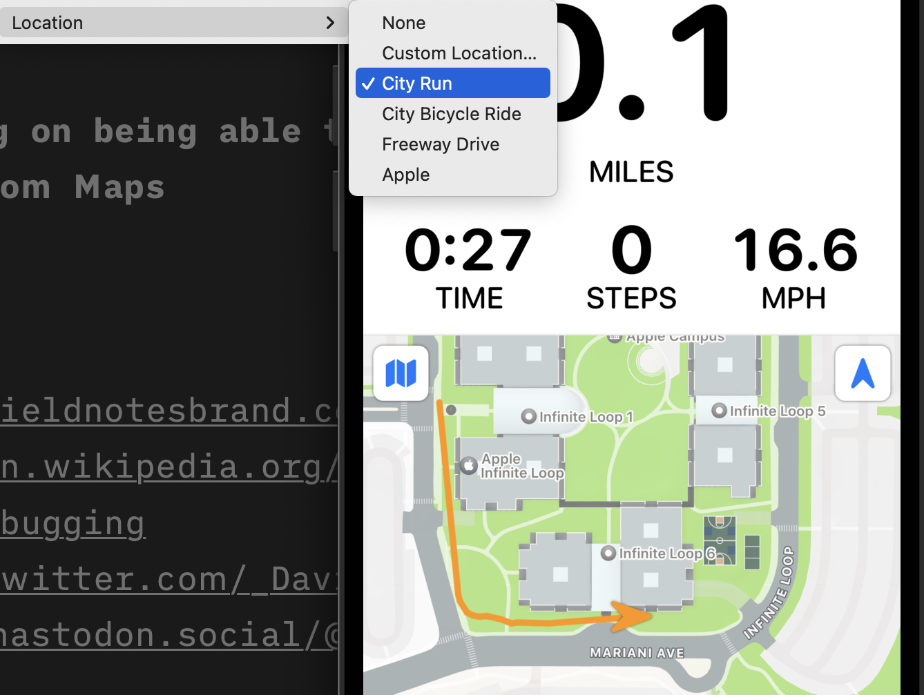
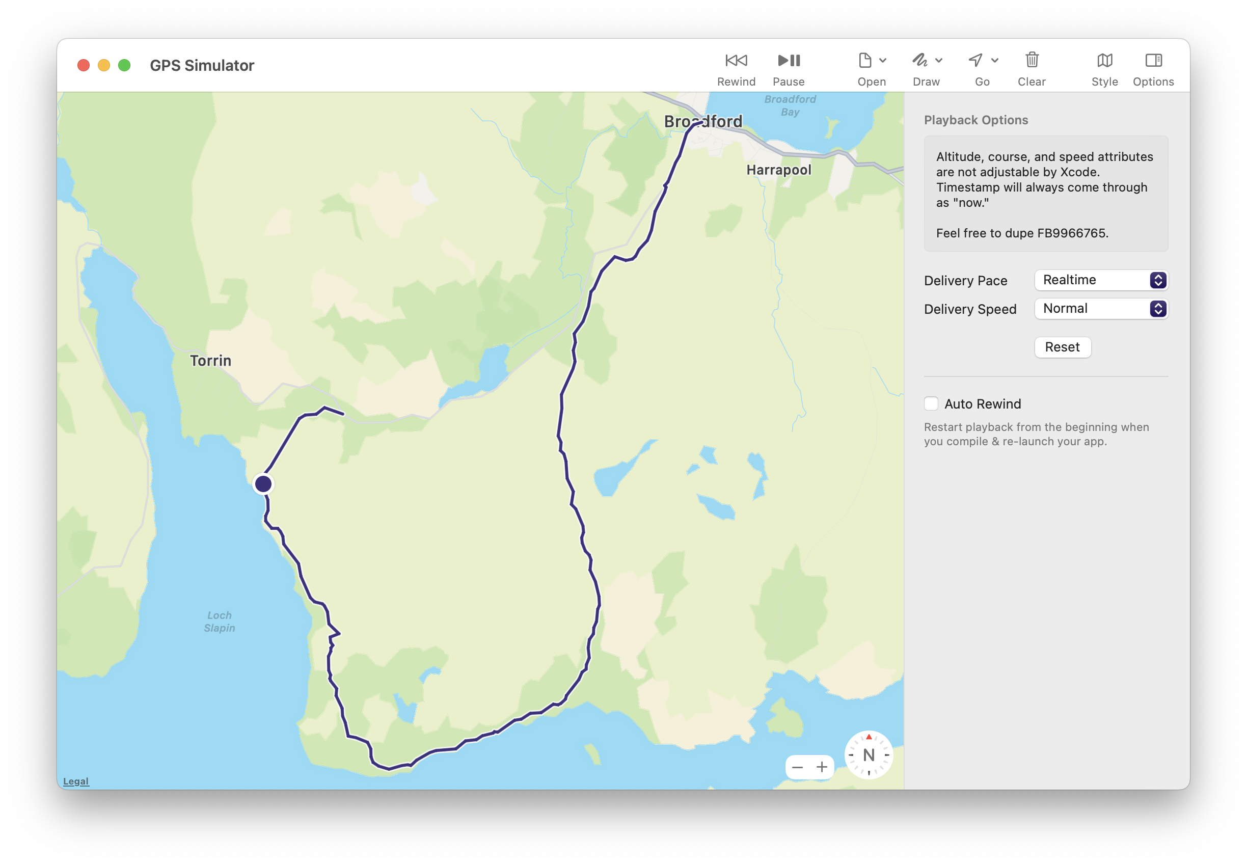
Probably a good time to mention the excellent Sim Genie tool by the legend himself, Curtis Herbert. This lets you replay GPX files to the simulator. Which I’ve found exceedingly useful for getting a variety of locations to test.
3:57p Initial Dynamic Type Stats
With the Widgetsmith release I published this morning I added data collection for Dynamic Type sizes. I want to understand which ones are most common to better adapt my designs. The fun thing about having an app with a wide audience is that I can pretty quickly get this data in.
Here is the result so far:
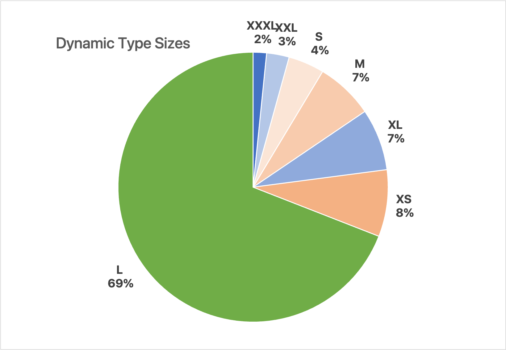
This overall matches what I’d have guessed, with a bit of a surprise that the Extra Small size is so popular.
4:36p Wrapping up
It has been a really productive day. Way more productive than I’ve been able to achieve in the last few weeks. Though of course I often can get a brief burst of productivity by changing anything. Working in a new location, working on a new project. The real trick is finding a change that sustains that productivity.
Will this one do that? No idea. But I’ll take the boost today either way.