5:35a Checking in with the new stats again
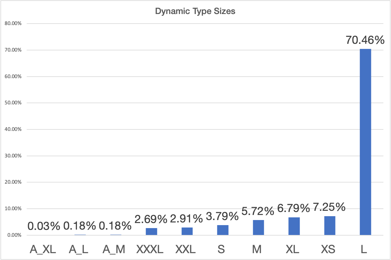
Now that I have a full day of data to look at I checked in with the Dynamic Type data. The funny thing is because of the Law of Large Numbers the result isn’t particularly different from when I has looking at a fractional day yesterday. With the exception of now having enough time to catch a few of the more rare Accessibility sizes.
It is a terrible habit I have, but I also check yesterday’s App Store sales every morning as one of the first things I do after I wake up. I got into this habit when I was early in my career as an indie and things were a bit tenuous. Even though the business has been stable for several years now, it is still something I do every day.
6:23a Tidying up the workout screen
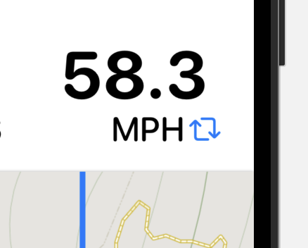
I thought about adding a button to the speed display to swap between pace and speed. But after playing around with it a bit I think it is worse that way. I’ll make it so that if you tap on it, the display will change. But put the ‘visible’ version of this in the workout settings page. I don’t mind hidden features as long as they aren’t only hidden.
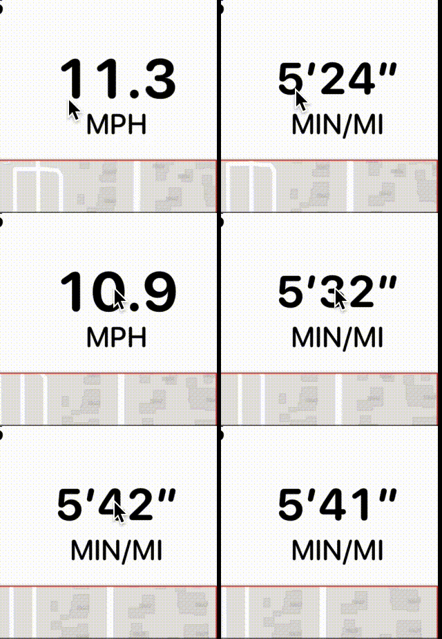
While trying to get this built I ran into one of the more frustrating aspects of SwiftUI work. Where a view’s hit box exceeds their visible bounds, making your button fail if you hit it in certain corners. In this case the map view was blocking the bottom of the speed label. The trick was adding a .contentShape(Rectangle()) to the map to constrain its hit testing.
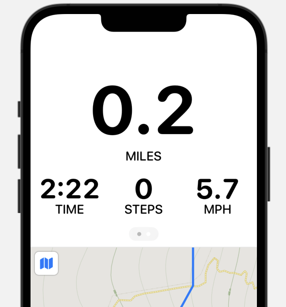
I tried out mirroring the Apple Watch Workout app layout where you have a swiped page view with the controls on the other side, but I think I like that less. Visually it is better, but it feels really weird on a screen that is so large.
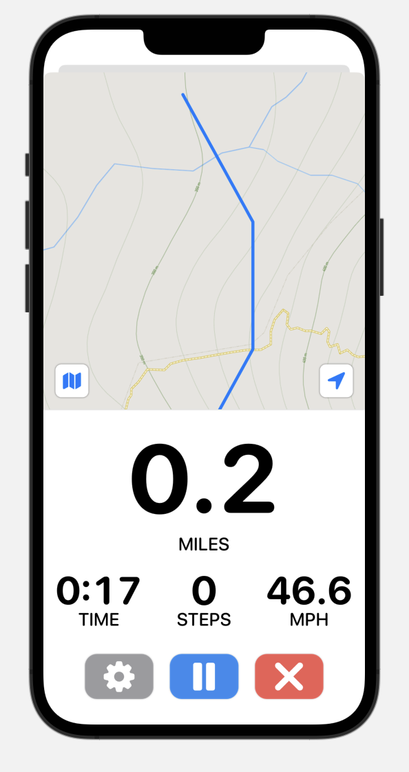
While trying out putting the map on top, I also realized that I need to change my SwiftUI preview to put the workout view into a modal sheet. This is how it will be displayed in the app and if I don’t then many of the designs may look better than they actually would on device.
Tried making the map HUGE.
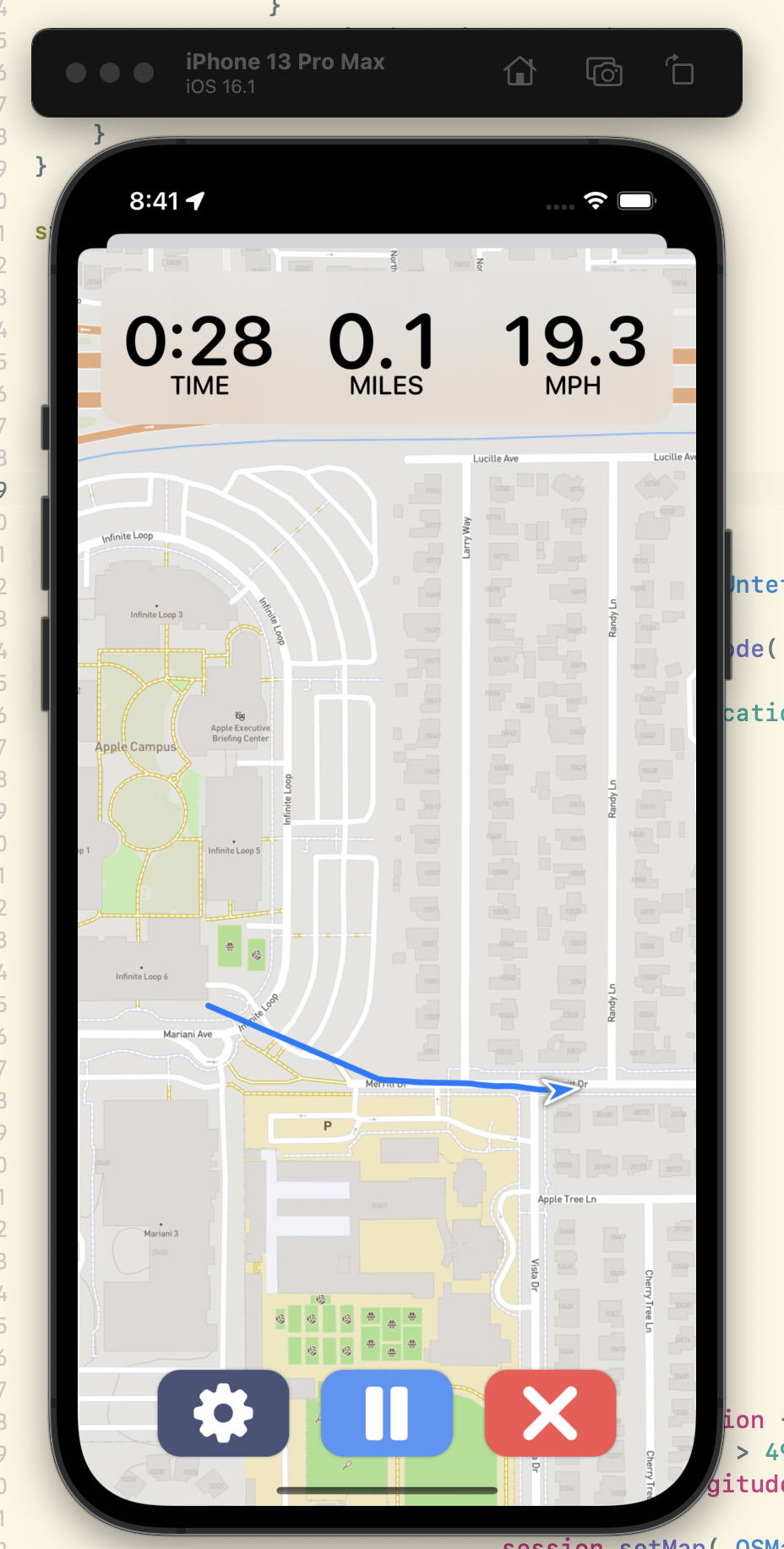
Now we’re talking. Let’s try to make the map the star and just overlay the metrics/buttons on top of that.
1:47p Time to start on the Trends Tab
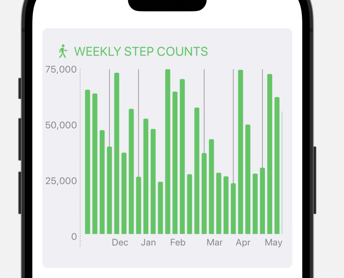
To start with I’m going to just throw some basic charts in here but hopefully get a baseline from which I can then get going with later.
What’s really tricky here is that I want to display graphical data…which means using Charts. I’d love to use Swift Charts, but those only work on iOS 16+. Currently iOS 16 is around 50% of Pedometer++’s user base, so that’s not great, unless I only show the Trends tab on iOS 16.
Right now that is what I’m tempted by and then to build a super basic version for users running old versions. One of the main goals of this update is to modernize the app, so getting stuck on something old seems counter productive.
Using a framework the first year it is out is always a bit perilous. I just spent a good hour trying to work out how to pin the axis to the side of a scrolling chart view. As best I can tell this isn’t a first class behavior. I got something working…but you know it might actually be simpler to just roll my own charts for this if I hit a bunch more limitations like that.
