Snow Day Morning

We had our first snow of the season, so of course I had to skive off work for the morning and go sledding with my kids.
It is absolutely one of the best parts of being self employed that I can choose to do that.
One way, though, that I can pretend that this was work related is that I ran a Pedometer++ iPhone tracked workout the entire time “testing” it out. Tracking a sledding expedition involves a ton of waiting around in one place to take videos.

So now I have a great dataset to build an automatic pausing algorithm that detects when you aren’t actually walking anymore and can automatically clean up your data and pause your workout for you.
Continuing Education
Whenever there is a new Hacking with Swift video out I typically will spend a little while watching it to see what I can learn. Often I won’t watch the whole thing, and jump around a bit as makes sense for my interest and mood, but I always learn something new.
Today’s video walked through making a Sudoku app. I learned:
- About the existence of the
defaultparameter you can pass to a Swift dictionary. I had no idea you could do that to avoid having to use optionals there. - About the
.dynamicTypeSizemodifier in SwiftUI to limit the size supported by a view, and the corresponding.accessibilityShowsLargeContentViewer()modifier we can use to display content super large.
2023 Monthly Achievements
While I’m knee deep into the next major update to Pedometer++, that doesn’t mean that I can completely ignore the version currently on the store.
Every year I add a set of Monthly Achievements to Pedometer++. Little goals to hopefully provide extra motivation for my users and help them walk more. I need to get these added into the app prior to January 1st so that they appear correctly on New Years Day. So I’m taking a break today from version 5.0 work to get these built out.
The first question I have to decide on is the color for them. Each year has its own unique color scheme:
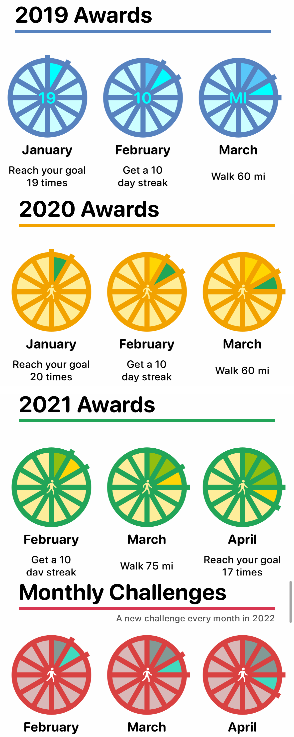
- 2019 - Bluish
- 2020 - Orange/Yellow
- 2021 - Green/Yellow
- 2022 - Red/Blue
The most obvious place to start is with Purple as the main color for 2023. I haven’t done anything in that side of the rainbow yet. So let’s start there.
Here is my first attempt:
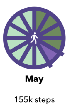
The purple is pretty good, but the green isn’t right at all.
Let’s try fix that:
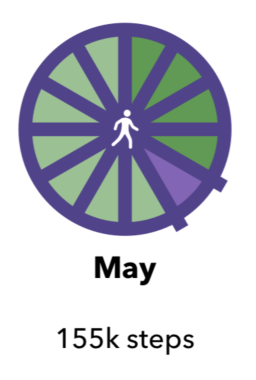
Much better, but the current month wedge is a bit boring.
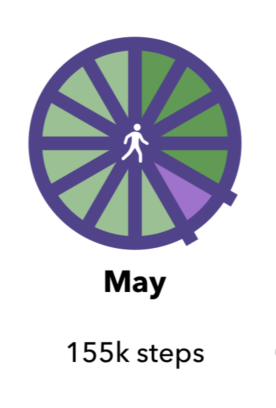
Brighten it up a bit, and I think we are there. At least for the start to build against.
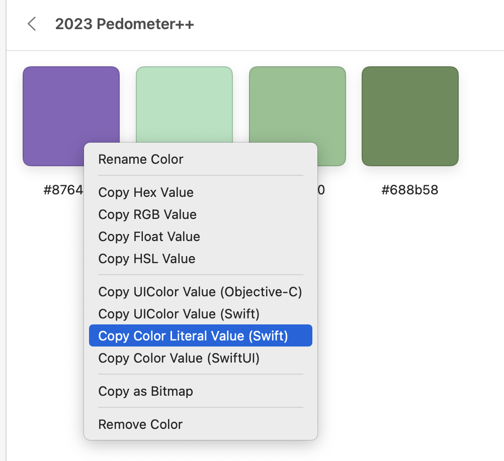
Probably worth saying that I’m building these color schemes using Steven Troughton-Smith’s truly excellent app, Pastel. Which lets you build out color schemes and organize them together. And then the killer feature is being able to export the colors directly into code:
The weirdest part of doing work on the old version of the app is having to interact with it after getting so used to the new one. This just looks strange to me now:
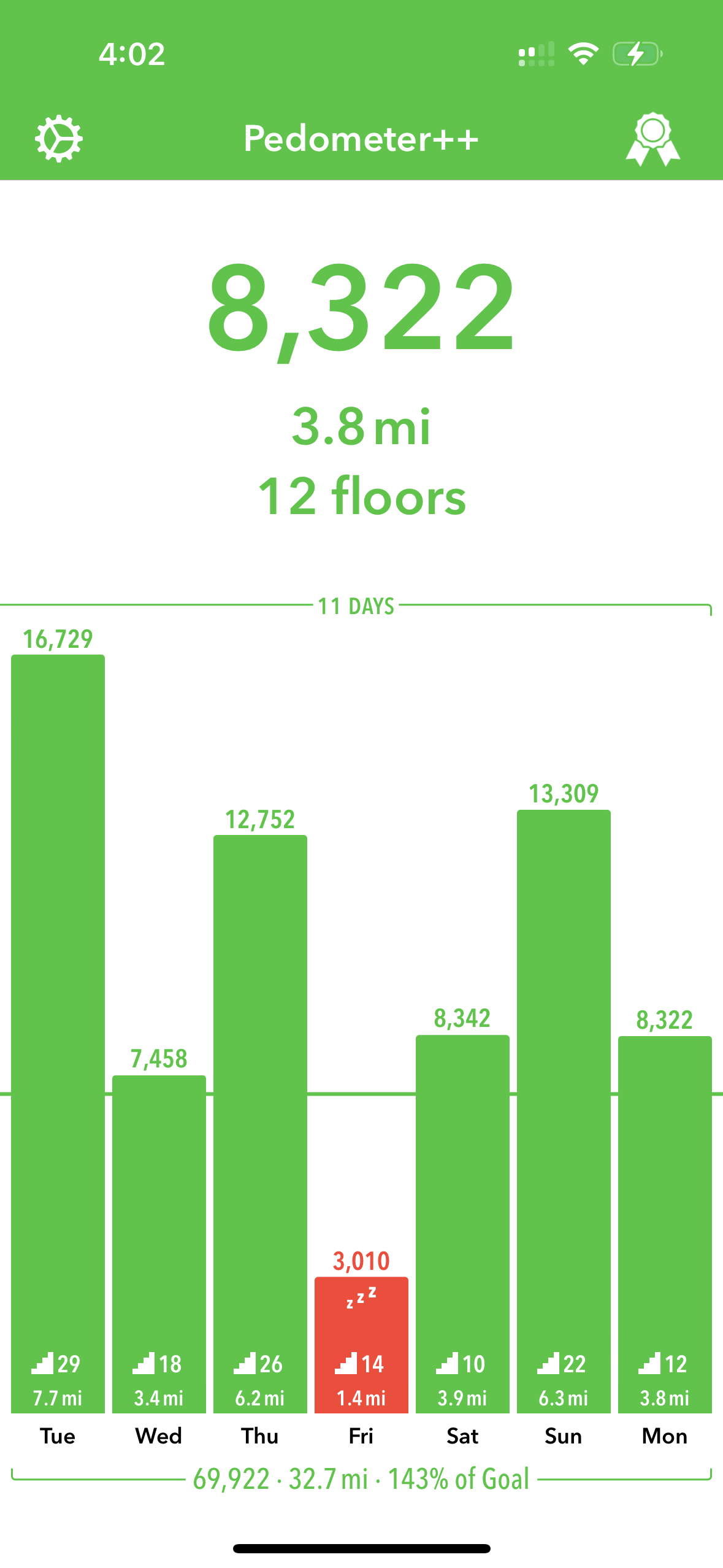
Which I suppose is a good sign, rather than going back to the old way and thinking it was amazing.