Continuing Education, Ask Apple
Yesterday Apple began another week of their Ask Apple event, where they do several days of Q&As in a hosted Slack.
Because I’m in the GMT timezone right now these typically are occurring while I’m asleep so unless I have a specific question I need to ask (and will stay up to ask it) I catch up with them each morning. Yesterday’s topics of interest to me were SwiftUI and HealthKit. I don’t think we are supposed to post screenshots/quotes from them, but here are a few high level things I learned (I’d recommend signing up for them if you haven’t already to read through yourself).
- There was a great overview of using the new navigationDestination method with an enum to get better control over where your navigation stack is pointing to
- That creating an
HKAnchoredObjectQuerywill begin streaming Heart Rate samples on watchOS, which would be useful for ‘warming up’ the heart rate sensor right before starting a workout so that data is present when they begin the workout properly.
Tonight is the ActivityKit Lab so I’ll be staying up for that one in person.
Widgetsmith Winter Themes
Similar to yesterday’s need to build out the year-end Pedometer++ update, I also need to build the Widgetsmith winter theme update.
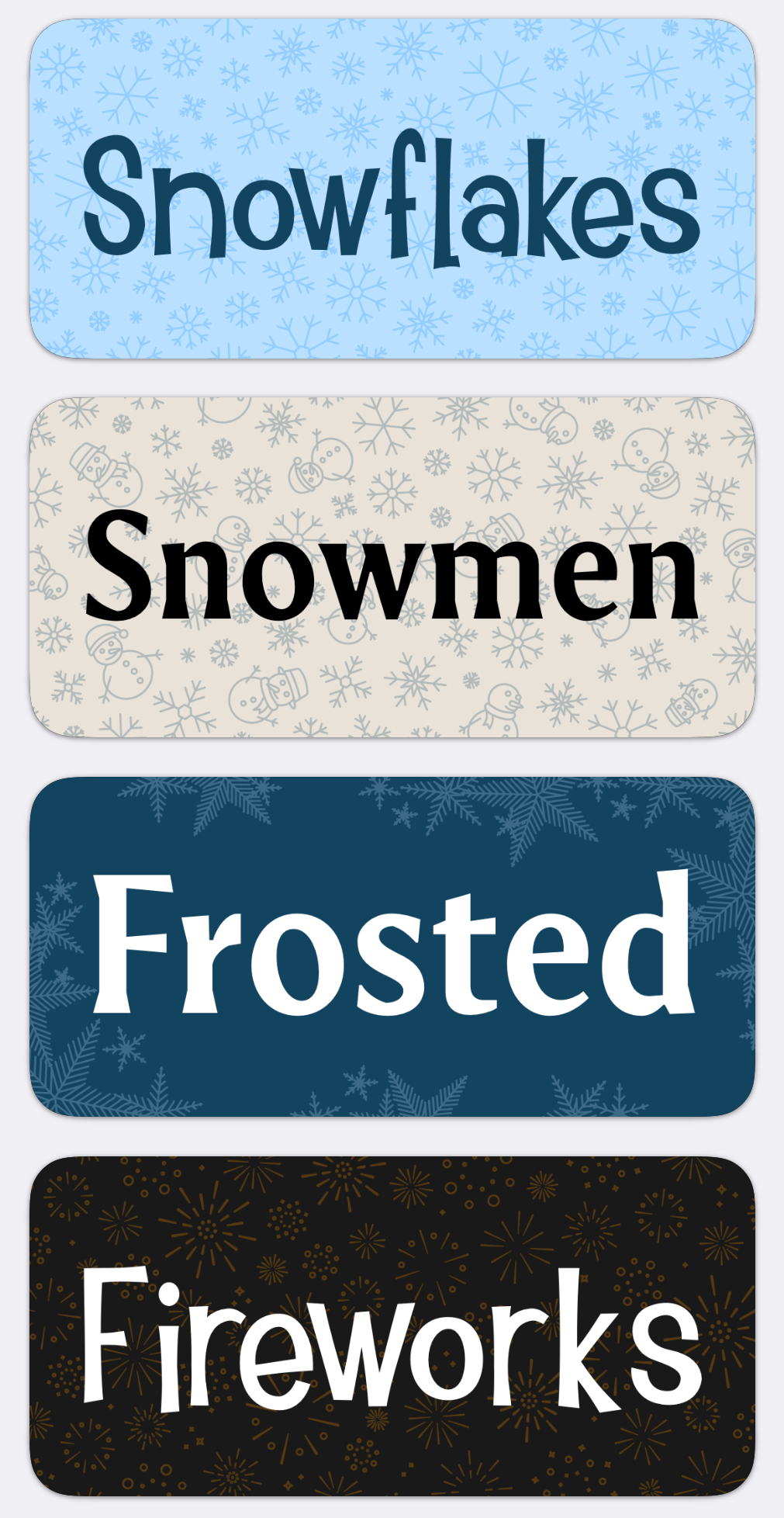
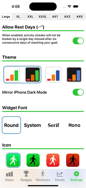
This update adds a couple of new themes. One with fireworks for New Years and then three with frosted/wintery themes for January/February.
I actually worked on these themes back a while ago but needed to wait until now to ship them. So this work was more a matter of doing the final integration work and testing them on device.
A better Tab Bar
While it might sound a bit weird to say, something that has always bothered me in my work is that the iOS tab bar doesn’t scale with Dynamic Type. It turns on the Large Content viewer for large sizes, but otherwise it doesn’t seem to make an effort to adapt to users who prefer larger sizes.
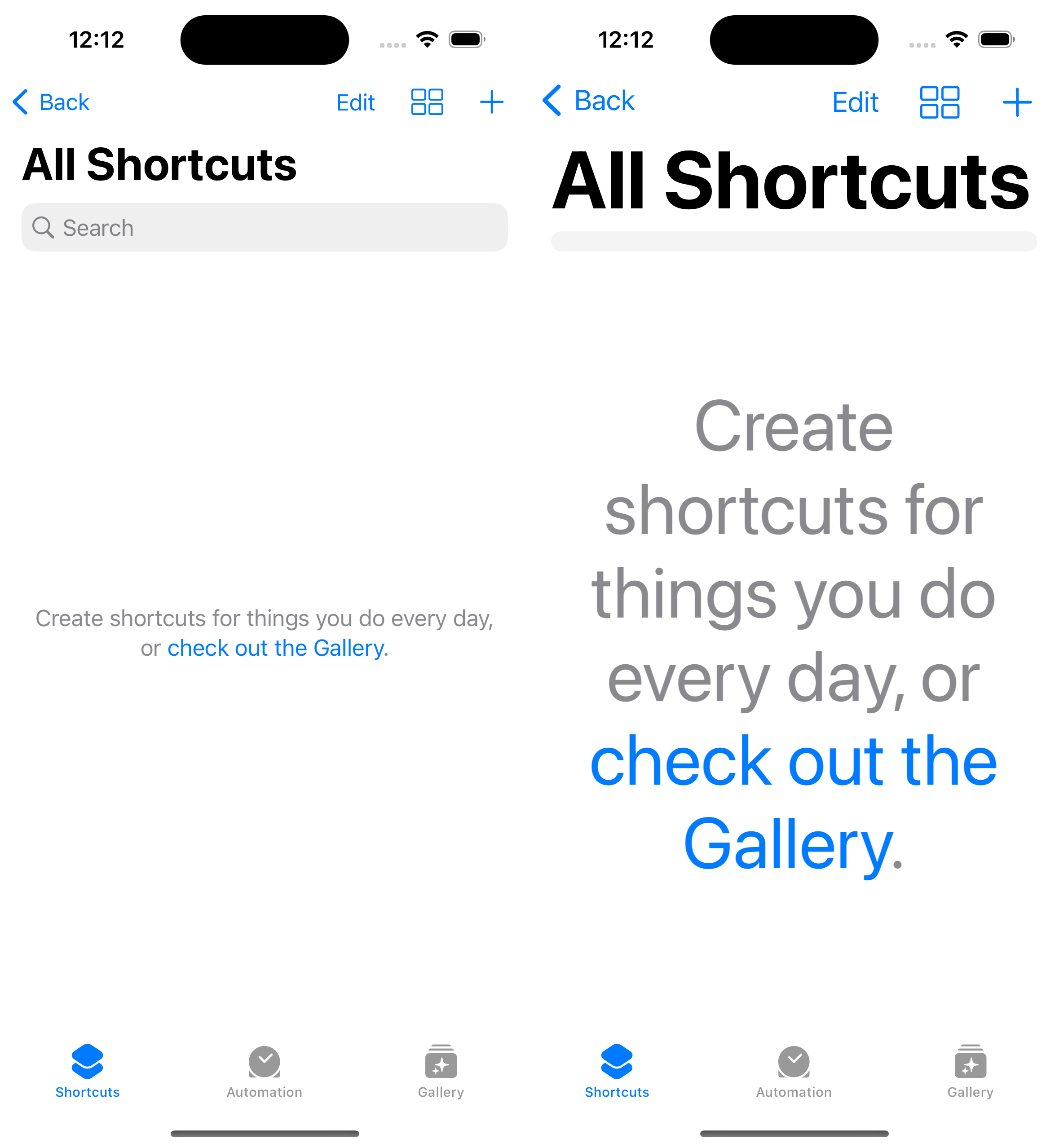
So I’m going to spend the afternoon trying to see what I can do about that and potentially build a more accessible tab bar for my Pedometer++ update.
Sidebar: Baking in Accessibility
Being a ‘good citizen’ with regards to accessibility on iOS is generally something that Apple has made pretty straightforward. The built-in controls and methods tend to do a good job and with a little bit of work to set the appropriate strings you’ll end up with a quite serviceable result.
However, something I’ve noticed is that taking a retrospective approach to accessibility where you work on it at end of a design can lead to situations where you can’t get a good, accessible result.
Some Accessibility relies on it being a part of the design consideration the entire time you worked on it. Or maybe put another way, there are some designs that cannot ultimately be made accessible. So if you happen to head down the path of one of those you’ll end up stuck at the end of it.
So I try to check-in periodically during my design process to make sure that I’m not on one of these un-accessible paths. Making sure that I’m not making something that looks cool, but can’t easily be adapted to differing user needs.
This has taken a long time and the experience of walking down those paths enough to get here, it isn’t easy to do. The flashy and shiny parts of design easily take over, but I don’t want to ship something that isn’t good for all my users…and if I don’t consider it early enough sometimes I will feel like I don’t have a choice because I’ve reached a deadline and need to ship something.
A better Tab Bar
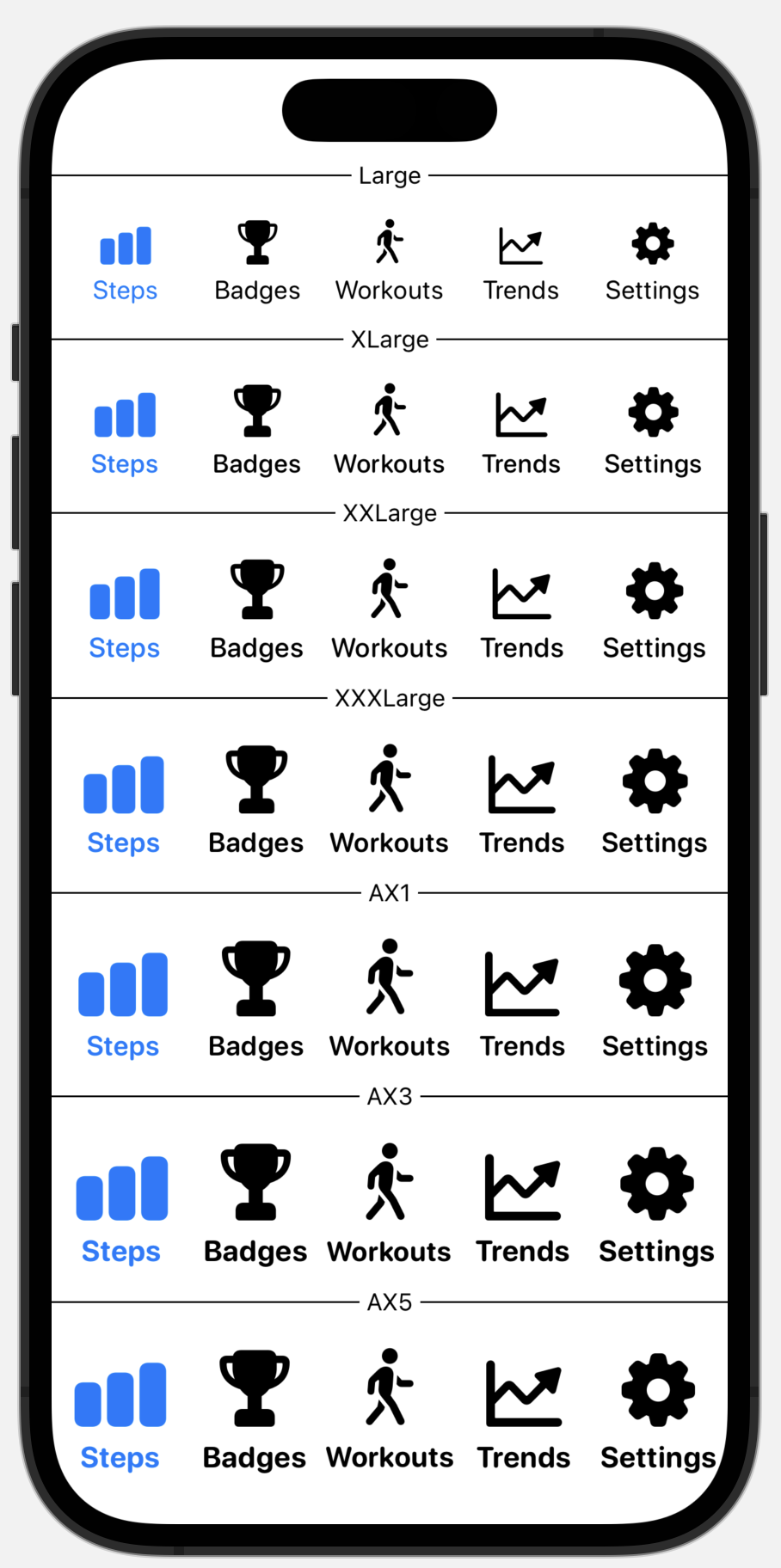
Here is my first pass at a more accessible Tab Bar. I want to make the text and images larger and more bold as sizes increases.
I realize that it is rather arrogant of me to assume that I can do better than Apple’s built-in control here. They have large teams of folks committed to building and improving the accessibility of their tools. But still, I just can’t help but think that their approach is leaving some users in a worse spot than they could be.
The justification that I’m at least telling myself for now is that they have to build a flexible, multi-purpose system that can apply to any app. So they are limited in what they can reasonably do. For example, they may have a requirement to keep the height of the tab bar fixed, whereas I can make it whatever size I want. I hope that’s the case and I’m not just missing something fundamental here. (😱)
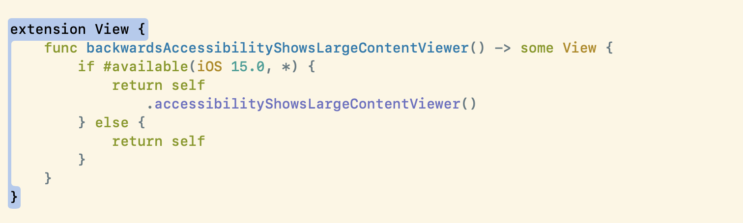
Astute readers will remember that yesterday I discovered the accessibilityShowsLargeContentViewer modifier in a Hacking with Swift video. Well, today I got to put it to use in this so that on large accessibility sizes you can long press on the tab buttons to see a giant preview.
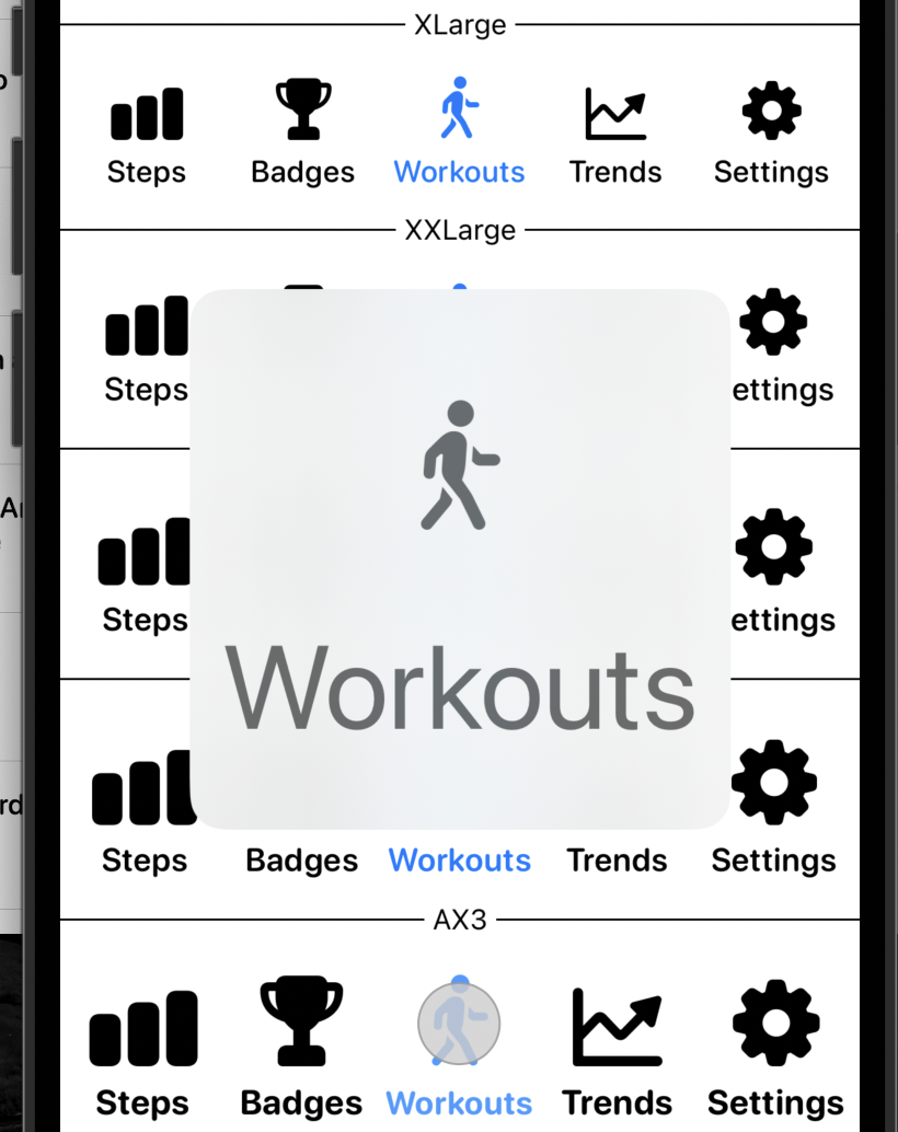
Also, I had to employ one of my “dirty little tricks” in SwiftUI development to use it. That modifier is only available in iOS 15+ and I support 14+…so I want to apply it without messing up my view graph horribly. So I wrote a little View extension that lets me use it whenever it is available.
Another benefit of this approach is that I can use that sweet, sweet blur Apple has added in recent years as the background for my tab view. I love the way this looks. But I can also drop it in favor of a more super legible black on white color scheme for the Accessibility sizes.
This gif is also a good example of something I will frequently do while building: add a bit of debug UI to the top of the screen. In this case I added a segment controller that lets me override the dynamic size shown in the tab bar so that I can try it out easily.
Prep for tonight’s Live Activity Q&A
I wrapped up my day by submitting my questions for tonight’s Live Activity Q&A. I had four questions I wanted to ask. I figure it is best to put these into the system early so that the relevant evangelists and engineers can have plenty of time to look them over and hopefully answer them. I’m sure there are tons of questions they have to sort though so getting it in early might make it more likely it gets seen.