Design Review
Late last night I had an excellent design review as part of the Ask Apple event. I think the contents of the review are supposed to be confidential but I will say that I got a lot of really great feedback about my update and have a delightful mountain of notes to work through to explore the ideas we came up with.
Formalizing this Diary
I’ve added a section to my website to aggregate all these Design Notes Diary posts. It will be available at https://david-smith.org/dnd. I also kinda love that that the acronym for this series is DND. Which has a bit of a “hey Do Not Disturb me, I’m trying to get some work done” vibe.
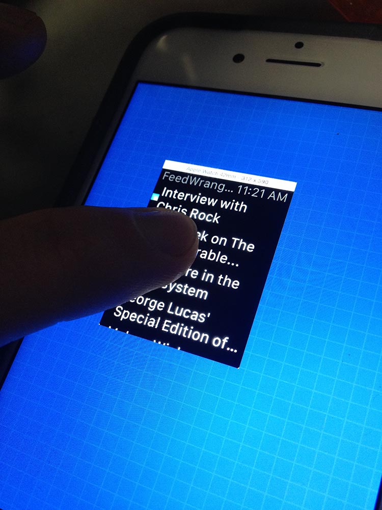
Also I was reminded of a series I did back in 2014 when the Apple Watch was first announced called As I Learn WatchKit where I documented my journey of becoming an Apple Watch developer. That is quite a thing to now go back and look at and includes some lovely little gems, like this rather hilarious approach I took to visualize the apps before the physical hardware shipped.
Seeing memories like this has given me a little boost in my intention to keep this diary going for a bit. So often my work is entirely ephemeral, I make something, I ship it, and then move on. The journey is completely discarded at the expense of the outcome. I think my future self will appreciate my current self taking the time to write things down now, to remember later.
Putting those design ideas into action
So I’ve spent the rest of today trying to build out as many ideas and thoughts I have after my design review. While the ideas and motivations are fresh and the excitement from them keen.
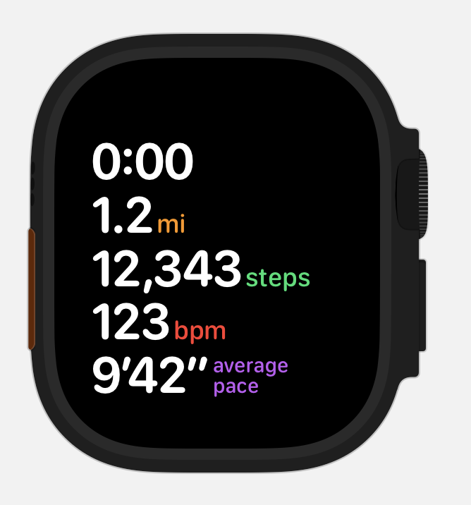
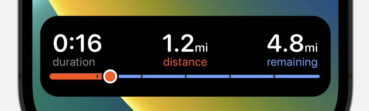
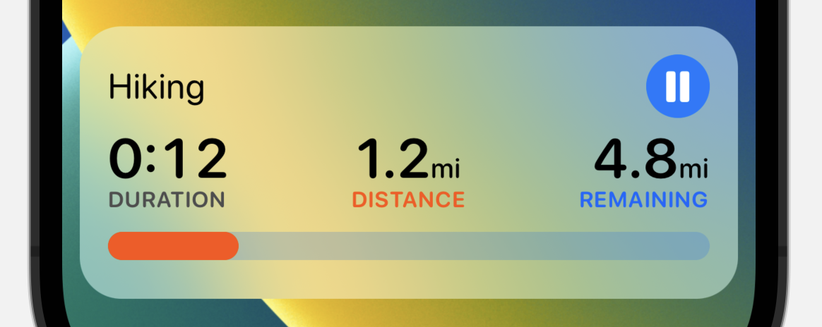
The first idea I have is to go back to a metrics oriented view but try to land on a super clean, minimal visual for it. Something with lots of consistency between the Dynamic Island, Live Activity and main app.
This is where I landed:
Next was some exploration of an alternative “route based” activity for when you are following a GPX file or walking a desired goal distance. Rather than showing a map here, I’m trying to instead show something more immediately glanceable. So here is the distance remaining as a graph bar, very reminiscent of the location marker on the map view for consistency.
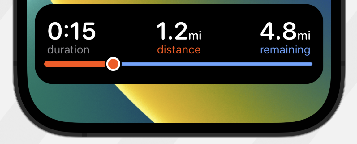
Possibly with mile markers along the bar?
I’m thinking I’ll end up with a variety of live activity configurations that the user can choose between with some smart defaults for different activity types.
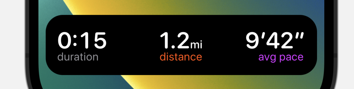
So for something more like running maybe something very paired down but showing pace as well instead of steps.
One thing I’ve been realizing recently is that often I have this desire to make things that are “unique”, which put my own “new” spin on things. While that there is probably some value in doing that I also am more and more convinced that often that is actually counter productive and I should just embrace the defaults.
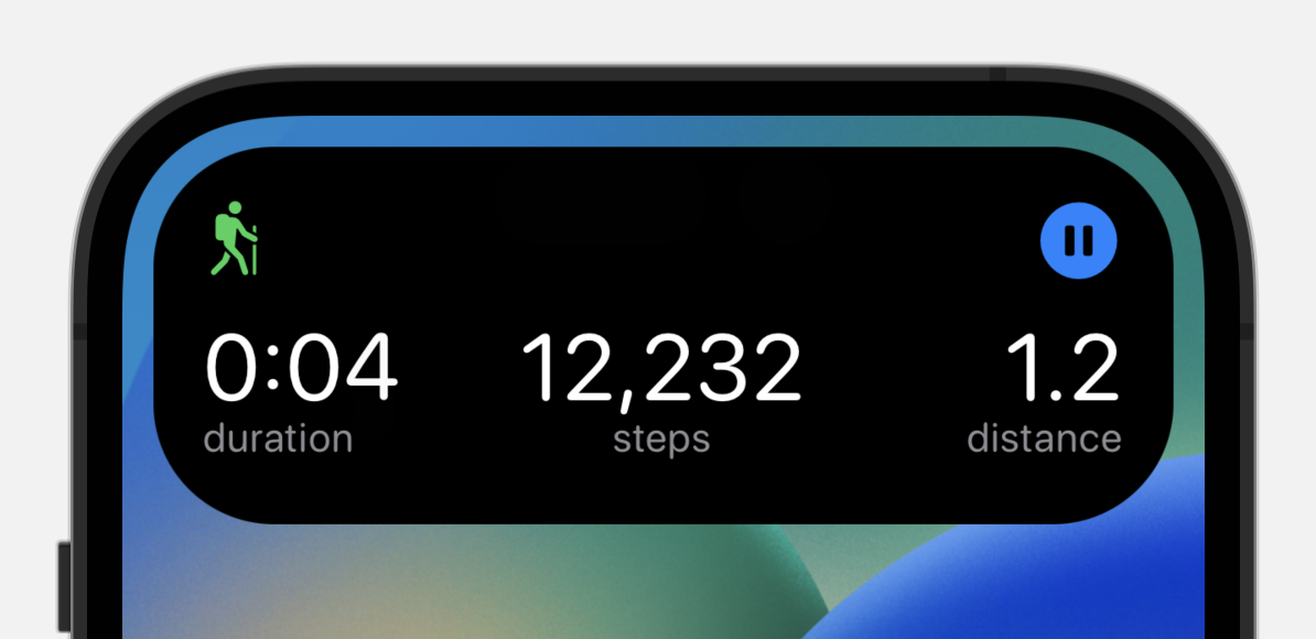
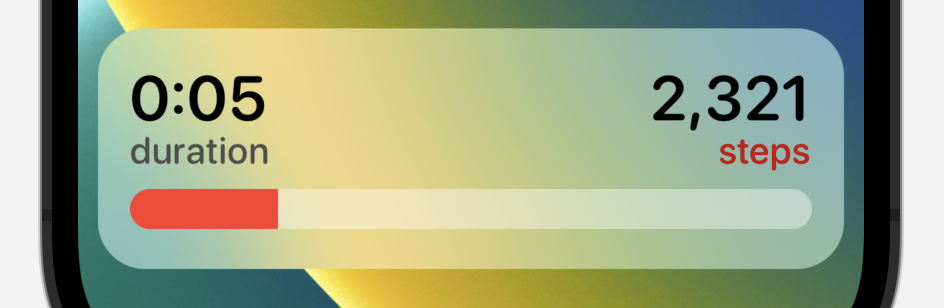
So I then did a few layouts with the default view background of frosted glass. I had been using black to be consistent with the Dynamic Island but I think that consistency isn’t actually that useful here.
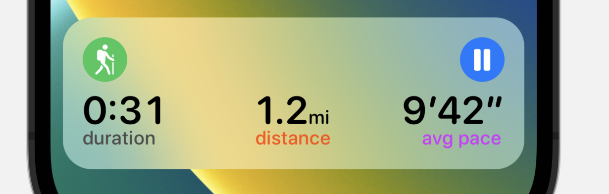
The biggest challenge with the frosted look is making the text legible. I found I really needed to boost up the font weights and darken the colors to make sure things can be seen well.
I also experimented with using capital letters for the subtitles, but I’m growing kinda fond of the all lowercase look so for now I think I’ll stick with that instead.
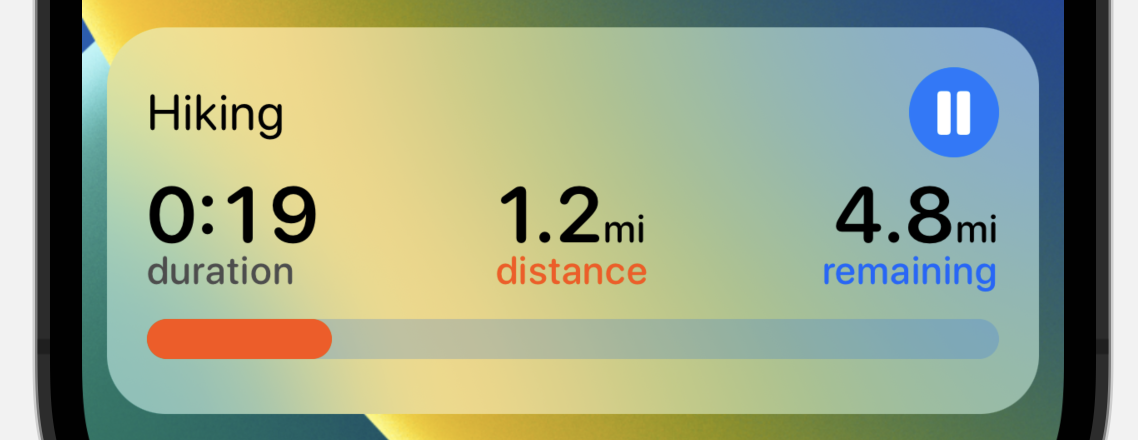
I think the horizontal bar metaphor would also apply well for just a step goal graph view. For the kind of walk where your intention and desire is to reach your daily step goal.
This “design language” (I feel like an imposter using that phrase) also seems to lend itself well for application on the Apple Watch where I could get a similar looking view to the Dynamic Island during workouts.