A Brief Aside: iPhone 14 Plus Adoption
I’ve been hearing a number of reports that the iPhone 14 Plus wasn’t selling particularly well and so I was curious to see how that aligned my with actual users.
So I took a look at the stats from Widgetsmith. These are the percentage of overall users yesterday.
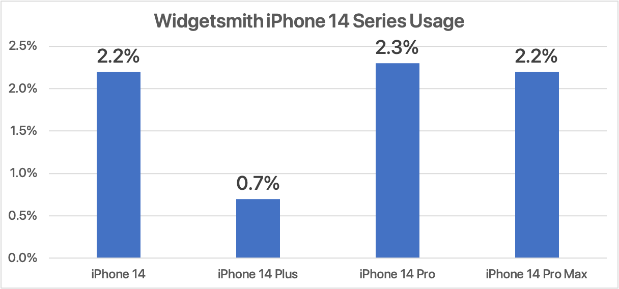
The Plus is definitely a bit of a laggard against the other iPhones of the same generation. With the standard 14 out selling the Plus by about 3-to-1. Now there are all kinds of confounding variables here, with supply chain issues, release timing, etc…but as I’m not a financial analyst that doesn’t matter too much to me. I’m just curious to see if the reports seem true-ish.
Out of curiosity I also pulled the data for the iPhone 13 series, and for consistency sake for the same day but one year ago.
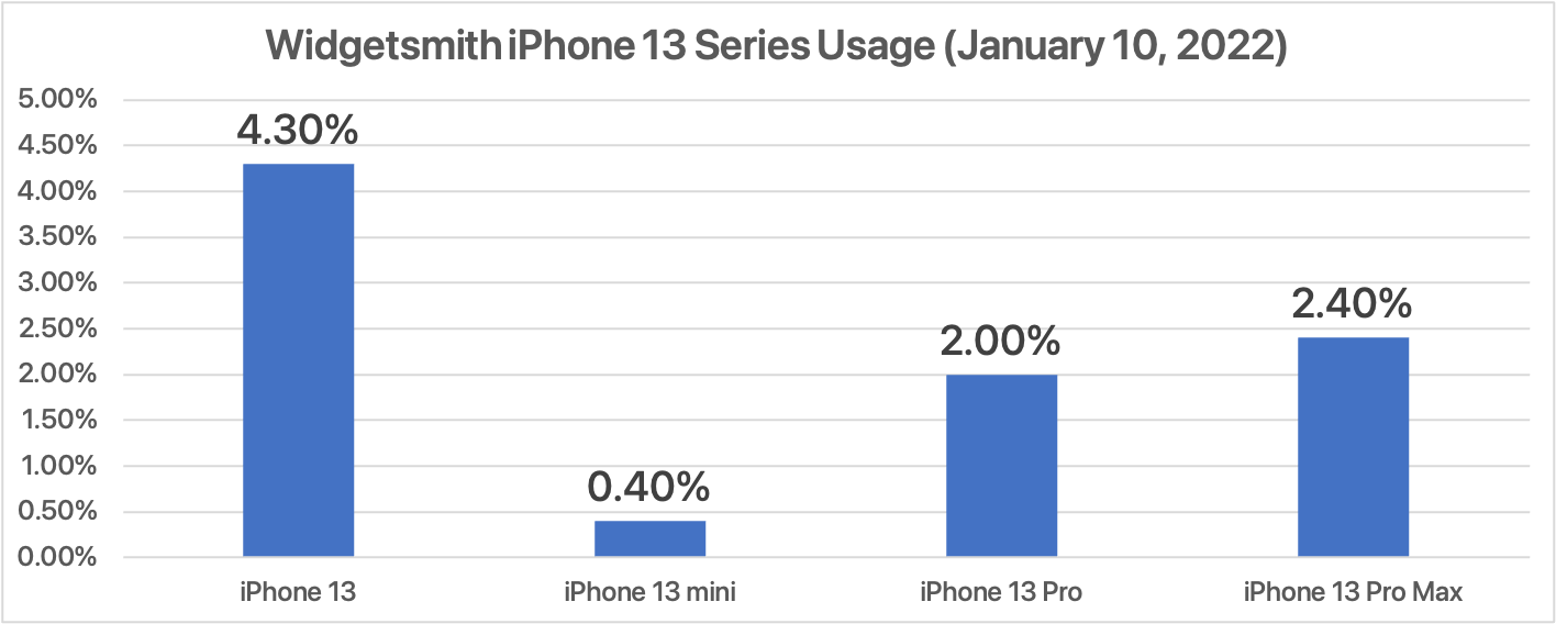
There are of course lots of things which make this data different than the iPhone 14 data, but I’m most interested in the comparative ratio. At this point last year the mini was outsold but the standard iPhone 13 by a ratio of 9-to-1.
So the Plus is around 3x more popular on a relative basis, compared the to mini. Though it still lags behind the rest in a meaningful way.
Warming up with Sleep++ Readiness Graphs
Very often when I first come back to programming after a while off, I find it very difficult to get back started right away. In much the same way as when you exercise you shouldn’t start running without first warming up, I find the same is true here. So rather than trying to tackle some super challenging design feature, instead I start with something straightforward and doable in a day.
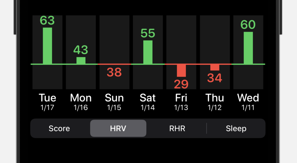
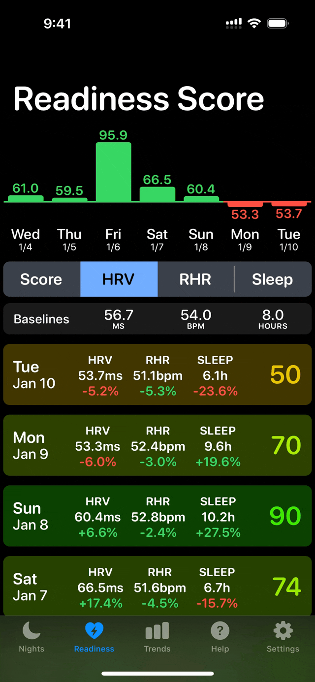
Today I decided that I wanted to expand the graph view in Sleep++ to include detail charts for each of the three readiness metrics: HRV, RHR and Sleep Duration.
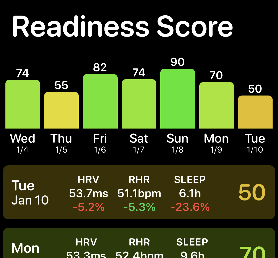
Right now the top graph looks like this. With your readiness score shown for the last seven days.
What I want to do is add individual graphs for Heart Rate Variability(HRV), Resting Heart Rate(RHR), and Sleep Duration(Sleep). What is interesting about this dataset is that each of the values is analyzed on the basis of its deviation from a baseline value (rather than an absolute range). So I’d love to show this by plotting the values relative to the baseline value.
At first I thought I’d try doing a graphical layout for this that uses something similar to a candlestick chart. Where each value is shown as a line moving away from the baseline line.
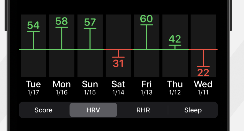
This works, but I think isn’t visually very rich and I think feels a bit “thin”. So next I tried moving this to a bar graph with the baseline as the x-axis. That worked much better and fit well with the main chart which is a bar chart already.
To start with I used the standard segmented control to flip between the display metrics. But I find that this has very limited configurability and so instead opted to build a custom one that lets me make the control stand out visually.
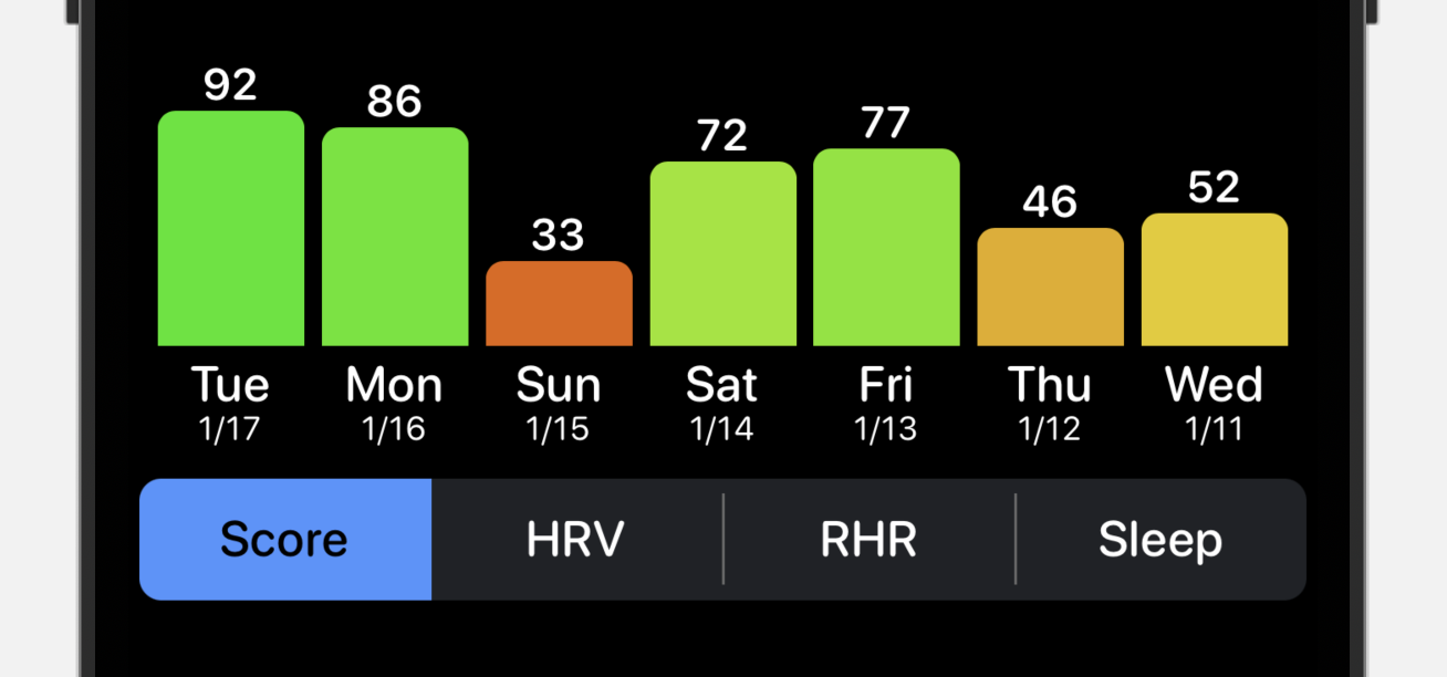
Next up was making this animate properly between the different charts. Because I ended up on a bar chart style view for each of them, I could then use the SwiftUI animation system to seamlessly move between graphs. This gives a nice visual effect and also I think helps with emphasizing the relationship between the different metrics on a particular day.
Making the charts Accessible
Next up was adding support for Audio Graph support to these newly created charts. Audio Graphs are a way to describe numerical data to VoiceOver in such a way that it can convert a chart into a spoken description. This is a perfect opportunity to try this feature out.
The implementation for this was pretty straightforward. I followed this excellent guide on Swift with Majid, which walked me through the basics and got it into a working condition. From there it was mostly a question of getting the values to update correctly when different segments are selected (the updateChartDescriptor method was key).
You can listen to this in action in the following video. Make sure you have volume turned on to hear VoiceOver in action.
Tip for Accessibility Work
Something I often find helpful when doing VoiceOver work is to enable VoiceOver as my “Accessibility Shortcut”.
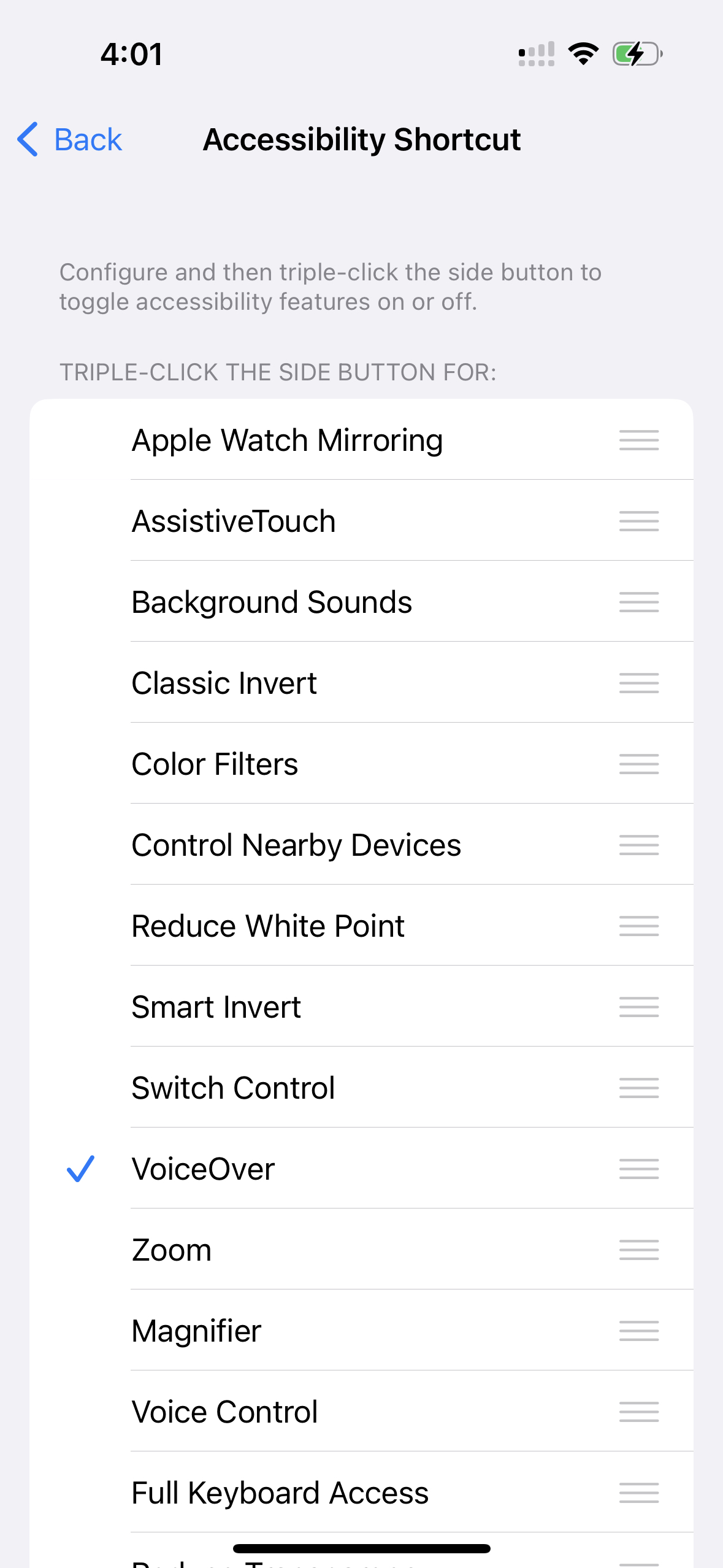
This lets me swap between VoiceOver on-and-off, without leaving the app. Just triple tap the lock button. This is great for testing a feature in standard and VoiceOver states.
Conclusions
I’m pretty happy with the way today went. I got a feature built from start-to-finish and have a bit of flow as a result. Tomorrow I’ll tackle the bigger work in Pedometer++, but today was a success to clear out the cobwebs and make some progress along the way.