Procrastiworking
The Design Notes Diary has been a bit quiet recently. That isn’t because I’ve lost interest in it, rather that I’ve had a lot of trouble getting properly stuck back into work since the Holidays.
My current plan is to write a diary entry for every day in which I am doing ‘real work’, where I feel like I’m moving my apps forward. Sadly, I haven’t had many of those lately.
Instead I find myself recently seeking ways to appear productive, but not on the projects I should really be working on. The last few days this has been reviving my Podcast Searching project. Using the fantastic Whisper project, I can now generate “transcripts” at roughly 5x realtime right from my Mac.
I’ve gotten through all of Under the Radar, a good portion of The Talk Show, and Cortex so far.
Better Settings
Last Friday I was talking about how I needed to start being ruthless about limiting scope and wouldn’t be able to migrate the Settings Tab to SwiftUI as a result. Well that lasted less than a week.
I did some initial work to update the UI styling to match what I’ve been doing for the rest of the app and immediately found that trying to get a nice looking, Dynamic Type compatible UI in UIKit was going to be way more work than just overhauling it into SwiftUI.
So that is what I’m starting to do today.
Step Goal Stepper
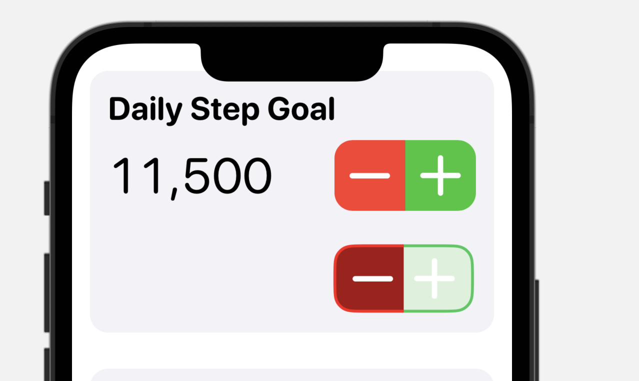
First up was the Step Goal Stepper. Even this relatively simple control gave me some opportunity for creative design.
Firstly, I style the increment/decrement buttons with red & green:
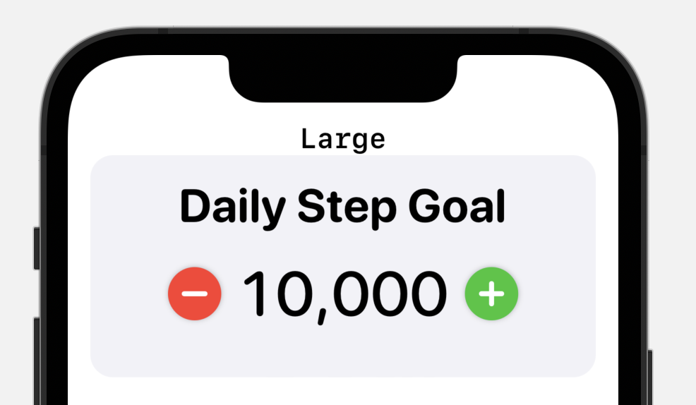
Which I think looks pretty good. However, anytime you are doing design with red and green and intending the color to show differentiation you need to be careful of colorblindness concerns.
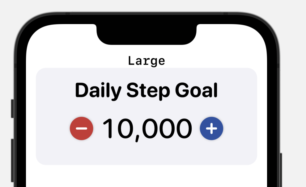
Thankfully, Pedometer++ already has a colorblind safe theme which users can select if they have difficulty distinguishing between red and green. So I make sure that I use their colors here as well.
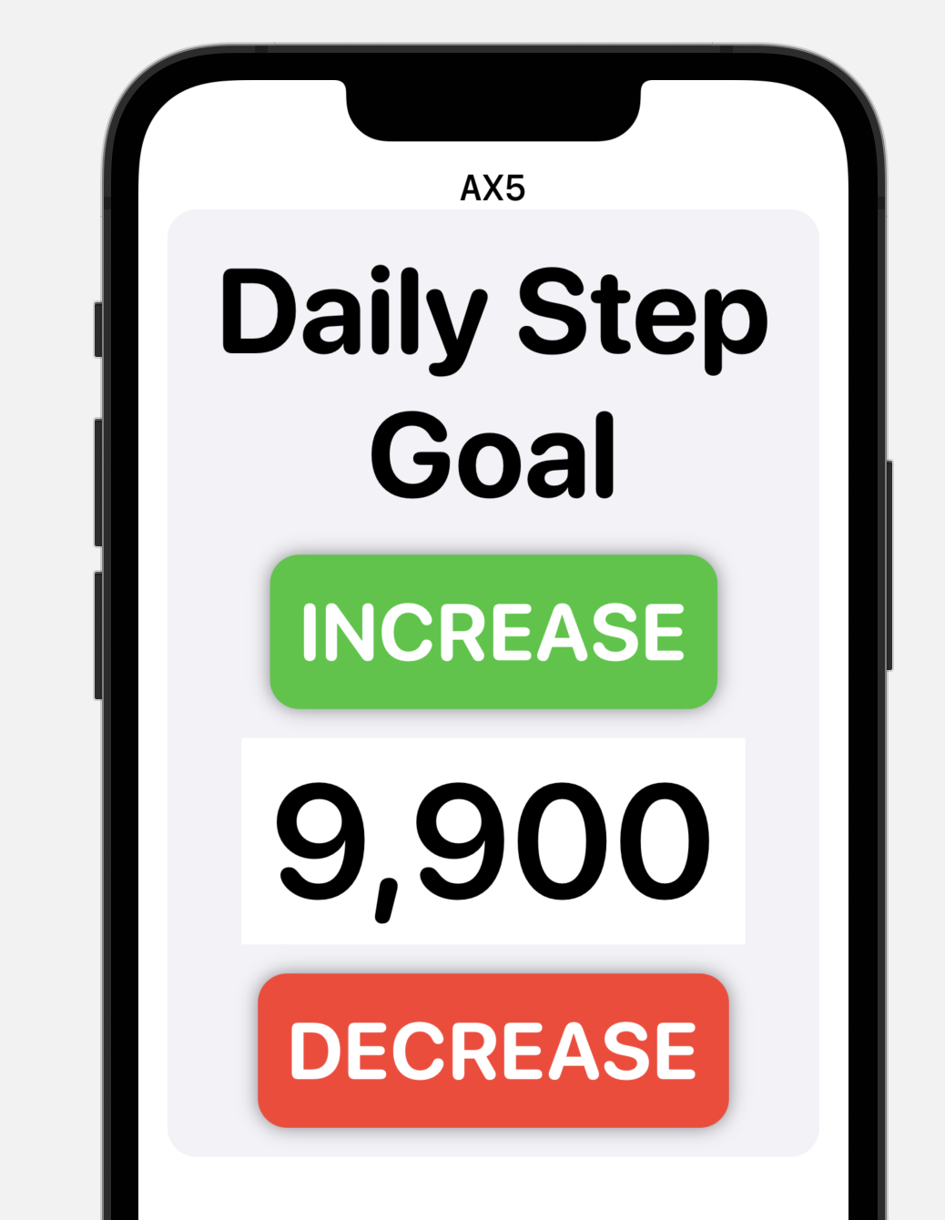
The main reason I decided to re-write these controls was that I didn’t like how limiting UIKit felt for creating good Dynamic Type support. I wanted a UI that really grew to make use of the screen and providing clear, legible controls. This is the result with the largest Accessibility size selected.
Custom Controls
I’m trying to create a consistent design theme throughout the app. Something that is very round and “friendly”.
To that end I’ve been working on some custom controls for this settings panel, the built-in looks just don’t feel at home in this app.
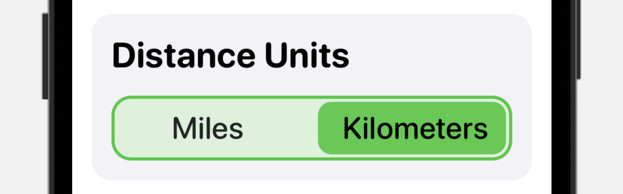
The first one is a segmented control. I want a segmented control which I can style and adjust with Dynamic Type fluidly. I started off with this:
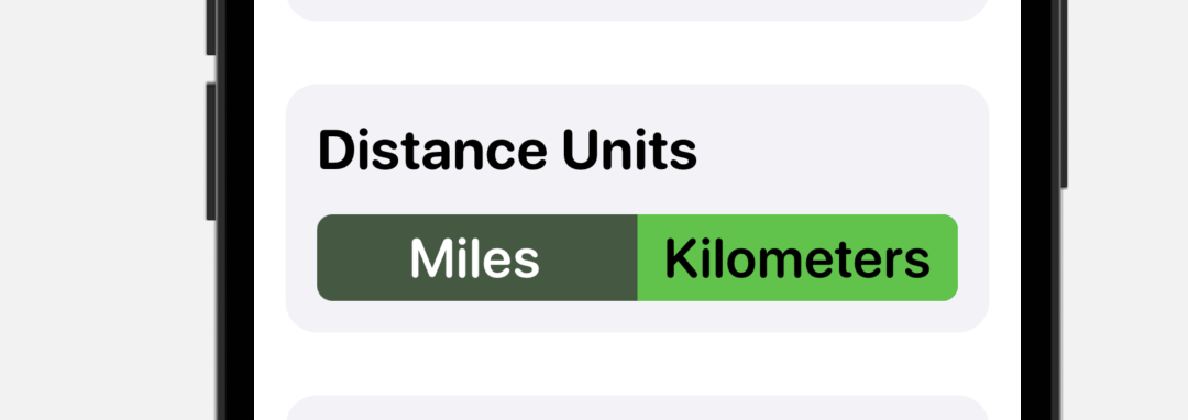
Which works but felt a bit heavy, so I opted for a rounded outline and an inset active marker. This also has the added benefit of making it dramatically clearer which element is selected:
From here I played around with adjusting the colors so that there is more contrast between the selected elements text and the background.
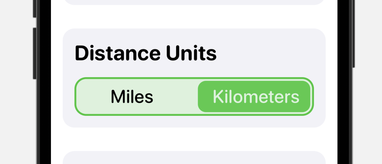
I think that works pretty well, I’ll now use it in practice for a while and see if it settles in nicely in use. Not convinced with the text colors yet but otherwise I’m liking it.
Stepper Control
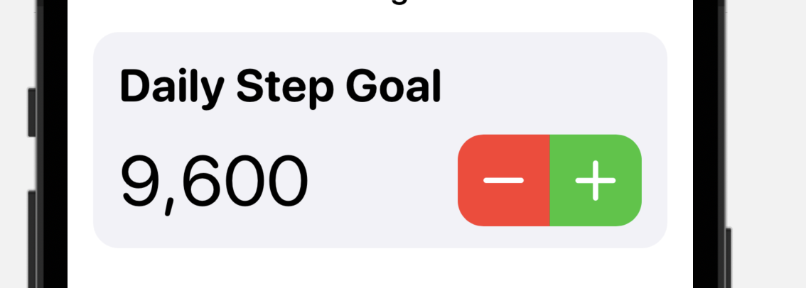
I wanted to create a layout for the goal stepper that fit in better here too.
I tried a number of approaches with outline shapes and looks. But in the end I think a simple capsule shape works best.
Actual Productivity!
Neither of these designs are final but I feel great about making so much progress today. For the first time what feels like forever, I’m actually coding properly again and getting things done!
Feels good.