I often find the period directly after a launch to be a really complicated time to be motivated to work. The excitement of the release is now behind me. A daunting list of tasks, which were waiting until the launch to become available, is in front of me.
So I often need to find a little project to get me going. Once I’m moving again, I can then turn my attention towards the actual work that needs to be done. Very often this ritual has taken the form of designing of a Watch Face, but today I found something else.
The rest of this article is a cursory walkthrough of the project I made this morning to “clean my palate”, which may or may not be of any interest. However, before you bounce away, the main point I want to make is that finding these little, few hour coding projects is a fantastic tool to kickstart you out of a motivational slump. Give it a try!
My Project
When I was doing my main work for Pedometer++’s mapping features I came across an algorithm for drawing contour lines on an elevation map, the Marching Squares method. While I have no actual need of this in my app itself, the concept behind it was really intriguing. So for my little coding treat to get myself going, I decided to try it out.
To get started, I watched this excellent overview video by Daniel Shiffman. Which walked through the concept in a very approachable manner.
Watch the video to actually learn the method but at a high level the method involves looking for the boundaries between different height thresholds and then using a series of precomputed shapes to then draw the outlines.
Data
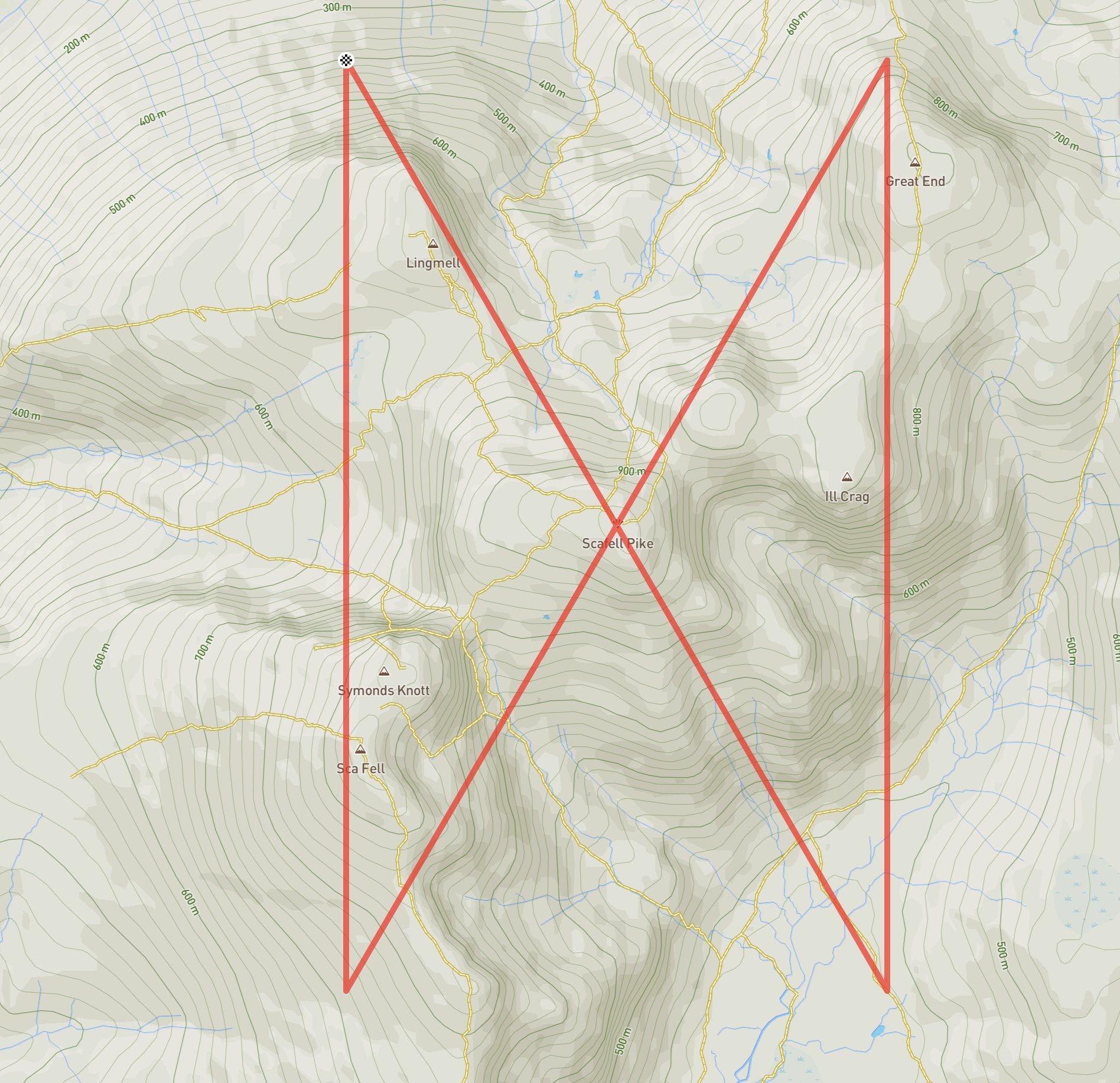
For my little experiment I chose to try and draw a map of the Scafell Pike area in the Lake District.
I poked around the internet a bit and found this dataset available for download, which included elevations at a roughly 1-second increments. A little bit of data transformation in a script later I had the data in a format I could read from Swift.
The first thing I did then was to visualize the heights using a super simple ZStack with a collection of Rectangle elements positioned within it. These are colored to reflect their elevations.
After more false starts than I’d like to admit (mostly getting the signs and sample ordering wrong), I had the data rendered on the screen.
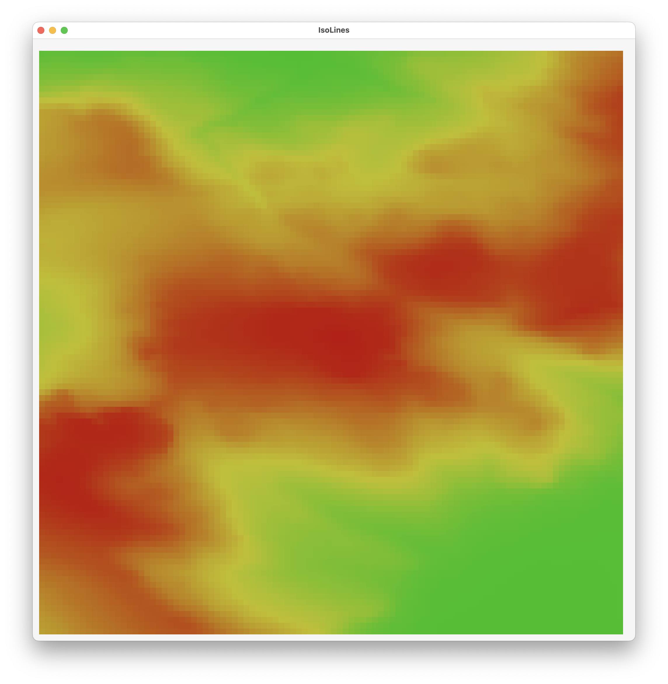
The red part in the middle is Scafell Pike, with the surrounding mountains visible as well.
Drawing the Lines
Next I wrote up a very basic version of this algorithm which iterates through the entire array of data points and determines if the points at a given vertex lie above or below a threshold value. For example, I might look for the points which span the elevation of 800m. Once I find these points I then apply the Marching Squares lookup table to determine which shape to draw at this point:

The result of this is a rather coarse visualization of the contours.
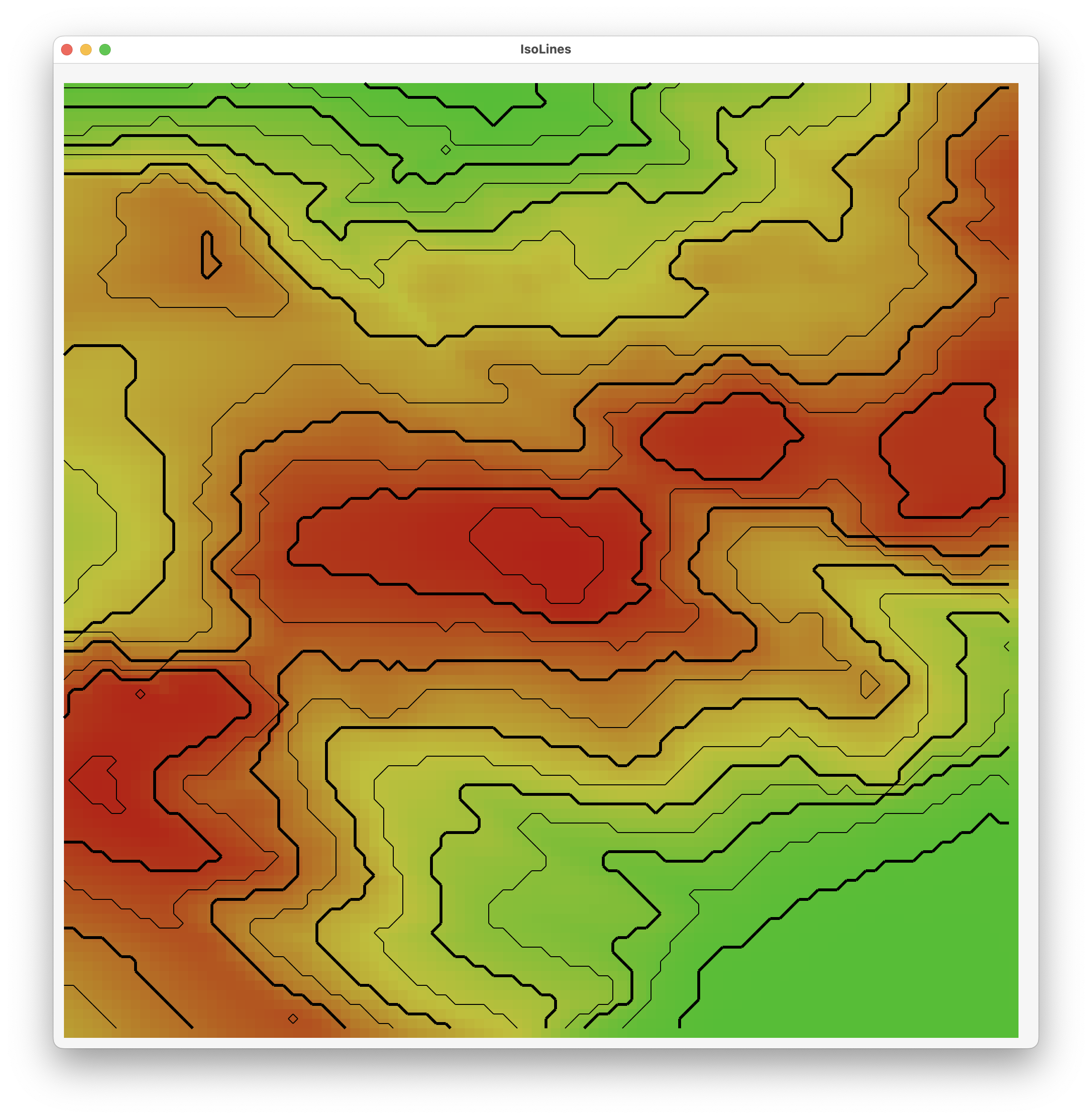
The sharp corners in the graph are an artifact of drawing the line segments from the middle of the sides. This means that you don’t smoothly move from one cell to the next. It is always a fixed jump.
To address this you can use linear interpolation to determine where along the cell edge you should draw from. The result is much, much smoother.
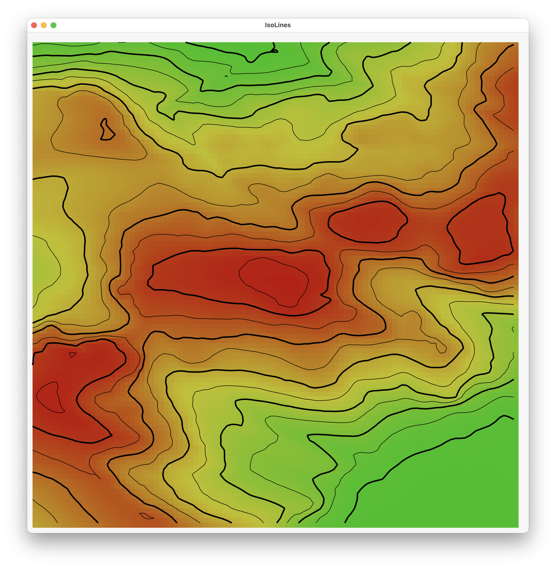
I’m quite pleased with that as my result. It matches reasonably closely with an actual topographic map of the area.
This code isn’t something that I expect to use in any of my apps directly. If I want a topographic map I’ll use a mapping service to generate this, where they can take care of all the weird edge cases I’m not covering. But I’m glad to have done this exercise and feel much better as a result. So now, on to the actual work.
If you wanted to give the code a look…it is here. Though I will freely admit it is super rough, slow and inelegant. But it did the job today.