Last week I talked about how rarely I find myself getting down to the ‘pixel level’ anymore in my design work, but still occasionally find that it is necessary in order to give a design that extra little bit of polish.
Today I again ran into a situation that needed this level of attention.
The main screen in Pedometer++ is centered around a bar graph view showing your daily progress towards your step goal. The step goal is indicated as a horizontal green line across the screen. As you walk your steps get closer and closer to this line.
I was looking at this screen today and saw something which I didn’t really like. When you get very close to reaching your goal the step bar will overlap the goal line ever so slightly. This is because the bar height is set such that it will reach the middle of the goal bar when you reach your goal, so for half the width of the goal line you still won’t have met your goal.
This only occurs for a few step totals each day, when you are within a few dozen steps of your goal.
While there is still the color difference giving a pretty loud indication that you haven’t quite reached your goal yet, one of the core rules of design is that you can never rely solely on color to indicate anything.
I really don’t want someone to open the app, see the step bar touching the goal, think they have reached their goal…then go to sleep and end up breaking their streak.
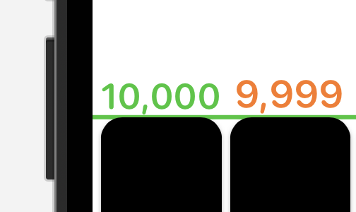
I zoomed in a bit and changed the bar color to make this problem a bit clearer. Those two bars look very similar visually, which is bad news.
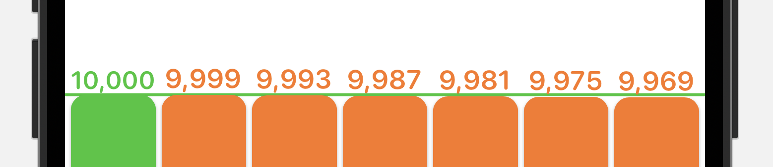
So what I’ve now done is added a bit of logic to adjust the daily step bars ever so slightly until you have actually met your goal. The day bar will now only ever touch the goal bar if you have actually reached your goal.
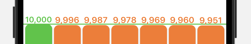
Now there is a clear distinction between reaching your goal and not reaching your goal.
A tiny detail but hopefully one that will prevent some disappointment in the future.