Three short years ago Widgetsmith came out and changed my life in a dramatic fashion. I never thought (or really dreamed) that I’d make something which would have the reach and impact Widgetsmith has. It has been quite the ride and today, as we start its fourth year, Widgetsmith is getting a very major update.
Interactivity
This past June while I was sitting at Apple Park listening to the announcements it seemed like every few minutes they announced something to do with widgets. We had clock face widgets on watchOS, desktop widgets on macOS, and Lock Screen widgets on iPadOS. But the real star of the show (for me at least) was the announcement of Interactive Widgets for iOS.
Widgets are at their core about extracting parts of an application and elevating them onto your iPhone’s Home Screen. This can be for utility or aesthetic reasons but in either case it lets you personalize your iPhone in a way which makes it uniquely yours. Up until now, however, these little windows into your app were entirely static. There was no animation, no variety, no anything. They were both technically and practically static snapshots.
Now in iOS 17 instead we can bring life to them and enrich their utility and beauty as a result.
I’ve spent the summer exploring as widely and creatively as I can the implications of allowing widgets to be interacted with. At WWDC Apple’s examples were typically small button pushes and fleeting interactions, but I thought I could do much, much more than that. I have no idea if the directions I’ve come up with are going to be popular, but I hope that at the very least the variety of options I’ve come up with will allow for us to find what is the ultimately successful use case.
Here are the ideas I came up with
Interactive Photo Galleries
By far the most popular widget configured in Widgetsmith is the Single Photo widget. This lets you put a favorite image right on your Home Screen, aligned and filtered exactly how you want it. So the first area I wanted to explore adding interactivity to was Photos. The logical place to start was allowing you to flip between multiple photos in a single widget.
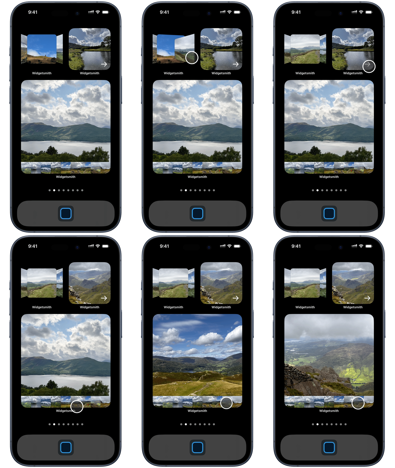
To start with I have three gallery views:
- A “Gallery” collection, where you get a horizontal bar along the bottom showing previews of the photographs which you can tap on to switch between.
- A “Carousel” collection, where each photo takes up the full widget frame and you navigate by tapping on the next arrow.
- A “Flow” collection, where the photos are stacked in a horizontal flip layout very similar to the old iTunes Cover Flow look.
The collections shown in these widgets can be created independently of the Photos app which lets you avoid needing to create an Album in two places.
Photo + Widget
The next idea I had for photo widgets was to combine them with another widget. This could be another single photograph, but more helpfully you could put one of the more informational style widgets as the alternate widget. For example, you can put your step count or the weather behind the photo.
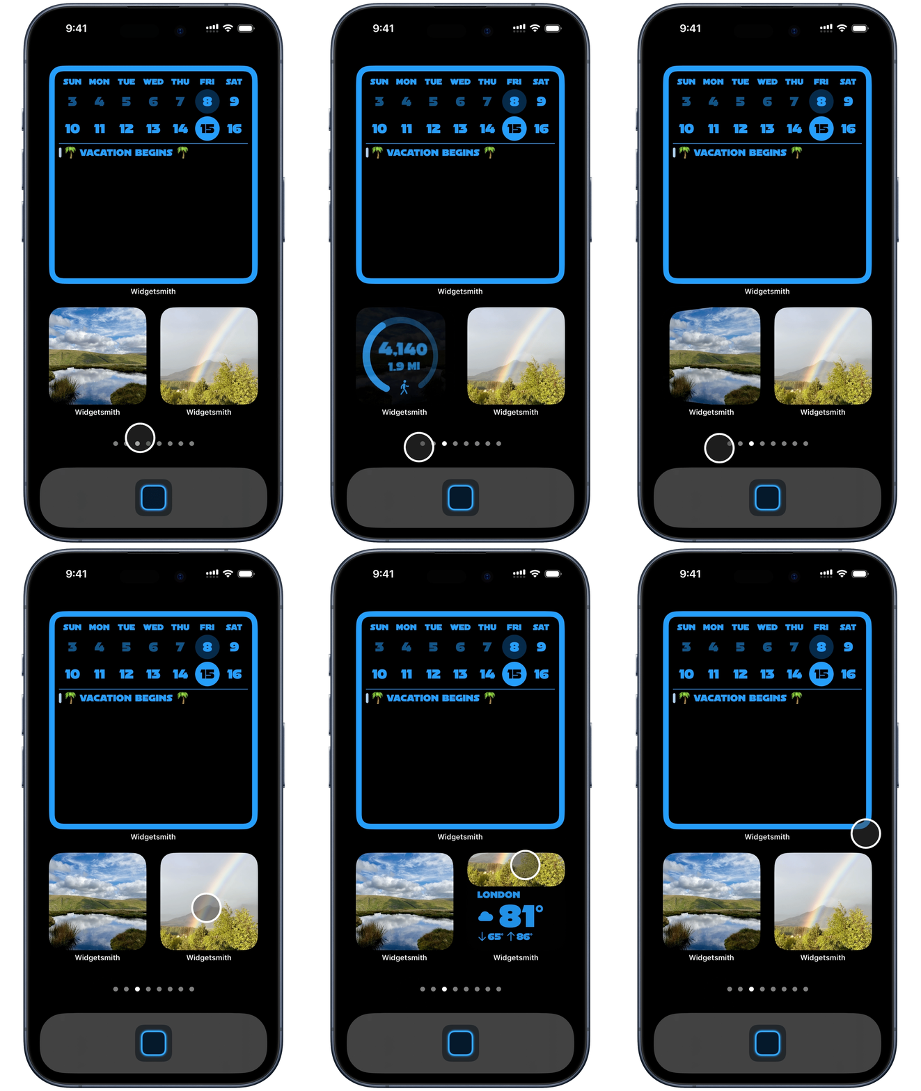
Tap on the widget to flip between the modes.
Photo Locket
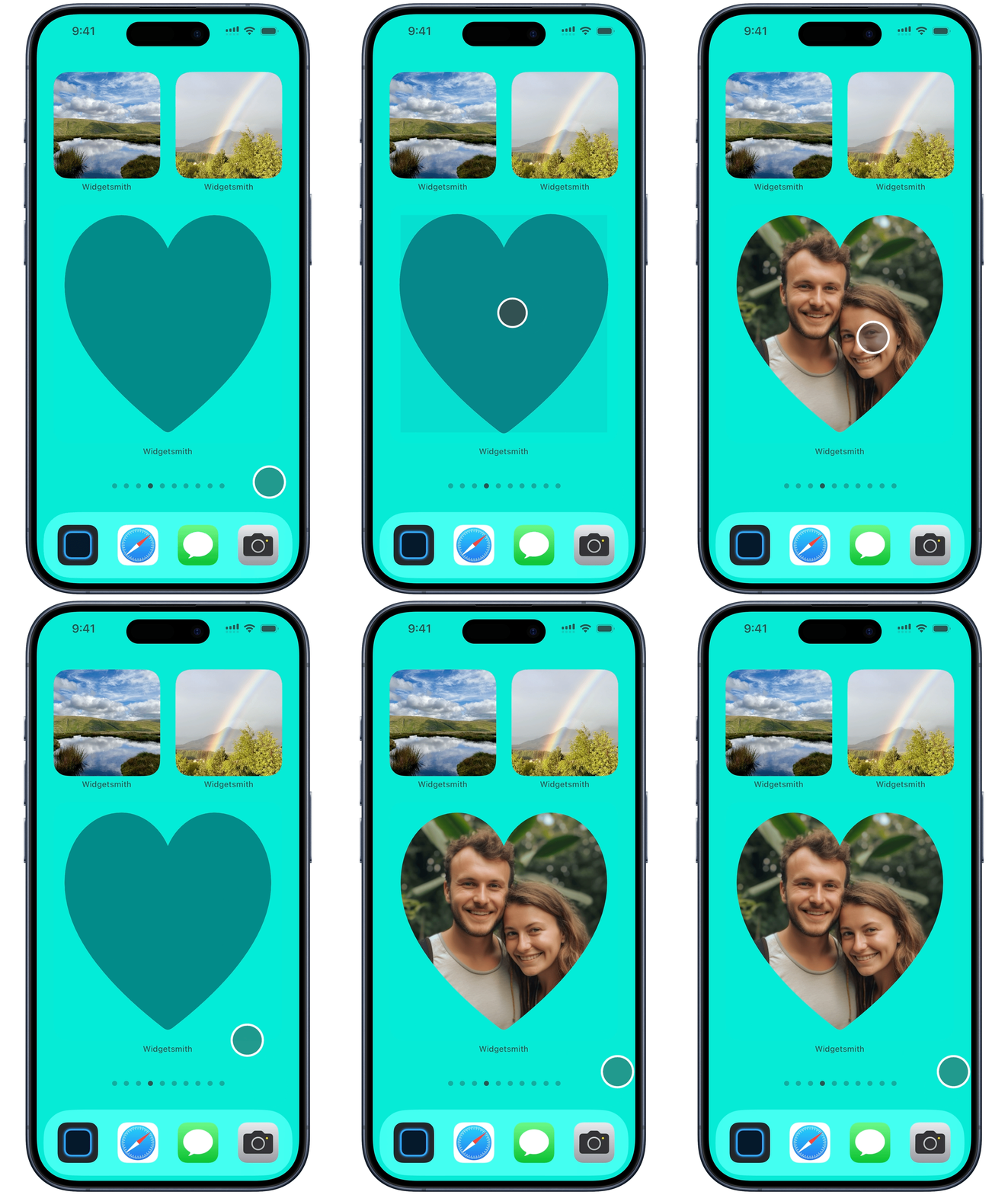
Next up was a way to take a special photo and give it a special prominence on your Home Screen. So I came up with the concept of a a photo locket. You can take your photo and choose a frame shape. Tap on it to close the locket, tap again to open.
Music Flow
Moving on from photos I wanted to see what I could do with Music. The most obvious thing here was to provide a way to virtually thumb through your favorite music albums and playlists and then play them right from your Home Screen.
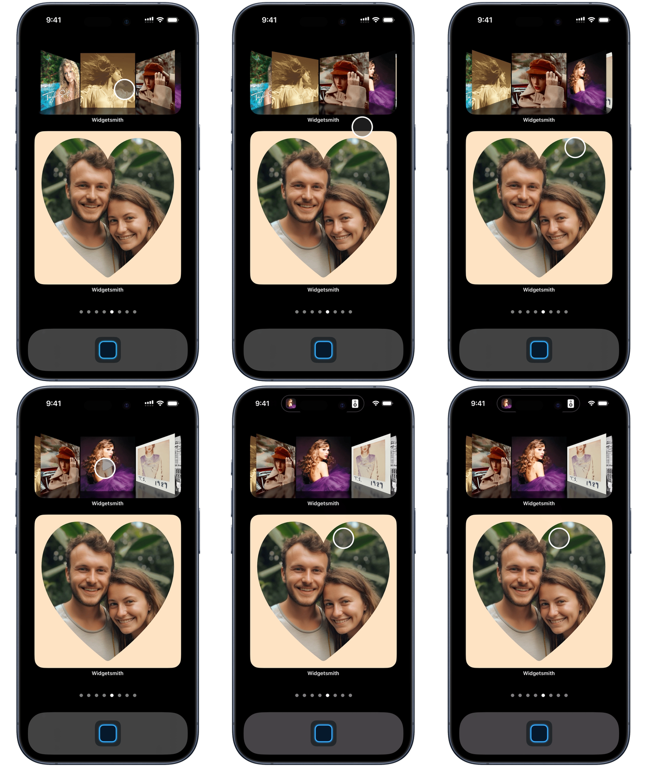
So I created a beautiful flow layout for your album artwork, including an optional mirrored effect. Tap through and when you find the perfect album for the moment, tap on it and it will play without needing to open Widgetsmith.
I also have added the option to play the song using the main Music app rather than within Widgetsmith if that is your preference.
Weather Station
My weather widgets got a massive improvement in their utility with the addition of interactivity. The nature of weather reports is that they have a timeline of data reported, through which you want to browse. So now you can browse through the forecast timeline from within the widget itself.
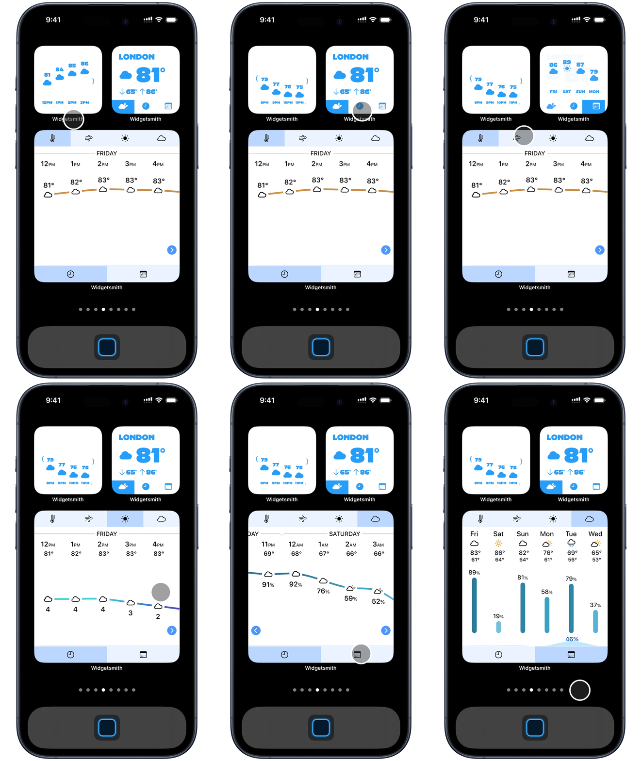
Additionally, you can toggle between the forecast mode: Current, Hourly, or Daily.
I also went a little overboard with a “Weather Station” widget which essentially brings the entire main weather tool from within Widgetsmith into the widget. You can toggle the graph between temperature, wind, UV Index and cloud cover. All smoothly animated and immediately loading.
Calendar
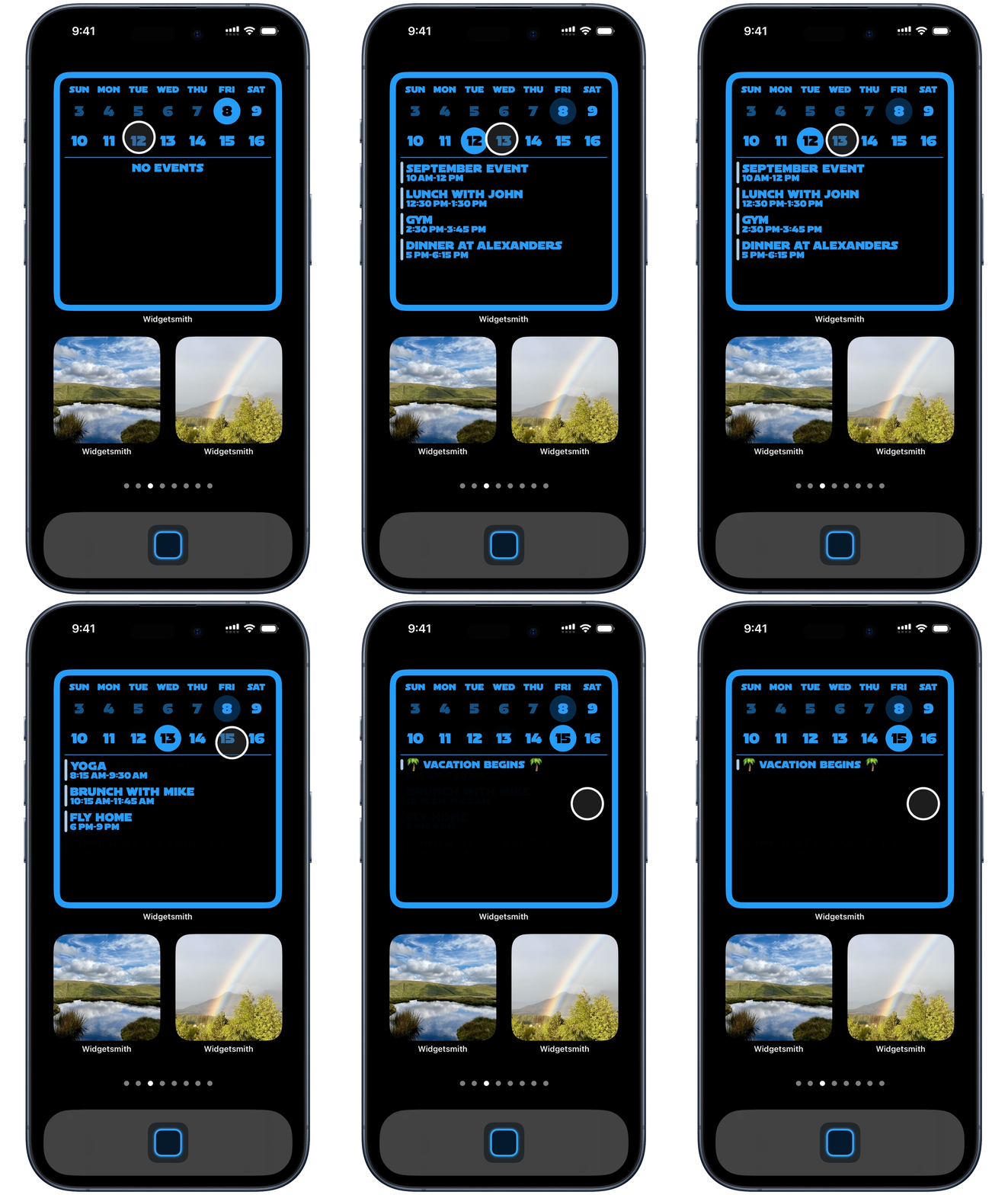
Similar to how a weather forecast’s timeline nature lends itself to interactive navigation, similarly I found that bringing interactivity to a calendar widget dramatically increased its utility. Rather than just showing you the events for the coming day, you can browse arbitrarily through the upcoming days and see what events are on each day.
Just for Fun
And last but certainly not least I’ve also added a tile game to the options for the Large widget style. This can be paired with another alternate widget which will typically display, but then when you have a moment and want a quick game you tap on it to open the game.
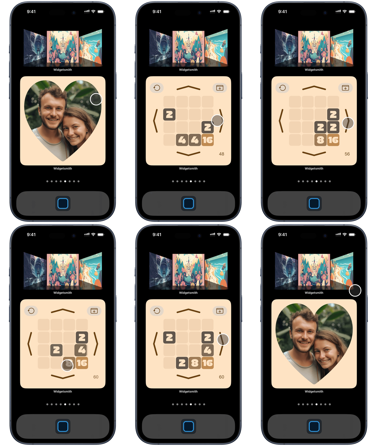
I have a number of other games planned but this seemed a great place to start and see how well they are received. Have fun!
StandBy Widgets
While all the existing widgets look and work well in the new StandBy mode introduced in iOS 17 (which displays a large print widget view while your iPhone is charging in a horizontal dock), I also added a new widget which I’ve found particularly useful for this mode. BIG TIME!
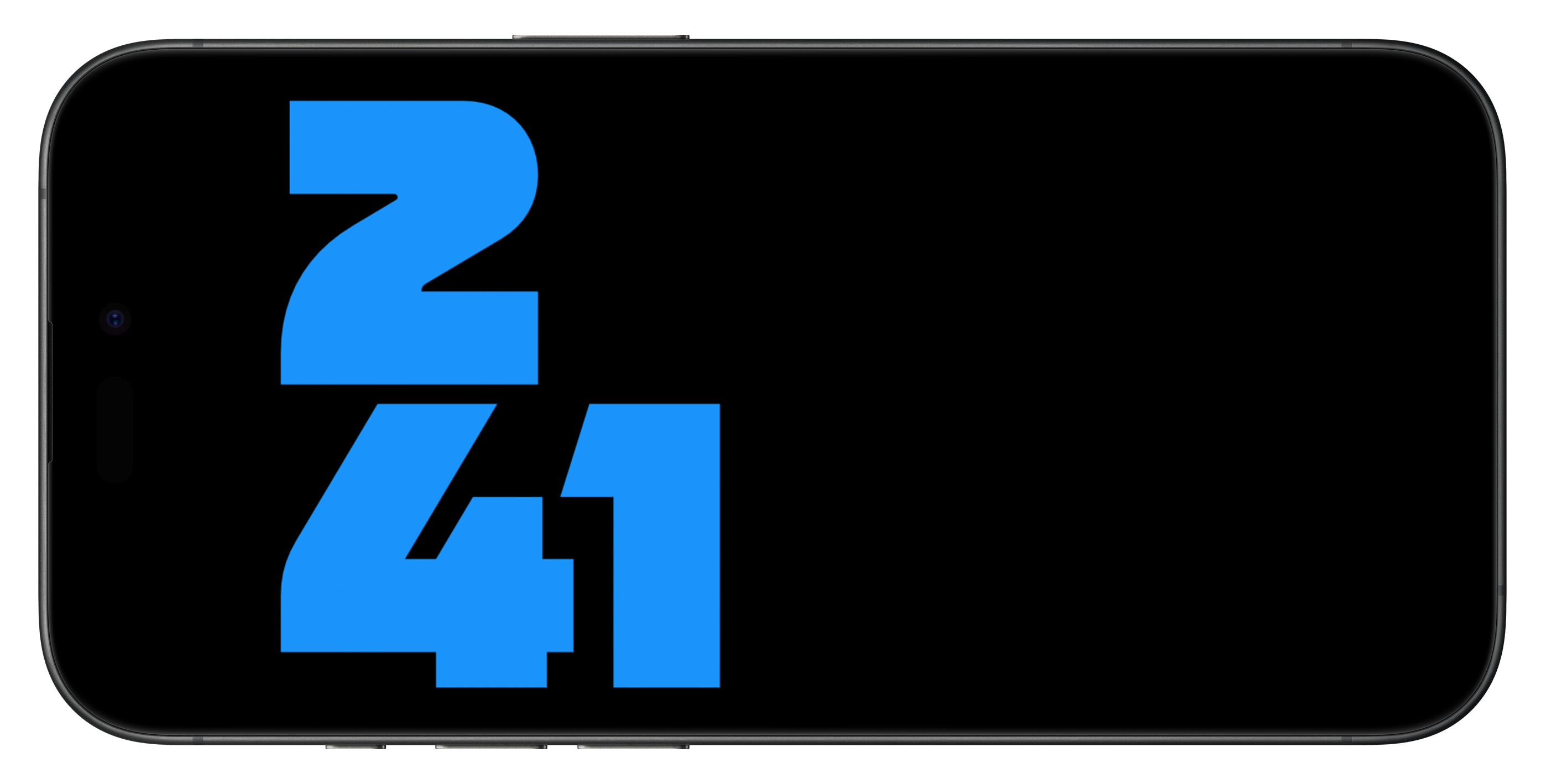
This docked mode is perfect for using your iPhone as a clock, however, the built in options don’t include a digital clock that you can pair with another widget, so I fixed this by adding a digital clock option which is positively massive.
Conclusions
This summer has been a wild ride. These widget represent the ideas which ultimately were good enough to ship. Believe me I tried a lot of whacky ideas along the way…and indeed have many ideas which will be coming out over the next few weeks & months. Interactivity opens a wide range of possibilities and even with this broad a collection of options I feel like I’m still only scratching the surface of what is possible.
Widgetsmith is free on the App Store.
