This is part of my ongoing As I Learn WatchKit (AILW) series.
I’ve spent the better part of today working on refining the visual layout and styling for one of my WatchKit apps. Specifically I was working on the Apple Watch component for Pod Wrangler, my podcast client. The result of which I plan to apply to the Watch component for Audiobooks too.
The Watch app I have in mind would include the following actions:
- Display the currently playing item
- Display the progress state of the item
- Let you Play, Pause, Fast Forward, Rewind
- Choose another track to play
This is a reasonably close approximation of all the core functionality of the host app itself. I imagine that for myself I’ll end up controlling my podcast/audiobook listening almost exclusively from my Apple Watch. Since I essentially just open the app hit Play and then immediately close the app, moving this to my wrist makes for a much more convenient interaction.
As I am doing any of my visual designing for the Watch I always start off by scouring the Apple Watch website and related videos for any clues or hints about how Apple has designed comparable functionality. While it is often a good idea to follow Apple’s lead in terms of visual design in this case it is doubly so. Apple’s designers are some of the only people who have ever laid hands on the actual hardware so have a much better idea of what works best in practice. The best example of a similar layout is for the Music app taken from their Overview page.
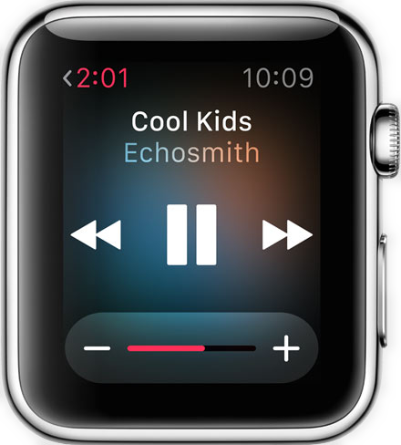
This matches up with the peek we got of it in action (playing Coldplay) during the keynote video (1h 20m). Their UI looks to:
- Provide the playback controls as a three across layout
- Use the album art as a blurred background
- Provide progress information in the upper left corner as the page’s title
I started off by copying this roughly, but directly into my app. The result was alright, but not great.
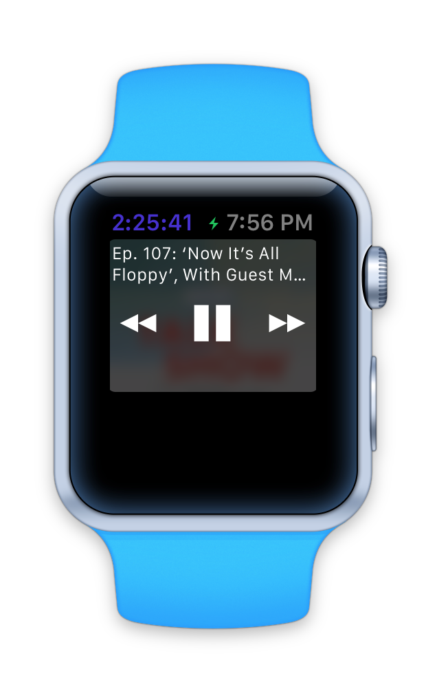
Abusing the page title for displaying the progress information might be a good trick for saving space on the extremely limited real estate of the Watch but it started to look really weird to my eye. It might work well for songs which are typically only a few minutes, but podcasts (these days) seem to run a few hours at least. So I don’t think that arrangement will work for me. So I instead moved the progress labels to below the controls. I also added in the ‘next episodes’ list from the app and display it below the playback controls.
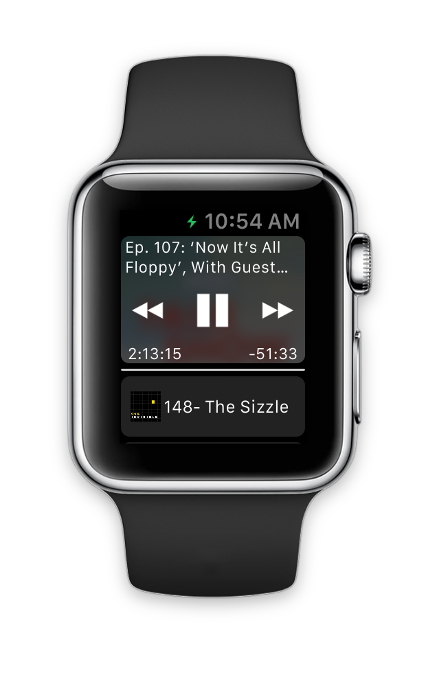
This is getting there, but felt kinda busy. There is a lot of words to read on this page. It isn’t particularly ‘glance-able’. Also, using the show art for the background can look really cool (I quite like this example for The Talk Show), but can also look terrible if it’s colors clash with the text. You can get around that a bit by hyper blurring things but then it no longer provides the hint about which show is playing…which was the point in the first place.
The HIG also warns a bit about putting three buttons next to each other. It doesn’t prohibit it but does discourage it. Apple does it that way but I thought I might try something else.
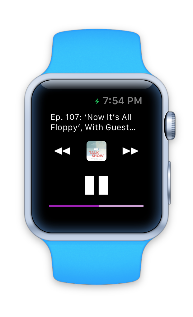
Now the Play/Pause button is all by itself and the show art is clearly visible. I also switched to showing the progress information as a track bar rather than in text. I found this much more ‘glance-able’. It is pretty easy to see what is going on.
However, splitting the controls up into two lines just doesn’t look right. In nearly every playback control app I can think of they are always in a row together. It is just what I expect visually. Also, while I liked the show art being clearly, shown it feels ‘detached’ from the episode title, when the point is to tie those two together.
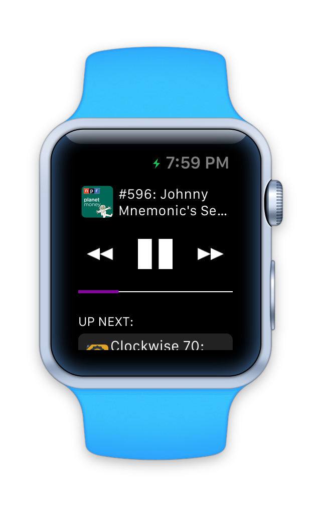
This is my current working design for the app, I’m pretty happy with it (at this point). It feels the most balanced of the candidates I tried out today. It isn’t too visually busy. It is very ‘glance-able’. The control mechanism is obvious. The spacing and layout of the ‘Up Next’ episode list also feels very accessible. Just swipe up to browse to another episode, tap it and it starts playing.
I doubt this will be my final, final design for this app but I wanted to share this process today. It is kind of amazing to see how quickly and radically the visual design of an app can change in just a few hours.