Today I’m delighted to introduce the next member of my ++ health and fitness app family, Activity++.
Ever since I first got my Apple Watch I have really loved its concept of activity tracking. It breaks down your overall activity level into three measures:
- Move (active calories)
- Exercise (minutes of elevated activity)
- Stand (hours each day where you stood).
It then presents these to you as three rings that you try to close (by hitting your goal) each day.
This concept is great but I’ve always found the actual implementation to miss for me. So when iOS 9.3 introduced the ability for 3rd party developers to access all three of the activity data types I got really excited to finally implement my own personal take on how this data should be displayed. The result is Activity++.
The iPhone App
The iPhone component of Activity++ is geared around trying to create the most motivating interface I could imagine. My goal is to make screen that displays your activity data in a way that drives you to hit your goals.
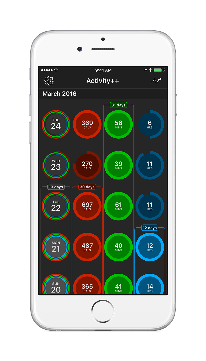
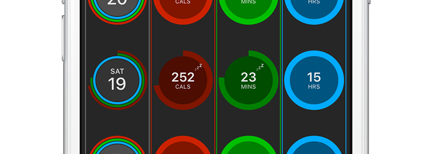
I wanted to try and get away from it being just a historical record and instead be a tool to help you get healthier. As such the screen shows a single, consolidated timeline of each day your Apple Watch has recorded your movement. You can easily scroll through and get a sense of how well you are doing. The color and size of the circles make it clear when you reached your goals and when you didn’t quite make it.
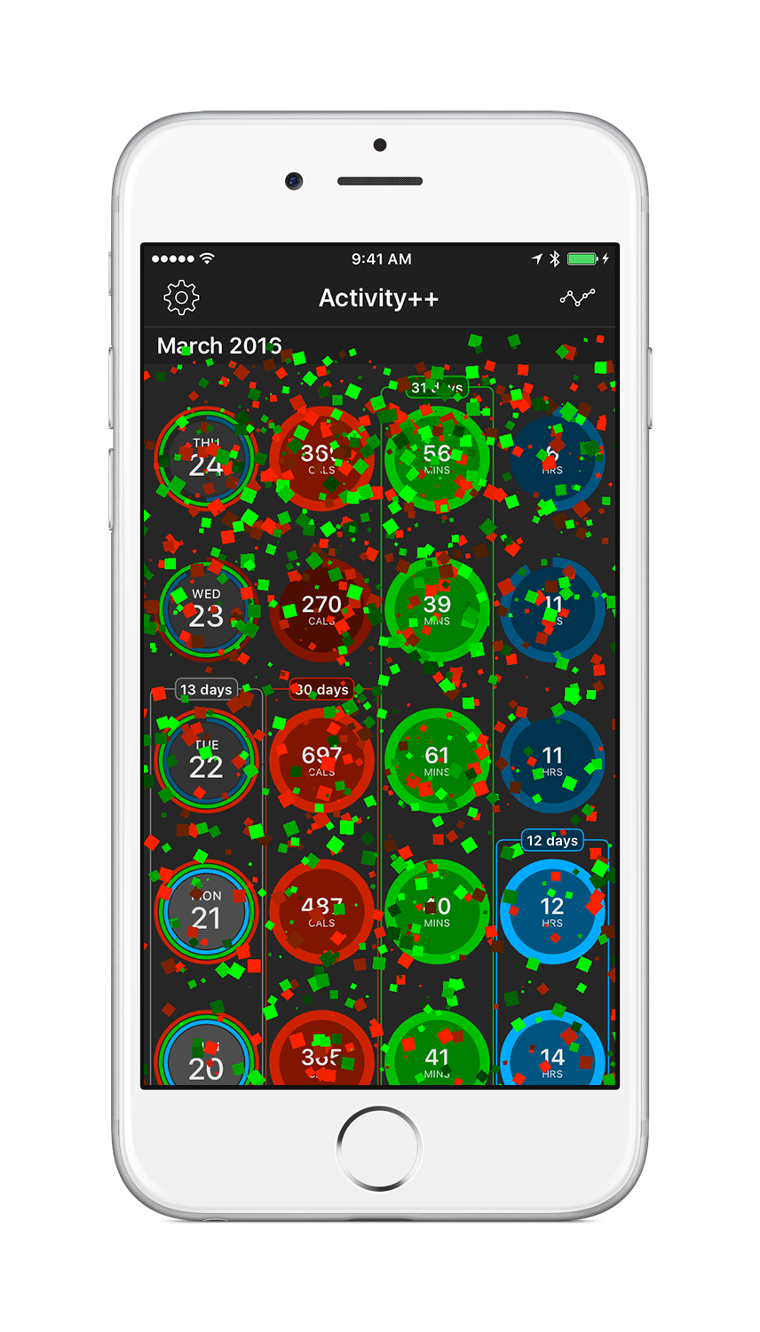
Of course, it wouldn’t be a ++ app if it didn’t have confetti to celebrate you reaching your goals. So in Activity++ any time you close one of your activity rings confetti will rain down, hopefully giving you that little bit of extra motivation to do it again tomorrow.
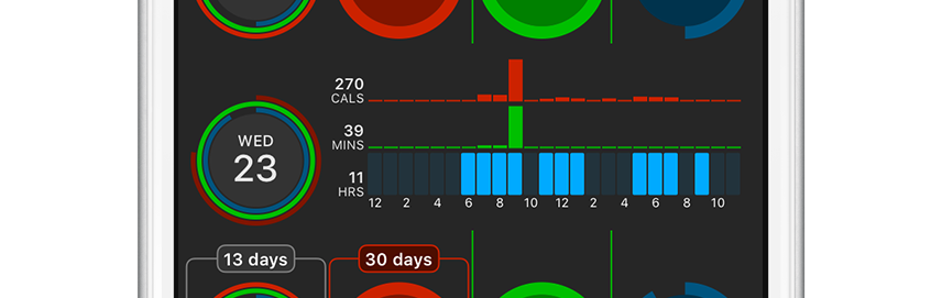
You can also tap on any day to quickly see an expanded, detail view of when you were active.
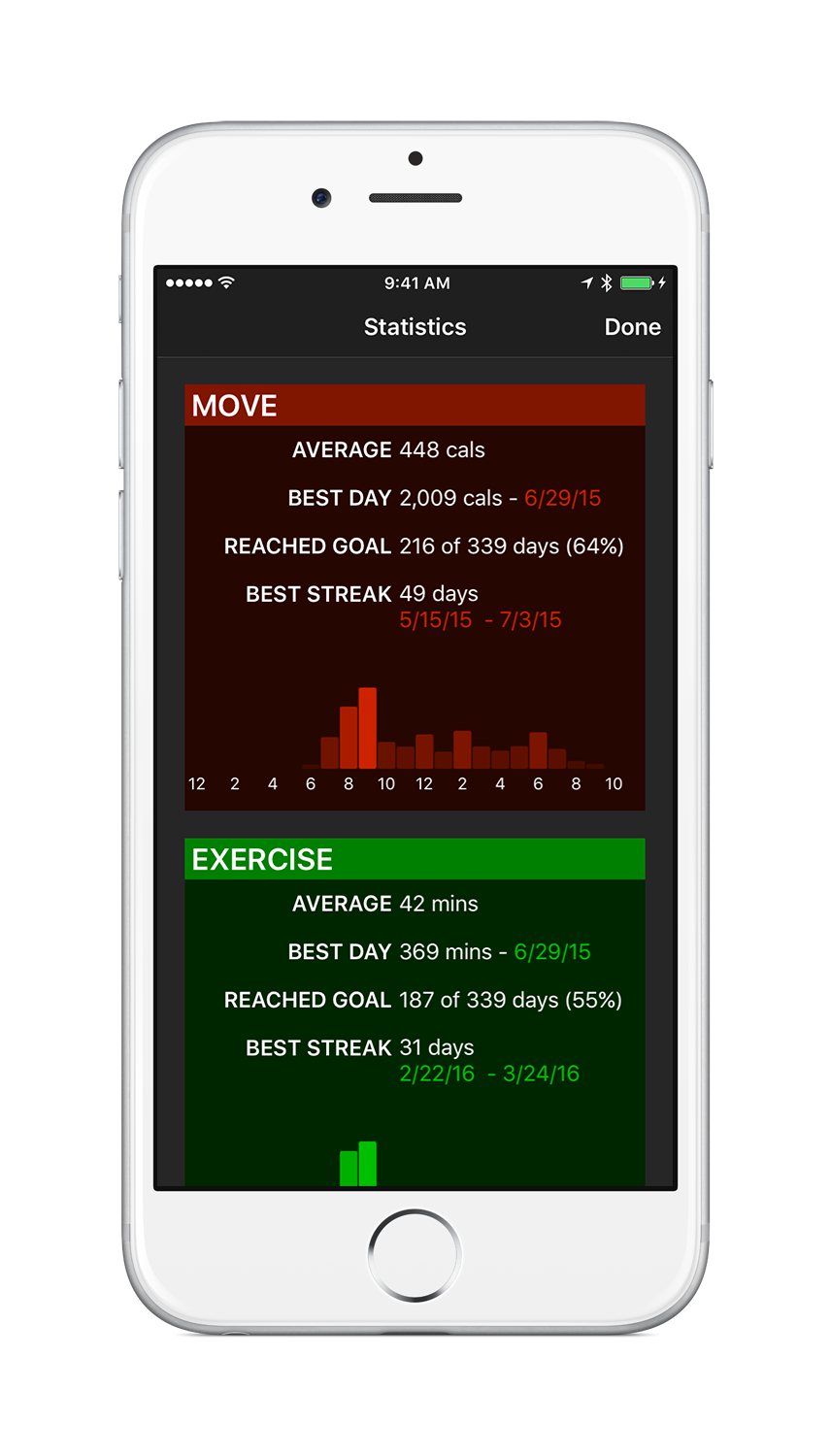
Tapping the top-right button opens up a statistics view that was something I felt sorely missing from the built-in Activity app. You can see what your average performance is, your best day, the frequency you’ve hit your goal for, your longest streak and a snapshot profile of what a typical day looks like for you. It is fun to see all the data your watch has collected over many months consolidated into a single summary.
Streaks
One thing that always frustrated me about Apple’s Activity app was the way they implemented “achievements”. They provide a collection of medals that you can earn by performing certain fitness related activities or hitting your goals for a certain number of days.
This was great for the first few weeks that I had my Apple Watch but once I had achieved each of these goals the motivation I had received from them fell off dramatically. So instead of taking a medal based approach in Activity++ I instead focus on displaying how long you have kept a streak of goal achievements going for.
I’ve found these streaks to be a much more long-lived motivator. The nice thing about a streak is that you can always start one, just hit your goal two days in a row…and the longer you keep it going the more motivation it tends to provide to keep it going.
The challenge, however, that focusing on streaks created is the desire to want to workout every single day. In my own fitness life I find that to be very problematic, and often leads to injury. In fact I found this to be very rough when I was trying to get Apple’s “Perfect Month” medal, it just wasn’t good for my body. So I wanted to make sure that Activity++ provided a way to avoid this pitfall.
To address this Activity++ will allow you to take a single day off from reaching your goal, but only once you have reached it for six consecutive days.
These “Rest Days” allow you to take healthy breaks as part of your fitness regime, but still keep the motivation of a long streak going. Because you have to have already reached your goal six times before you are allowed to take a rest day I have found that it is difficult enough to keep a streak going that it feels precious to continue, but not unhealthily challenging.
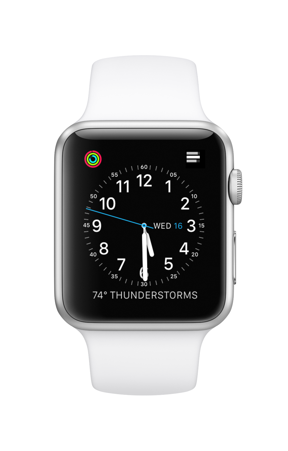
Complications
Ever since watchOS 2.0 changed the look of the activity ring complications to be colorful I’ve yearned for a way to replace them with my own. I typically use the Utility face and the colors here just feel out of place and distracting.
Similarly I’ve had a “few” gripes about the physical layout and structure of the rings since the Watch was first released. I view my activity data most often through the complication so I want it to be perfect.
That is the standard I’ve strived for in this app. The improvements are as follows:
- Monochrome, always.
- Never fill something that isn’t actually completed close enough to full that you could accidentally think you’d reached it.
- Change, subtly, the colors when they are completed to make it very clear when you hit them.
The result:
Both of the two complications in this image show the same activity data, but the Activity++ one does it in a much clearer way.
Glance and Watch App
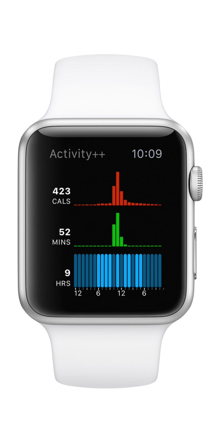
In addition to the complications you can also view your activity data on your Apple Watch via either the glance or watch app. These are all geared towards showing you everything you might want to see about your activity data as quickly as possible, so you can put your wrist down and get on with your day. The built-in apps force me to be continuously swiping through pages of data to see what I want.
The glance shows you both your goal progress as well as a detailed view of your activity.
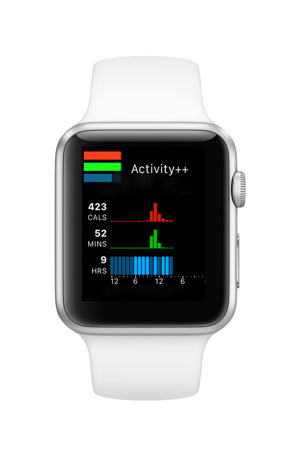
The app itself shows a big detail graph of your daily activity.
Activity++
Activity++ is available now in the App Store. It is $3 (or local equivalent). I really hope you enjoy it and that it will help you to become and remain more active.