I really like my new 44mm Series 4 Apple Watch. It is fast, much more comfortable to wear and the larger screen is a welcome improvement. But I only kinda like the new Infograph faces. I’ve been trying hard over the last few weeks to work out why, and I think I may finally have worked it out.
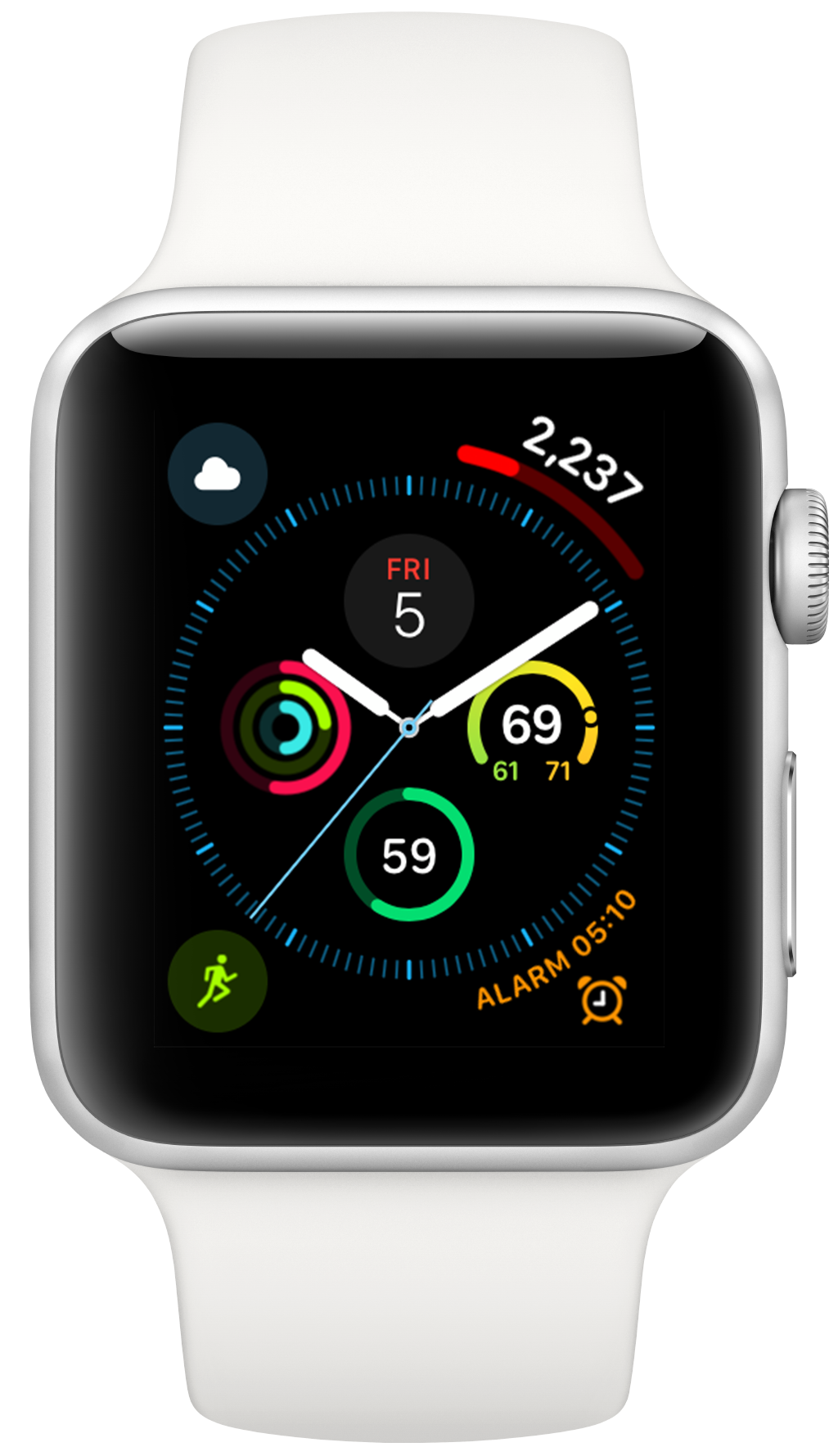
It feels like they de-prioritize showing me the time in favor of showing me my complications. Or more concretely, they lack a sense of hierarchy. The visual ‘intensity’ of the time and my complications are roughly the same. The hands of my clock have a slight drop shadow to give them a sense of height above the complications but otherwise they are largely undifferentiated.
For my eyes, this makes it hard to easily tell the time, which frustrates me. I really enjoy being able to cram so much data on the screen at once but also really want to know what time it is when I look at my watch.
I’m not one to just complain about a problem so I’ve been spending the last week trying a variety of approaches to alleviate this problem. I very much doubt that any of these options are things that Apple’s designers haven’t already tried and decided they weren’t a good fit for the platform at large, but I’ve settled on something that works well for me, low contrast complications.
The complications I want to have on my face are:
- Date
- Current temperature (with high/low)
- Chance of rain in next hour and weather conditions
- Battery
- Activity++, activity ring status
- Pedometer++, daily step count
- Workouts++
- Sleep++
I spent an afternoon building a collection of replacement alternatives for all the system complications that I use that render with a more low contrast appearance. What I’ve found is that I can still read the data on the complications without much fuss, but if I am just glancing at the screen only the clock hands ‘pop’.
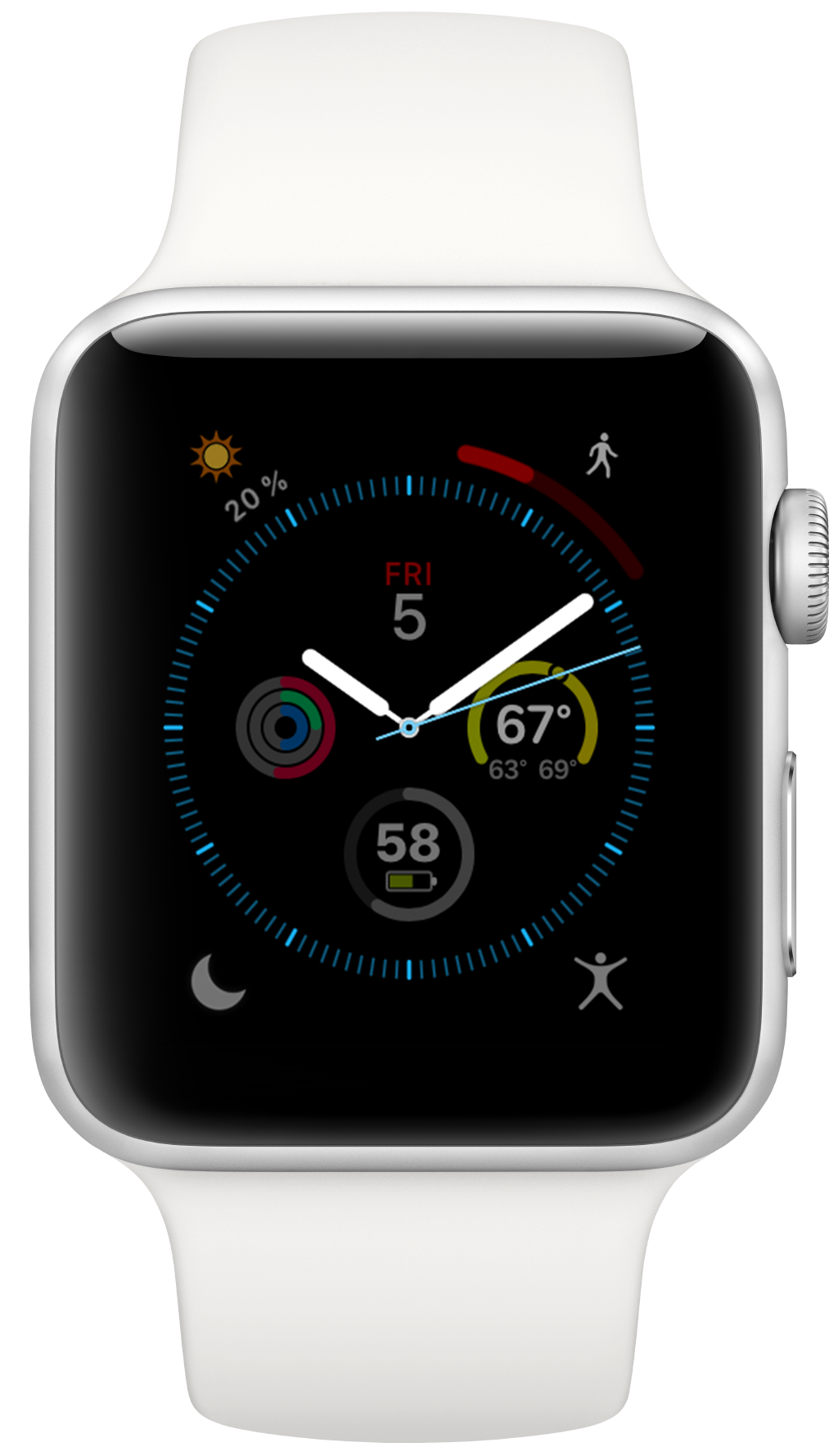
I tried at first to just de-saturate them all but since the clock hands are white this didn’t create enough visual separation. Keeping them colored but just darker was the thing that I found really helped.
With a change like this you really have to live with it for a while to appreciate the difference it makes. I’ve had my watch configured this way for a week and I really like it. I’d love to see Apple provide a way to get this appearance across the board for all my complications. It is not a scalable solution to have to custom build a whole watch app for any data you want displayed like this on your watch face.
I’d also really like this option, if it ever appeared, to integrate with one of my favorite little easter eggs in watchOS, where you can turn the crown on the watch when it is dimmed to ‘peek’ at the watch face without fully illuminating the screen.
I could imagine that if you continued this gesture past its current end point that your dimmed complications could brighten up until they are in their full state (potentially even brighter than the clock hands). That way if you want to see their content more clearly you have a natural way to make that happen without needing to have them full intensity all the time.