My Journey Towards Watchsmith
For the last five and a half years I’ve been enamored with developing for the Apple Watch. I’ve made workout apps, weather apps, calendar apps, health apps, news apps, audio apps, astronomy apps and games. With each app I’ve learned a lot about what makes a good watch app and also built up a wide library of code and tools for making them.
This last summer watchOS 6 opened up a whole new world of possibilities for developing on the Apple Watch. The introduction of SwiftUI means that for the first time I can make fully native applications for the Apple Watch. This allows me to make my apps lively, interactive and responsive in ways that were not possible before.
With this in mind I immediately started planning how I could take full advantage of watchOS 6. I didn’t want to simply update my existing apps. I wanted to really swing for the fences and see if I could push the definition of what a “watch app” was. In many ways the result is my Master’s Thesis of watch development, combining all of what I’ve learned over the years into a single, cohesive experience.
Watchsmith
Watchsmith is an application that seeks to give you complete control over the appearance and utility of your Apple Watch.
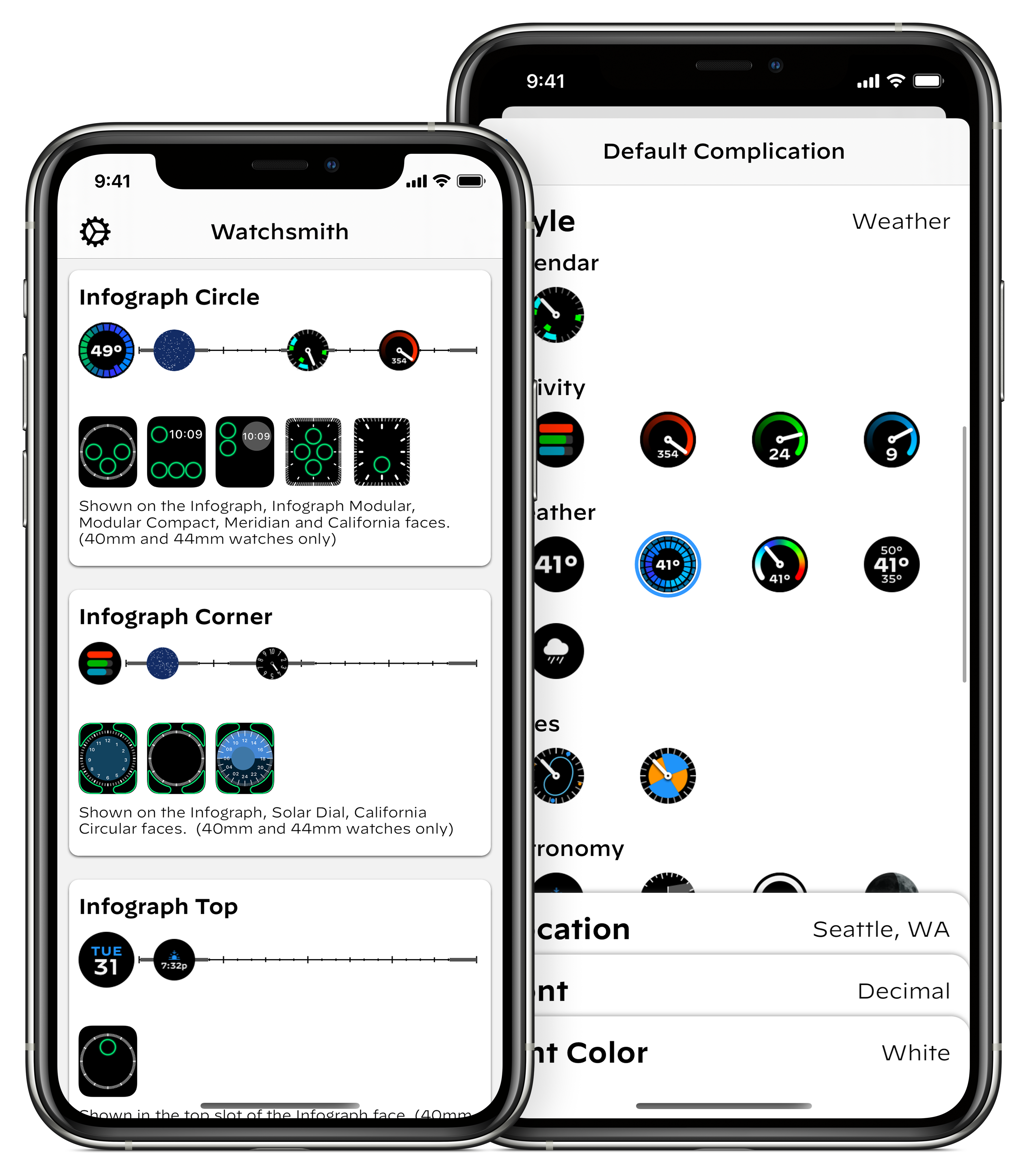
First, it provides a wide array of complications. Each of these is completely customizable, with controls for things like font, color, hand type and location1. The initial set is just over 50 unique complications, with dozens more planned down the road. My goal is to provide a complication for just about every use and let you make it look just how you want. In the absence of 3rd-party watch faces, this is the closest I can get to making my own watch faces.
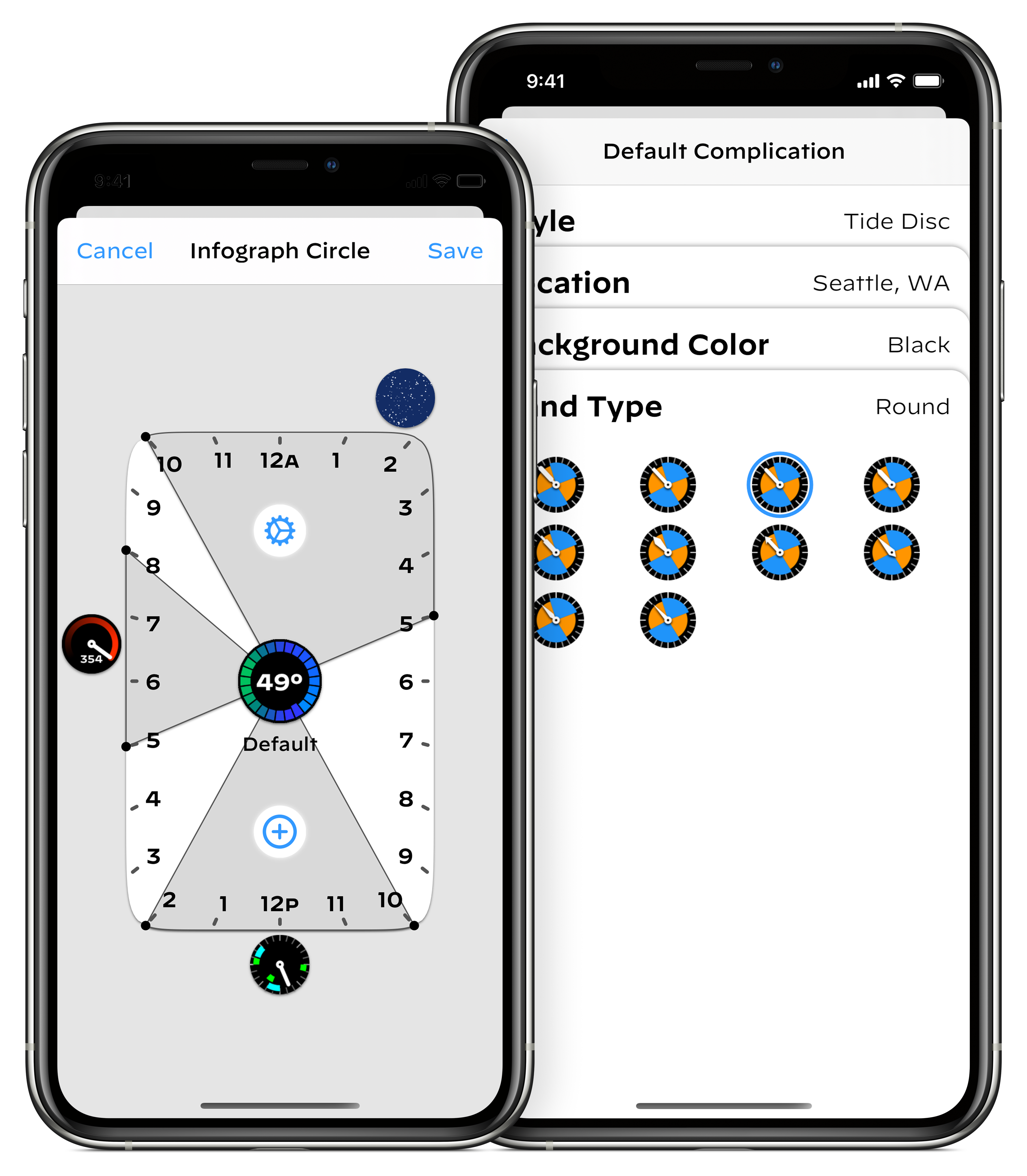
Second, rather than simply providing a static display of the complication you configure, Watchsmith lets you dynamically schedule the complications to appear on your watch face. This is done using time based triggers (with plans for additional trigger types down the road).
For each complication slot you can decide what you want displayed on your wrist throughout the day, making it precisely relevant and personal. For example, you could show the weather in the morning while you get ready, then maybe switch to your calendar while at work, then switch to your activity progress as you close out your day, and then finally switch to a peaceful starfield when it is time to head to bed.
I’ve found this movement away from static complications has dramatically changed how I think of my Apple Watch. In some ways it is more true to itself. An Apple Watch isn’t a mechanical watch, fixed in construction and appearance. It is a computer, fully capable of adapting itself to your needs. It should change itself throughout the day so that it is always providing you with the most relevant information. You shouldn’t need to swipe around back-and-forth to find the data you want, it should already be there waiting for you.
One of my guiding goals is the idea of enhancing complication display in ways not possible on traditional watches to eliminate problems traditional watches are plagued by.
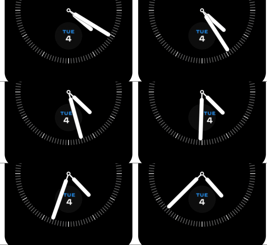
One solution I’ve come up with is a way to ensure the legibility of complications located within the clock face. You can optionally configure Watchsmith to shift its complications around within their complication window to try and avoid the watch hands. This means that you can avoid the situation where you can’t read the date when it is 5:32.
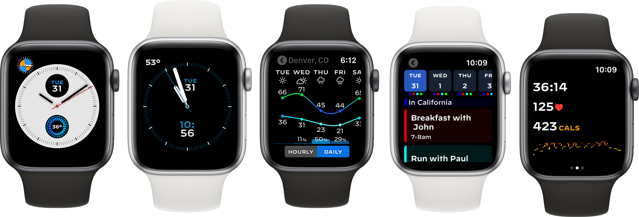
Lastly, given its wide and varied collection of complications, Watchsmith’s watch app includes a wide array of utilities. My goal is to provide just about every functionality you could ever want, accessible right from a complication customizable enough to be at home on every one of your watch faces. It currently includes:
- A standard workout app, with dynamic metric display
- An interval based workout mode for things like Tabatas, EMOMs and HIIT.
- A zone workout mode for heart rate range training
- A workout history with heart rate graphs and core metrics
- A weather app with graphical display of hourly and daily conditions
- An activity area showing your progress towards closing your rings
- A heart rate app showing your pulse over the course of the day
- A mindfulness breathing app
- A calendar showing your next week’s events
- A timezone converter
- An astronomy app showing the current position of the Sun, Moon and stars
- A 360-degree interpretation of a classic pong game
These are all written entirely using SwiftUI which allows them to be much more dynamic and capable than the type of app experiences you might be familiar with on Apple Watch. Just as with complications, this initial set is just the beginning.
Watchsmith Premium
Most of the functions and features in Watchsmith are available for free within the app. You can configure and schedule complications and use most of the Apple Watch app features right away. There are additional styles, configuration options and data sources that do require a subscription to use.
These hosted data sources include weather and tides right now, with additional sources planned over time. This type of data involves a significant, recurring cost to me so I cannot make them available to unpaid users.
My goal is to provide great utility to anyone who downloads Watchsmith, with an enhanced experience available to those who choose to subscribe. I’ve found that the economics of making Apple Watch apps are really challenging.
The small, quick, glanceable nature of their interaction don’t lend themselves to high prices and thus developing robust experiences is often hard to justify. My hope is that by combining so many useful experiences into a single app I can build a platform that makes subscribing an obvious choice for my customers.
Watchsmith is available for free in the App Store.

-
It is currently possible to configure 96,605 permutations of complication styles and settings. ↩