A Little Trick for Developing for Dynamic Type
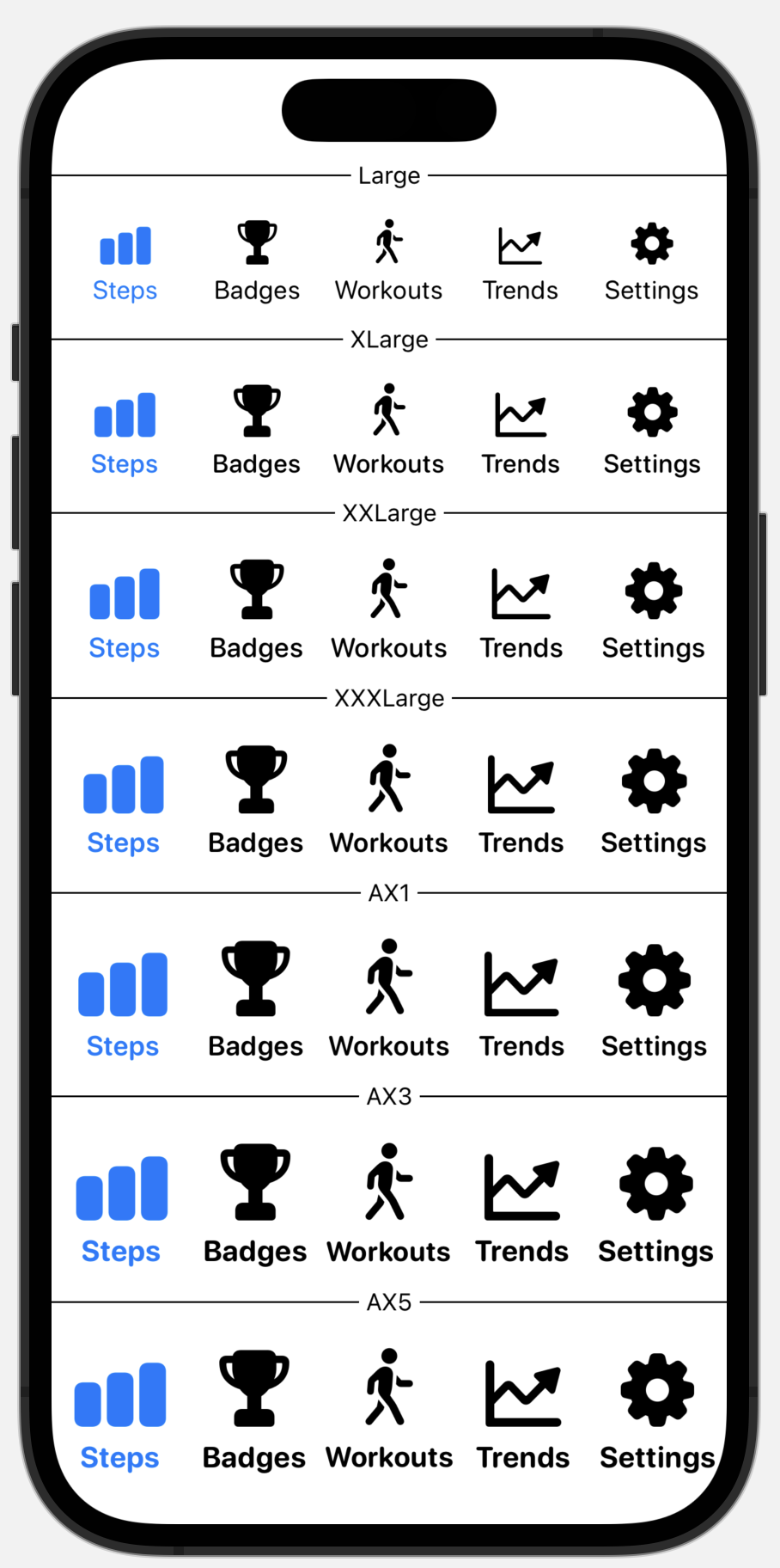
Last week I was doing some work on better Dynamic Type support for Pedometer++. This involved building out a custom tab view, which scales the size and visuals of my tab bar with larger sizes (the iOS system one doesn’t change at all).
When I’m doing work for VoiceOver I will turn on the Screen Curtain and then enable VoiceOver to try out the app without any visual feedback as a way to improve my understanding of what it might be like to use the app without seeing it. It isn’t perfect, but it helps me hopefully do a better job of supporting visual accessibility needs.
For Dynamic Type I wanted to find a way to similar method for “simulating” the types of visual impairments which would typically lead to using Dynamic Type’s larger sizes. It turns out SwiftUI actually makes this super straight forward.
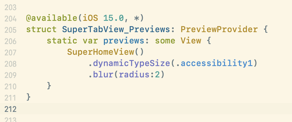
If I apply a .blur(radius:2.0) modifier to the root of my view hierarchy the entire app will have its content blurred slightly, giving a general impression of what it might be like to use the app with farsightedness.
Clearly this isn’t a perfect correspondence with actual farsightedness, but it seems close enough to be really useful.
Example with my Tab Bar
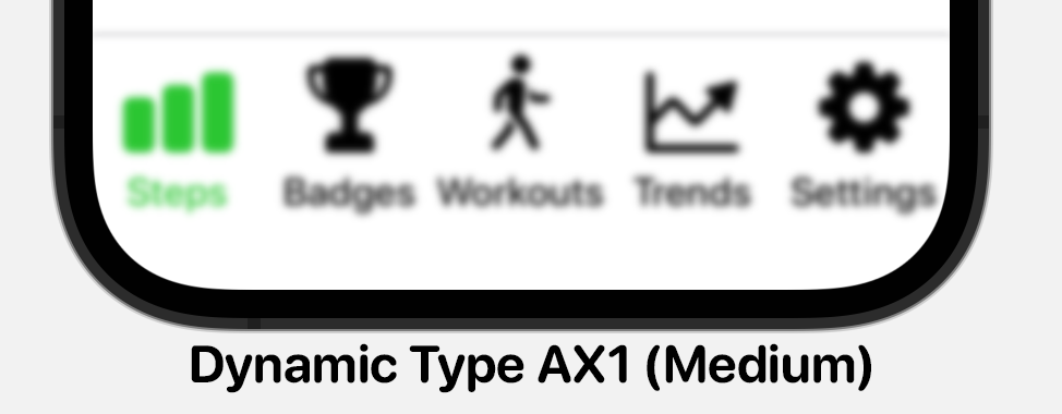
This is what my tab bar looked like at the standard “Large” dynamic type size:
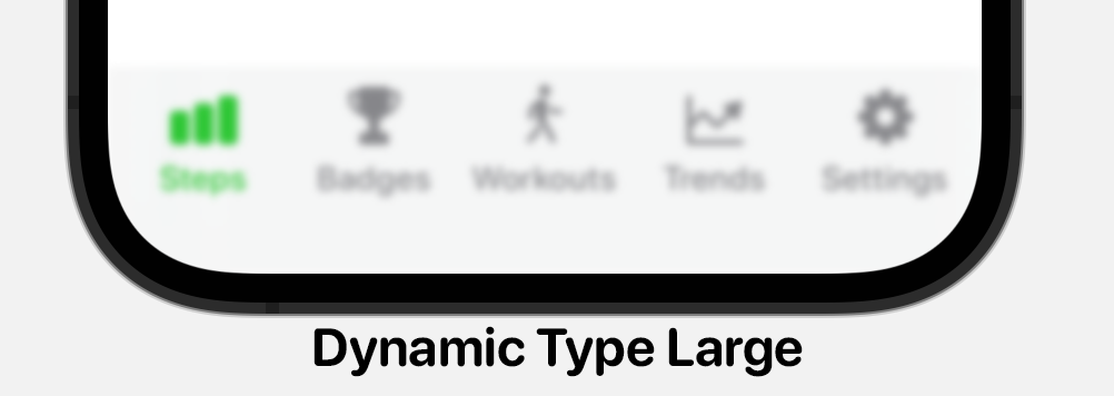
Barely visible, let alone legible. So then bumped up the Dynamic Type size to AX1 (the smallest of the Accessibility sizes).
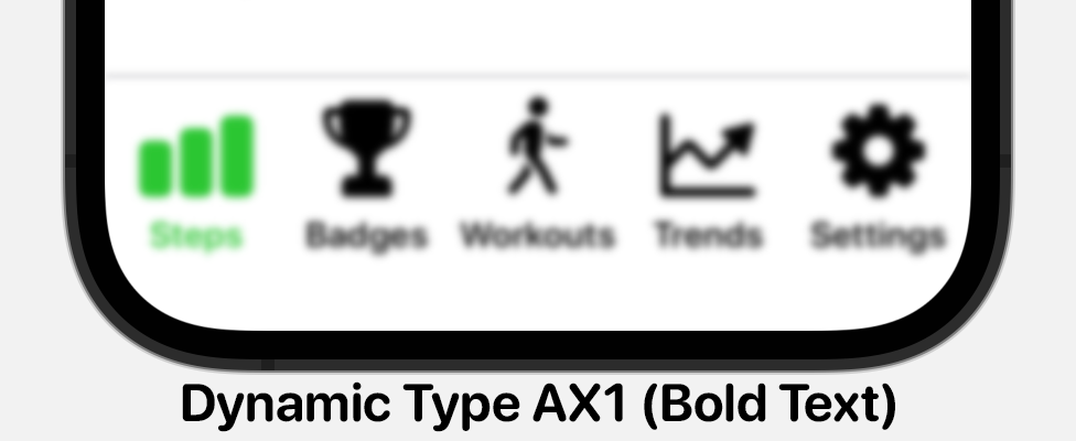
Which was better but honestly still harder to read than I’d like. As I explored why this was hard to read I realized that I was increasing the font weight as the Dynamic Type size increased. This had seemed logical to me since it is making to more dramatic.
But in practice I was actually making the problem worse with these heavy sizes. So I went over to the Typography section of the HIG to confirm this finding. Sure enough, Apple doesn’t change the font weight, only the font size.
When I changed this to retain the Medium font weight I was using for the smaller classes the result was noticeably easier to read.
I expect to keep this blur trick in my back pocket going forward to help me quickly preview my app for Dynamic Type.
Designing a new Badges View
The existing app has a section where users can earn a variety of badges within the app based on their step performance. Things like steps per day, streaks, etc. This screen currently looks like this:
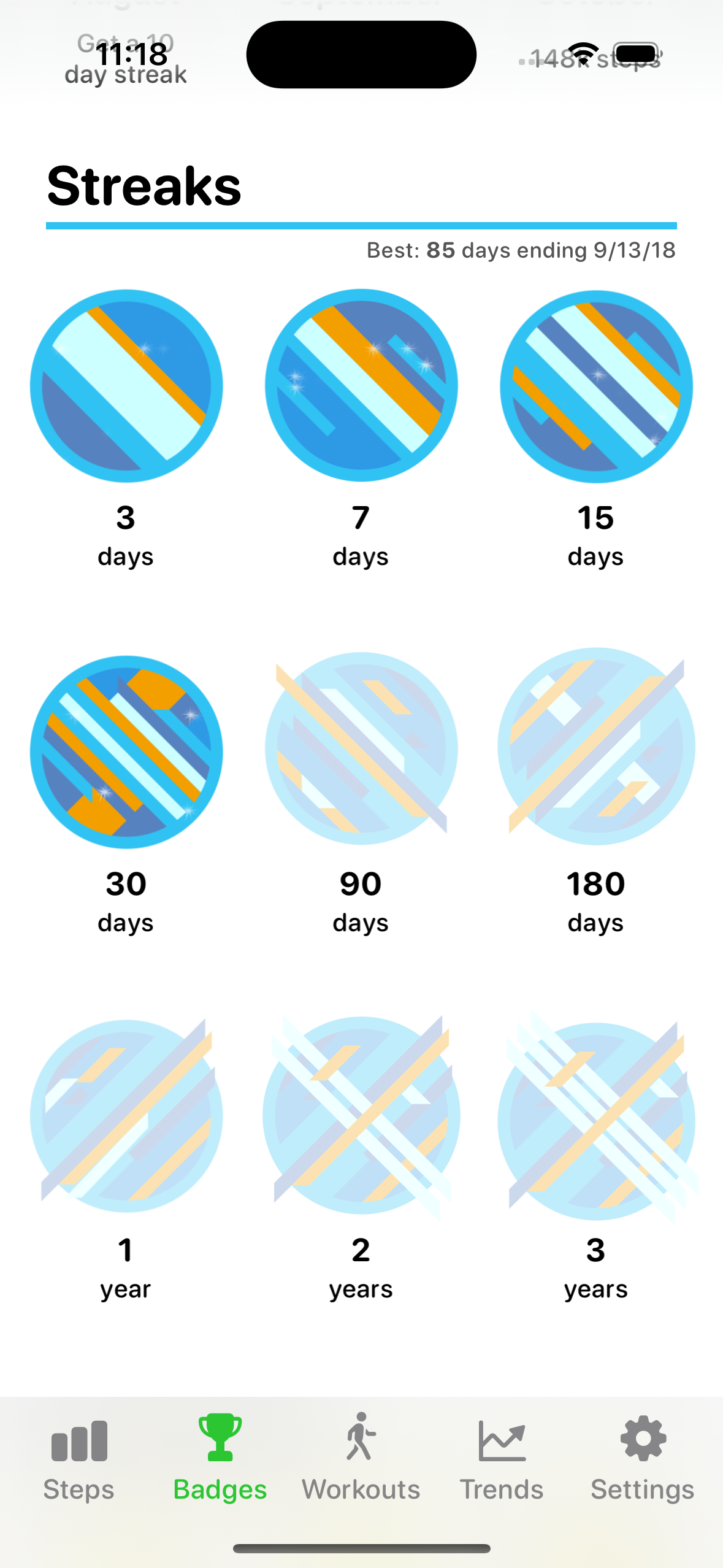
It is based on an old UIKit CollectionView. One of my goals for this update is to move it over to SwiftUI, to make its maintenance simpler going forward. So I set out to recreate it today, here is a speed up 50x screen recording of the process:
Overall this process went well and also came with the added benefit of giving me the opportunity to better adopt Dynamic Type here too. The old version didn’t scale the column counts based on size, which meant I hit a hard limit on how big I could make the labels. This version now scales from three columns to one.
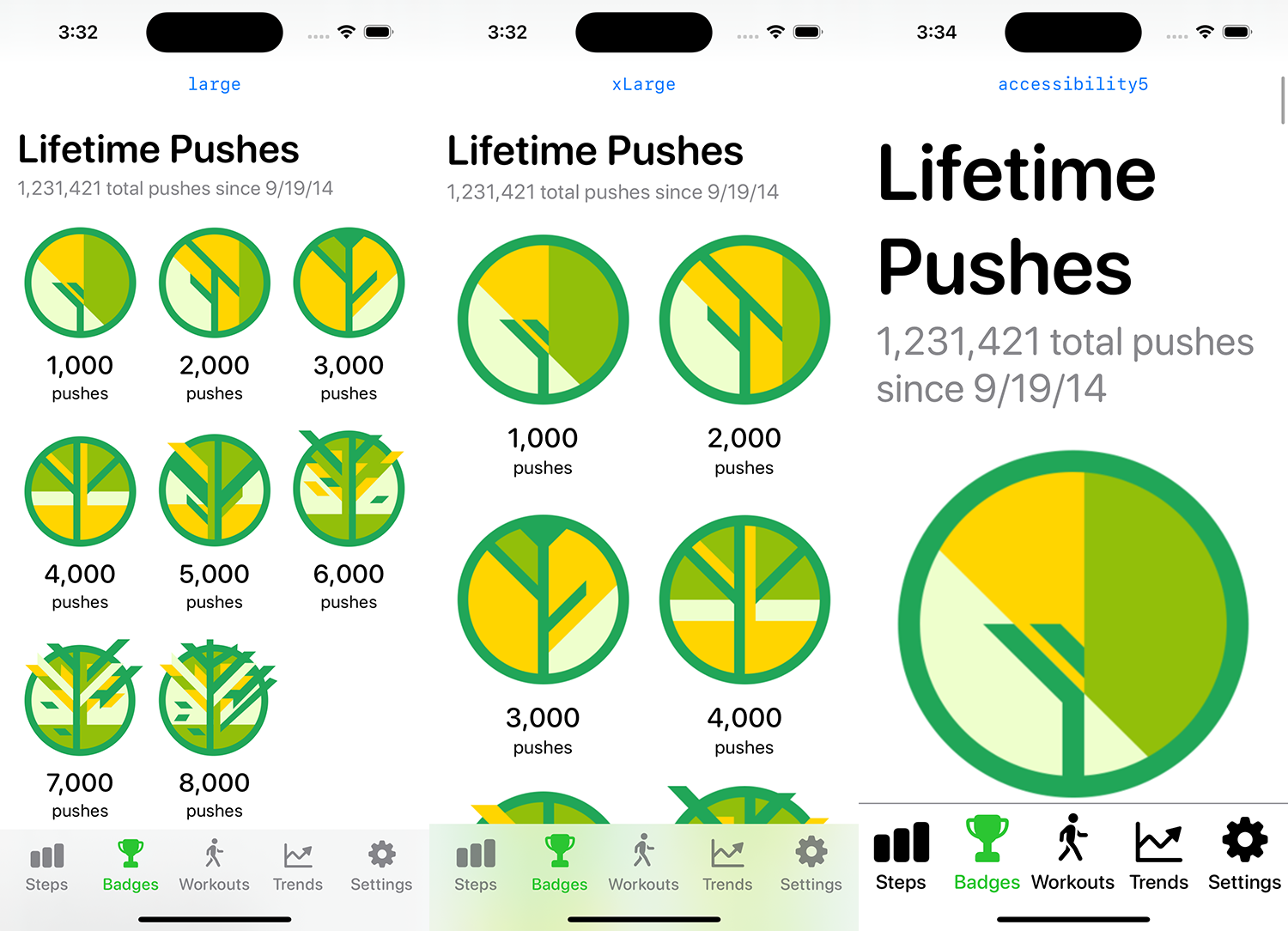
Not quite the final layout but getting pretty close.