In the early days of iPhone development people would often talk about “Pixel Perfect” design, where we would sweat the details right down to the pixel. I hear a lot less of that these days. The shift towards such a wide variety of device screens and accessibility modes made it incredibly cumbersome to be designing things to that level because you’d be tweaking layouts for many dozen screens individually.
Well, I ran into a situation today where I had to pull out my old Pixel Perfect design skills, fire up xScope and get down to the pixel level.
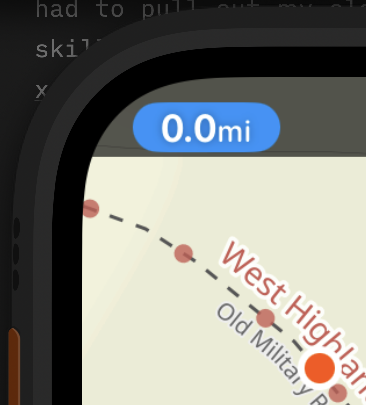
The fast switching button in the top of Pedometer++’s workout view (discussed here) has turned out be a really great solution for providing persistent UI without getting the way. However, placing a UI element on the inside of the top corner of the Apple Watch has lead to a number of really tricky layout challenges.
Here is an array of all the different Apple Watch versions that this screen supports. If you look closely at them you’ll notice that the exact layout of the top areas are actually relatively different between the models. Pay special attention to the position of the time label for reference.
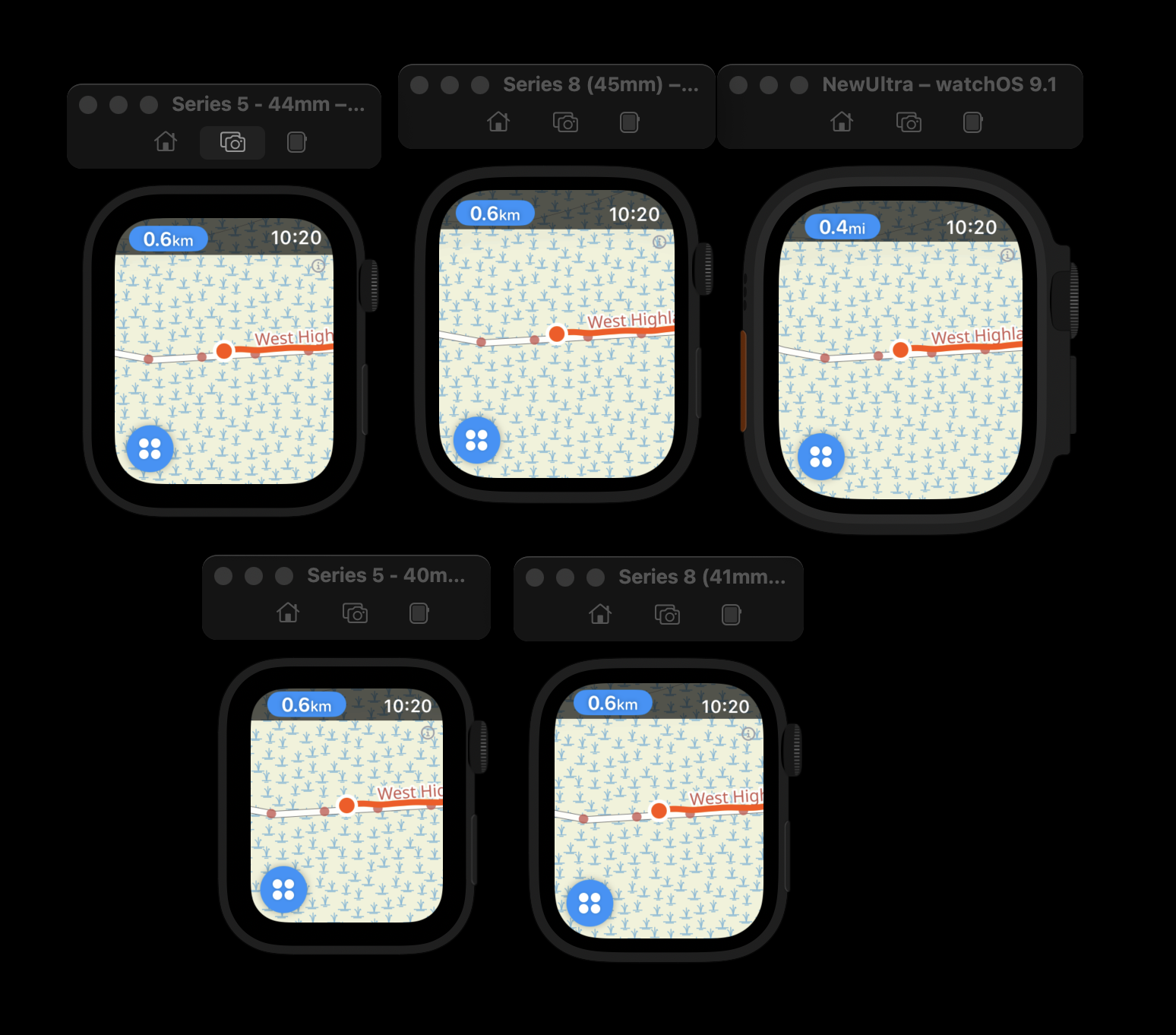
In some watches the date label is pressed closely to the top margin of the screen, in others it floats down considerably. This is largely just an artifact of the same size text being used here so the relative shape and position of the label will naturally need to be adjusted to look at home on the screen. The 40mm watch is a really different screen size to the 49mm, so naturally things will need to shift.
In my original version of this button I did some basic adjustments to account for this but after living with it for a few weeks I didn’t like the result. It wasn’t quite right.
So today I’ve gone into depth to explore what I can do better here.
The first place I looked for reference was the HIG, but it doesn’t seem to provide indications about handling layout into these corners, I think generally it is regarded as best practice to respect the safe areas and so I’m definitely (and literally) painting outside the lines with this design.
The second place I checked was in the Accessory Design Guidelines which is a document Apple publishes for case and accessory manufacturers. I was hoping it would document the corner radius for the screen in a way I could then use to guide my layout.
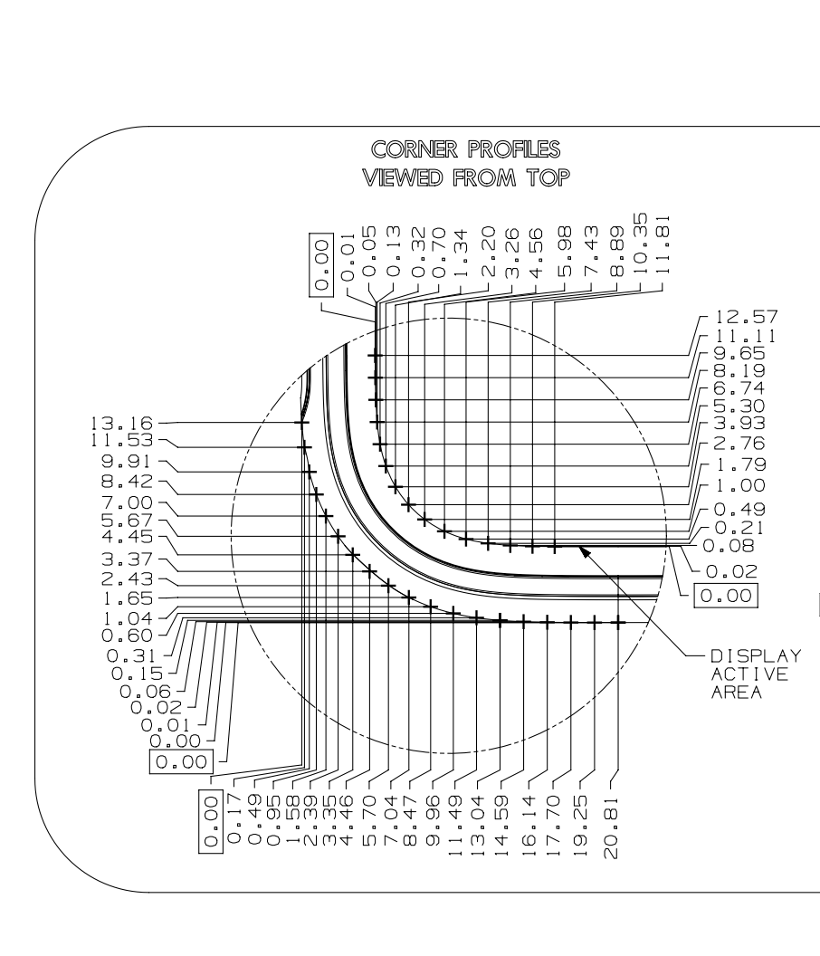
Sadly this was little help. If I’m reading the blueprint correctly the corner radius isn’t actually even uniform with respect to vertical and horizontal curve. 😞
Undaunted, I then just wrote a little app I could use to determine a close approximation of the corner radius of the screens. This was the result:
As far as I can tell the corner radius doesn’t seem to follow a particular formula or pattern. It is on average about 20% of the Width or 17% of the Height, but actually varies quite a lot between models.
And thus any hope I had for coming up with a general solution for this layout went out the window and I was on to manual, pixel perfect layout per device.
This isn’t too bad, thankfully I only have five watch screens to worry about and since the Apple Watch doesn’t seem to scale the status bar with Dynamic Type changes I don’t need to adjust for that either.
So I instead just spent a while trying out slight shifts one-pixel and a time until I felt that things looked ‘right’ to my eye. This was highly unscientific and I’m sure that my results would be different to that of another designer. I took my cues from how Apple has laid out the time label but ultimately I had to find a balance between left and top padding that just visually looked good to me
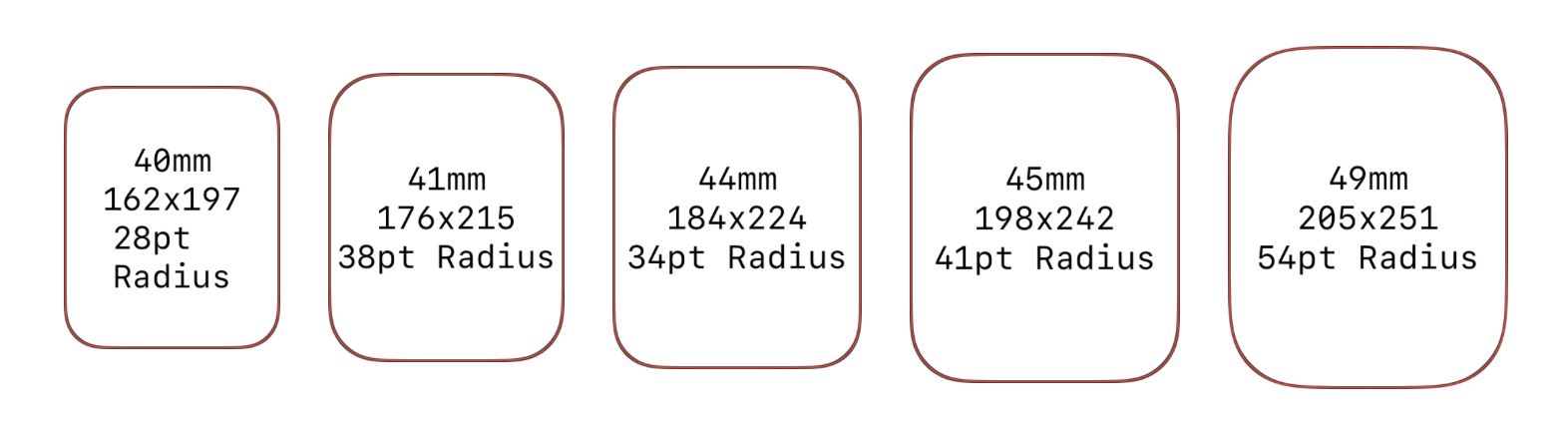
The result a handful of lookup tables like this:
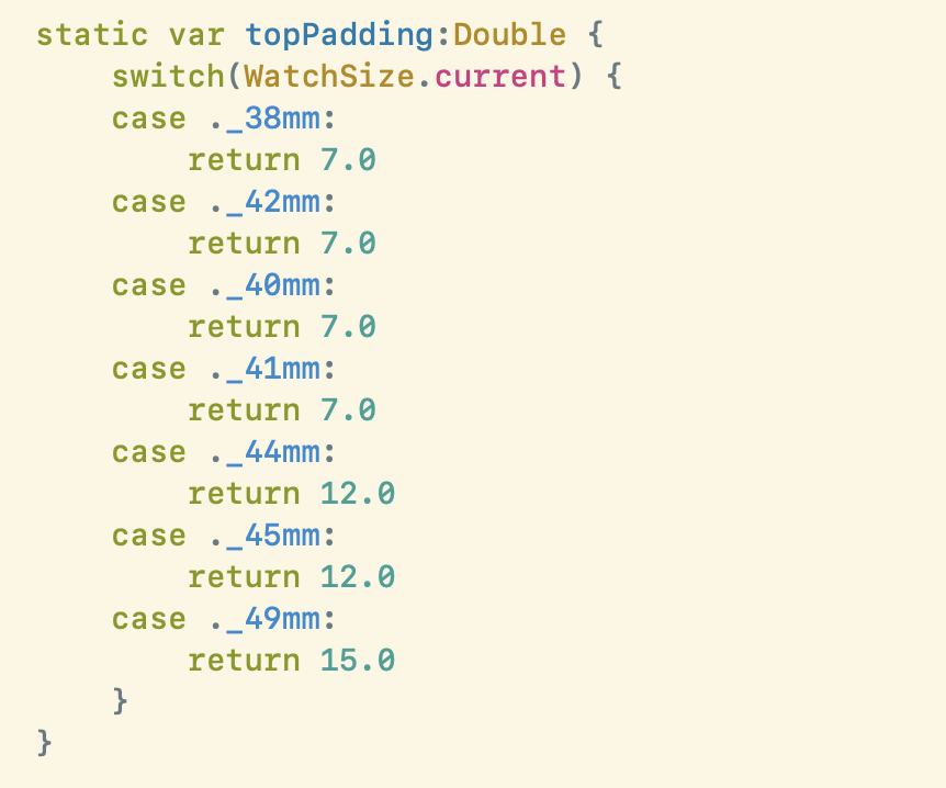
Which adjust the padding of the various elements to suit.
Generally I’d prefer to avoid this kind of special casing in my designs. It is brittle to future devices and will need to be tweaked for each new Apple Watch that comes out. However, sometimes it is just unavoidable to get the layout to look right and especially on screens this small, every pixel really does count.
Postscript, Another Pixel Perfection
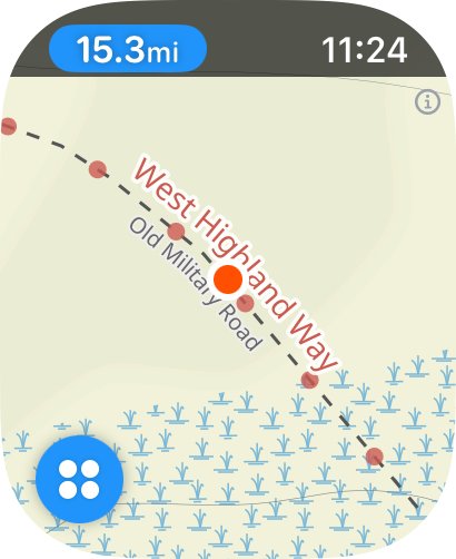
Another little bit of pixel perfection I was chasing today was adjusting the width of the “reverse” button for this control when viewing the metrics view. This just contains a Map glyph and no text. However, it is placed exactly in the same spot as this textual button so I want there to be a smooth transition between them:
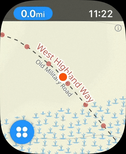
The challenge I run into is that this button’s width is highly variable based on the distance you have walked. So needs to grow and shrink accordingly.
To accomplish this I had to build in a bit of logic to size the green, map button based on how the alternate view will look when tapped. Honestly I doubt anyone will ever notice this little touch but I feel better with having it in there.