It feels like every few years in order to renew my developer license it is required that I design a Now Playing screen.
Historical Background
The earliest one I remember making was for my app Audiobooks, which back in 2009 looked like this:
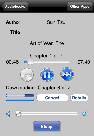
You know that’s an ancient screenshot because it is 320x480, we are talking about a time even before background audio existed.
Things have come quite a long ways since then. In the intervening years I’ve probably designed at least a dozen different Now Playing screens. Each presents a really interesting design exercise.
The design brief is pretty straightforward:
- Playing item metadata (title, artist, artwork, etc)
- Playback controls (forward, backwards, play, pause, …)
That’s it. Organize those elements in a manner that is intuitive to the user and aesthetically attractive. That simplicity is what makes it such an interesting playground to work in.
Widgetsmith Music
The next project I’m working on is to add MusicKit integration to Widgetsmith. This will include a variety of music related widgets and then the ability to play the audio from within Widgetsmith when tapped. So I today again find myself designing another Now Playing screen.
Don’t reinvent the wheel.
While a design project like this is probably a beautiful opportunity for a skilled visual designer, an chance to explore and expand what is possible…an opportunity to innovate. For me a task like this falls squarely into the mindset of being a follower, not a leader.
Maybe that’s a cop out, but this isn’t the distinctive feature of the app, it is a secondary feature and secondary features’ main job is to be intuitive. So what I want is for my design to be immediately intuitive and understandable. I was to optimize for familiarity over distinctiveness.
Here are the Now Playing screens in three popular streaming services:
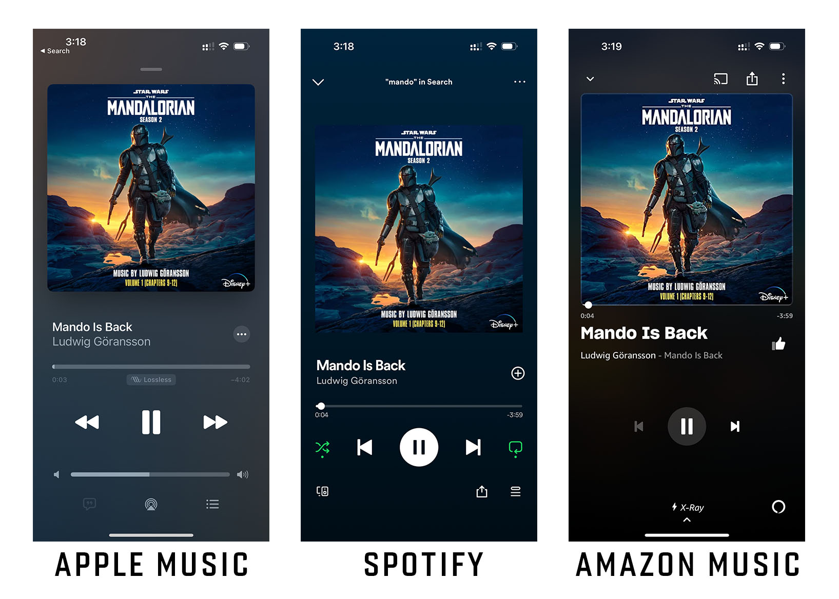
The current ‘fashion’ is to have relatively minimal looking UI with artwork taking the dominant visual weight. Of the three designs I personally prefer the Apple Music one best. It feels more visually balanced and uncomplicated than the rest.
So that is what I’ll be basing my design inspiration around. With the caveat that my design will be necessarily simpler than any of these because I’m not building a widely featured music player, just a basic one which lets you play/pause and do basic navigation.
Speedrun Design
To get started with a project like this I often use a ‘Speedrun Design’ approach. This involves as quickly as possible building something which is visually similar to your ultimate vision, created using the same medium that you will ultimately be using. In my case this is MusicKit and SwiftUI.
So this morning I got to work building out my initial design. I recorded the speedrun session and sped it up 25X below:
I’m using the MusicKit affordances to get the key colors for the currently playing artwork. For the speedrun I’m just hard-coding these using values I previously extracted in another prototype. (Using the Andor and Mandalorian artwork because they contrast strongly against other)
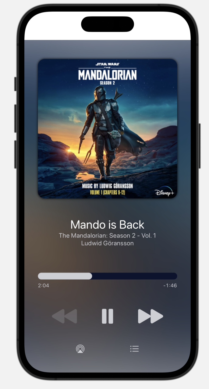
I’m pretty happy with this as a starting point, it is visually simple and should be immediately comfortable to anyone coming from Apple Music.
Lots of work to be done actually implementing this and tweaking the design, but by speedrunning my starting point, I can start to live with it sooner and get used to how it works in practice.