Yesterday’s announcement of the new Liquid Glass design system has made me think it is a good time to dust off my old Design Diary series of blog posts. I expect I will be spending a good part of this summer working through what the new design system means for my apps.
The Road Ahead
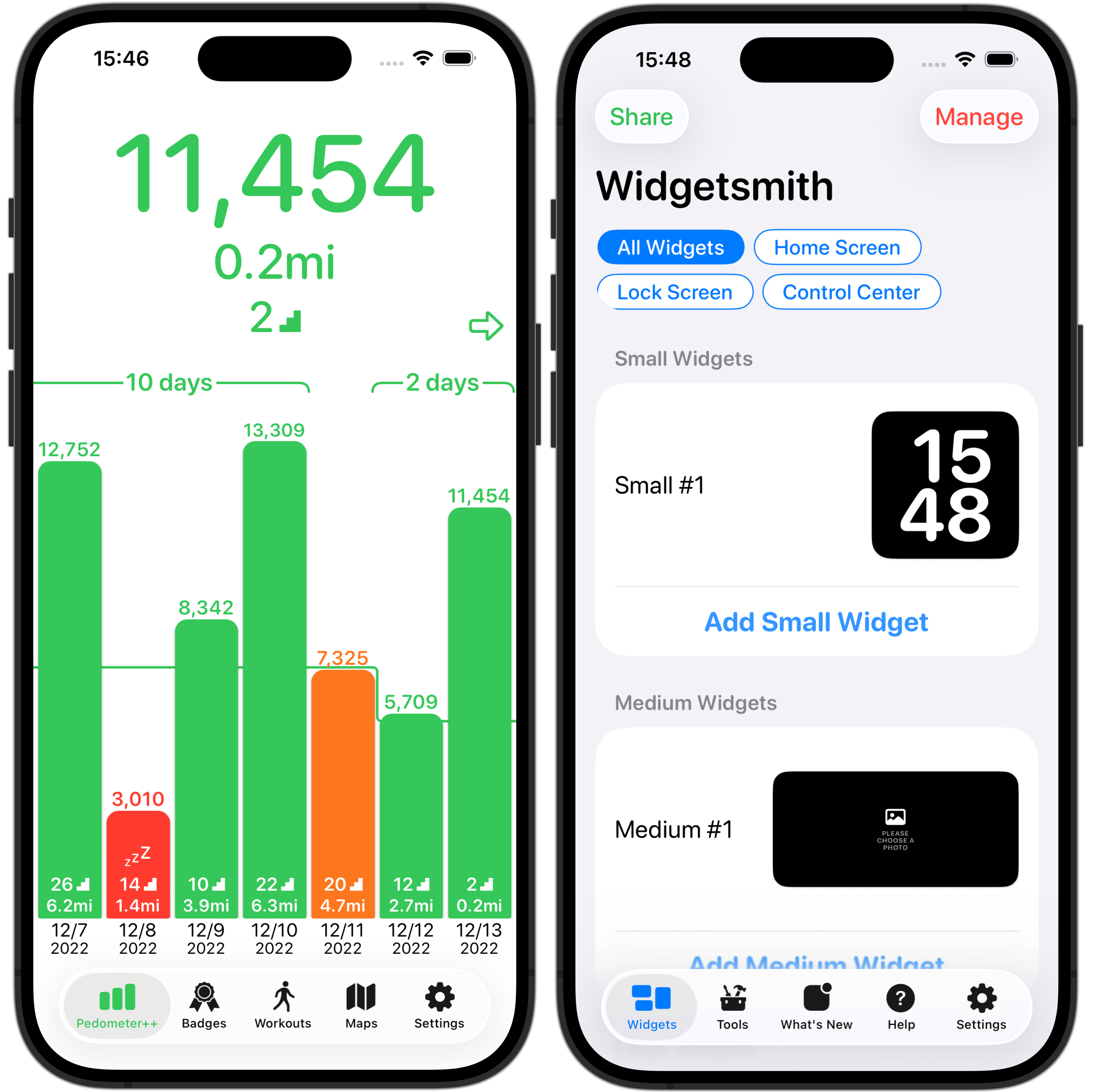
The very first thing I did once I got the new Xcode versions installed was a simple build-and-run of my apps to see how far I have to go with adopting the new design. The result showed just how far I have to go.
Having now watched a bunch of the Session Videos about the new Design is clear that Apple has done a lot of thinking about this new direction they want their platforms to head and it is gonna be far more than just a simple coat of paint.
While the core functionality of my apps will remain the same I expect I will need to do some deep thinking and exploration of how I can best adjust the hierarchy, layout and adornment of my apps to fit in.
This talk “Get to know the new design system” by Maria Hristoforova in particular lays out the fundamental concepts which undergird the thinking I need to adjust to adopt.
Rule #1: No HIG Exceptions, No Custom UI
I’m also learning (the hard way) that I will need to be careful to properly understand the new system before I get carried away with my ideas for adopting things.
Something I have a tendency to do is want to build lots of little custom interactions, which serves me well in some contexts but here it would be rather unwise. Apple has spent a lot of effort crafting this new design system and likely explored and tried a great number of different paths which they now advise us to avoid.
As a result, my first rule I’m adopting for myself in this initial redesign is that I will 100% follow the system guidance and use all default system behaviors.
There might come a time when I have enough knowledge, experience and confidence to go my own direction with a design element, but what I should do first is be completely default in my implementation. I’m going to try and hold myself to a rule that I don’t do anything custom.
I think should try to follow the proverb “Imitate, then Innovate”. Until I know the design system backwards-and-forwards, I not going to think I know better than the defaults.
Getting a head of myself
This rule is top of mind for me right now because of a little exploration I did this morning. I saw how in a few places the new design will have a search button as an element along the bottom trailing edge of the Tab Bar.

I saw that and was like “ooo, I wonder what it would be like to put a universally accessible action button there”, like maybe I could put a “Start Workout” button in there for Pedometer++.
Trying to implement this I immediately discovered that there was no default, system method in the new design’s API to do this. The Search button is a specifically unique action which the system supports.
That didn’t stop me from trying to see if I could do it anyway. So a bit of hacking around with onChange and other abuse of SwiftUI I got something working.
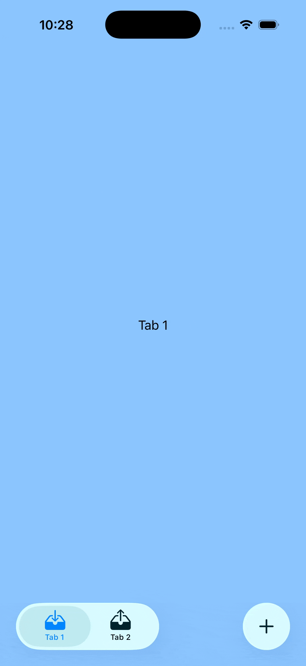
Then I caught myself and gave myself a metaphorical slap on the wrist. Nope, don’t do that. This summer is all about learning the common path, the default path. I shouldn’t spend time hacking around the system.
This was then confirmed all the more when I started reading the new Human Interface Guidelines and what should I see when I get to the Tab Bar section.
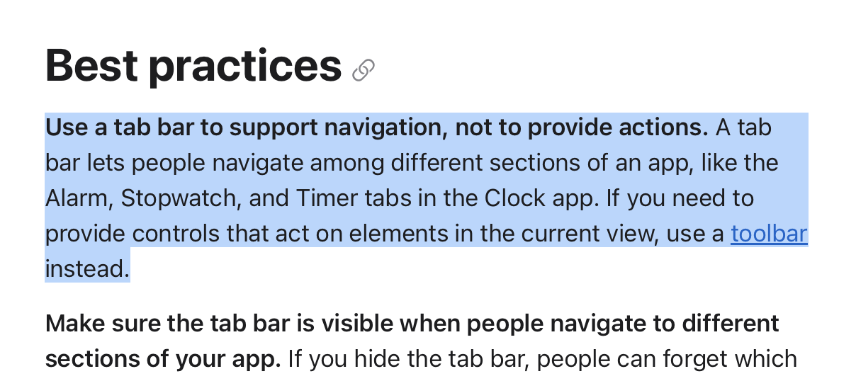
The exact thing I wasted a few hours working on was specifically called out as a bad idea.
So that is now my mission for the summer. I want to adapt Widgetsmith and Pedometer++ into the new system without a single hack. If I can do that then I should reach a point where I deeply understand things and then maybe at that point I could starting thinking about places where I might be able to reasonably innovate on top of it. But until then it would be hubris and folly to think I know better.