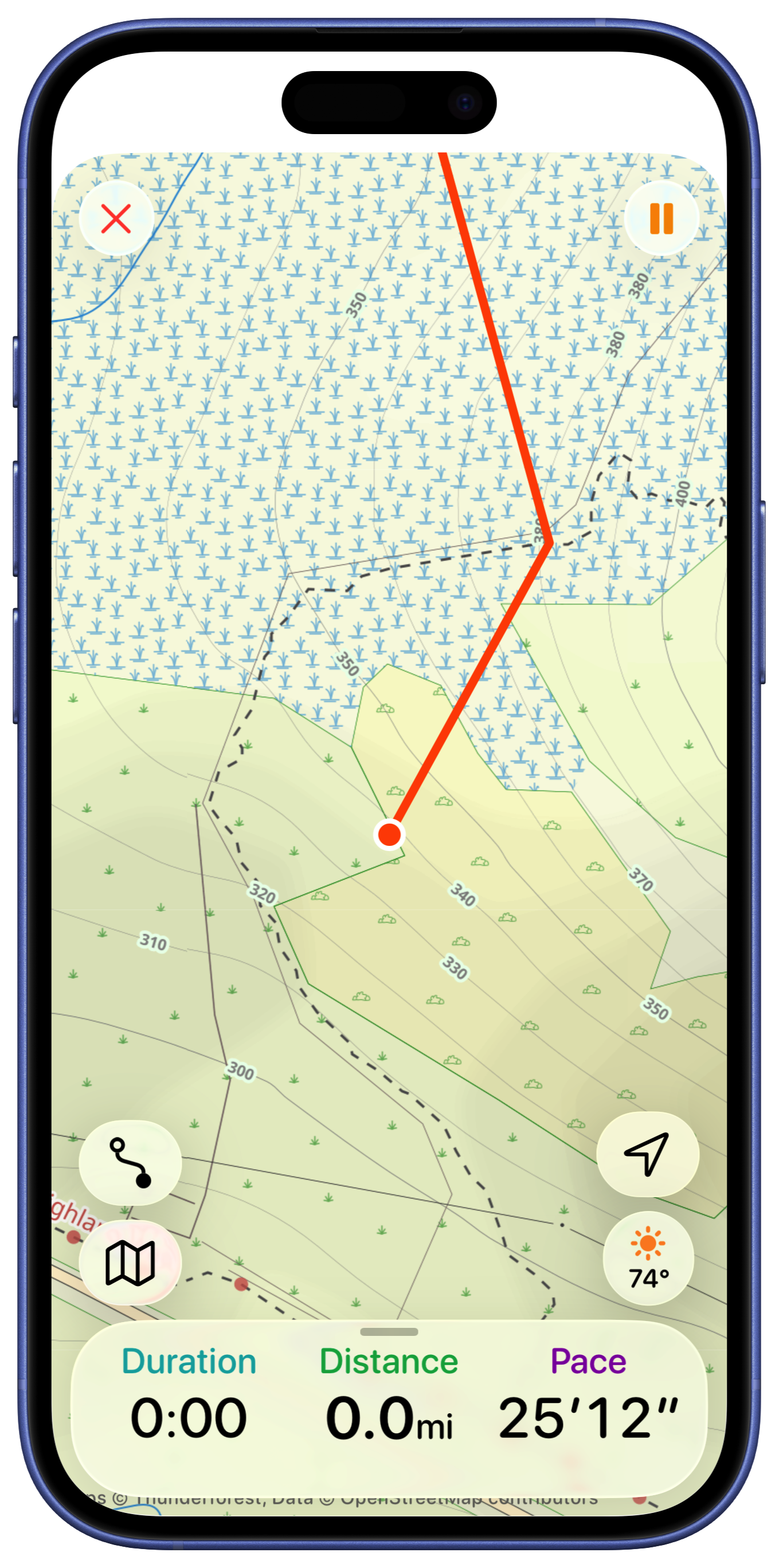
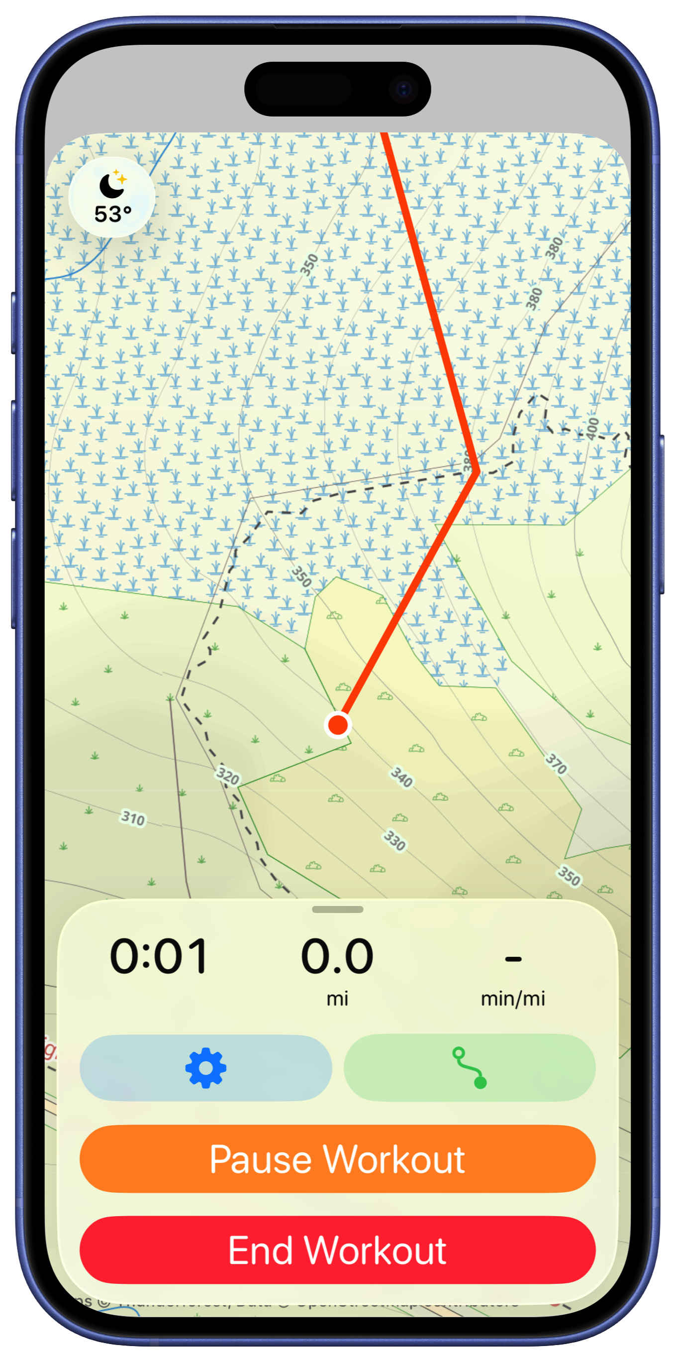
Next up is the active workouts screen. This is shown when the user is out on a walk, hike or run. It uses their iPhone to track the metrics associated with the effort. It also includes route finding features to help with navigation.
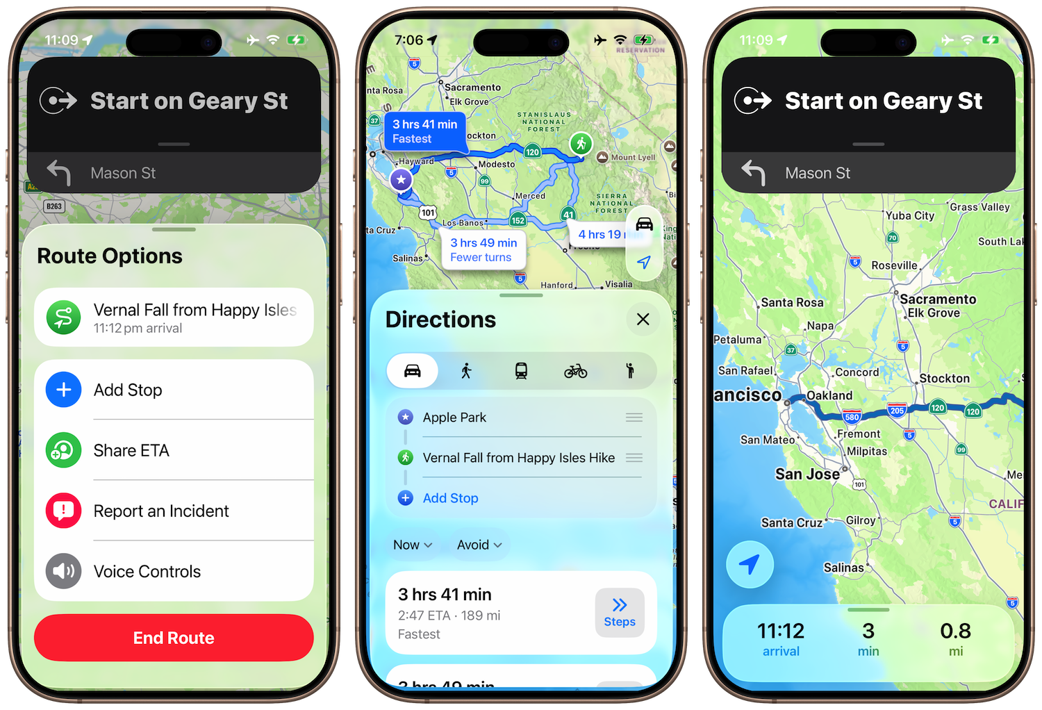
It seemed like the best place to start looking for some inspiration would be in the Apple Maps app, which does essentially the same thing…just without the backcountry and fitness abilities.
The overall direction of map focused with glass overlay seemed like the obvious place to start. So first to go is the bottom section, to be replaced by a floating glass panel.
NB: These screenshots were mostly taken with Beta 2, so had a much stronger glass effect, the last ones were Beta 3 where Liquid Glass turned into Frosted Glass.

I tried to make the top panel also have a glass background but I find that doesn’t look quite right and feels a bit disjointed.
So instead I tried to mirror more of the Apple Maps during a navigation session look with the status on the bottom.
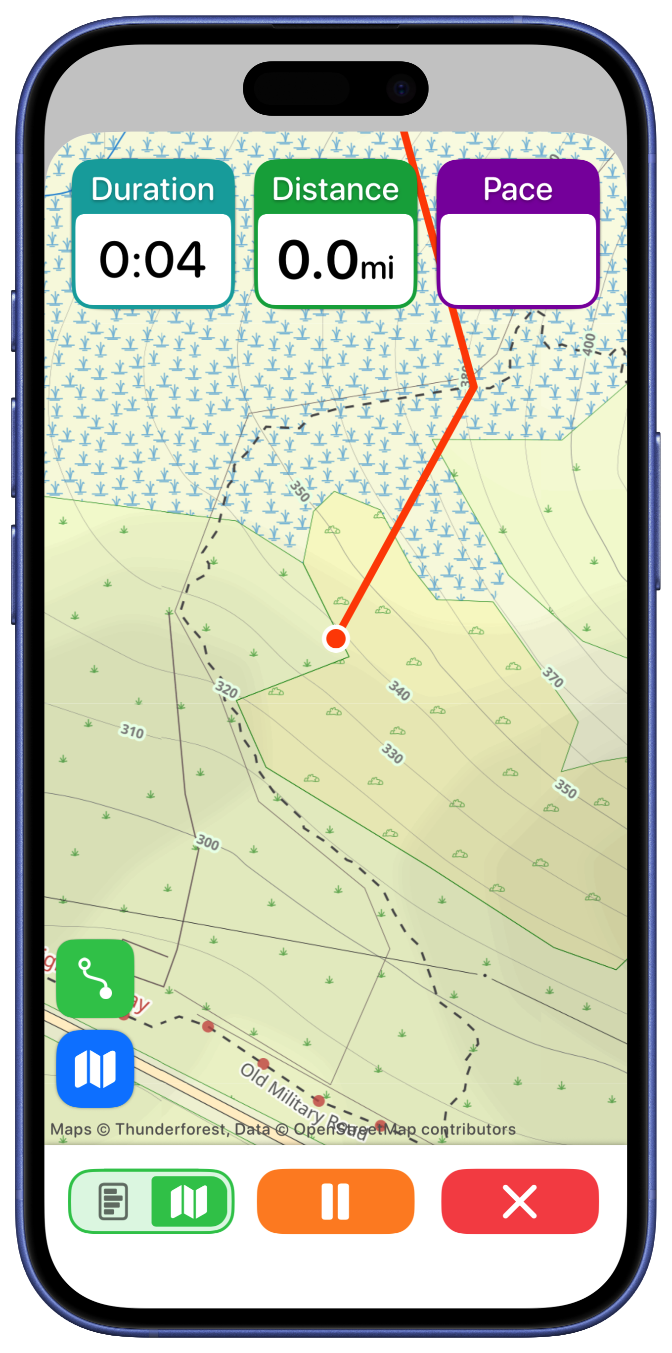
That’s much better. In this early draft I tried putting the end and pause buttons on the top like I have in a number of other views for closing map editors…looking at that now that was an awful idea which thankfully later on I will remedy in due course. But until then I experimented with adding a fuller metric display here.

But I think that is visually not as nice and I’m not sure is super helpful.
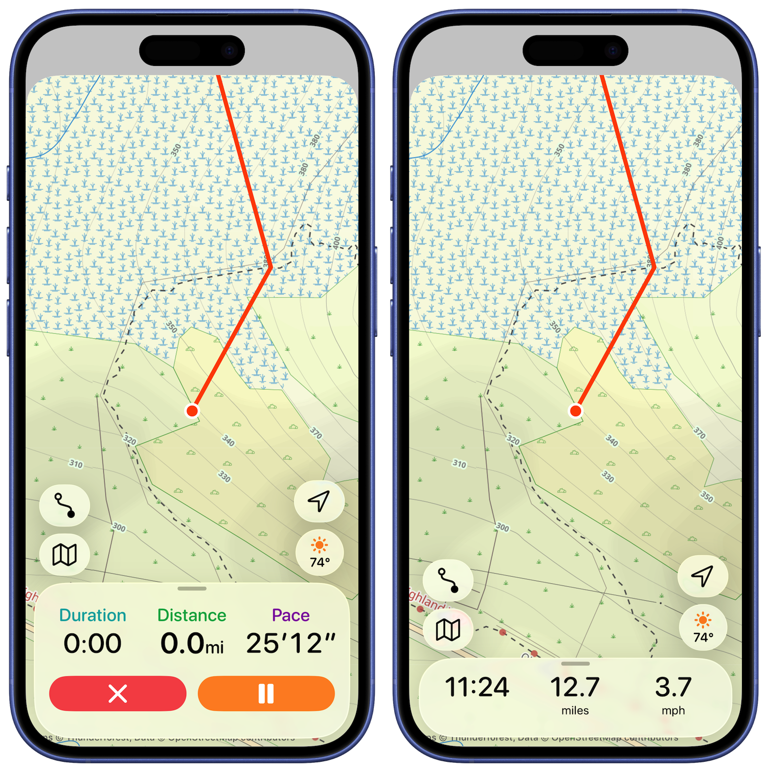
So streamlined things and added in the maps buttons for controlling route selection, weather and basemap.
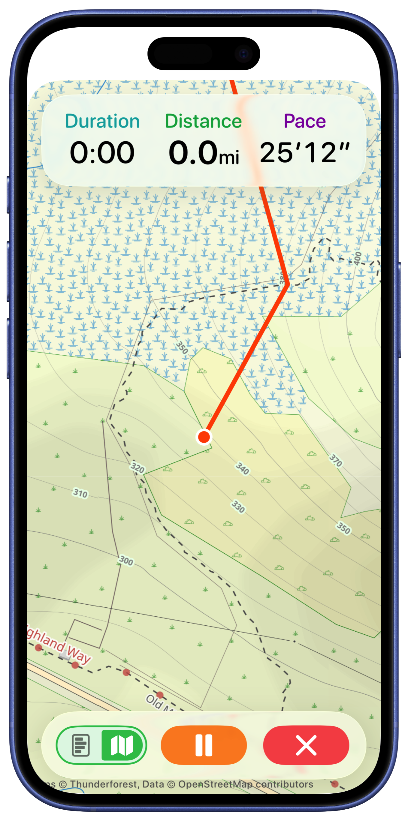
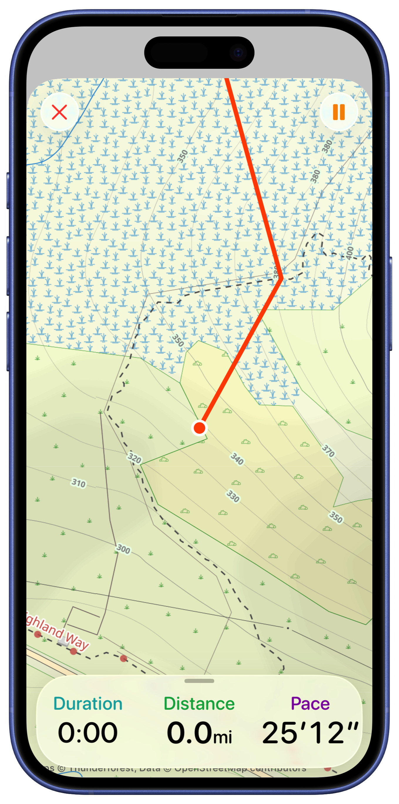
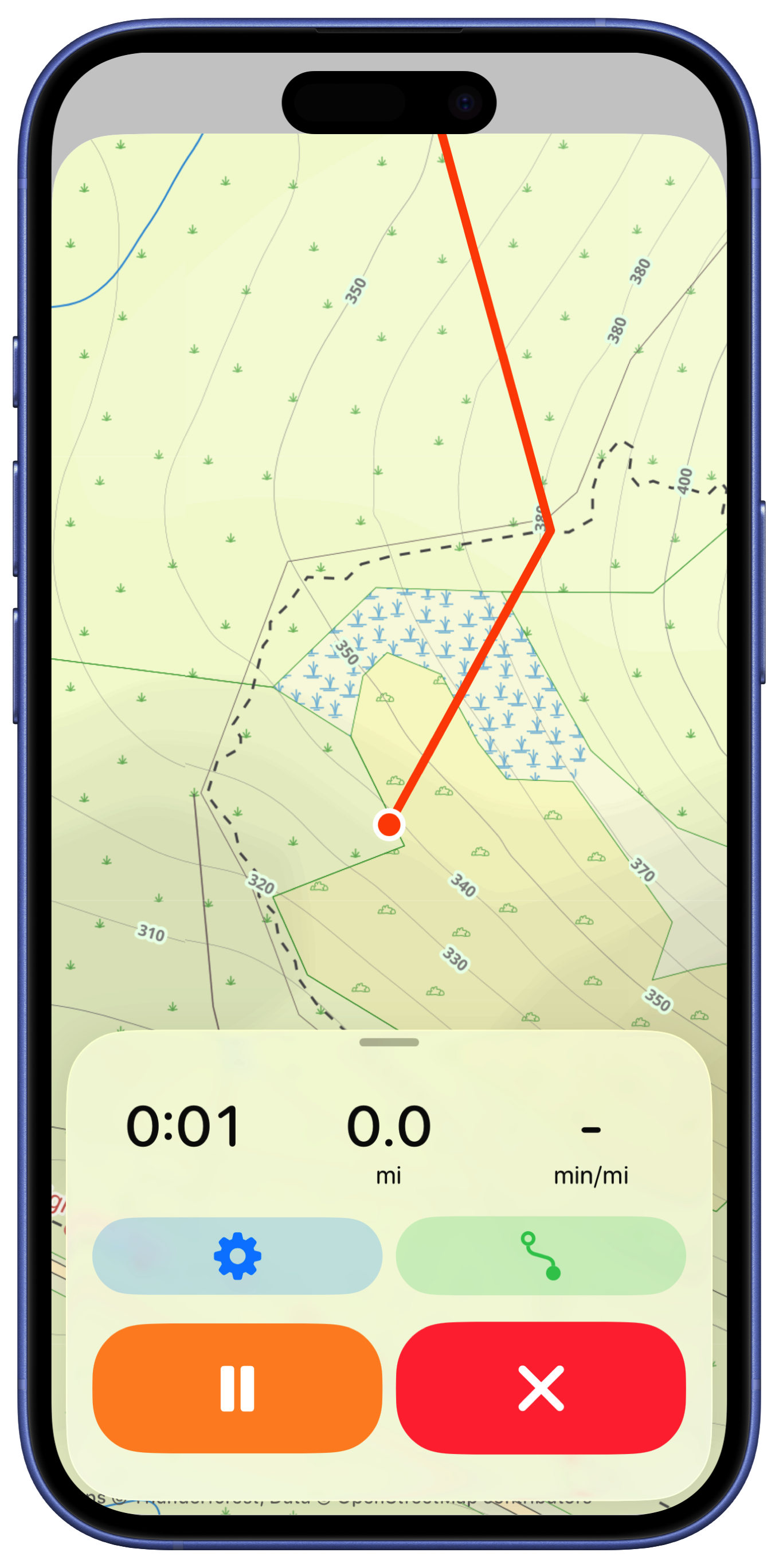
I then had the good sense to bring down the workout control buttons to the bottom of sheet. They are hidden when the sheet is collapse and visible when the user taps or pulls up on it.
I played around with adding the additional metrics in the expanded sheet. I was recreating a feature in the old version where you could get a just text display (hiding the map entirely). Visually I’m not in love with this.
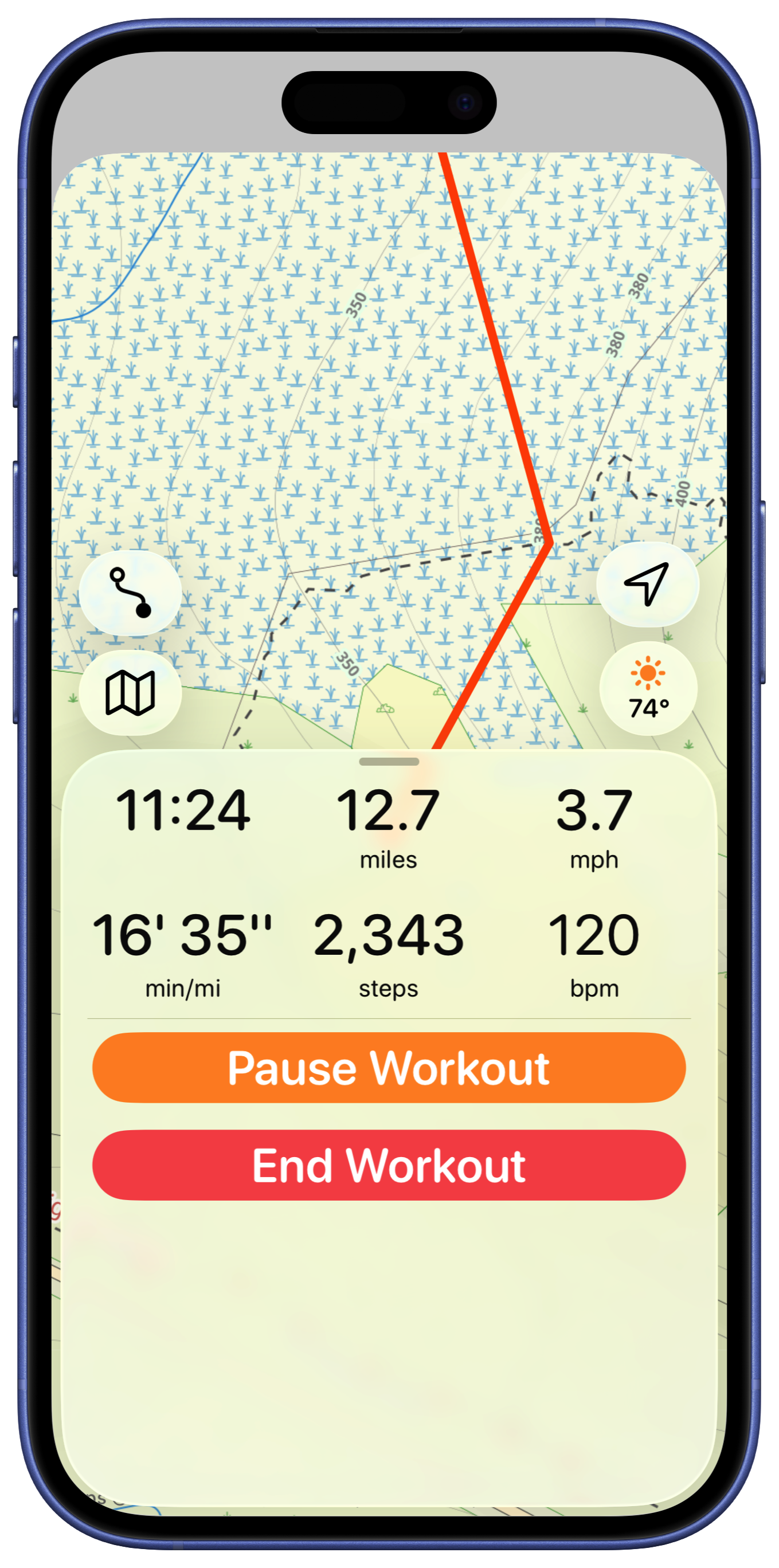
But I think the map view is too crowded with all those buttons, so let’s pull them down into the bottom panel, hidden by default.
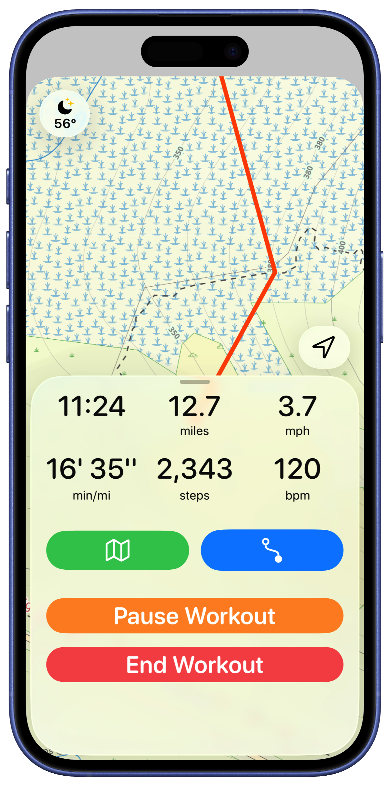
I tried having the weather display up in the corner (like the Apple Maps app). But I also feel like the two lines of metrics is too much. Instead, I’m going to make the shown metrics configurable, allowing the user to see what they like here.
The buttons in the bottom feel a bit unbalanced so I played around with their button styles.
When I showed this design to a designer friend (Ben), who has much better design sense than I do, they pointed out that arranging the buttons horizontally would make for larger targets, ideal for users who are working out and might not be as precise with their taps.
That was better but then we iterated a few more times on the idea. Drawing inspiration from the Apple Workouts cycling mode screen.
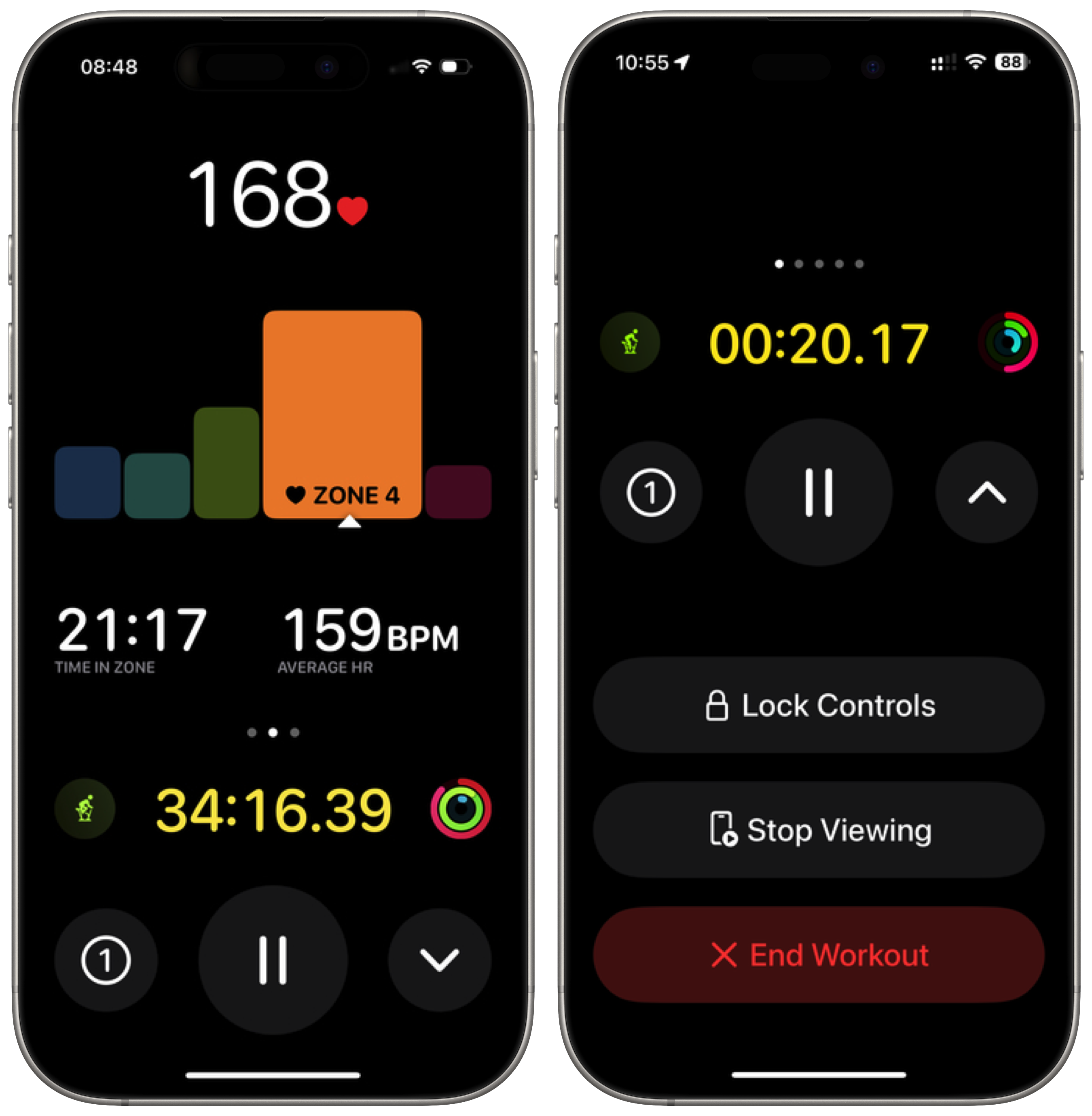
I really like emphasizing the pause button as it is likely the one to be hit most often and the circular arrangement feels good too.
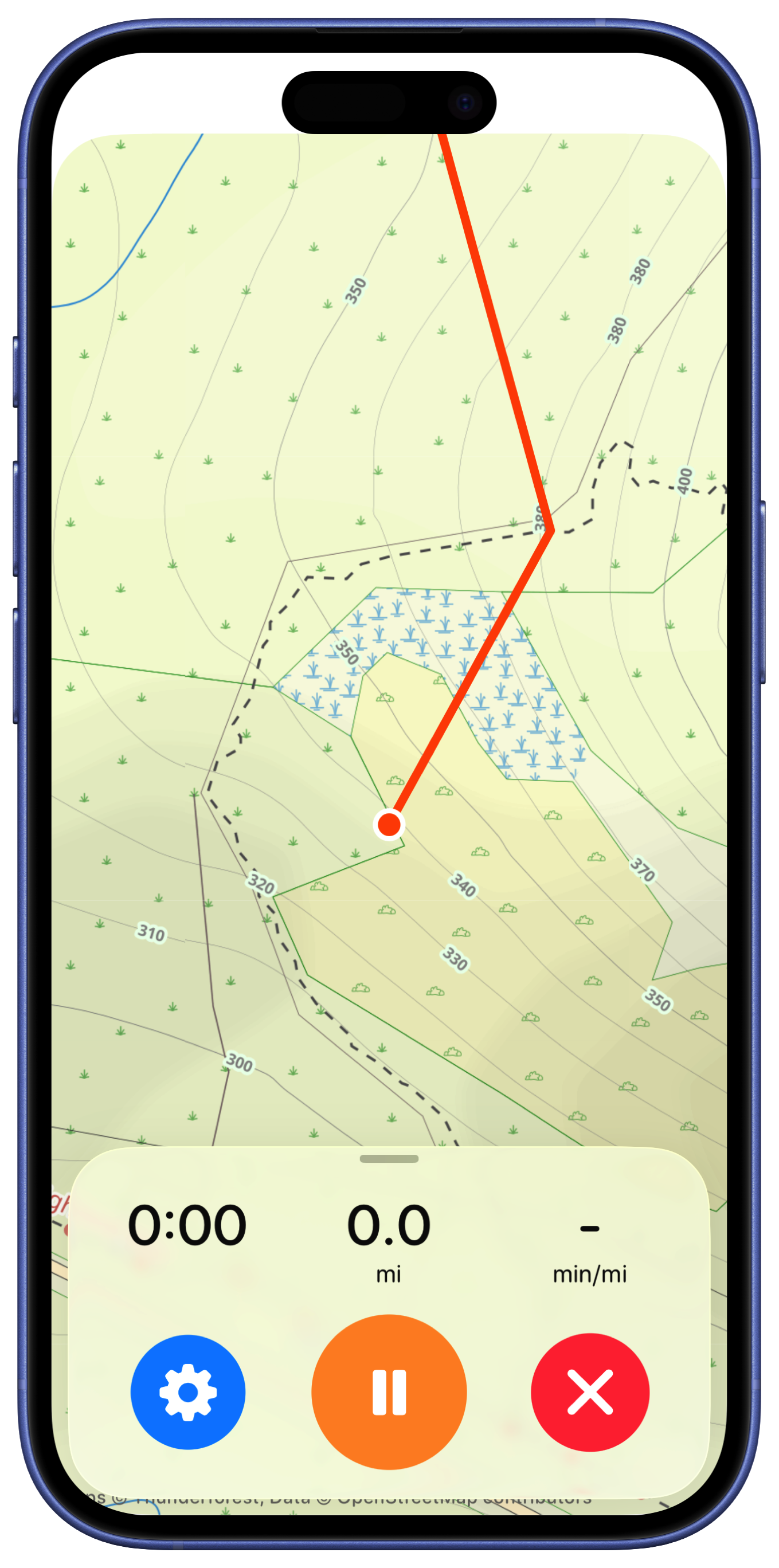
That is where I’ll leave it for now. That feels very streamlined and clean. The core functionality is all still here but in a very easy to read, map focused way.