This is part of my ongoing As I Learn WatchKit (AILW) series.
Yesterday in Beta 5 of WatchKit Apple added support for MPRemoteCommandCenter and MPNowPlayingInfoCenter directly to the Apple Watch.
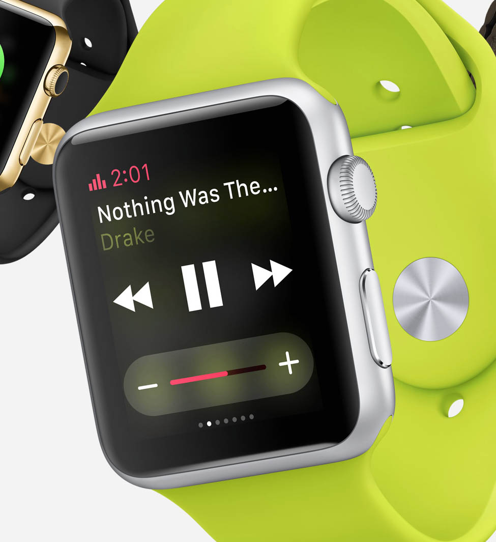
While we don’t know exactly how these will be presented in practice, they will likely provide an interface to media applications similar to what we have in Control Center on iOS. Basically a simple, consistent way to view metadata about the currently playing track and perform basic playback controls.
This will probably look vaguely similar to this example shown on one of the promo pages for the Apple Watch:

I’m very glad this new API was adopted—not because it makes my work for Audiobooks and Pod Wrangler much simpler, but for how much this will improve my customer’s experience with Apple Watch.
The Problem.
As I outlined in my design post, I’m working on a WatchKit extension for both of my audio focused apps. The obvious capabilities for these include:
- the ability to view the currently playing item,
- control its playback and
- navigate through the user’s media library.
This new ability introduced in Beta 5 helps with the first two. It doesn’t eliminate the need for them in my own app but allows me to de-emphasize them. The real value, however, is in how my customers can now access them.
In all my design work for my WatchKit apps the question that I keep asking is: How will this make my app more convenient to use? If I don’t have a good answer for that then I’m likely heading down the wrong path.
Watch apps shouldn’t try and be full blown apps, replicating the full functionality of their big-brother iPhone apps. Instead they should be sleek, svelte companions that take advantage of their immediate availability to their user. This leads me to the problem I’m so glad Apple has addressed. The tap distance required for the user to perform any action.
Reducing Tap Distance.
Prior to the introduction of the Now Playing Glance this is the path a user would have to take to get to my app to perform an action:

So at least four steps before they can even start performing the action they want. This is likely not any more convenient than just pulling out your iPhone or using your headset controls, especially for play/pause/skip interactions.
It might still be worthwhile for choosing another episode or book, but that would narrow quite significantly the usefulness of the WatchKit app. The tap distance for performing actions was just too great.
The situation now is much better:

Basic actions are now immediately available and advanced actions are very nearby.
Now this assumes that the user will put the Now Playing Glance in their first position, but that is massively more likely than them putting the Glance for my own app in that position. The Now Playing Glance would work for all media apps, not just my own.
This is a workflow that I believe can compete with an iPhone or headset controls in terms of convenience.
General Lesson.
The more time I spend designing for the Apple Watch, the more I understand how vital thoroughly considering user experience details like tap distance are. Watch apps are being used in a context very dissimilar to iPhone or iPad apps. Apple describes this difference like this in its Interface Guidelines (emphasis mine):
Apps designed for Apple Watch should respect the context in which the wearer experiences them: briefly, frequently, and on a small display.
Before the inclusion the Now Playing Glance I could design an app whose visual layout respected the last of those points. But, I couldn’t make the interaction brief since getting to the point of action was so deep in the navigation stack…which likely meant it wouldn’t be used all that frequently either.
If you are designing a WatchKit app that doesn’t benefit from all three of those attributes you may need to re-consider its utility and scope.
PS: If you can’t find a way to build that kind of utility into your app because of the navigational structure of Apple Watch make sure you have filed a request to Apple explaining your situation. That is what I did for Now Playing (#19057688) and while I can’t take credit for its addition, I can only imagine that helped.