I’ve recently been curious about the overall trend in iPhone screen sizing. Both as a result of the introduction of iPhone SE and because I feel it is an important thing for app developers to understand to make better decisions about their app UIs.
Since 2013 I’ve kept a pretty detailed set of device analytics for my Audiobooks app, these are the stats that power my iOS Version Stats Page.
Included is the screen size of the device being used. While the latest summary has always been included in the bottom portion of the stats page, I’ve never really thought to look at it over time. The result turned out to be very interesting.
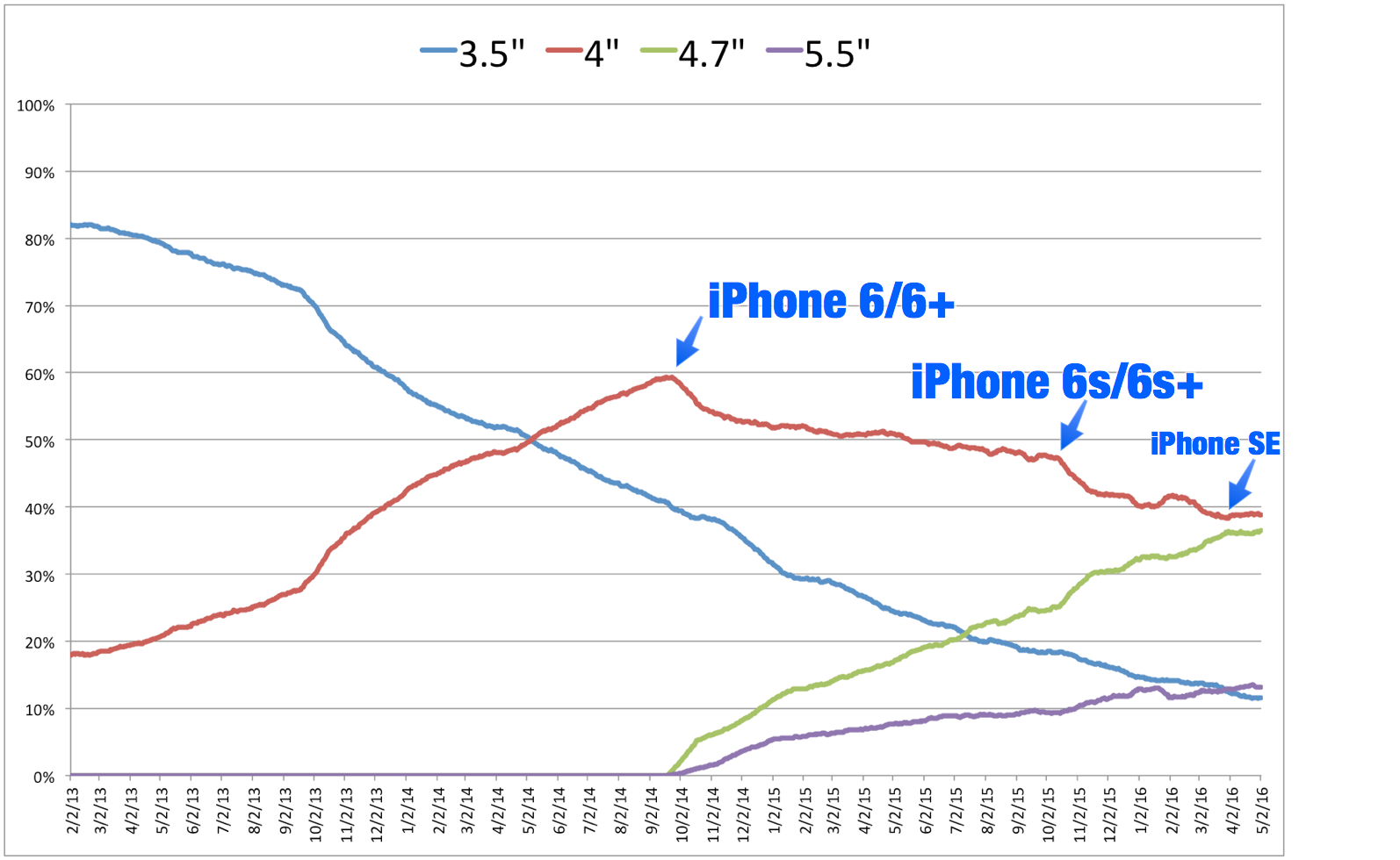
Here is the percent of daily sessions (30 day moving average) using each size of iPhone over the last three years. The iPhone 5 (which introduced the 4″ size) was introduced in September 2012, so around five months before I have data.

Much of the shape of this curve isn’t particularly surprising. 4.7 and 5.5″ screens have seen a steady increase in popularity since their introduction, with the 4.7″ outselling the 5.5″ at nearly a 3:1 ratio.
What did catch my eye was the impact of the iPhone SE over the last month or so. The 4.7″ curve had been steadily growing since its introduction and poised to take over as the most popular screen size. However, since the introduction of the SE the 4.7″ line has leveled out demonstrably (currently settling around 36%). This may be a short lived phenomenon, but is nevertheless very interesting to see.
From a development perspective this shows me that continuing to target my visual design around a 4″ layout continues to be a smart move. While the 3.5″ screen is essentially out-to-pasture at this point (I’d expect iOS 10 to drop support for the iPhone 4S), the 4″ layout will be with us for a long time to come.