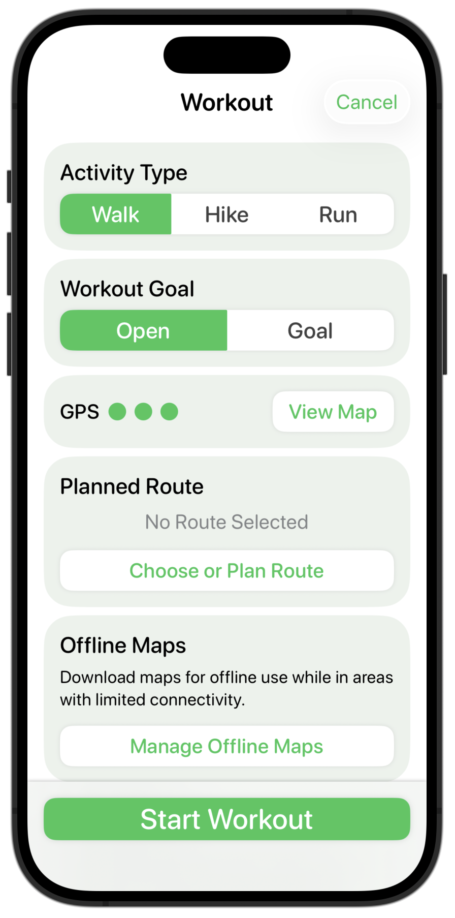
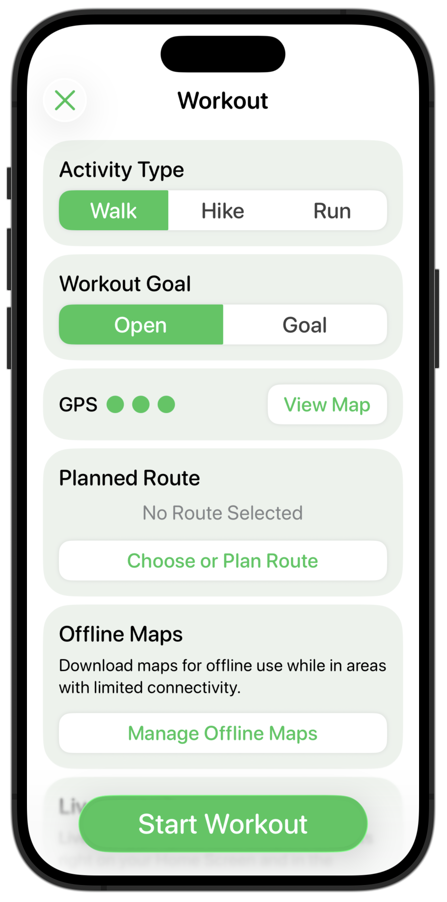
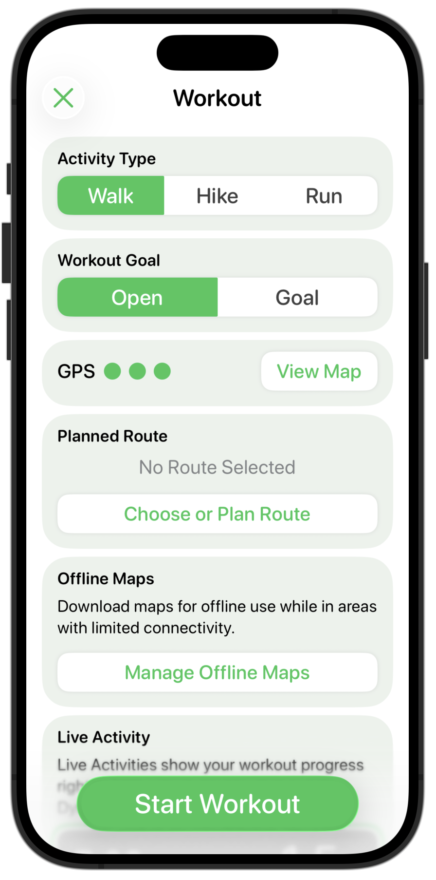
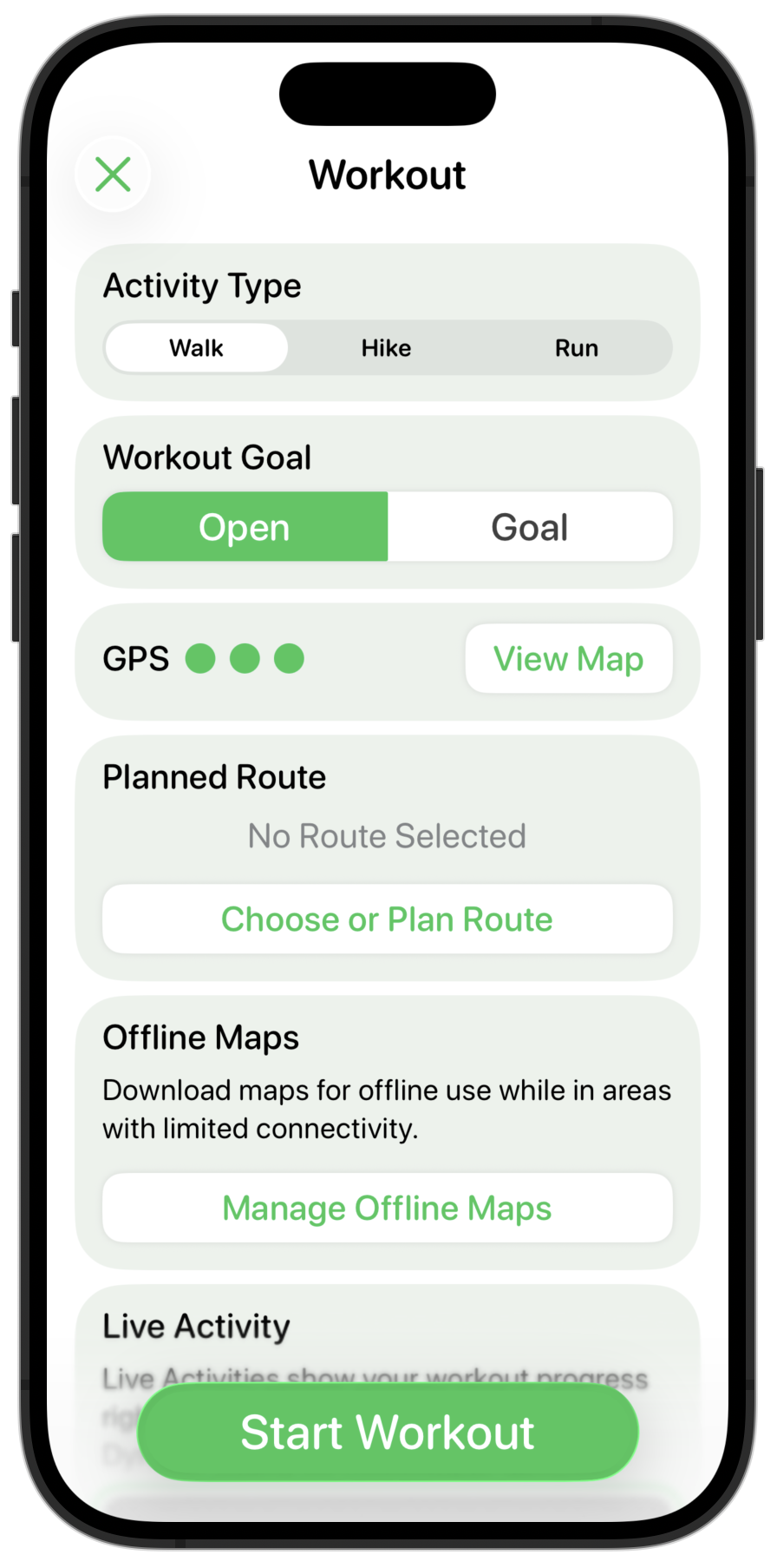
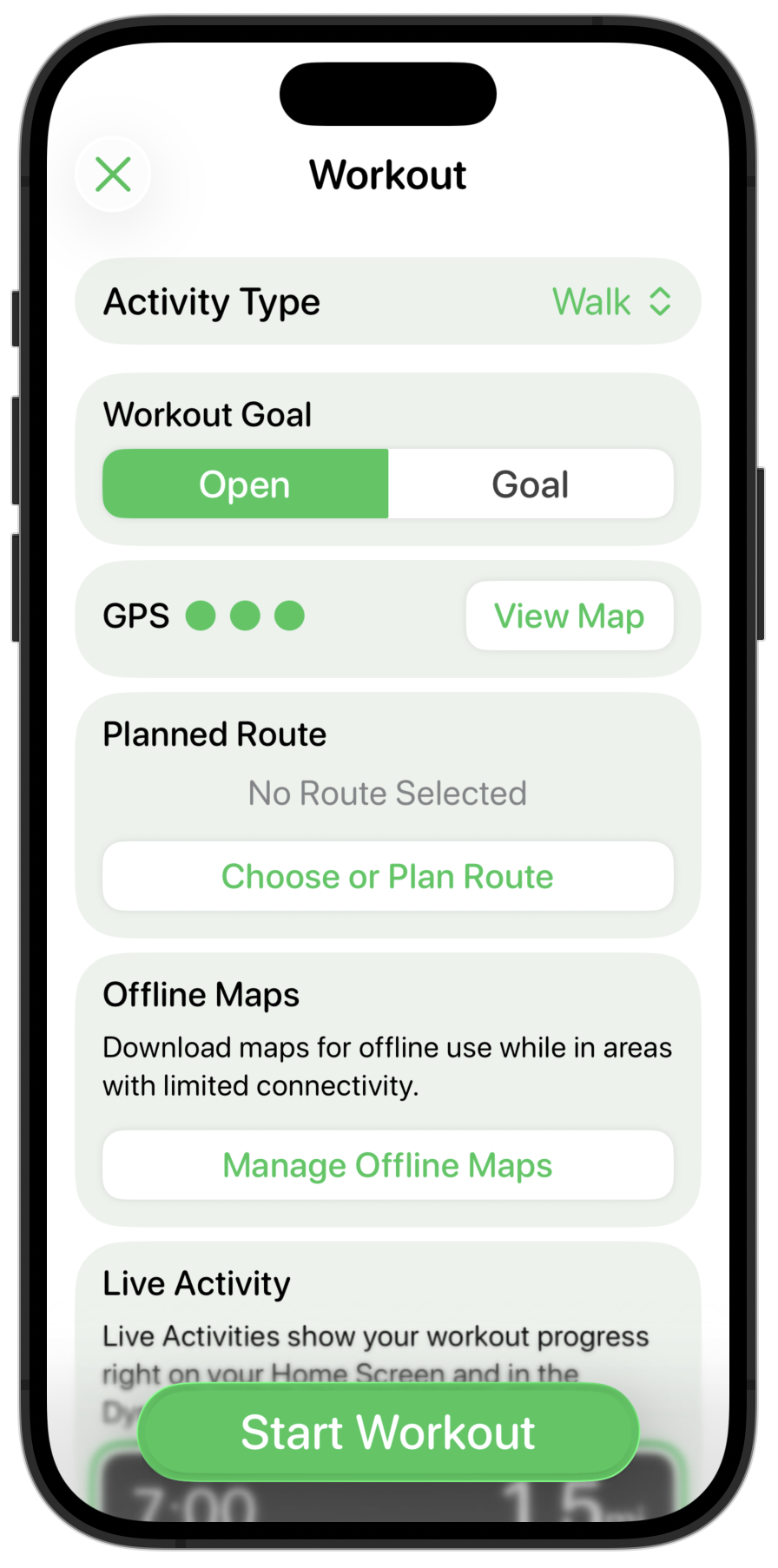
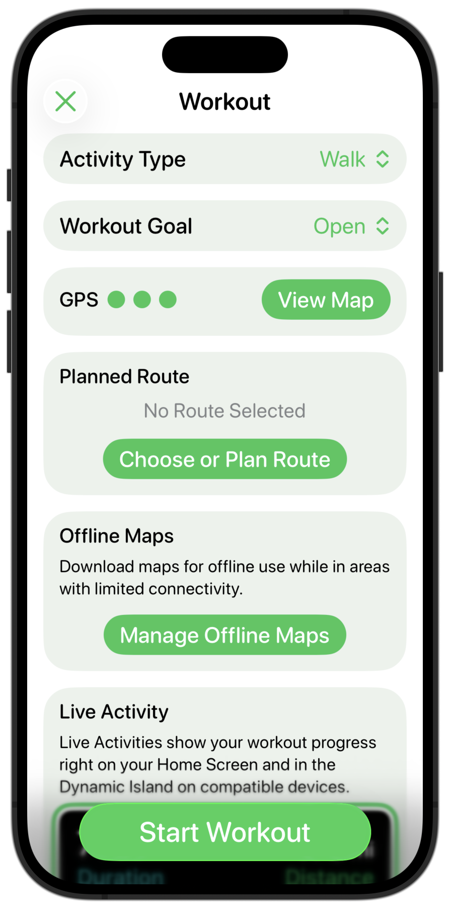
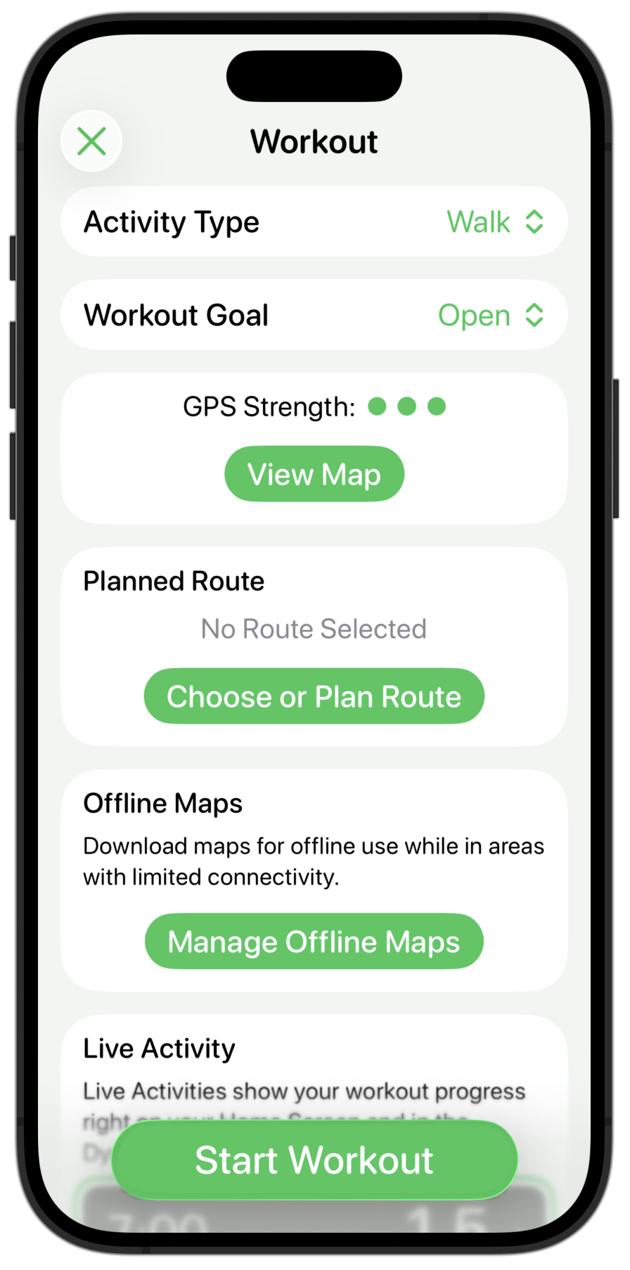
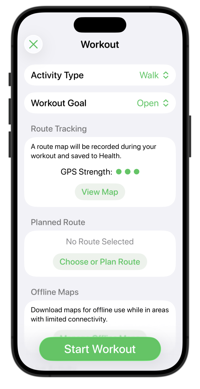
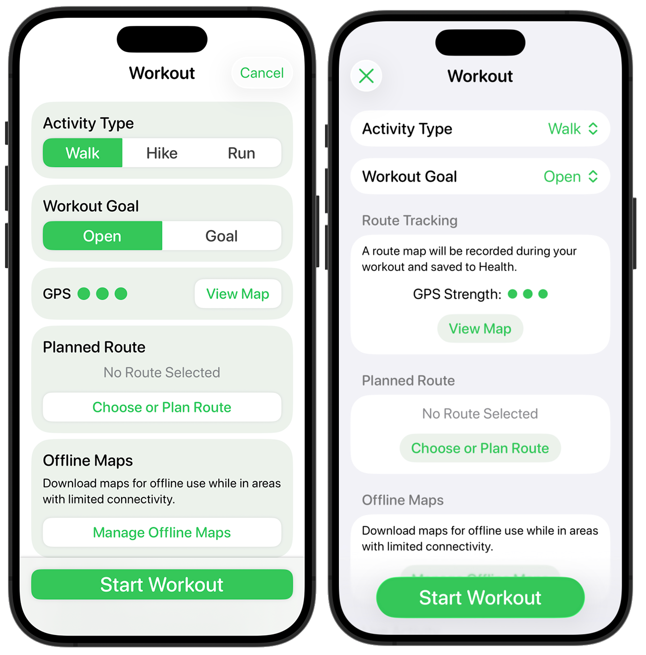
Yesterday’s re-design involved updating the “Start Workout” screen, which I chose as one of the core screens of the app. Today I’m going to walk through redesigning another of more pivotal areas of the app, maps!
Pedometer++ has a number of mapping based features for planning and reviewing your walks, hikes or runs. Within Apple’s own iOS 26 apps, I’d say that Apple Maps is one of the prettiest implementations of the new design. Conveniently it also includes several of the kinds of features which Pedometer++ has to find a design for.
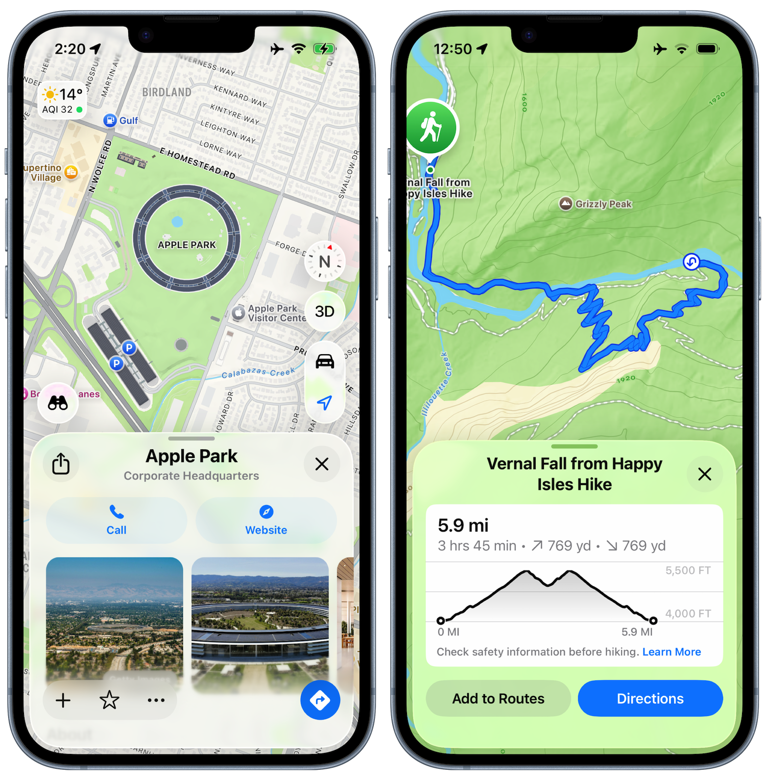
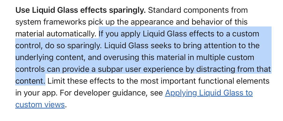
This is a screen which actually neatly falls into a clear separation between “content” and “controls”. In the “Start Workout” screen this was much squishier, but here we have the map and its annotations and then things which either edit or report on that contents. This is a perfect spot for concentric glassy elements overlaying the content.
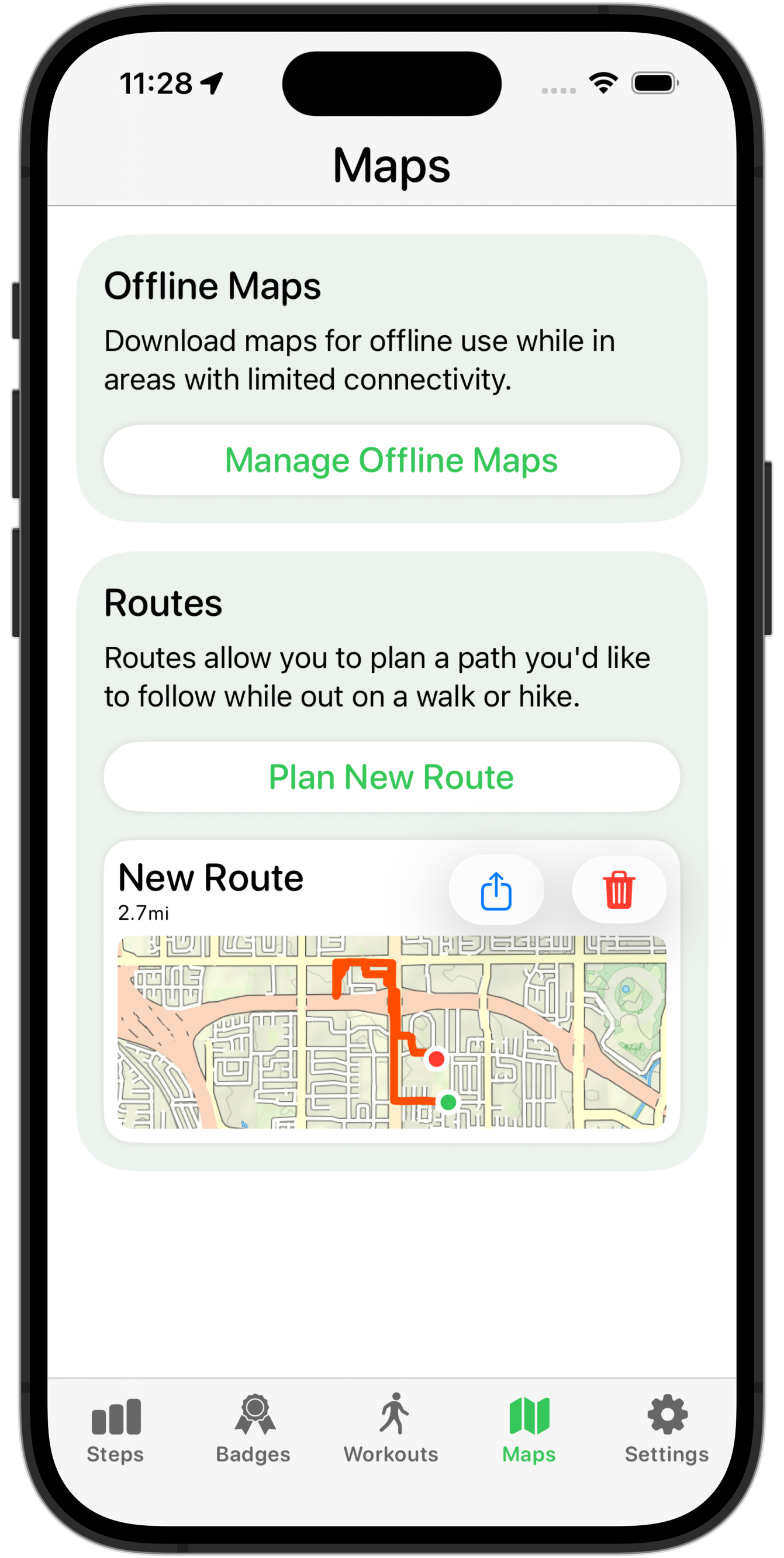
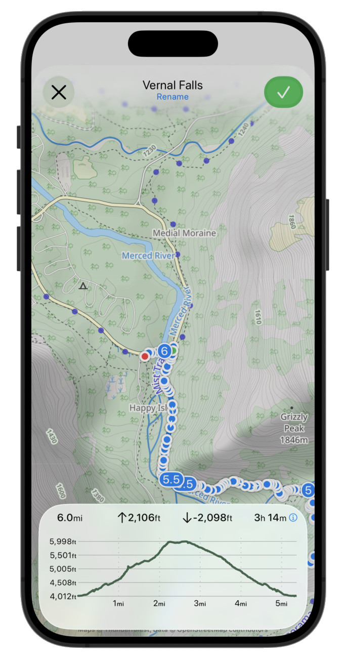
Here is my starting point:
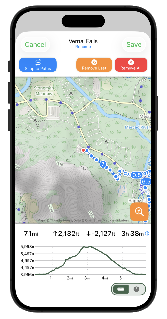
This design feels very constrained in the perspective of the new language, the map is squished between the two white bars and overall this feels like it creates an unstable tension.
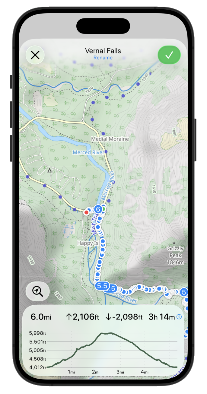
So the very first thing I need to do is to get that map going edge to edge.

That already feels much fresher, but the text based top buttons feel a bit heavy and distracting. So let’s swap those out for some of the newly defined Standard system icons.
Often the “primary action” is given the prominent button style. So let’s try that for now.
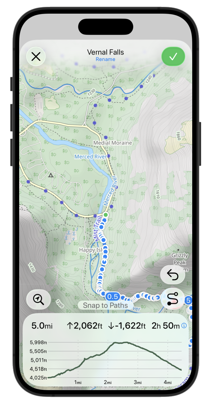
Now let’s put the elevation graph and route stats panel back as a floating glass sheet. The proper API to round this sheet (.containerConcentric) doesn’t appear to be in Beta 2, so I’m just fudging this for now with some hard coded corners radii. The overall effect is pretty good, just enough of the map shines through to give a pretty effect but still very legible.
I think I’m gonna drop the toggle for distance vs time scale on the chart. The difference is way too subtle in most situations to be useful and I think it just creates confusion overall. That leads to a much cleaner looking chart.
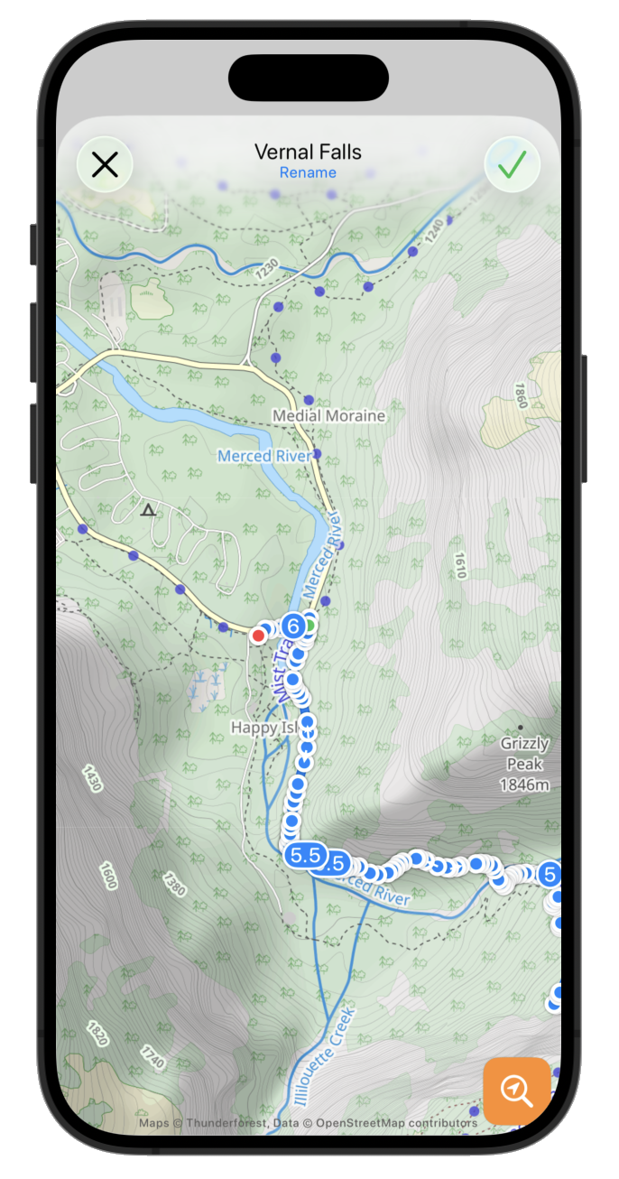
Next to start putting back in the buttons which control the route editing. First up the search for location button. This is used to allow the user to jump to a named place rather than having to swipe around the map.
Then the route editing controls for removing points or switching between snapping to paths or straight line plotting. To start with I just plopped the current buttons in their with a .glass button style.
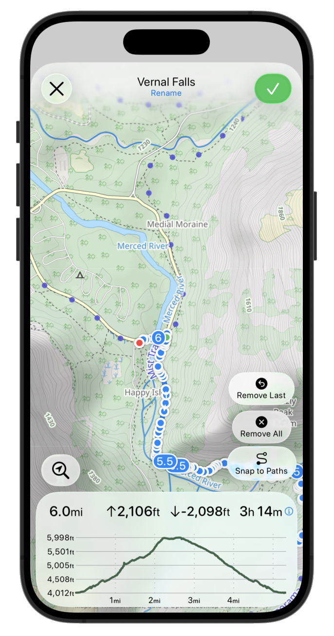
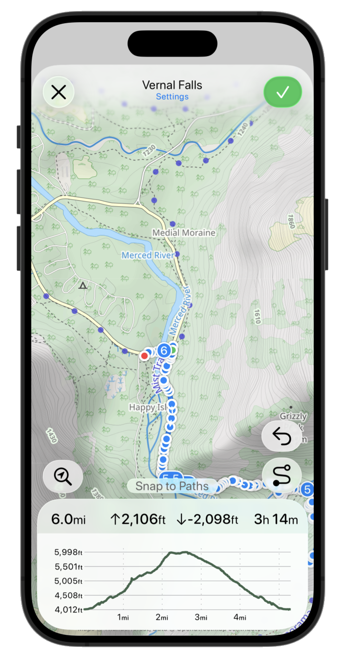
That is obviously way too wordy and doesn’t really fit with the sleek UI I’m going for. So I’m gonna make two changes. I’m gonna drop the “Remove All” option from this primary editing UI. It is rarely used and dangerous so likely best put in the “Settings” area for the route. Then I’m switching over to simple icons for the buttons.
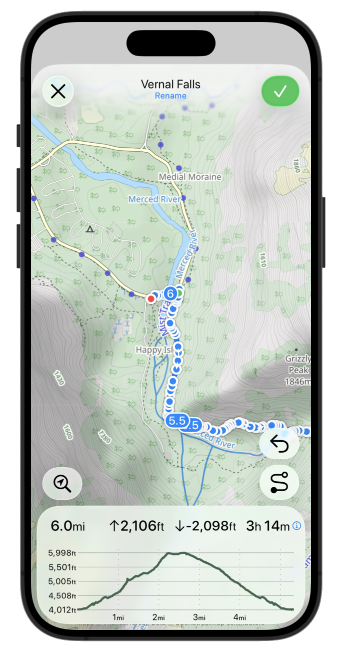
That is visually a lot better but I think it makes it much more confusing about what the snap to path vs straight line plotter button does. So I think I’m gonna put a status area above the info sheet. This also can contain transient messages when it is doing route processing or similar.
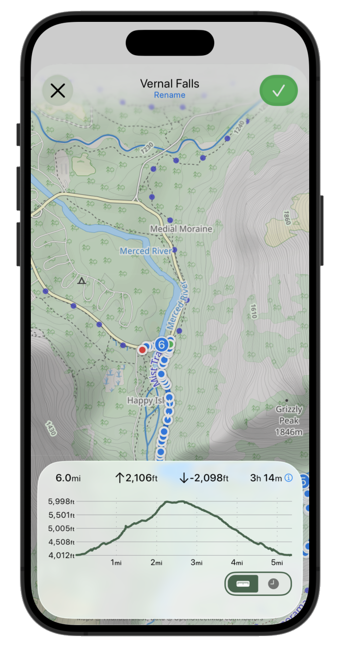
I think the info sheet could benefit from a bit of visual distinction between the elevation graph and the route information. They are related but look a bit too smushed together right now.
I think I might also try pulling down the route name into the button sheet and the settings button too.
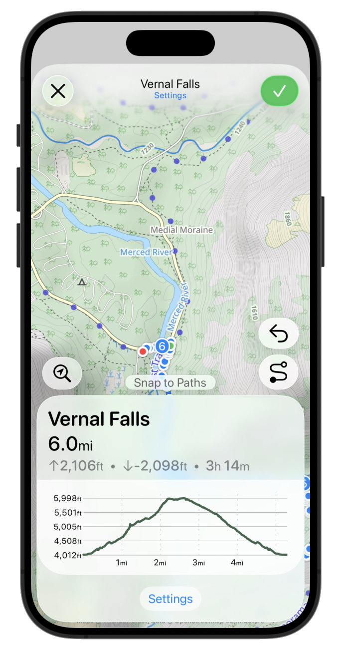
That’s the right idea but the settings button isn’t right there. It should likely be next to the route name area.
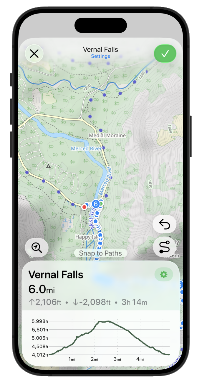
That is getting pretty close but I think the scaling isn’t right. So let’s make the button a bit bigger and move the route name out of the header.
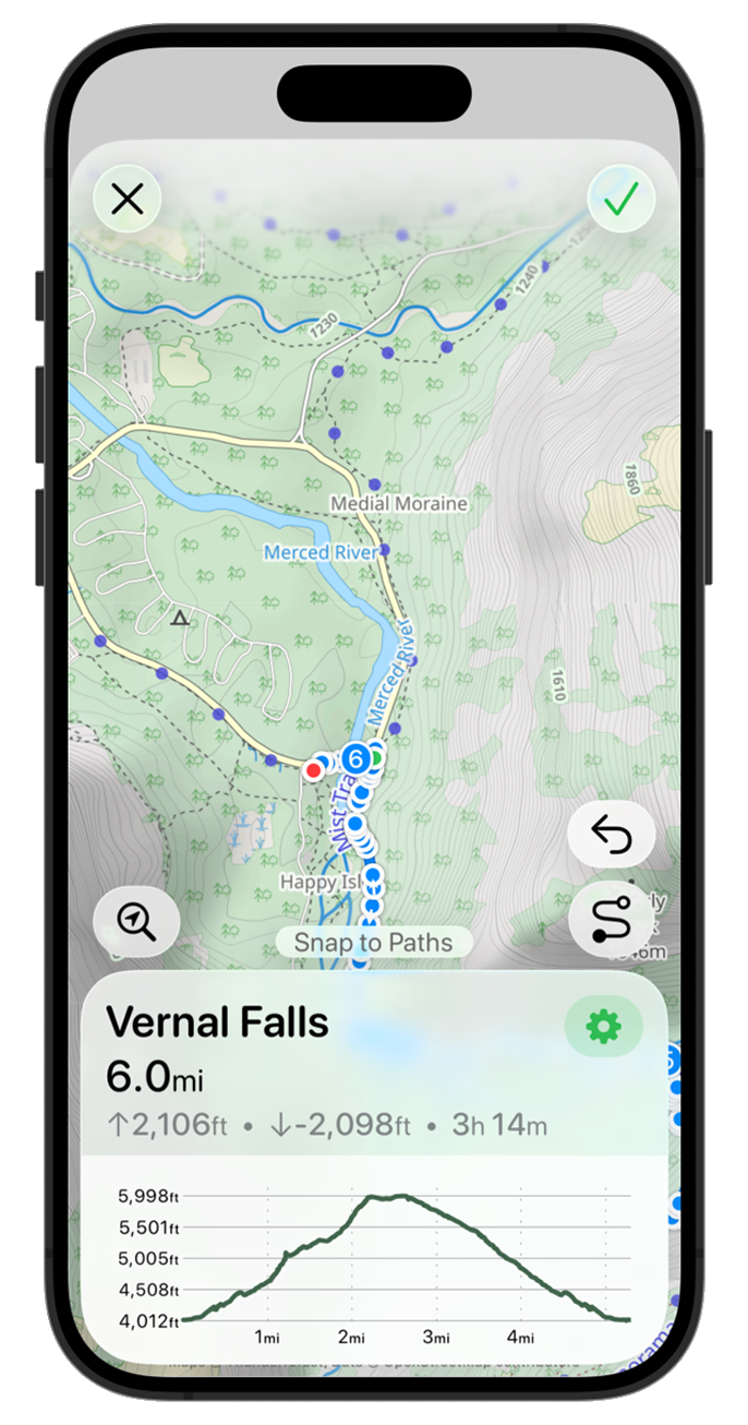
I like that but I think the “Edit Route” text is kinda redundant and makes the map feel a bit squished again. So maybe let’s leave it open so that the map can fade gently to the top bar.
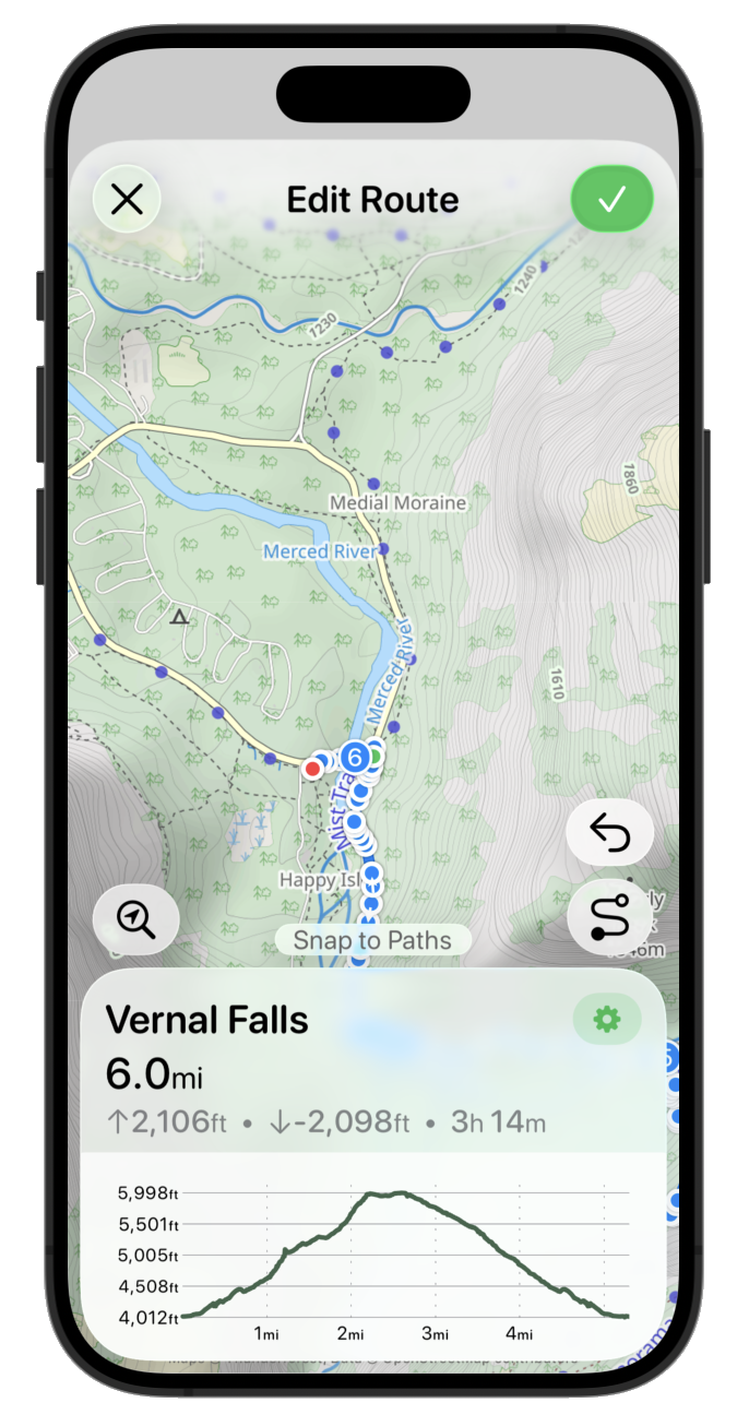
Getting pretty close to a first draft, but the more I look at it I don’t like the way the top right button is the only filled in button. While it is the ‘primary’ action it feels off balance to me. So let’s go back to a simple tinted symbol.
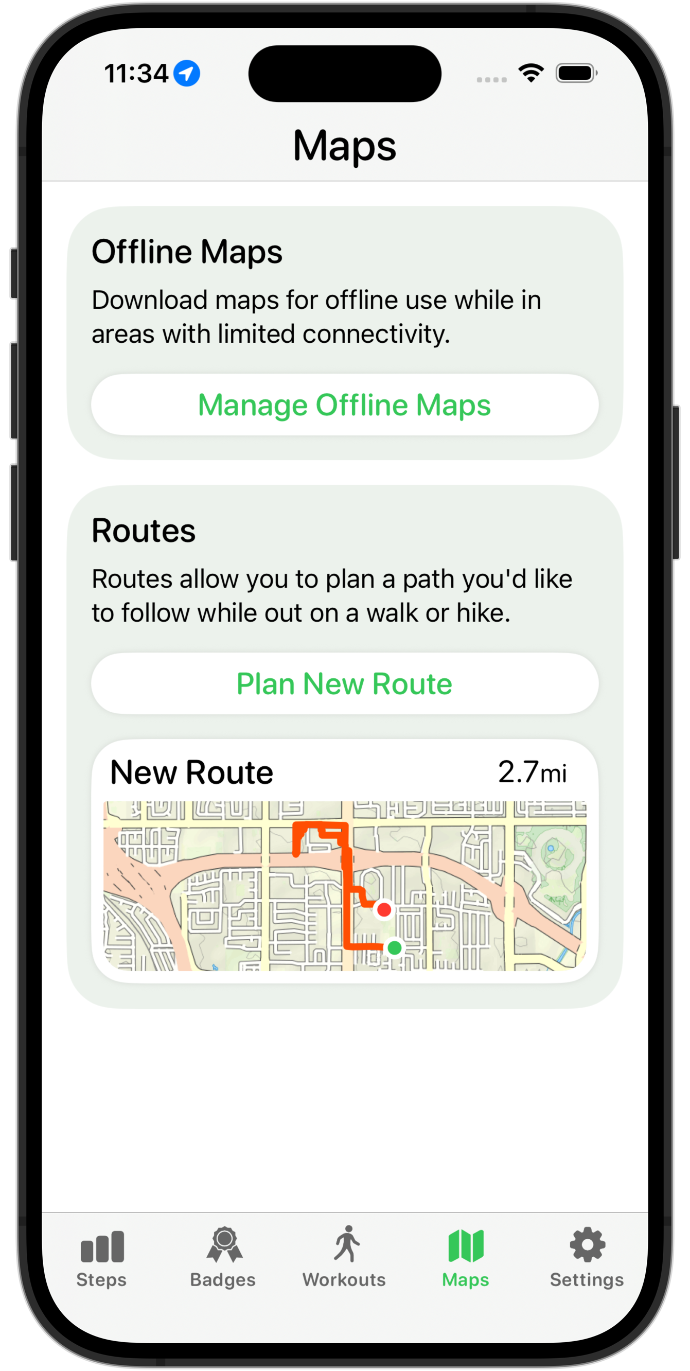
Much better. I feel pretty good about that as the starting point for now. That feels very ‘iOS 26’-ey to my eye. The metrics are still a bit off, and I think the graph styling feels a bit disconnected but this is a good place to stop for now and move on to the next screen.